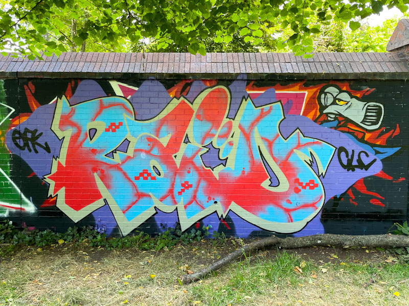
What a fine way to mark a century of posts from Sparke Evans Park, with this immaculate piece of graffiti writing from Raid. Since his arrival in Bristol, about 18 months ago, Raid has consistently turned out great pieces, with an emphasis on the intricate and colourful letter fills, and he has produced another cracker here.
Raid, Sparke Evans Park, Bristol, June 2024
In addition to the writing, which is set on a purple, diamond-shaped background and some flames, Raid has included a ‘Screw’ character from Vaughn Bode’s imagined universe. I am wondering if the character is an artefact of a piece that was there before (I should know this), and Raid has incorporated it into his work. The edges and sharpness are not consistent with his tight style. Another fine piece from Raid – I’ll have to update his gallery, as they just keep rolling in.
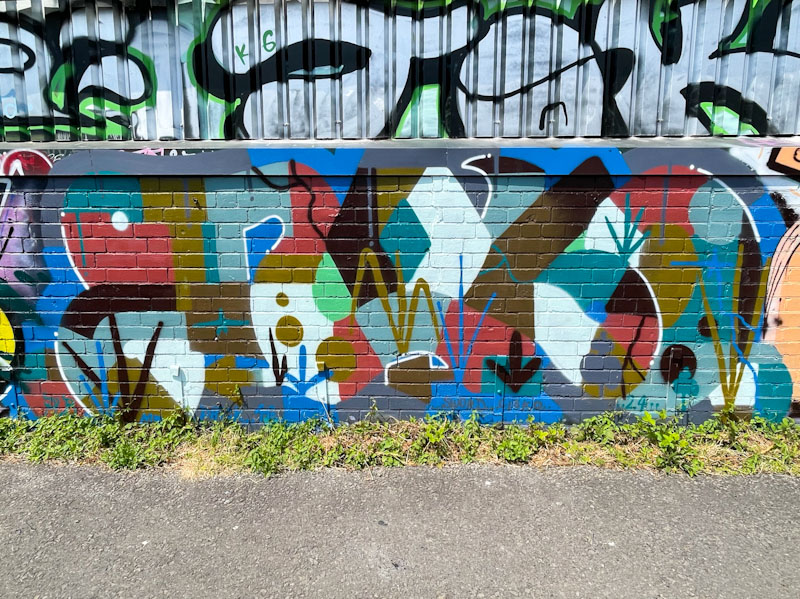
My rather loose description of this spot, which I call River Avon, is actually a cycle/foot path that runs alongside the river from Sparke Evans Park to Temple Meads Station, where light industrial units back on to the pathway for most of its length. This piece by j9449j (or dr3amc0re94) is at the Eastern end of the pathway, and quite easily overlooked… I only spotted it on my return leg of my walk.
j9449j, River Avon, Bristol, June 2024
The joy of j9449j’s work is in its organic simplicity. I suppose you could class it as kind of anti-style graffiti writing, but it is perhaps a little bit more designed than that. As ever, I struggle to read the letters in this piece, so shall have to remain content with the fills and suggested vegetation. j9449j is an artist I am keen to meet – I have so many questions!
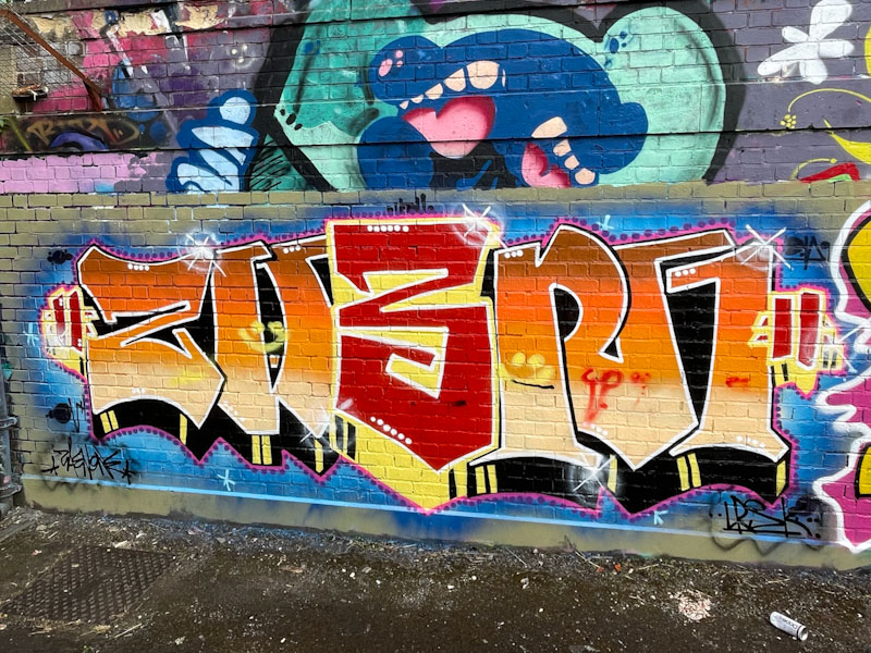
I think that one of the under-rated walls and indeed partially unseen by many is the swimming pool wall at Dean Lane skate park, that lies behind a fence and a hedge for much of its length. If you can be bothered, and historically I am guilty of not bothering, you can access the space between the wall and the hedge/wrought iron railings and see quite a few pieces, and the turnover here is reasonably high. At the right-hand end of the wall, the hedge stops and there is a stretch which can be seen and photographed easily from the ‘wrong’ side of the fence. This piece by Zaneone is in that visible stretch.
Zaenone, Dean Lane, Bristol, June 2024
Even without his customary book-end characters, Zaenone’s pieces have a certain symmetry to them. The letters spell ZAEN1, with a reversed E. He has chosen some nice red, orange and yellow colours, and there is depth provided by the 3D drop shadow, and the blue shading around the outside frames the graffiti writing nicely.
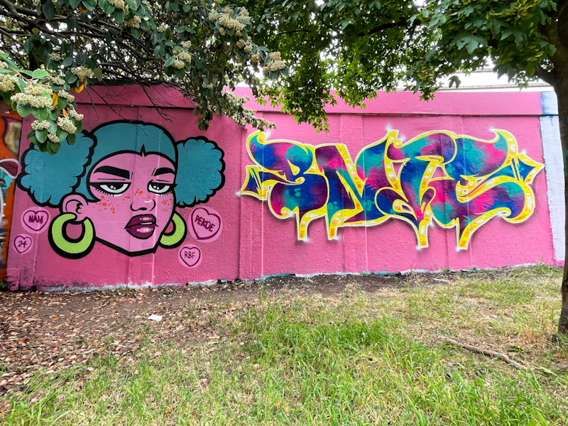
Pekoe and Bnie, M32 roundabout, Bristol, June 2024
Of course, it is a terrible cliché, but when I see pieces like this that are both pretty and pink, I like to describe them as ‘pretty in pink’ stealing from the celebrated 1986 teen film, and then I get the earworm of the Psychedelic Furs and the song that the film was named after. This PIP collaboration is a peach from Pekoe and Bnie.
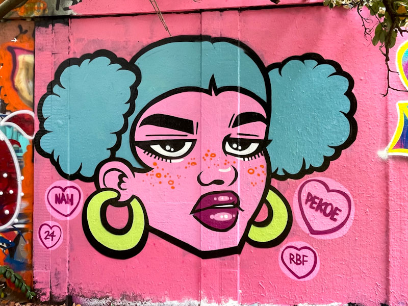
Pekoe, M32 roundabout, Bristol, June 2024
Pekoe has been mixing up her portraits and her writing recently, but I have to express my slight preference for her portraits, because, well, I just love them. The figurative piece is nice and clean, with solid fills and strong black lines, and there is something a little more stylised about the face, especially around the eyes. A classy piece of work.
Bnie, M32 roundabout, Bristol, June 2024
Bnie is so consistent in the quality of her work, and all the elements of these letters come together perfectly. The pink background provides a great canvass for the writing to stand out. The golden drop shadow adds depth to the beautifully designed and filled letters. A clever touch is the subtlest dark shading at the base of the letters, creating a bit of shadow and lifting the writing further. What a fine collaboration.
I don’t think I have posted anything from Alos for rather a long time, so it was nice to encounter this small piece at the end of the long wall at Cumberland Basin. His rather loose anti-style writing appears to have been superimposed on another piece, and it looks like the fills in his letters are from that previous piece.
Alos, Cumberland Basin, Bristol, June 2024
One could view this technique as lazy, but I prefer to think of it as opportunistic and illustrative of the perennial layering on the walls we know and love. The skill has been in how to make his letters ALOS rise above from the surrounding chaos, and I think he has succeeded.
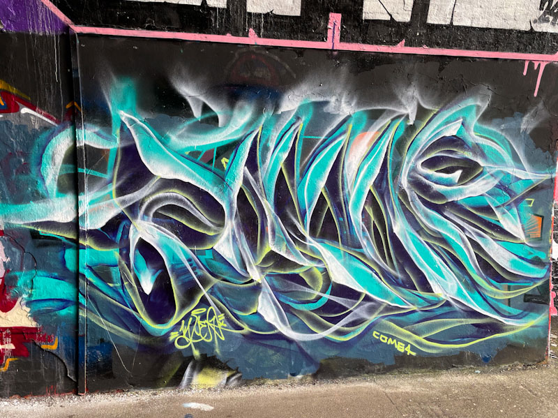
Mr Klue is having another of his purple patches – he is very much a peaks and troughs kind of artist, and this one in the tunnel is one of several new pieces in his favourite spot. Mr Klue is also posting a lot of old pieces on his Instagram account right now, which is almost like a retrospective exhibition – and most enjoyable.
Mr Klue, St Werburghs, Bristol, June 2024
This piece follows the familiar formula of wispy ephemeral writing that spells out KLUE, using the blue tones that he loves so much. I hope that this productive period continues, because Mr Klue is another of those artists whose work underpins the diverse scene we have in Bristol.
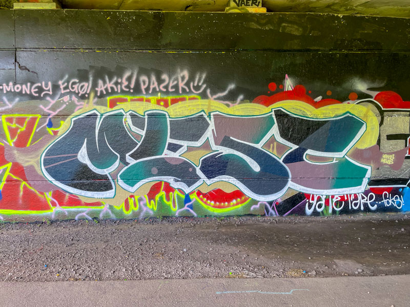
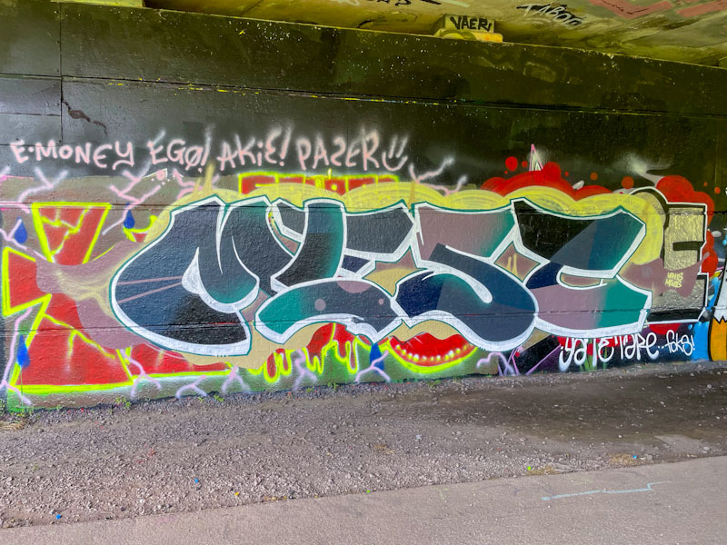
After what feels like a long absence, I have noticed one or two new Mest pieces appearing about the place, which is good news, and this is a recent one from Brunel Way. His journey can be applied to so many other artists with peaks and troughs in activity, which can happen for all sorts of reasons.
Mest, Brunel Way, Bristol, June 2024
I have always liked Mest’s graffiti writing. For me he falls into the school of artists who present their letters clearly, without too much disguise, and concentrate on fill patterns and other details. Other artists that I would liken his work to are Phour, Mr Draws, Raid, Nips, Oner and Mates, and I am sure there are a host of others too. Mest has crated some nice letters with fabulous fills, and appears to have hit the ground running on his return. Looking forward to seeing more from Mest.
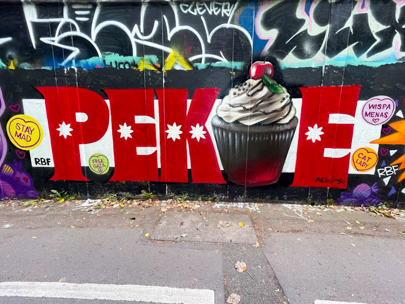
Pekoe and Jody, M32 roundabout, Bristol, June 2024
This is another installation from the recent paint jam to celebrate Wispa’s (in absentia) birthday. I can’t recall whether Pekoe and Jody have collaborated before, but they have done so spectacularly well in this writing/cup-cake combination piece.
Pekoe and Jody, M32 roundabout, Bristol, June 2024
Pekoe has been working more on her letters over the last year or so and is clearly gaining in confidence. There is a uniformity and discipline here which is good to see, She has added a sprinkling of ‘love hearts’ in line with the confection theme for the paint jam. The cup-cake by Jody is nothing short of perfect… topped with a swirl of cream a cherry, mint leaves and some chocolate sprinkles. A superb collaboration from the pair – I hope Wispa was suitably impressed/touched.
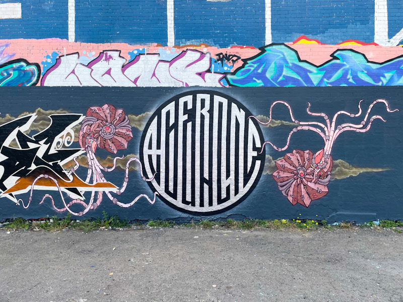
Fade, Andy Council and Acer One, Dean Lane, Bristol, June 2024
What I love about recording and writing about street/graffiti in Bristol is the enormous array of quality, experience and styles that I get to see – it is never boring, and I love to try and represent it all here. This is an extraordinary ‘high-end’ production from Fade, Andy Council and Acer One. I get the feeling from the balance of the piece that Fade may have been an opportunistic addition to this piece, but has integrated perfectly with the colour scheme and tone,
Fade, Dean Lane, Bristol, June 2024
Fade, using all his experience, manages to create such a tight finish to all of his work, and it feels like there is never any part of it that is untidy or out of place. His letters spell FADE, and are filled beautifully in black fading to brown. The writing is set on a stunning grey/brown cloud that runs through the whole collaboration.
Andy Council and Acer One, Dean Lane, Bristol, June 2024
The balanced symmetry of the Acer One and Andy Council element of the collaboration is what makes me think that Fade was an add-on. It comprises one of Acer One’s designs that he is currently favouring, which is accompanied by two of Andy Council’s famous Ammonites.
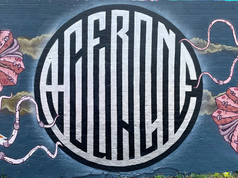
Acer One, Dean Lane, Bristol, June 2024
Acer One has come up with this incredibly clever and intricate concept, where two words are incorporated into one design – something he has done before, but is now more refined. Some of the words are easier than others to see. The upper chrome lettering spells ACERONE and the lower black letters spell COUNCIL. If you block off the upper or lower part, it is easier to read the names.
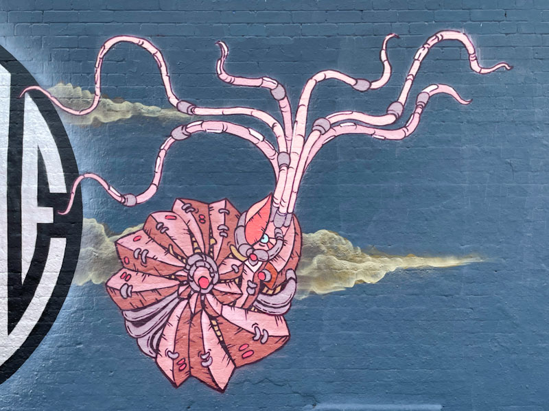
Andy Council, Dean Lane, Bristol, June 2024
I love it that Andy Council will often return to his ammonites in his mural work. They obviously hold an important part in his work because his signature incorporates one. These creatures are ‘composites’ made up of elements ‘stitched’ together in Andy Council’s unique and inimitable style. This is overall a brilliant production, and a precursor to a larger one including Dibz and Jody… watch this space.
I have mentioned before on Natural Adventures, how much visiting artists contribute to the spectrum of street and graffiti art that we see in the city, constantly adding to the diversity and culture of the scene. All visiting artists are welcome, and none more so than Mr Tanner, whose one-off unique pieces have brought some imagination and and sparkle to this wall in Cumberland Basin on several occasions.
Mr Tanner, Cumberland Basin, Bristol, May 2024
I am not too sure where Mr Tanner is based, but he does appear to visit Bristol occasionally. The horse in this piece is a reverse silhouette on a black background, within which its skeleton appears, almost X-ray-like. There are two vertical lines of writing that accompany the piece, on the left, something in Japanese, and on the right the letters TOPIA constructed out of bones. Altogether this is an unusual and striking piece.