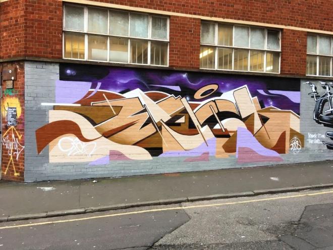
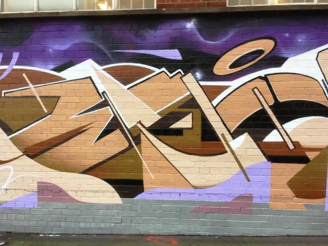
What a nice surprise this was. I had been told there were some new pieces down by the M32, but nobody had said there was a new SkyHigh piece and that it was really good. I have featured SkyHigh a few times in this blog, posting pieces in Bristol and in London, but I think that this is my favourite so far.
SkyHigh, M32 Spot, Bristol, February 2018
He spacialises in combining different designed letter block fonts spelling out the word SKYHIGH, and as a whole it becomes an interesting form of wildstyle writing. It is not so much cryptic as it is creative and technically attractive.i love this piece and I think the colour scheme works perfectly in this site. Top marks.
I don’t visit this spot very often as it is slightly out of the way and I need to find time to get there, park up etc in my very busy family schedule. Often I find that going to the recycling centre (tip) is a good excuse for taking a bit of time out, but on this occasion my wife had to do some shopping locally and offered to drop me off…never one to pass up an opportunity I accepted the offer.
Kleiner Shames, New Stadium Road, Bristol, February 2018
Lucky that I took a look, because I found this rather nice pairing of Whyasyit and Kleiner Shames who used to spray a lot together until KS moved to London a little over a year ago. Both artists have such unique styles which once you get your eye in are easy to identify.
Kleiner Shames, New Stadium Road, Bristol, February 2018
I like it when two or more artists use common colours and background and do their thing. Kleiner shames always write FOIS, and for a long time I thought it was the artist’s name…early posts refer to him as Fois. His lines ans designs have what I would call an ’80s deco feel about them (I know what I mean by this, but you might not).
Whysayit, New Stadium Road, Bristol, February 2018
Whysayit seems to be forever busy on the streets writing YSAE with similar ‘handwriting’ but always with creative and imaginative backgrounds and fills. Two great writers who work well together.
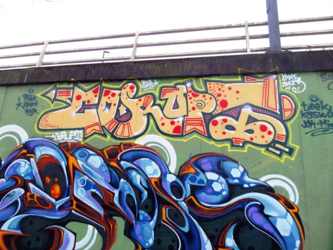
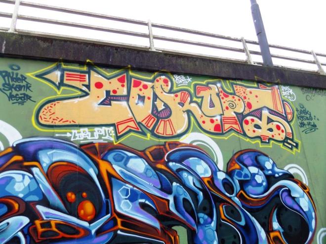
I am not entirely certain, but I think this piece is by Hemper. For sure the writing spells HEMP, but it is possiblt this is a drug reference and nothing at all to do with Hemper. Whoever it is by, it is a nice bit of chrome writing set on a green and purple wall for a background.
Hemper, M32 roundabout, Bristol, December 2017
Walls seem to feature a lot in street art. I suppose that along with spray cans, walls are one half of the tools of the trade. This is a nice piece that seems to have stood the test of time in a location that normally has a high turnover. Finally, who can’t agree with the statement ‘homes for all’?
This is the first time I have posted any work by Corupt although I have seen tons of his stuff over the years. As a graffiti writer I think he likes to stay well under the radar, and I have only once seen him at work, and I think he quite wanted to keep a low profile.
Corupt, M32 roundabout, Bristol, January 2018
I have seen a lot of his work on the walls at Dean Lane skate park and here at the M32 roundabout. It seems to me that he rather favours these high up spots, often above other works. I think the idea is that if he sprays high up, his work will be there for longer. Seems to make sense to me.
Corupt, M32 roundabout, Bristol, January 2018
I must confess that I haven’t paid too much attention to his writing, although I see quite a lot of it, but am breaking that habit now with these first two works. I haven’t yet formed an opinion about his work, which all seems to conform to a particular style format.
Corupt, M32 roundabout, Bristol, January 2018
Both of these are colourful works, and I will enjoy posting more and seeing how his work develops over time.
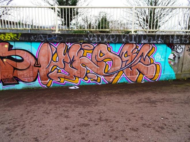
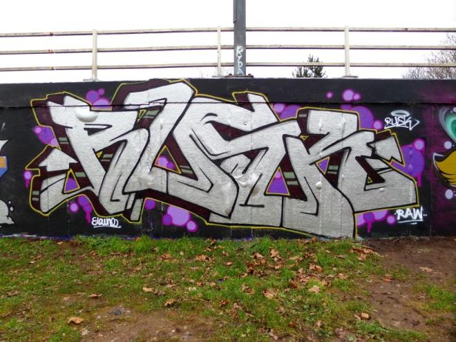
There is a reliable consistency about the work of Soker. Always high quality and always delivered with some panache. In this piece of writing e has opted for a chrome finish on a wall background. The chrome complements the Rusk piece next to it.
Soker, M32 roundabout, Bristol, January 2018
There is a big thing for chrome writing, and it seems to be the colour of choice for many graffiti writers, I guess because of the impact it has. If I am honest, I’n not too sure about it, I feel it is a little over-used to achieve impacts, however what it lacks in subtlety it makes up for in clout. A nice piece of writing.
Well, well, well. This is a sensational piece of writing by Epok which was sprayed at the same time as the Sepr pianist. Two great artists painting together but not a collaboration. The modern phrase that comes to mind when I look at this is ‘he’s smashed it’.
Epok, Upper York Street, Bristol, February 2018
With some references to the modernist movement, this piece is technically brilliant, bringing together elements of writing, shading, colour selection and mood that have created a master work.
Epok, Upper York Street, Bristol, February 2018
Anyone with aspirations of becoming a writer should take a long hard look at this piece. It would be worthy of hanging in any gallery. Perhaps you have noticed that I like it…a lot.
I think I said it quite recently that I don’t often get down to St Werburghs tunnel, which is a pity really because I miss out on a lot of gems like this one from Whysayit. I am beginning to think that he might simply be whysay or YSAE, because his Instagram handle which used to be Whysayit has changed to Whysissy and again to Whydot. However, I am not retrospectively going to correct all my posts. I shall call him Whysayit.
Whysayit, St Werburghs tunnel, Bristol, January 2018
Once again we such great quality of ideas and shading from this graffiti artist. When I see great writing, I often wonder whether the artists could do characters or something other than writing. There is something of a split between graff writers and street artists, but some have crossed the divide and others, such as Deamze and Voyder seem to be equally comfortable with both.
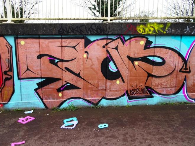
Sitting snugly next to an Elvs work is this great chrome piece by Rusk, set on a black background and decorated with pink and purple bubbles. A friend of mine, who is a designer, asked me what is this thing for drawing arrows on the end of graffiti letters all about. Is it simply a design feature? who first did it? does anyone know? I don’t know the answers, but they do feature in most wildstyle writing.
Rusk, M32 roundabout, Bristol, January 2018
Rusk as always has smashed it with this piece, which is rather different from some of his work I have been posting recently. Maybe I’ll ask him about the arrows next time I see him.
I have said it before (and I have said that before too), but I will say it again – I am really enjoying the work of Elvs. Having only comparatively recently established who he was, I seem to be finding a lot of his work, either contemporary or in my archives.
Elvs, Raleigh Road, Bristol, January 2018
This is a recent piece in Raleigh Road that really stands out. The fade of shading through the piece is masterful and I rather like the yellow frame and green patterning that his letters ‘ELVS’ are sitting on. The pink and black accents lift the edges of his letters expertly. A fine piece of writing.
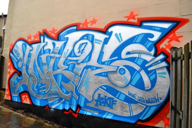
Unmistakable, this piece is from our very own street art mega-star, Inkie. In Bristol, he is pretty much a household name and is recognised not only for his amazing street art work, but also for the stunning designs he produces in his studio. Many of his prints hang on the walls of Bristol homes.
Inkie, Upfest, Bristol, July 2017
At Upfest, Inkie was supposed to have a different wall, but for some reason he didn’t take it, and Dzia did an extra piece (the robin) instead. This was where Inkie ended up, in a back yard that is fenced off. A few intrepid visitors found it and went round the back of the yard, and saw that the gate was open (probably for the festival only). There have not been many images of this piece, even though it is still there. A beautiful example of his work, so clean and an example of wildstyle writing at its best.