
In Lansallos Cove
where trees huddle for shelter
lichen enrichens
by Scooj
- This only works if you pronounce lichen, litchen rather than liken. That is the way I was taught at school.
In Lansallos Cove
where trees huddle for shelter
lichen enrichens
by Scooj
I love it when you start to see the work of an artist who has previously been off the radar, and recently I have become aware of a couple of stencils by Yoshi of which this owl at St Werburghs is one. Actually it is a cat owl, and if you look carefully at the face you’ll see why.

It would seem that Yoshi is reasonably new to the street art scene and is very much in a discovery phase of his work with sencils, trying out different materials and ideas. Yoshi has a good Instagram feed that offers a little bit of narrative and insight into his work, which is great, I also have noticed that there a couple more stencils I need to go out and find. Looking forward to seeing more work from Yoshi.
Although I can’t be sure, I think this ephemeral portrait might be the work of Annika Pixie… it certainly has many of the ingredients that are common to her work, the lightness of touch and delicate nature of the subject, but I have not seen her paint many walls like this one.

As I write this, my curiosity got the better of me and I had a look at Annika’s Instagram feed, and sure enough there is a little video of this piece, filmed in only the way she can do such things. I love her touch, which is full of subtlety and magic and in such stark contrast to the macho work one is used to seeing. Nice one Annika.
.
I said from the start
I don’t think we’ll leave Europe
a view I still hold
.
by Scooj
The long wall at Dean Lane plays host to a great many great collaborations, and this one is no exception. Two of there artists, Rusk and Turoe One are familiar to me, but the third, Kasoe (Gatoloco) is reasonably new to me .

Starting off the collaborative wall is the familiar writing of Rusk which has been really beautifully done. His horizontal shading gives the whole piece the effect of being a glistening gold bar or something like that, and the depth created by his 3D shading is really well done. The whole piece is set on a cosmic background with a bit on an electric storm going on. Great stuff as you’d expect from this artist.

Next up is a terrific Iron Man character piece by Turoe One, an artist who has been decorating walls for more than 30 years, but whose work has been almost off my radar until recently (how does that happen?). There is little to say about the Iron Man figure other than it is utterly awesome.
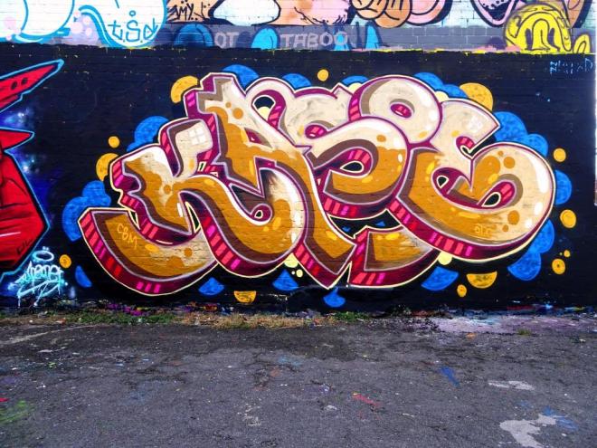
On the right hand side of the collaboration, and perhaps a little bit discrete from the other two is this very distinctive and beautifully painted writing from Gatoloco who writes Kasoe. There are elements of other styles in this piece, such as 3D shading reminiscent of Inkie, but the whole thing has a strong and clear identity and is very easy on the eye. I have seen at least one other piece from Gatoloco and will be looking out for more.
Rather difficult to photograph, but easy to spot and be curious about is this striking mermaid created from foam insulation material, by Bristol installation artist, Duncan McKellar. What I love most about his pieces is that they are placed in busy parts of the city and challenge people to stop and think and look and laugh and be curious, rather than burying their faces in their cell phones.
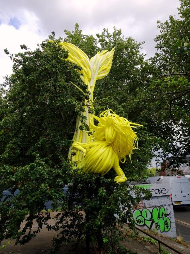
This is a clever ‘sculpture’ because it takes a little while to ‘get your eye in’ and interpret what you are looking at, then once you have got it, it is impossible not to see it. I am never quite sure with Duncan McKellar’s work whether it is done with the permission of Bristol City Council, or whether it is ‘guerilla art’. I rather hope it is the latter. I really love this.

I’m out of practice
and out of inspiration
nothing to see here.
by Scooj
Mr Penfold is a designer who paints quite a few commissions in and around Bristol, and his characteristically colourful patterns are unmistakably his work. I think that his art tends to divide opinion a little, but I have to say that I am always rather pleased to find a piece by him.
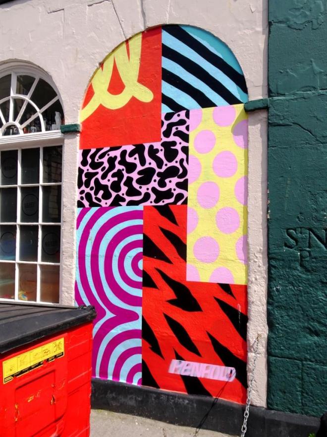
This one on King Street is a favourite spot for the artist and is a replacement for a piece he painted there a while back. The most annoying thing about it is that the red wheelie bin is permanently parked right in front of it and it is very hard to get a clean shot (you can see I failed miserably). The colours that Mr Penfold selects always reminds me of confectionary, in particular liquorice allsorts, you can probably see why. There is an interesting feature on the wall just to the right of Mr Penfold’s piece, which is the letters St N P, carved into the stone wall of. I don’t know if this is some kind of stone mason marking or a signpost or something else… answers on a postcard please.
This is the second part of a four-way collaboration in the foot underpass at New Stadium Road between T-Rex, Tasha Bee, Decay and Ryder. The first half (the boy’s end) was posted here. As I always say about this location, the light was not helpful for getting good photographs, but you can still see the quality of the work.
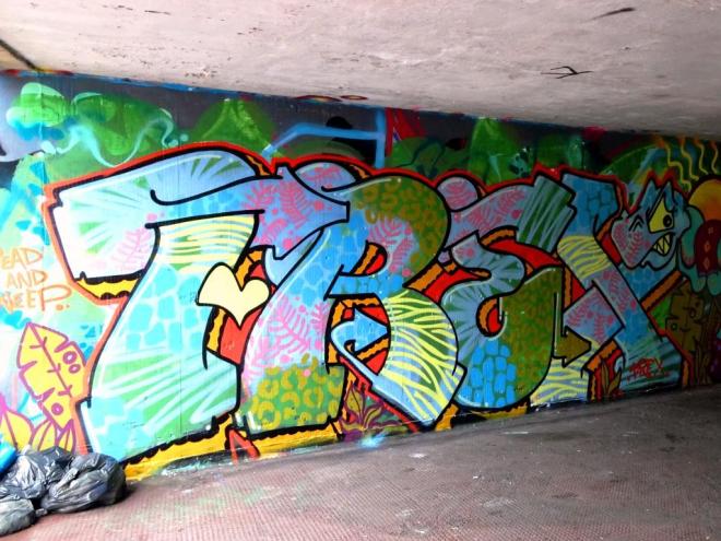
On the left is a beautifully colourful piece of writing from T-Rex with some wonderful and varied fills and her trademark dinosaur character rounding off the ‘X’.
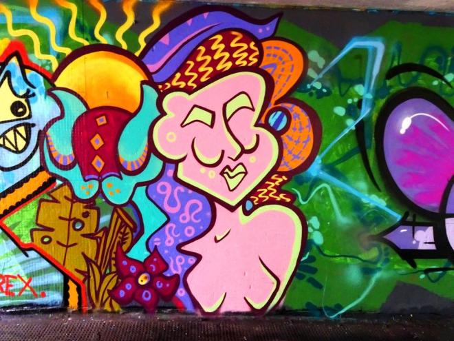
On the right is a very nice piece by Tasha Bee (Keep it Colourful) which reaches the very high standard I am used to seeing from her. Tasha Bee’s work never disappoints, and although she pretty much always paintsthese soulful styalised portraits, each one is an absolute beauty. All in all, it looked like these four artists had a great day out.
Wowzer… this is quite the best piece I have seen by Pekoe yet. It is beautiful and I truly believe that in this piece we are witnessing an artist reaching a new level, I see it as a really significant piece. The blue-faced portrait has something very special about it, the expression, the tone, the confidence and of course that amazing hair.
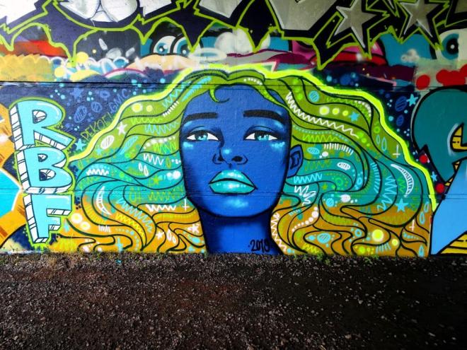
In this piece I feel that Pekoe’s naive style has transformed into something altogether more sophisticated and mature, and I love it. I would like to think that a lot of thought, care and effort went into this piece, it certainly looks really tight.
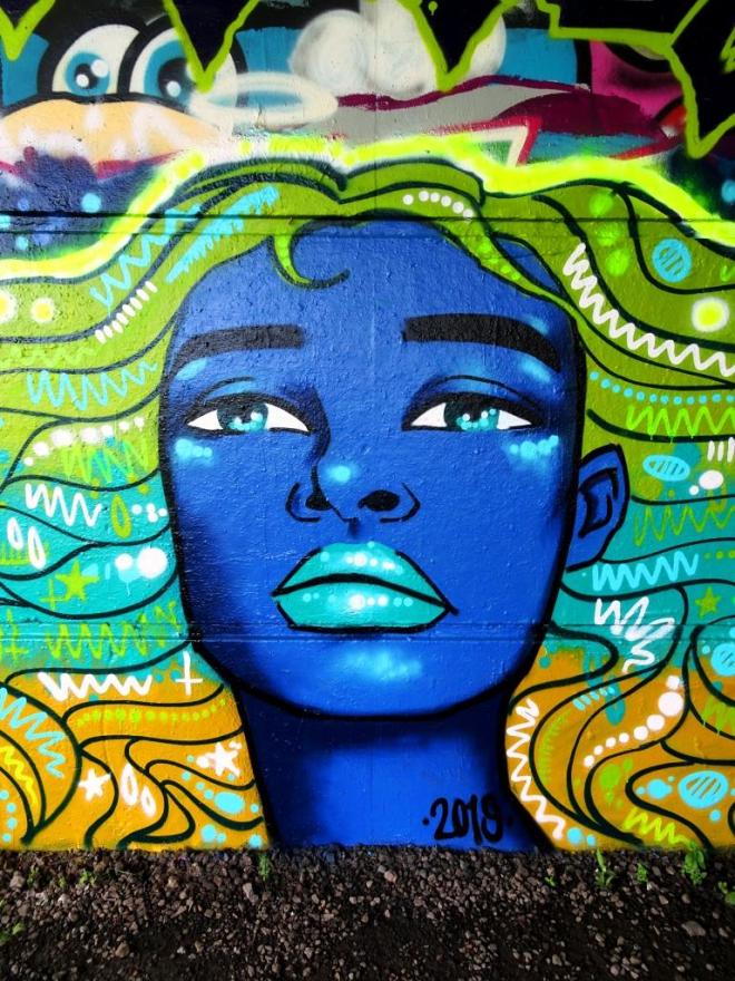
The patterns in the hair are so typically Pekoe, but the addition of three layers of base colour add an extra dimension. The eyes too work well with several dots in each creating a glassy effect, very clever. There is so much to like about this work. Bravo Pekoe!


