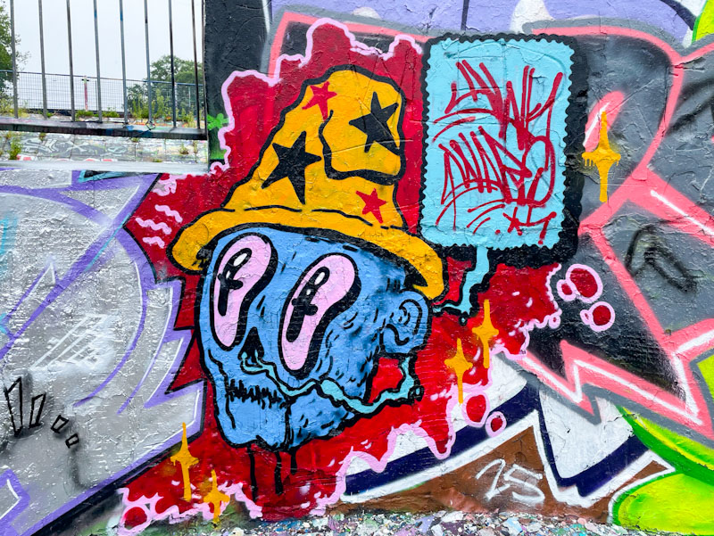
After quite a long fallow period, Awkward has popped up once again, spurred on by Benjimagnetic, it would appear. His character pieces are so distinct and have a slightly sinister quality to them, with crazy big eyes, a skeletal nose and zigzag line mouth.
Awkward, Dean Lane, Bristol, August 2025
The blue-faced character looks like he is wearing a Cheech Wizard hat, the character created by underground comic artist Vaughn Bode, and firm favourite with graffiti artists. The speech bubble contains the word Awkward and performs the role of signature for the piece, as if a signature is needed for Awkward’s work. A lovely piece.
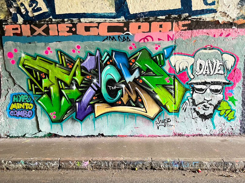
Hypo and Minto, St Werburghs, Bristol, August 2025
This is another fabulous collaboration from Hypo and Minto, who seem to team up reasonably regularly and clearly enjoy painting together. The little tag – ‘Hypo Minto combo’ captures the friendship really well.
Hypo and Minto, St Werburghs, Bristol, August 2025
Hypo has smashed it with his writing. The colours are magnificent and transition through the piece with grace and style. The shading, and in particular the white highlights, help the piece to pop and create a superb 3D effect. Truly outstanding. Alongside the letters, Minto has painted a contrasting greyscale character portrait, and a tribute to Dave I guess. The combination piece just works – a classy collaboration.
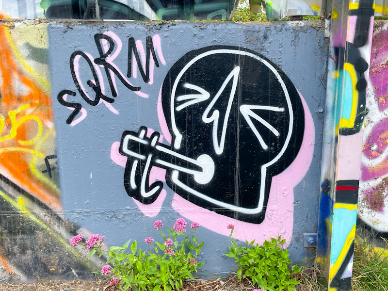
There is something very charming about the stylised skeleton characters painted by Squarms. They are nicely designed and consistently presented, so that it is clear and obvious that they all belong to the Squarm stable. His work feels like that of a graphic designer taking his ideas to the street.
Squarms, River Avon, Bristol, August 2025
These two small pieces are so much more than quick throw ups. The grey background has been prepared nicely so that the skulls stand out with their soft pink and light grey drop shadows. Accomplished designs presented really well by Squarms.
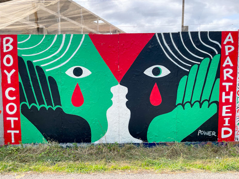
I have mentioned many times before on Natural Adventures how much I love the way street artists capture the moment or the mood of the city or country as a whole. In saying that, I would reflect that most, not all, street artists are aligned with progressive or left leaning sympathies. It is rare to see right-wing or fascist street art that evolves beyond slogan tags. This potent piece by Zoe Power is one of many painted during a paint jam organised by the Bristol Mural Collective up a Greenbank a couple of weeks ago.
Zoe Power, Greenbank, Bristol, August 2025
Zoe Power has kept her message and artwork simple and unambiguous. The captivating piece features two faces looking at one another with tears, symbolising sadness and tragedy, painted in the colours of the Palestinian flag, with the words ‘Boycott Apartheid’ book ending the work. Who, in their right mind, could support the slaughter of innocent civilians on such a mass scale? Has the Israeli leadership learned nothing about attempted eradication of a people? Zoe Power and her collaborators are keeping the tragedy unfolding in front of our eyes out there and protesting through their art.
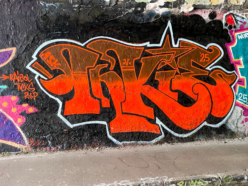
Inkie is back in town and has been painting a little. This is a rather nice little piece of classic Art Nouveau/funky graffiti writing, and what makes it a little unusual is that he appears to have painted it alone.
Inkie, St Werburghs, Bristol, August 2025
when you see a quick piece like this, you know just by looking at it that you are in safe hands and looking at the work of a master craftsman. The red fills of the letters are brought to life with the application of a thin white border. Classy.
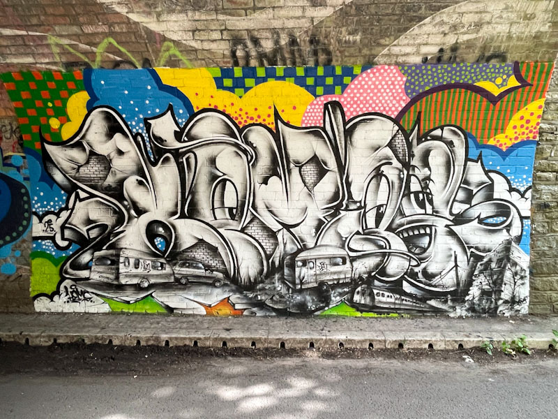
The tunnel, under the railway, at Boiling Wells Lane is usually pretty useless for graffiti, more commonly used for throw ups and tagging than serious artworks, but some new pieces from Hemper and friends have rather upgraded this spot, and I wonder if it will encourage others to paint there a little more.
Hemper, Boiling Wells Lane, Bristol, August 2025
Hemper has arisen from his mini-slumber for the last month or so and started producing these slimline ‘Hems’ pieces of which this is an absolute cracker. The black and white letters, portraying local scenes of trains and caravans, and full of mischievous characters, contrast superbly with the quilt-like patchwork of colourful patterns surrounding the piece. This is masterful work from one of the very best writers in the country.
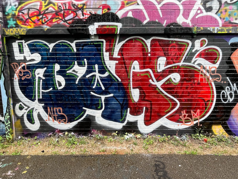
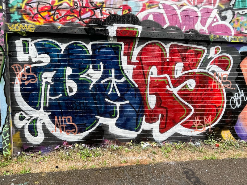
I have a great many pieces by Bags in my archives, but have only posted a fraction of them. I keep meaning to post more from this stalwart of the No Frills crew, but somehow never seem to do it. This is a recent piece, one of several, in which he has played with bilaterally splitting his letters into two colour sections, with the BA in one colour and the GS in another.
Bags, River Avon, Bristol, August 2025
He has painted so many of these, that his letters must come very easily, and he tends to keep the general shape of his letters consistent from piece to piece. The dark blue and red colours work well, and I rather like the half-and-half appearance. I’ll try to post more of his pieces in the future.
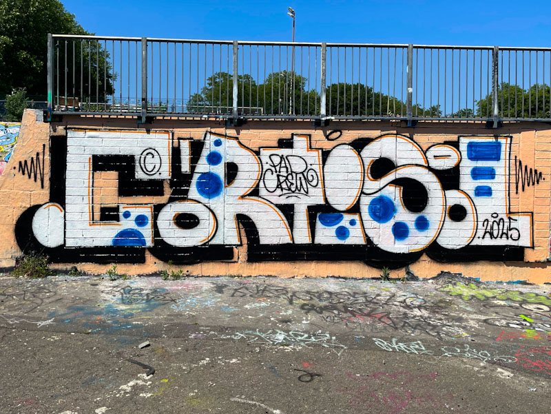
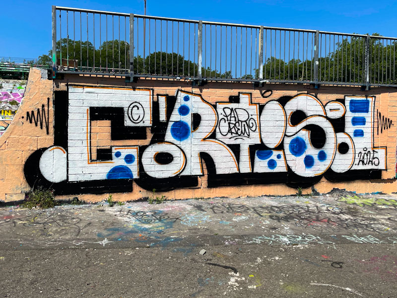
Cort is an elusive artist, painting as part of the PAD crew which includes Laic217 (what has happened to him?) and Trafficity amongst others in the Polish street art community. His style is really distinctive, and at times his work is exceptional.
Cort, Dean Lane, Bristol, June 2025
This is a rather tidy piece that looks like a bit of a sketch, painted or drawn with black and red biros (ball point pens) and a blue fountain pen. The letters are irregular in shape and size, but the whole word conforms to a specific height throughout. Set on a creamy background, the lettering looks rather good to me. I like this piece.