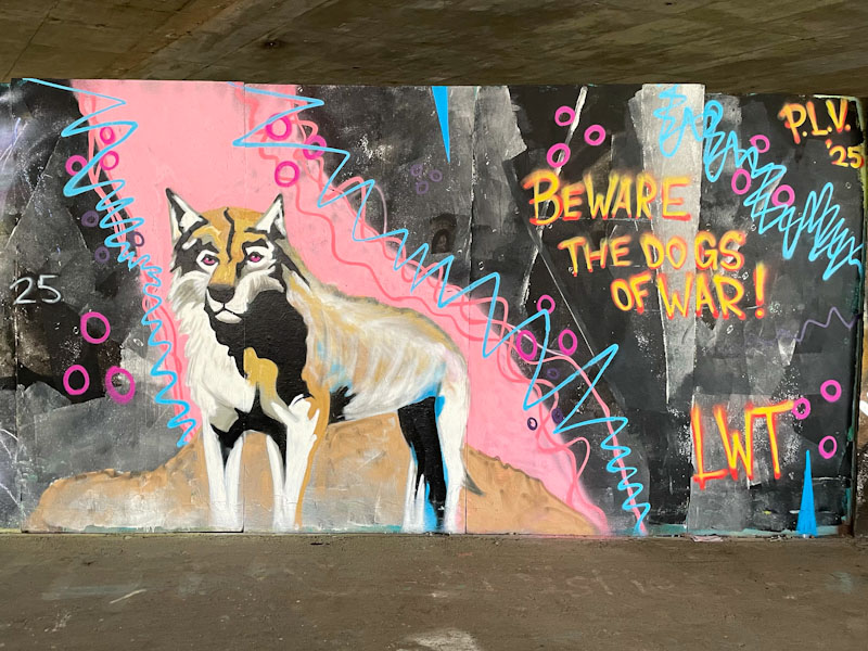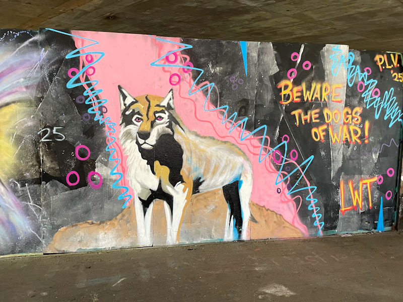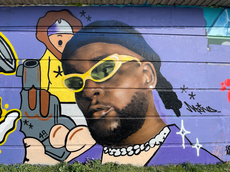
Ooh! How brilliant to see Mind 49 returning to the streets after a relatively quiet start to the year. Commensurate with his last piece at the Greenbank spot in January, Mind 49 has combined a photorealistic portrait with a cartoon illustration, carrying some threat and menace.
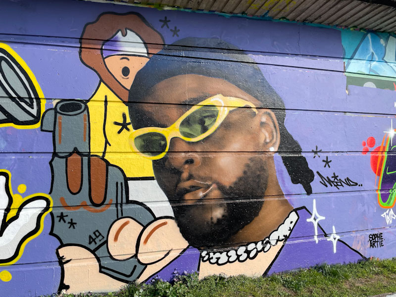
The portrait is superb, painted in his unique style that creates what I would term a blurred photorealism, rather than some of the perfect sharp pieces that you see from time to time. The cartoon parts begin around the main character’s neck and show him holding a pistol. In the background, a hooded character looks on. I love the way that Mind 49 brings these two very different styles together and makes them sit side by side effortlessly. Looking forward to more as the days get longer and weather warms up.