I am Stephen. I live in Bristol, UK. I decided to shorten my profile...to this: Wildlife, haiku, travel, streetart, psychogeography and my family. Not necessarily in that order.
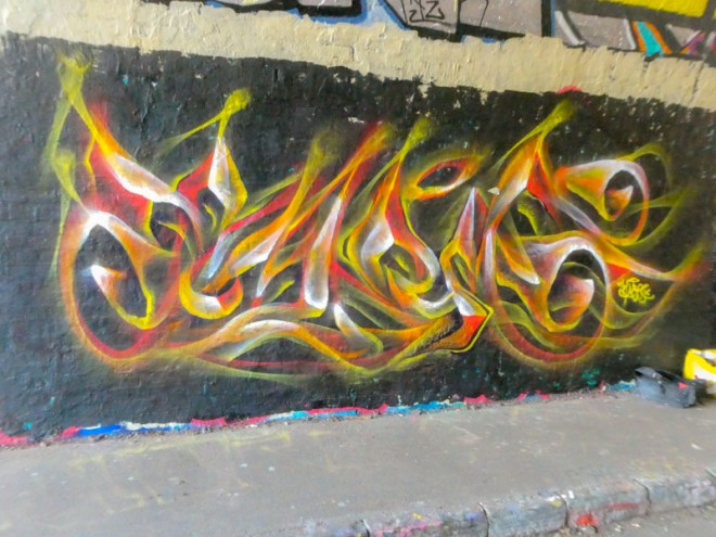
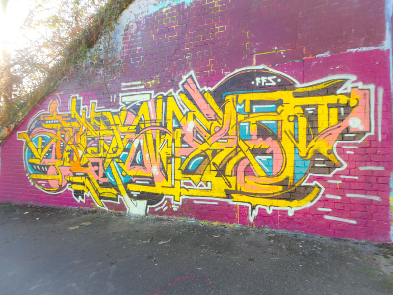
How nice it was to see Mr Klue again, when he was painting a new piece adjacent to this one last week in the tunnel. At first, I didn’t recognise him, as it has been a few years since we last met. During the course of our conversation, I managed to establish that he always writes KLUE in his pieces, and never deviates, which is great to know, because there have been times when I thought he has written something else altogether.
Mr Klue, St Werburghs, Bristol, February 2023
This, I think, is one of my favourite Mr Klue pieces, Mainly on account of the colour selection. I love the reds, yellows and oranges, which combined with the wispy, smokey style of Mr Klue’s work give the impression of fire. Now that I know it definitely says KLUE, I can see it so much more clearly – funny how the mind can fill the gaps when you have a little bit of information/confirmation. A wonderful piece from a lovely man.
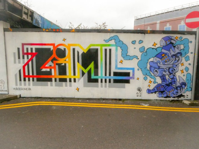
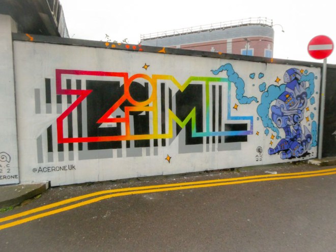
Acer One and Andy Council, Chatterton Square, Bristol, December 2023
Although I photographed this piece reasonably recently (back in December), it actually dates from October 2022. It is yet another fine combination from painting pals Acer One and Andy Council, and what a productive year they both had in 2022.
Acer One and Andy Council, Chatterton Square, Bristol, December 2023
To the left is a rather nice birthday shout out by Acer to fellow graffiti writer Ziml, painted in the stylised font that is by now so familiar on the streets of Bristol. To the right is a Cheech Wizard, by Andy Council, constructed out of buildings and other component parts. It has just occurred to me while writing this column that the way Andy Council composes his work resembles the work of the incredible 16th Century Italian artist Giuseppe Arcimboldo, who painted portraits composed of fruit and vegetables. I never thought I’d be writing that in Natural Adventures, but there you go.
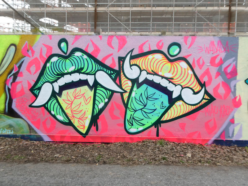
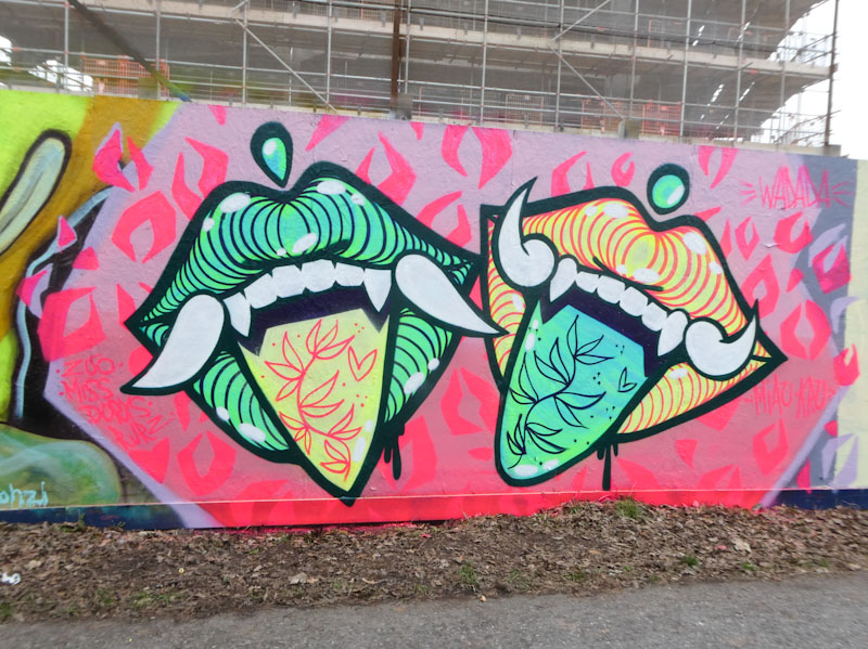
This bright piece from Gosia Wadada both delights and frustrates me. Firstly, it is great to see that this artist made the most of her time in Bristol, painting both here and in Cumberland Basin, however, her choice of panel to paint on, was not great, because she painted over a one third of a very fresh and magnificent portrait piece by Rozalita.
I was once told by an artist that it is a bit disrespectful to partially obscure somebody else’s work, you should either leave it or go over the whole thing, and sometimes you can tag the artist in your new replacement as an acknowledgement. But as I am frequently told, there are no rules and it is a jungle out there. In fairness, I’m not sure that Gosia Wadada would have known that the Rozlita piece was only a few days old.
Gosia Wadada, Greenbank, Bristol, February 2023
Gosia Wadada has visited Bristol before (thank you, Paul H, for your Instagram post) and I will dig the piece out and post it some time soon. In this ‘swapsies’ piece, Gosia Wadada has painted two of her trademark mouths, but switched the colour combinations, to create opposites, although you might spot the small inconsistency in her approach. The mouths work well on the carefully constructed red backdrop, and overall this is a refreshing and fun piece. I would love to see more of her work in Bristol.
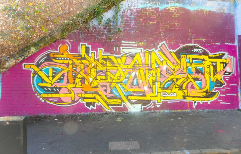
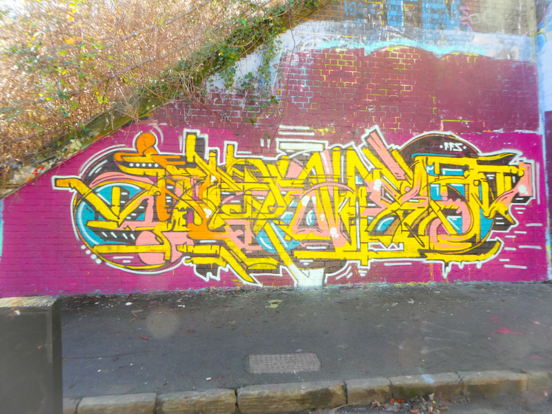
I met Kid Krishna for the very first time when he just completed buffing this wall and had begun this large and complex piece. As luck would have it, I met him again in exactly the same spot a couple of days later, it is funny how things like that happen.
Kid Krishna, St Werburghs, Bristol, January 2023
This is a magnificent beast, monumentally intricate and bewildering. His letters are so well disguised, that they simply become part of the overall experience – a little bit like Mr Klue’s work. This piece is a real workout for the eyes, in that search to make sense of it. The technique Kid Krishna uses to paint these writing pieces is to lay down the main structure of the letters with a roller, and then to add the borders and details, and it works very effectively. Kid Krishna told me that he is thinking of shifting to a new idea, so I’ll be scouring the streets to see what he does.
further evidence, as if it were needed, that our Conservative Government is drifting even further to the right. The appointment of the loud-mouthed “30p” Lee Anderson as party Vice Chairman demonstrates that there is nothing left in the party. All the Europhiles have left or been ousted, the moderates have been silenced, and the primary qualification for getting into the Cabinet is a rabid Brexit stance.
I remain in a constant state of revulsion and despair. What am I supposed to tell my children? They are being brought up in a political landscape where it is normal to lie, to deceive, to disrespect, to blame the poorest and the vulnerable and to be strong instead of compassionate. I still hate what they have done to my country, my home.
Anyone who says “well, what’s the alternative” or “I’m not sure Keir Starmer…” is either a Tory or has never got over Jeremy Corbyn’s unpopularity (for whatever reason) and hence unelectability.
I think I might need to write some nice nature haiku!
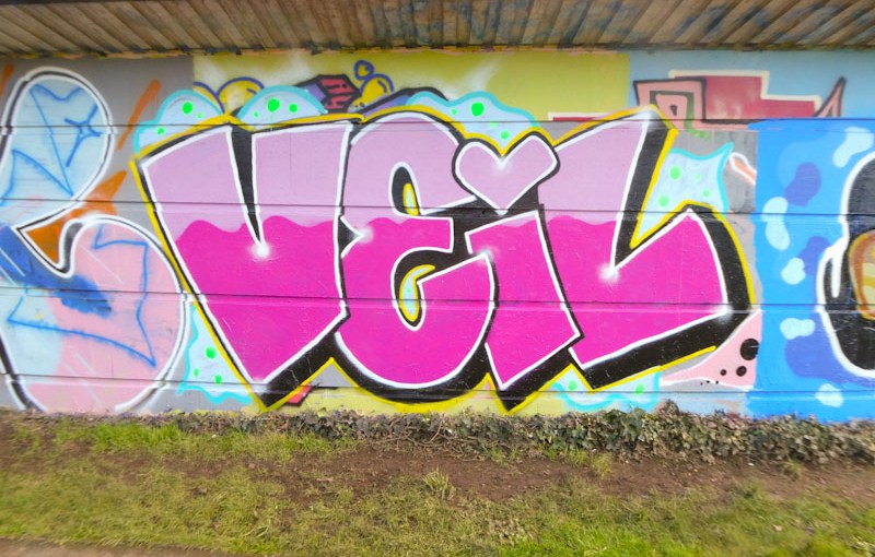
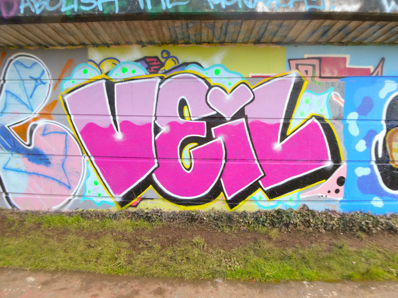
I met Desi earlier this week when she was painting a new piece in Dean Lane with her friend Lupa. I took the opportunity to ask Desi why she had started painting the letters VEIL, and her answer was swift and honest – “no reason, I just wanted to play with some letters”. So there you have it, sometimes there simply isn’t a backstory or meaning.
Desi, Cumberland Basin, Bristol, January 2023
This is a very nice piece, simple in structure and well executed. Desi continues to improve, with strong fills and sharper lines, getting better with each new piece. It is interesting that most times (but not always, as I have learned to my deep embarrassment) you can spot the gender of the artist. For example, it would be a rare thing for a male artist to put a heart instead of a dot on top of the “i” as Desi has done here. It is almost as if handwriting is transposed onto the wall in some way.
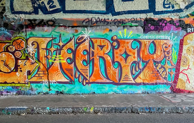
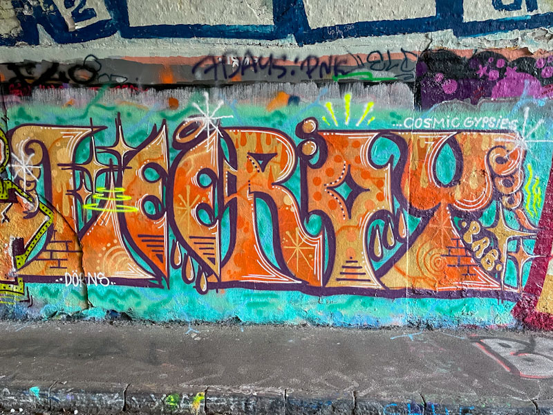
Lee Roy is a writer whose work I really rather enjoy. His writing is a little unconventional and always interesting to look at. This recent piece in the tunnel is an immediate attention-grabber on account of its use of orange on a turquoise background.
Lee Roy, St Werburghs, Bristol, January 2023
The letters are uniform in size, and the letter design is exceptional. The fills and fill patterns are quite subtle, but beautifully worked. This is one of the best Lee Roy pieces that I have seen – a true beauty.















 Natural adventures