

.
Crystallisation
miniature ice formations
encrust frozen leaves
.
by Scooj
.
Crystallisation
miniature ice formations
encrust frozen leaves
.
by Scooj
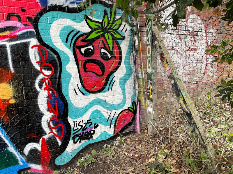
Tucked away in this corner of Montpelier Park is a curious strawberry piece by Lis. It is curious, simply because strawberries aren’t exactly front of mind during the winter. Lis has painted in this spot before, and seems to like its remoteness.

I have noticed that for many artists, there has been a bit of a slowdown during the colder months of the year and Lis would fall into that category, so I was happy to find this quirky piece in Montpelier. The concentric rings around the piece are in keeping with a few of her pieces and may represent a ‘black hole’ into another place.

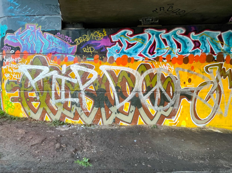
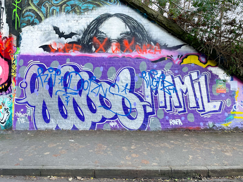
A recent visit to Bristol by Logoe and Mamil has caused a bit of a stir. The artists are not residents of Bristol, and are not so very much in touch with the wall protocols. Unfortunately, they painted over a tribute wall to Dorns under Brunel Way, and the piece was immediately tagged as being disrespectful. Another of their collaborations in St Werburghs was given the same treatment. It can be a jungle out there, and it is often advisable not to paint over a tribute piece, or anything that you might believe is a tribute.
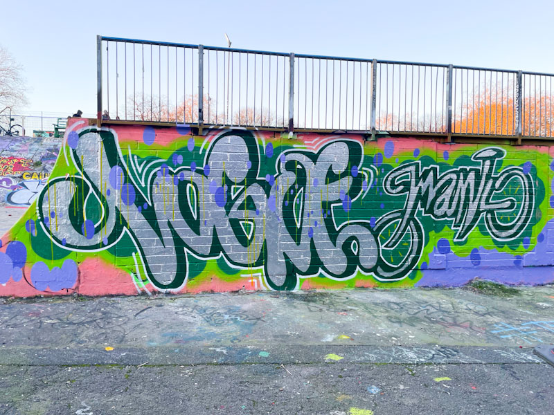
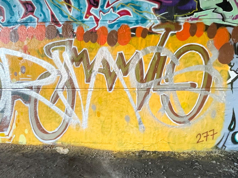
I am familiar with the blitz visits of Logoe over recent years, but Mamil is new to me, and it looks like Logoe has found a kindred spirit script graffiti writer. This is a proper collaboration with a shared house sty;e in terms of colours and background. Both artists have adopted a script style, but Mamil’s is, in this example, finer than Logoe’s, and is in the form of a bicycle. Clever stuff. More to come from this pair, and their tagged pieces are shown below.
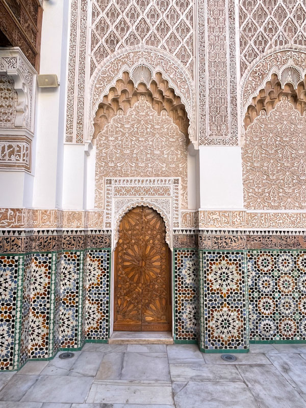
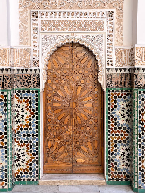
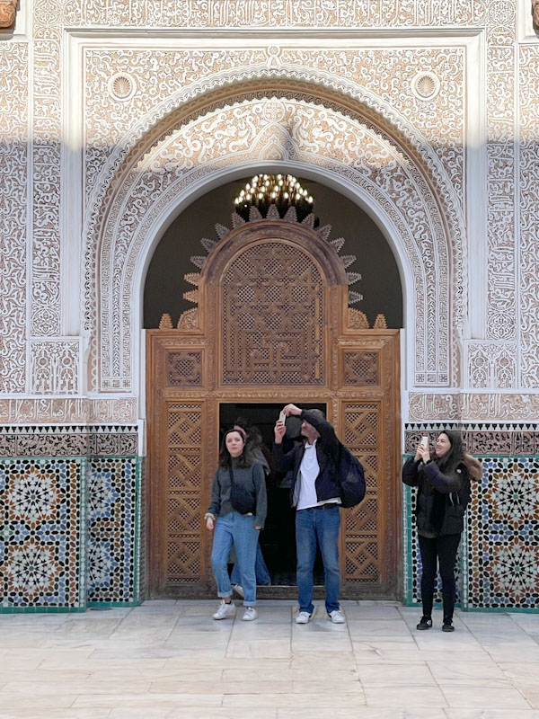
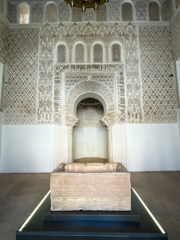
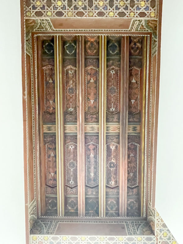
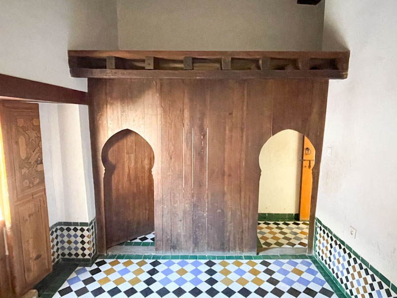
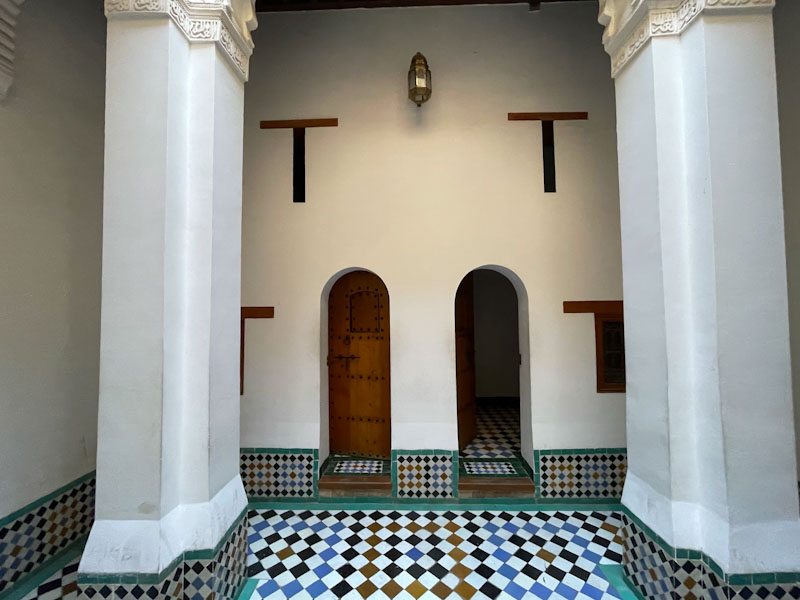
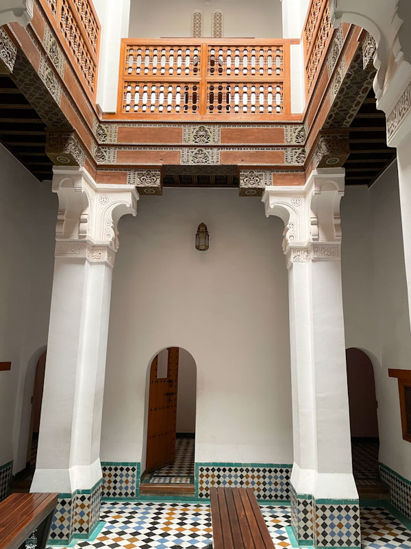
Doors 337 – Doors of Marrakesh, Madrassa Ben Youssef, Morocco, January 2025 (Part XVII)
Happy New Year, one and all. I took an unexpected break from Thursday Doors this Christmas break. I had intended to post doors throughout, and do a review of my best doors of 2025, but I just didn’t have much time, and decided not to stress about it. Today, I return with a penultimate selection of doors from Marrakesh (a holiday from exactly a year ago), and the stunning Madrassa Ben Youssef.
Here is a brief description of the Madrassa, that I stripped from the Interweb:
The Madrassa Ben Youssef in Marrakesh is one of the finest surviving examples of Islamic architecture in Morocco and a masterpiece of the Saadian period. Founded in the 14th century and extensively rebuilt in the mid-16th century under Sultan Abdallah al-Ghalib, it functioned as an Islamic college attached to the nearby Ben Youssef Mosque. Designed to house hundreds of students, the building reflects the importance of learning in Moroccan urban life while showcasing a highly refined architectural language intended to inspire contemplation and discipline.
Architecturally, the madrassa is organized around a large rectangular courtyard with a shallow reflecting pool at its centre, creating a sense of symmetry and calm. The walls are richly decorated with zellij tilework, carved stucco, and finely worked cedar wood, arranged in horizontal bands that rise in complexity from geometric tiles at ground level to floral and calligraphic stucco above. Qur’anic inscriptions and poetic texts are integrated seamlessly into the decoration, emphasizing the unity of art, faith, and scholarship. The craftsmanship is exceptionally precise, with repeating patterns that demonstrate both mathematical sophistication and aesthetic restraint.
Surrounding the courtyard are two levels of small student cells, their plainness contrasting deliberately with the ornate central space. This contrast reinforces the architectural hierarchy of the building, where communal and spiritual spaces receive the greatest ornamentation. Light is carefully controlled, filtering into the courtyard and prayer hall to animate surfaces and textures throughout the day. Together, these elements make the Madrassa Ben Youssef not only a place of learning, but a carefully choreographed architectural experience that embodies the ideals of Islamic art and Moroccan craftsmanship.
It is a destination I would highly recommend for anyone thinking of visiting Marrakesh. There were plenty of doors and interesting architectural features to capture – I hope you enjoy this week’s selection:
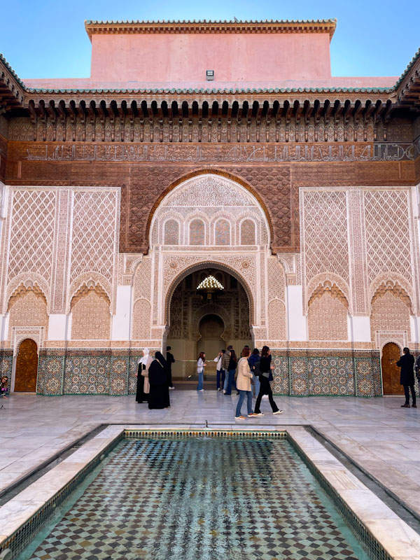
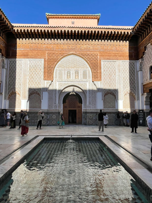
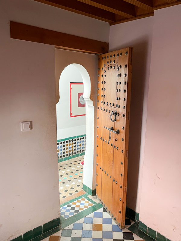
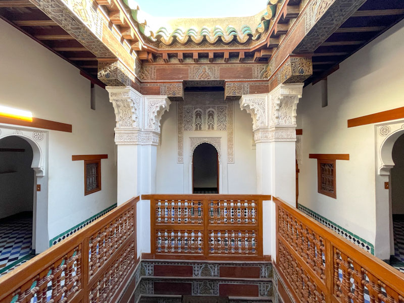
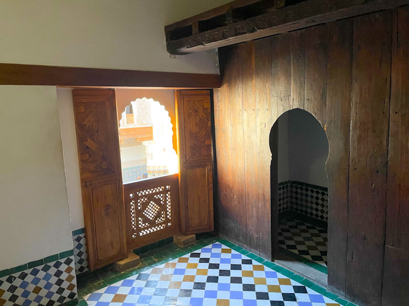
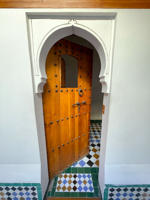

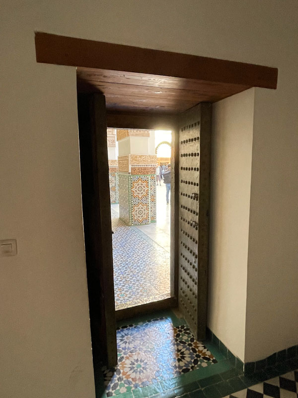
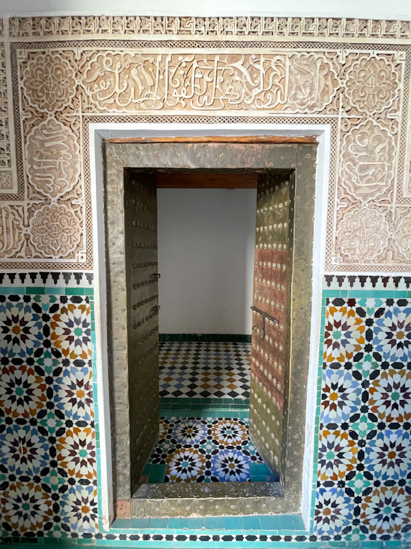
The Madrassa Ben Youssef is a truly magnificent place and one can imagine the bustle of hundreds of young boys in their dormitories and the calm contemplative learning space of the central courtyard. The building is in great repair and a real treat.
If you have made it this far, you probably like doors, and you really ought to take a look at the No Facilities blog by Dan Anton who has taken over the hosting of Thursday Doors from Norm 2.0 blog. Links to more doorscursions can be found in the comments section of Dan Anton’s weekly Thursday Doors post and his Sunday recap.

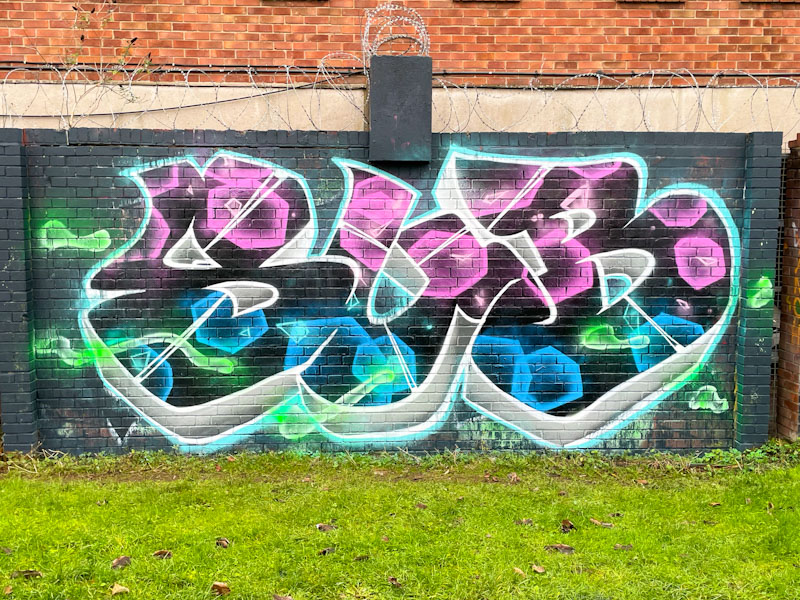
This is what I have been waiting for from Sub – a wonderful fusion of his extra-large letters and a creative fill. In my mind’s eye, this piece and the one from underneath the M32 mark a new level in his work, and is a culmination of tons of practice and development during 2025.
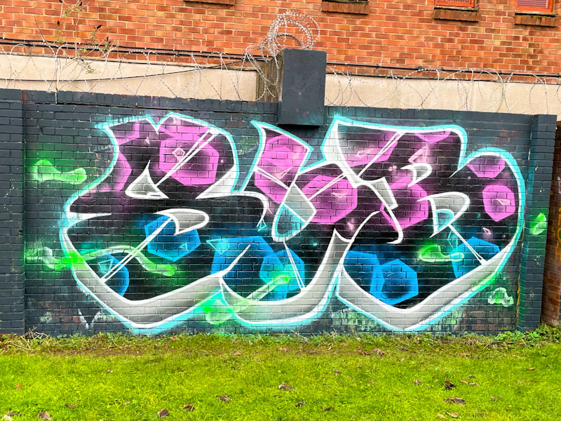
His SUB letters give the impression of being hollow and having the appearance of a pastry cutter, which is a clever effect. The void is filled with pink and blue ephemeral hexagons that appear to float in the space. Some green blobs distract the eye and round off the work – I can’t make up my mind whether they add to or detract from the piece. I hope that Sub will be able to kick-on from this fabulous end to the year in 2026 – I’ll be watching.
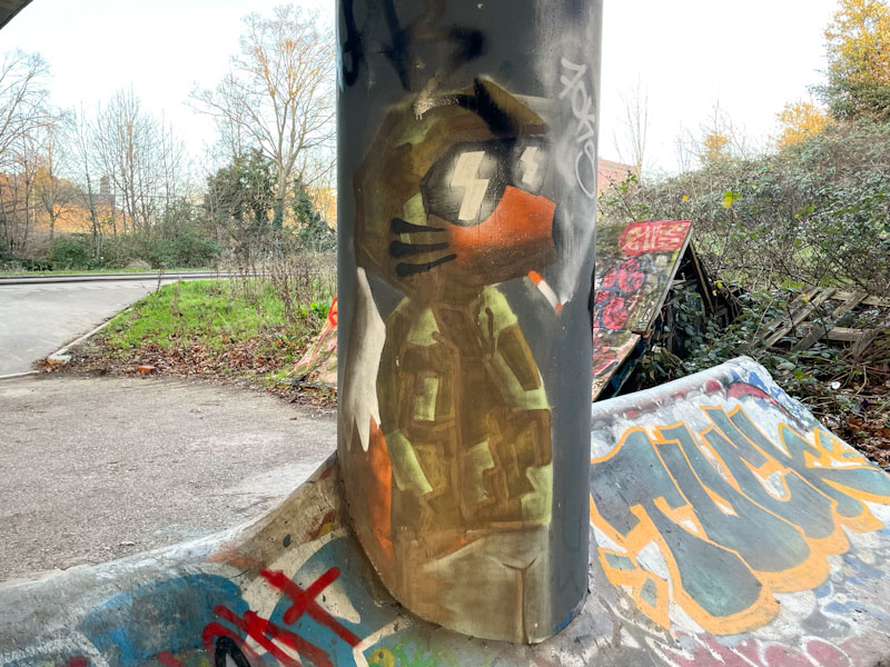
There is something rather urban and street wise about the fox character painted by Foksymoron, which I guess is no huge surprise. The character taps into the long relationship that Bristol has with the study of urban foxes, indeed, my old allotment was recorded as having the most densely populated distribution of foxes found anywhere, ever (at that time).
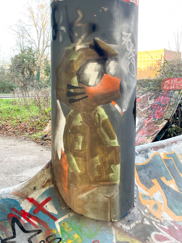
This column fox almost went unnoticed, as it is rather subtle, and the camouflage outfit actually works in breaking up the outline of the character. The cool fox wearing his trademark sunglasses is having a casual cigarette, while standing nonchalantly – perhaps he is watching the skaters and bikers that frequent this little area. Another great piece from Foksymoron.
.
While-U-wait service
yearly inconvenience
waiting for Godot
.
by Scooj
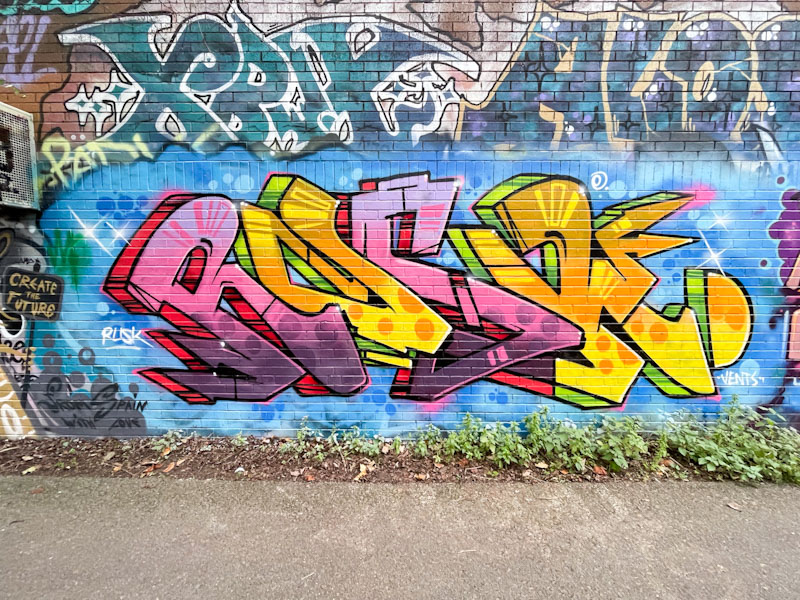
I enjoy my dog walks alongside the River Avon through Sparke Evans Park, and beside the light industrial estate, all the way to Temple Meads station. The walks combine my love of nature and of street art, and the dog enjoys the smells, and running around the park. These walks are especially rewarding when I come across a piece like this one by Rusk.
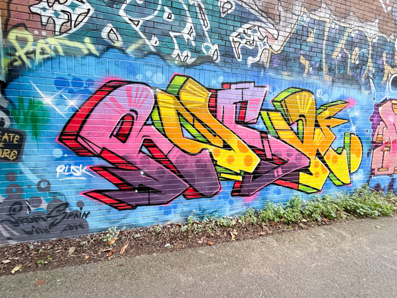
This is a fabulous piece of graffiti writing by Rusk, and stands out as such on this long wall. The colourful letters are tidily presented in a blue background. Although it is not as polished as some of his pieces, the whole thing oozes class. I believe it might have been to celebrate Vents’ birthday (hence the shout-out) but I am not sure. An unexpected and pleasant surprise.
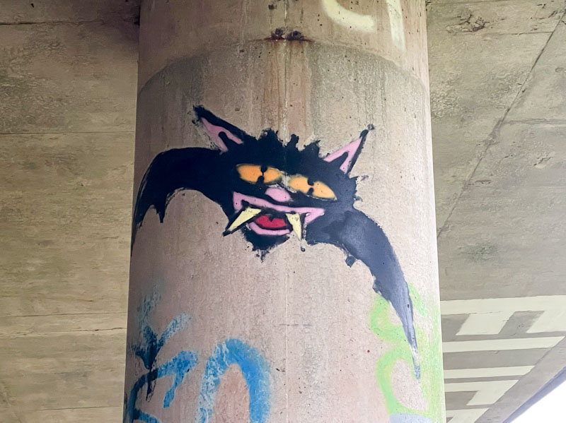
Turnover underneath the Brunel Way flyover has been relatively slow in recent months, and I have reduced my visits slightly to reflect this. The last time I passed by though, I was delighted to find these three distinctive bats on separate columns by Rowdy.
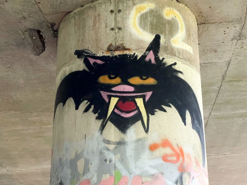
If there was one artist in Bristol who represents the beating heart of the city’s street art scene, it would, in my view, be Rowdy. His crudely painted animal characters can be found all over the city, and some have been around for years.
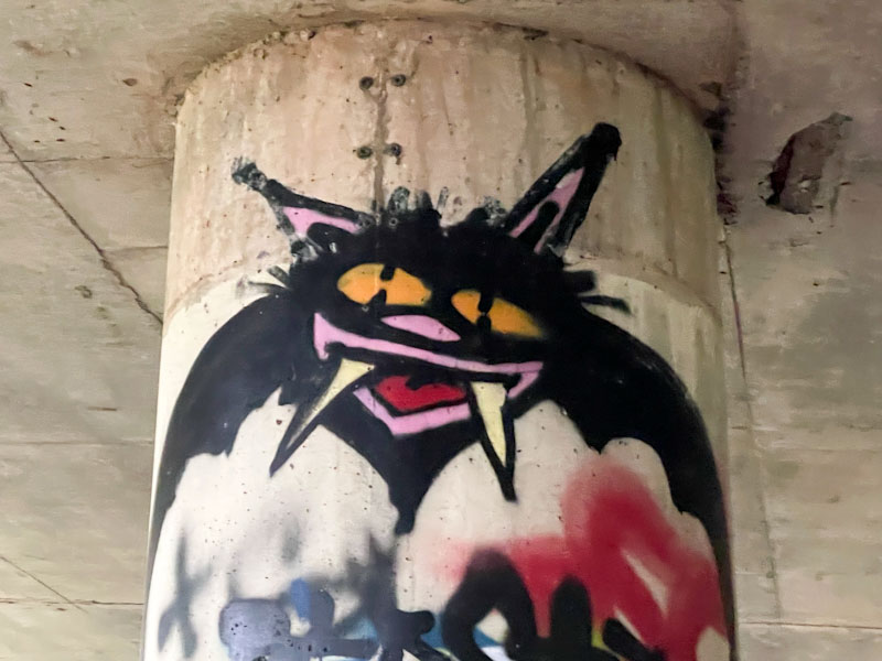
These three bats are full of mischief and character, and so utterly unmistakable as the work of Rowdy. Rowdy is an artist I haven’t yet met, which is a pity, but perhaps I’ll get lucky sometime and find myself in the right place at the right time.
We have had a very busy Christmas period, doing lots of travelling and visiting of relatives. Just before Christmas, we met up with my niece and her three-month-old boy in a pub for a spot of lunch in Leyton Marshes and to meet the youngest (at that time) member of our family. It was a lovely opportunity to get to know the little chap. Naturally, I couldn’t help but notice some graffiti and street art dotted about the place.
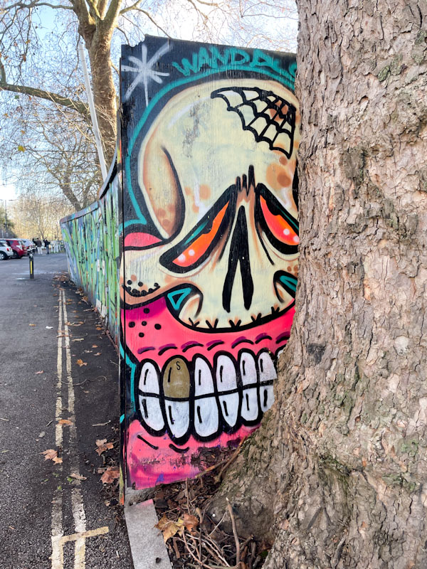
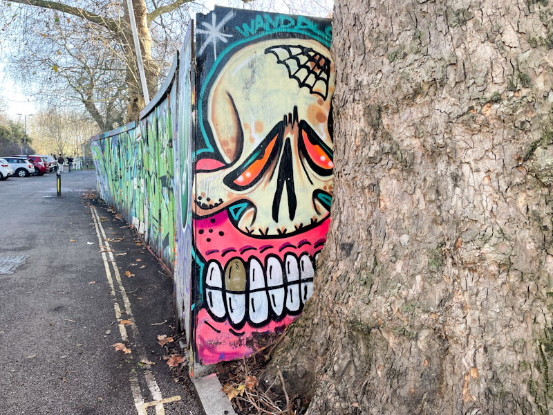
Immediately outside the pub was this distinctive piece by Sweet Toof on a hoarding squished up against a tree. I have seen work by the artist in various places on my travels, including New York, and I know that he gets around a lot. I think that he operates out of London though, and I don’t see as much of his work that I’d like to. This was a serendipitous occasion, but the star of the show was my little great nephew.


