It’s almost as if
there wasn’t a Christmas break
nose to the grindstone.
by Scooj
It’s almost as if
there wasn’t a Christmas break
nose to the grindstone.
by Scooj
This is an extraordinary paste up that I really ought to have posted some time ago, but it slipped through the net until I had a little look back through old files. It is by the Bristol-based artist Gvnly and presents his surreal style with real confidence.

At first I mistook this for a regular poster and with peripheral vision it looked like a kind of generic ‘circus coming to town’ poster. But as always with these things taking a moment to stop and look has its rewards. There is a lot going on in this colourful piece and there is quite a dreamy type of theme going on. I’m not sure what media were used in the painting, nor do I quite understand how it was turned into a poster (I’m not very good at understanding that kind of stuff). The wheatpaste stayed up for quite a long time before finally seccumbing to the elements. Something a little different from the norm in Bristol, and all the better for it.
Turbo Island Has seen quite a bit of action in the last month. First there was a reminder to vote in the election from DNT (not posted), then there was a happy Christmas message from Rezwonk and Decay, and then early in the new year, Mr Klue gave us this lovely abstract piece.
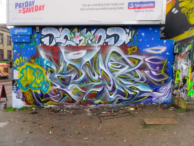
Nothing lasts long on this hoarding before it gets tagged, and I was a bit slow in photographing this one. I do think though that it is a great place for street/graffiti art and I would like to think that this will become a high quality high turnover space for local artists. It certainly is in a fantastic spot with a whole ton of cars passing by every day, and I think that there is an element of curation from the Peeople’s Republic of Stokes Croft.
Mr Klue has included a Mad Hatter’s hat, which is a motif used reasonably frequently in the artist’s work. Great to see a flurry of Mr Klue pieces this winter, because as many will know I am an admirer of his nicely understated work.
High church christening
grand rituals aplenty
intoxication
by Scooj
It is a great time of year for street art because although there is not a huge amount of action (something of a relief for me I can tell you) on the streets it is a time when artists are doing their ‘first piece of the new year/decade’ and it somehow feels a bit like a fresh start.
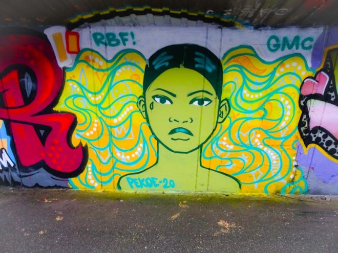
This new one from Pekoe on the M32 cycle path is a fresh and clean start to the year. Of course the portrait piece wouldn’t be a Pekoe work without the big hair, and what magnificent hair with a crown, hearts and face concealed in it. A wonderful way to kick off January.
This is just sublime. Although the form of Slim Pickings’ (TES) work is relatively simple and repeated, the way he sets about the colours, fills and attention to detail is masterful. In this piece I absolutely love the complementary colours of the fill and the bubbly shapes. As always the outline and shadow are clean and crisp.
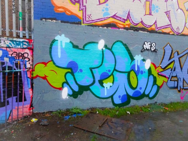
The letters TES are set on a floaty cloud of green and red and the letters are adorned with some little light blue drippy bits and whight highlights. The whole thing is set off perfectly with a grey buffed wall, completely worth the effort if you ask me. Really nice piece.
Another New Year collaboration, they are coming thick and fast, this time from Decay and Lens. Decay is of course well known to me and to readers of Natural Adventures, but this is a debut piece for Lens, which is perhaps not at all surprising given that he comes from Melbourne, Australia and is just visiting.

I do like it when artists from different places hook up and paint together, it makes for a terrific sense of community. This Decay half of this combo is everything we would come to expect from the artist and ticks so many boxes… the shapes of the letters, the extravagant fills and the little ‘motion’ highlights in black on the outside of the lettering to give a sense of movement and energy to the whole piece. Perfect.
Using a similar colour palette to Decay’s, Lens has an altogether different letter shape, much more angular with sharp edges and corners. Lens’ fills and decorations are absolutely magnificent, and this is an accomplished piece of graffiti writing. It is so good to see some work from an Australian artist, and it is great to see that Lens has included a little shout out to Rezwonk, who often teams up with Decay, a nice touch.
I think that this is the second collaboration between Logoe and Haka in as many months, and both have apeared on this board under the M32 in the DIY skate spot. It is not often that I like my photographs, always something wrong with them, but I actually like this one, somehow the colours of the piece stand out well against the dark top and bottom, but have not been bleached out by the light to either side.
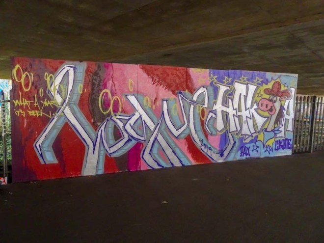
Logoe has written his name in his script style set on a rather nice red tone abstract background. He has added to the work the sentence ‘What a year it’s been’ and he is not wrong there. On the right Haka has included a character into his chrome writing which I believe to be Hanna Barbera’s creation Quick Draw McGraw – a cartoon I don’t think I ever saw, but rather wish I had… I might have to consult with YouTube. All in all a most satisfying collaboration from these two established Bristol artists.
Out-standing wall art
hints at animal rescue
and safety within
by Scooj

Here’s a rather nice three-way collaboration from just before Christmas by The Cat Came Back, the ever so familiar Mr Klue and DNT who has rather ‘owned’ this wall over the last few years.
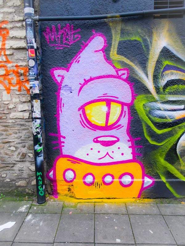
I know absolutely nothing about The Cat Came Back, but there are two things I really like. The first is the name of the artist, it’s just kind of bonkers and memorable too, the second is the simple but well constructed piece from an artist who is obviously well practiced in producing this cat character. I don’t know if the artist is Bristol-based but if they are, then I look forward to seeing more alley cats.
The central portion of the collaboration is by Mr Klue, who seems to be on a bit of a painting spree at the moment. I have commented before on the pulses of activity from Mr Klue. You can go a month or two and see nothing new and then out of the blue several pieces appear in quick succession. I can’t read the letters in this abstract piece, but I don’t think it says KLUE. (Update, The artist tells me it does).

On the right is another feline-type creature compete with a third eye, and a design style that is so very DNT. His character pieces tend to be mad up of shapes with solid fills and outlined with black, almost like a stained glass effect. Great to see another DNT piece here. (Note to self – a good wall for ‘One wall many faces’).


