In the chaotic and utterly unpredictable world of street art and graffiti, order has been created in the form of festivals. Upfest, the largest of its kind in Europe, brings artists from all over Britain, Europe and beyond to showcase their skills. The order I refer to is that rather than accidentally finding stuff, you can be certain to find artists that you like and actively seek them out.
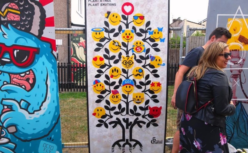
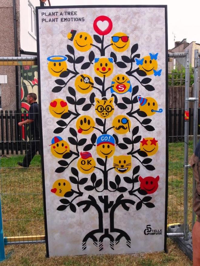
Stelle Confuse, Upfest, Bristol, July 2018
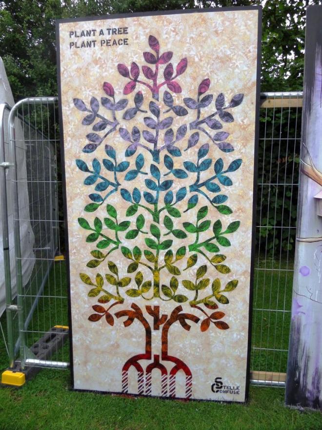
Stelle Confuse is an artist whose work stands out for me from last year, and I was thrilled to see another piece this year. Again we have a tree and a message, and the message ‘plant a tree, plant emotions’ is brilliantly conceived with emoticons being borne by the branches. A nice, clear and well executed stencil from this Florentine artist.
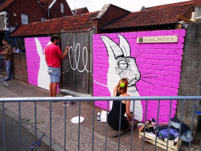
Alex Lucas is no stranger to these pages and is responsible for bringing street art closer to the citizens of Bristol in a charming and accessible way. Any visitor to the city is likely to have seen a piece of her work, because she has had a lot of commissions and her illustrations lend themselves very well to shops, cafés and other high street businesses.
Alex Lucas, Upfest, Bristol, July 2018
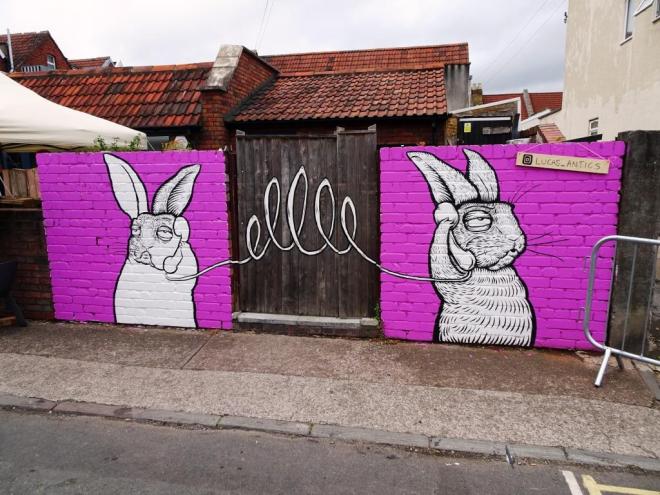
Her piece for Upfest was on yet another new wall space, but rather inconveniently interrupted by a gate. Alex has used this to her advantage and incorporated the gate as a way of joining her two hares in conversation.
Alex Lucas, Upfest, Bristol, July 2018
Although on the surface her work looks quite simple, it takes a long time to produce, and this piece was a real labour of love, given the number of weather-related interruptions. Each of the hairs on her characters are individually hand drawn, and as we ought to know, hares are hairy.
Alex Lucas, Upfest, Bristol, July 2018
Most Upfest walls are re-used each year, with only the occasional one remaining as a more permanent piece. I suspect that this one will have a new artwork on it next year, which is rather odd in the case of Alex Lucas, because one is accustomed to the permanence of her work. It’s pink, it has animals…what’s not to like?
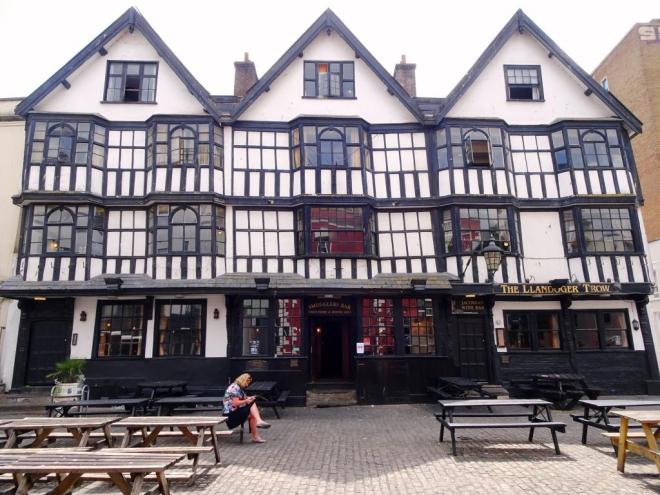
This week I have pulled out some pictures I took back in July with Thursday Doors in mind. They are of a very popular pub in the centre of Bristol, the Llandoger Trow in King Street, diagonally opposite the very recently refurbished Theatre Royal.
The Llandoger Trow gets its name from a small village in South Wales, Llandogo, and a trow, which is a flat-bottomed sailing boat that could lower its mast for navigating under bridges. It was named by a former owner of the pub, Captain Hawkins, who lived in Llandogo.
Llandoger Trow, King Street, Bristol
The building dates from 1664 but it was damaged during the war, like so many buildings in Bristol, and originally had five gable fronted sections – it had been a row of houses. In the middle, the pub has an 18th century shop front, but the doors although they look old are in fact 20th century, the door frames much older.
Door, Llandoger Trow, King Street, Bristol
I love the way that around old buildings grow great stories, some of which might be based on some kind of truth, but many are part of our urban mythology. One story says that the pub was the inspiration behind Robert Louis Stevenson’s Admiral Benbow in Treasure Island, another story is that Daniel Defoe met Alexander Selkirk, his inspiration for Robinson Crusoe here.
Door, Llandoger Trow, King Street, Bristol
No self-respecting old building is complete without a ghost and the Llandoger Trow boasts some fifteen of them! Can’t say I’ve ever seen one, although I have seen some rather deathly looking characters emerge at closing time.
Door, Llandoger Trow, King Street, Bristol
And round the side is a rather ordinary door and this ‘upside down’ window.
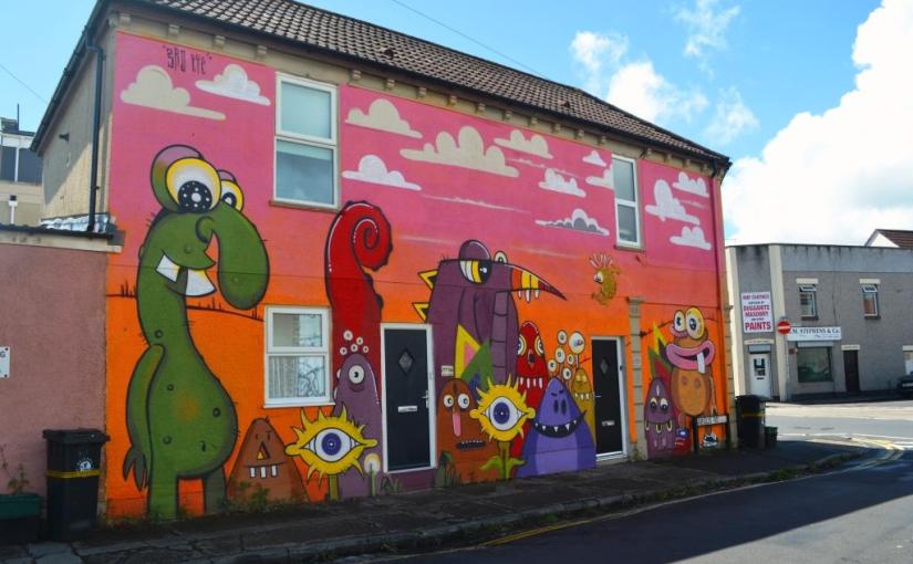
Another fabulous new wall for Upfest 2018 – they have done very well this year with opening up these new walls – by Bristol artist 3rdeye. This is an impressive wall but may not have had the foot-fall of other Upfest venues as it was a little off the beaten track.
3rdeye, Upfest, Bristol, July 2018
3rdeye is an artist who cut his teeth on the streets as a graffiti artist in the eighties, but has since developed this further into studio work of paintings and illustrations as well as offering workshops. His rather nice website shows the full range of his work and activities.
3rdeye, Upfest, Bristol, July 2018
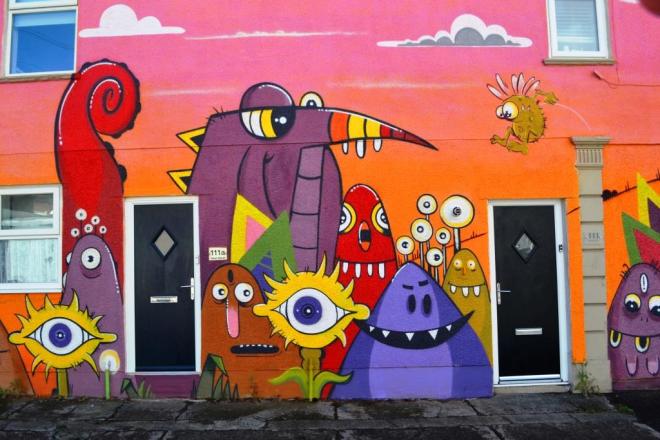
This wall plays host to a hoard of friendly monsters set on a vibrant orange background. It is a colourful and child-like piece, and all the better for it, and I am particularly drawn to the little monster launching itself off a column which is actually a real feature of the wall of the house.
3rdeye, Upfest, Bristol, July 2018
This piece amply demonstrates that street art does not have to be edgy or threatening to be great and that bright child-like ideas have great appeal. Great piece, great wall.
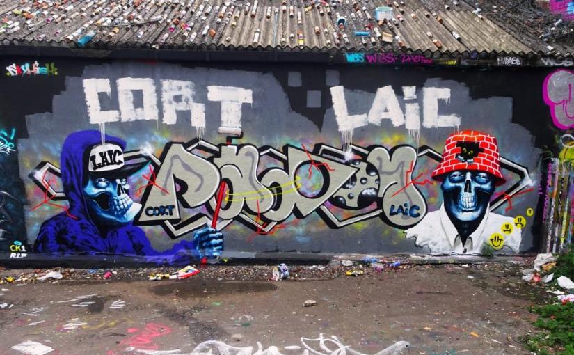
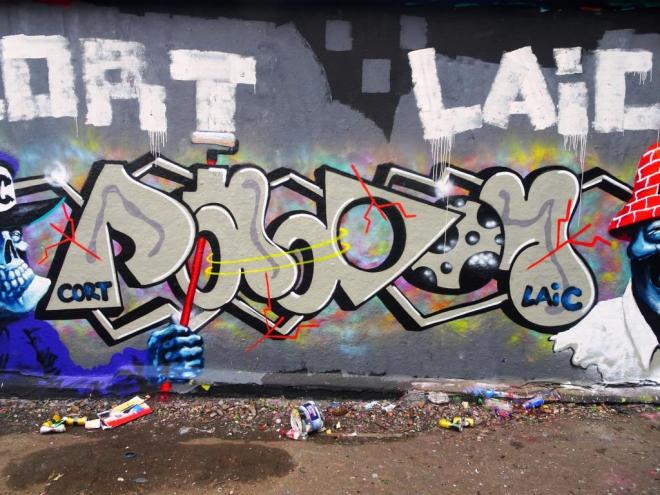
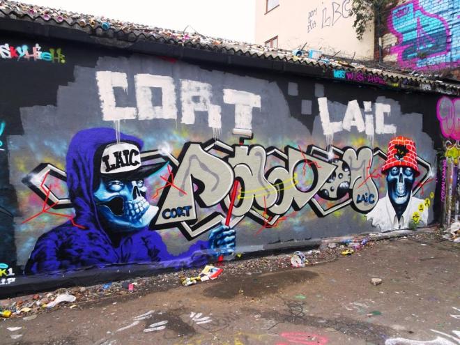
I just love it when these two get together, which fortunately they seem to manage rather regularly. These Laic217 bookended Cort pieces do tend to follow a formula in terms of presentation, but the characters and writing always offer something visually stimulating.
Cort, Dean Lane, Bristol, September 2018
Cort’s writing style seems to be quite versatile and he has produces a real gem here, incorporating soft curves and angular shapes all into the same piece. It is an unusual and slightly unconventional style, but that is what makes it stand apart from other writing.
Laic217, Dean Lane, Bristol, September 2018
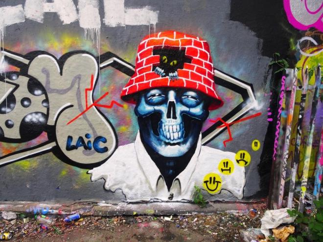
Then on to the Laic217 characters. His skeletons have become such a prominent feature of walls around Bristol that they must have entered the sub-conscious of a great many Bristolians on exposure alone.
Laic217, Dean Lane, Bristol, September 2018
Rarely disappointing these figures include many of the things we expect from Laic217 – great clothing, skulls, smiley’s brick walls, bucket hats. I love the bit of fun too with the left hand side character using a roller to spell out the two artist’s names at the top of the piece. Another classic wall.
Laic 217 and Cort, Dean Lane, Bristol, September 2018
It feels like if I keep my eyes open long enough and scour each inch of Bristol I will keep finding paste ups by qWeRT. This right royal googly-eyed character is in City Road only a few metres away from another paste up by the same artist from last year.
qWeRT, City Road, Bristol, September 2018
As well as admiring the original ideas and artwork that qWeRT puts into these wheatpastes I get a great amount of pleasure each time I find one. I think that the artist only visits Bristol about once a year, but it takes me that long to find many of these little characters, and some I never find no matter how hard I look. Come back soon.
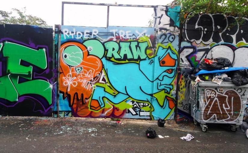
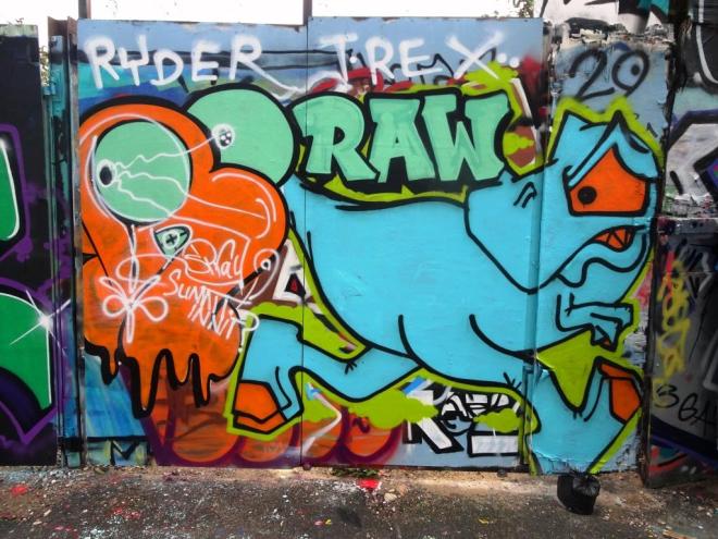
Things in the Stokes Croft area have been a bit slow compared with some of the other spots in town, so it was nice to spot this quick collaboration between Ryder and T-Rex. These two nearly always paint together, and their comfortable friendship comes across in all their pieces.
Ryder and T-Rex, Armada Place, Bristol, September 2018
I can’t quite work out where the white lines came from and the writing – I think it says ‘Spray summit innit’, and although it looks slightly incongruous I think it is part of the piece and not a tag. Fun stuff from these two.
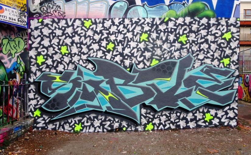
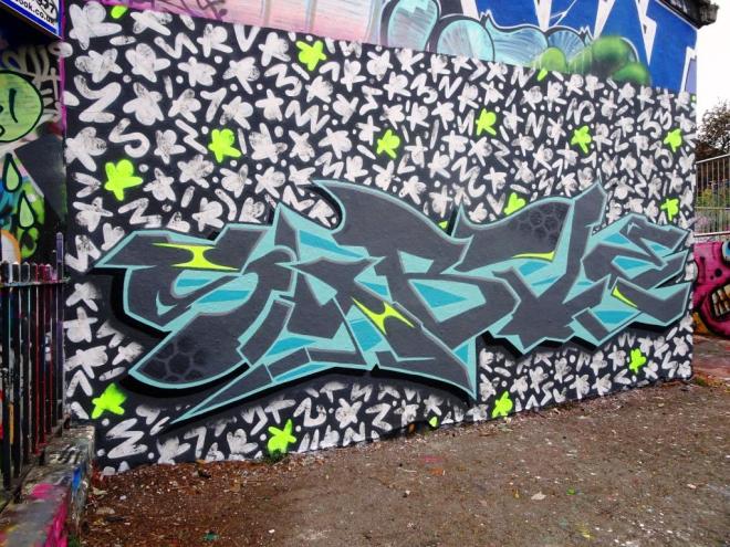
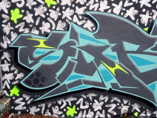
This collaboration is a real treat and raises the bar by quite some margin. It is by Subtle and Rezwonk and is quite the best collaboration I have seen on this wall this year, in fact possible anywhere in Bristol.
Rezwonk and Subtle, Dean Lane, Bristol, September 2018
Rezwonk has provided an incredible background of little white symbols – actually I think they are made up of the letters R E Z W O N K, and in amongst them are some bright green ones randomly spaced. Each of the symbols has been dabbed, probably with a cloth, to give them some texture. This really does provide a perfect backdrop.
Rezwonk and Subtle, Dean Lane, Bristol, September 2018
The writing from Subtle is nothing short of sublime, every single part of it touching on perfect, right down to the hex shading on the S and the T providing texture and interest, but it is the 3D effect that really sets this piece apart. It is hard to look at it and not be fooled into thinking it has been written on a board that stands proud of the wall by a couple of inches. Also some of the accents have picked up the same bright green used by Rezwonk, to provide some read-across between the two.
An utterly outstanding collaboration that takes collaborations to a new level.










 Natural adventures