.
Too great the shared loss
school friends shuddering with shock
tragic episode
.
by Scooj
- On the unexpected death of a boy in my daughter’s friendship group.
.
Too great the shared loss
school friends shuddering with shock
tragic episode
.
by Scooj

Another rather nice piece rescued from my archive, this time by Trafficity in May 2018. I know that each time I dive through old folders, I will find more of these pieces that for whatever reason never saw the light of day, and actually, I quite like ‘discovering’ them… it feels like getting a bit of a present.

The letters say ZIOM and take the form and style that Trafficity uses, which is rather unique. There is a kind of symmetry to the whole word, which although not a palindrome, is almost visually palindromic. The muddy dull colours, which are not my favourite, somehow just work well – perhaps it is the splash of blue background that helps.
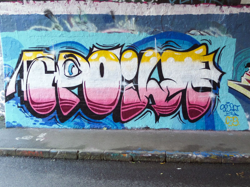
Every once in a while, I take a quick canter through my archives, just to see if there is something significant that got left behind. This is most definitely a piece that I should have posted back in September 2017, but like so many pieces before it, missed out. I am sharing it now.
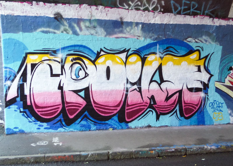
The writing is by Dott Rotten and spells out SPOILT, which he most commonly writes. What is interesting about this piece is that it is quite unlike much of his other work, and could easily be by half a dozen other artists about the place. Everything about the piece is good, the background and the design of the letters and fills. It is the execution though that stands out; this is a perfectly finished piece, crisp and clean, from a master.

Often associated with Face 1st, Moon Street has a new kid on the block in the shape of Kid Krishna, whose work has been appearing all over Bristol over recent months. This is the first of his pieces to appear on Natural Adventures and highly unlikely to be his last.

Kid Krishna’s writing is very distinctive, with long thin letters, looking like planks of wood stacked in a pile. I believe the letters spell out KRISHNA, but I could be mistaken, such is the disguise. Expect to see a whole lot. Ore from the artist in this blog, I already have a considerable back-catalogue of his work in my archive. Definitely something creative and different.

Desi continues to grow and develop, and I think that this piece in Sparke Evans Park might be one her best to date. It is great to see her painting more frequently, and with each new piece she will gain more confidence and skill.

This is a really neat and tidy piece with the letters DESI beautifully filled with four horizontal colours with nice transitions. One of the additional things that works really well is the white accent dots that give the writing a bit of sparkle and depth. A Very nice addition to Desi’s portfolio.

This piece is a classic, classy and colourful piece of wildstyle graffiti writing from Dibz, on the end wall, home to countless brilliant pieces in the past. In my mind’s eye, this piece feels a bit like an ‘audition’ piece, technically brilliant and beautifully designed, but without a theme or backstory.

Dibz has set the bar so high for writers in Bristol, and would suggest that it has had a knock-on effect, where it seems that the vast majority of writers strive to improve and perfect their letters and styles. With inspiration like this to draw on, who wouldn’t want to aspire to it?

This piece from Laic217 was painted while I was away on my family summer holiday, but I was more than aware of its existence due to the fact that it was all over the Bristol Instagram feeds that I follow. Of course, on my return home, I made a beeline for the spot in Cumberland Basin.

There is something rather striking about the portrait piece, and I have a feeling the background pattern has a lot to do with it. The portrait itself is a classic piece of Laic217 art, disturbing and menacing, with the figure clan in a full mask and goggles. It has a dystopian future feel about it.
.
Constants disrupted
and a nation all at sea
despair before hope
.
by Scooj

The thing about Paul Monsters’ work is that it is consistently outstanding. His geometric designs and colour schemes couldn’t possibly be by anyone else, and this one for the Cheltenham Paint Festival is a real beauty.

One of the really noticeable things about Upfest and the Cheltenham Paint Festival is that a large proportion of the artists are from Bristol and it makes me realise just how blessed we are, and how much a part of the culture street/graffiti art is. Paul Monsters is at the heart of that culture and his work emblematic of it.
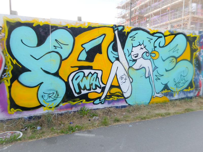
I cannot express how much I am enjoying this ‘happy’ period from Face 1st. There is something new and fresh about his work at the moment, which you might only notice if you have been following his art for a while. Face 1st is concentrating a little more on his characters, nearly always laughing girls, but there is more movement and different poses entering into his work.
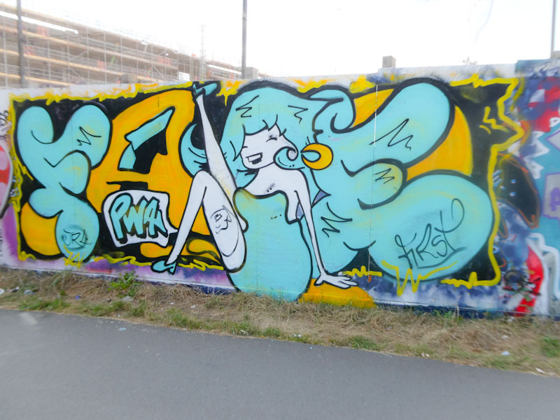
In this piece we have one of Face 1st’s letters and character pieces, with the letters FA and E broken up with a kick-dancing girl obscuring or being the C. The girl is striking a similar pose to one of his other recent pieces, which I posted a short while ago. Gotta love this one.


