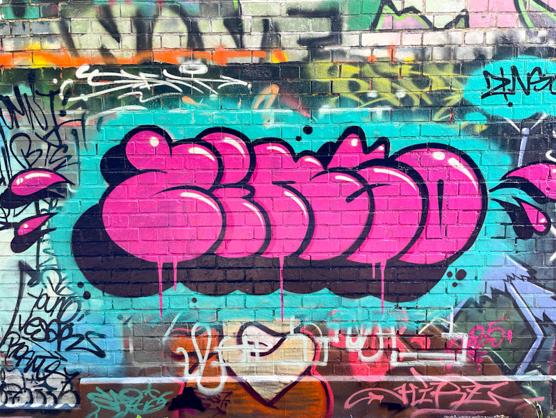
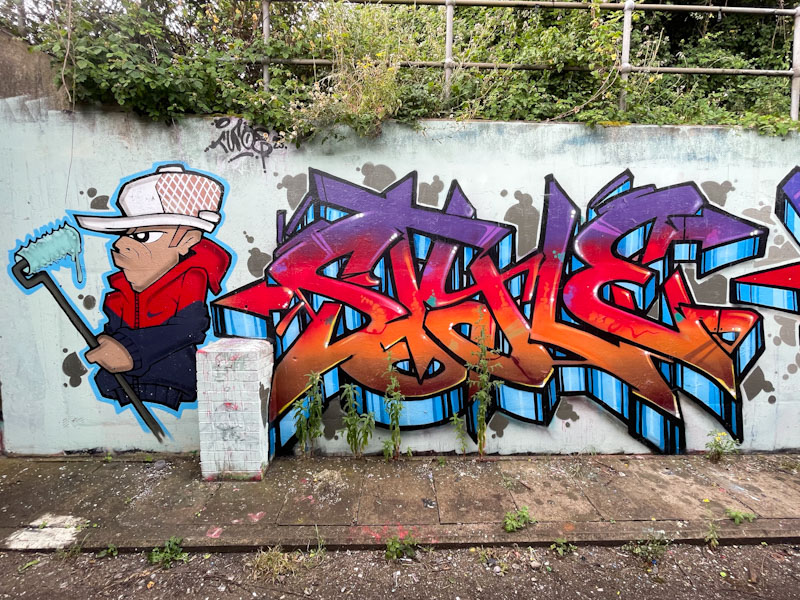
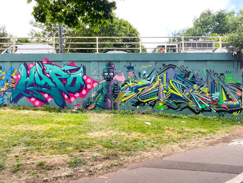
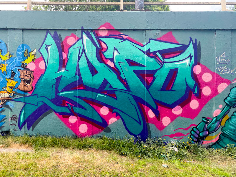
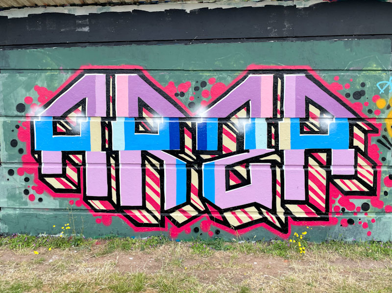
A gallery of outstanding writing, portraits and landscapes by the brilliant Bristol artist Nice One.
All photographs by Scooj


A gallery of outstanding writing, portraits and landscapes by the brilliant Bristol artist Nice One.
All photographs by Scooj


Jest Soubriquet is an artist with several ‘noms de plume’ such as Jest Likes and Likes Wan Tu or Likes 12, which makes things horribly difficult for my tagging his pieces, which is why I stick with the first name I came across… it just makes things simpler for me.

This is another of his wonderful colourful patchwork portraits, and probably the best I have seen so far. The highly stylised portrait features a pouting woman whose face and hair are splashed with some delightful colours, and yet somehow appears to be completely normal – if that makes sense. I mean, nobody actually looks like that, but our brains compensate for the unusual colours and presents a normal portrait – clever things brains. Clever art from Jest Soubriquet.

Normally, when Haka paints one of his graffiti writing/character combination pieces, I recognise the character from a children’s picture book. This time Haka has stumped me – I am not familiar with any books containing a lizard, and can’t tell you too much more about it.

Some classic HAKA letters sandwich the lizard, although I note that only the right-hand side has been decorated with stars. I wonder if that is an omission, or whether it is the lizard that has emitted the stars from its claw. The lovely piece was difficult to photograph on such a sunny afternoon, something that has been a constant problem during our glorious spring.

Only a few days ago I posted a piece by Mr Penfold, a collaboration with Mul that was at least a year old, and now I present a contemporary piece by the artist containing the same endearing character, that has a passing resemblance to Disney’s Pluto.

I love it when artists who make a living from their commissions and studio designs and illustrations, take a little bit of time out and decorate our streets. It feels like they are doing it for love and joy rather than for money, and there is something about that that is a refreshing break from the avaricious world that we live in. Thank you Mr Penfold for brightening up my day.

I’ve said it before and I will say it again, there is an authenticity I really like about Lupa’s work. Her modest pieces stick to her general formula, and her letters are unpretentious and fun.

In this piece she has pushed herself to incorporate an intricate grey and white box background pattern which must have taken ages to do. It has worked really well and raise the interest level in the piece considerably. Her letters are nicely filled with a combination of colours that are easy on the eye. A very nice piece of graffiti writing from Lupa.

I often comment about artists who paint in a particular style, and ask myself whether they could do something completely different, marking them out as a versatile artist. Well, Bean has gone the full mile with this portrait piece that couldn’t be further removed from his usual cartoon characters.

I have to say I was quite flabbergasted when I saw this, and admire Bean even more than I did before. I knew he was clearly very talented, but this portrait takes my view of him to another level. I hope he will be painting in Bristol more over the Summer months, and will wait to see what other hidden talents he has in his locker.

I have to be a little brief this morning. I am staying with family, and I think breakfast is ready…
I have noticed that Sait Bare likes to paint in this area by the river, and would guess that he probably lives nearby.

Perhaps the most notable thing about this lovely piece is the colour selection, which reminds me of a stick of rhubarb, and once seen that way, it can’t be unseen. The letters SAIT are nicely filled in the base colours and liberally decorated with colour- matched dots. The whole thing is nicely rounded off with a black and white stripy drop shadow. An attractive piece of graffiti writing.

Andy Council has painted this exact spot a number of times, and I can only think that the shape and size of the wall suits his pieces really well. I had to make a return visit, because I arrived only moments after he had completed the piece, but there was a dirty great big shadow running right through the middle of the piece. Obviously, I managed to get some better pictures the second time.

The creature looks like a cross between a dinosaur and the Alien creature from the film series. It is, as you’d expect, beautifully crafted from a load of component parts that come together beautifully to make the whole. The writing to the left ‘Rising Trichomes’ I think might be a reference to cannabis buds, and not, as I first thought, the dinosaur species name, haha. A fine piece from Andy Council.

Ordinarily, I would expect a 3Dom piece to stick around for a month or two at least, but this wonderful piece only lasted a couple of weeks, which is a shame, but at least it was painted over with a decent piece, and it wasn’t tagged or bombed.

There is always a great deal of symbolism in 3Dom’s work, and here is a large eye character bearing the heavy weight of a skull. There is so much more going on here than simply the idea. The colour selections, light cast, shadows and perspectives are all impeccably presented and sets a bar for character artists across the land. You might spot a yellow Mr Bloopy in the background too.

It is a little disappointing that I have missed a couple of pieces by Hire this year, which is a real pity. You have to be quick off the mark in this game, and if you snooze, you lose. However, it does feel like Hire’s pieces, a bit like Kid Crayon’s pieces, tend to get painted over rather quickly. I am not sure if this is deliberate targeting or simply bad luck, I would like to think it is the latter, but whatever the reason, it makes their work feel even more precious.

This is a slightly strange piece by Hire, which I think is meant to represent a pile of poo, with some excited insects making the most of it. Certainly it is an unusual composition in brown (why is everyone painting with brown this spring?), spelling out ODIAH, letters which Hire likes to use from time to time. How much better the piece looks with the subtle green glow on the edge of the letters, without which it would all look a little flat. Unusual and interesting work from Hire.