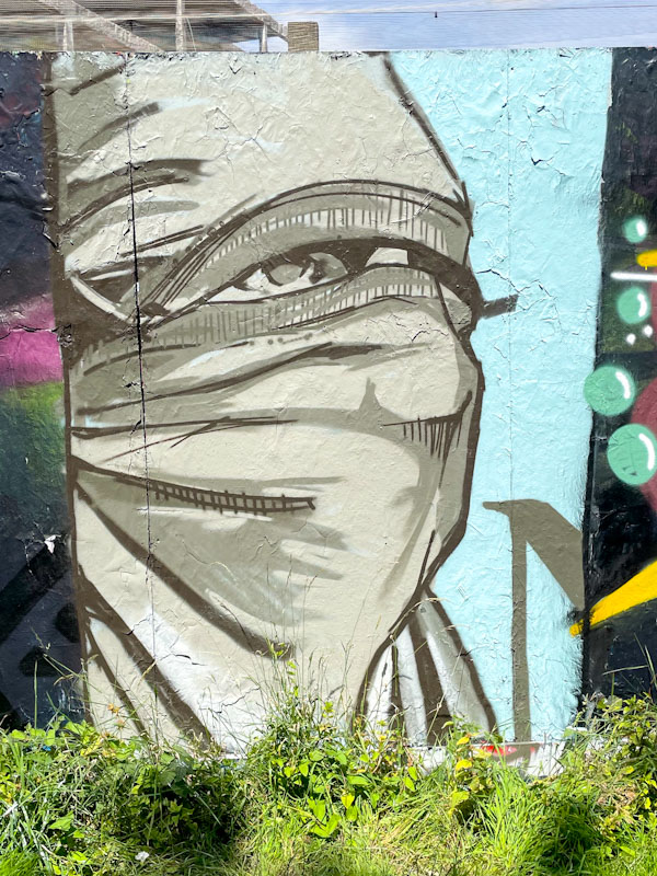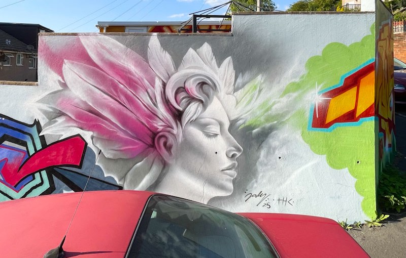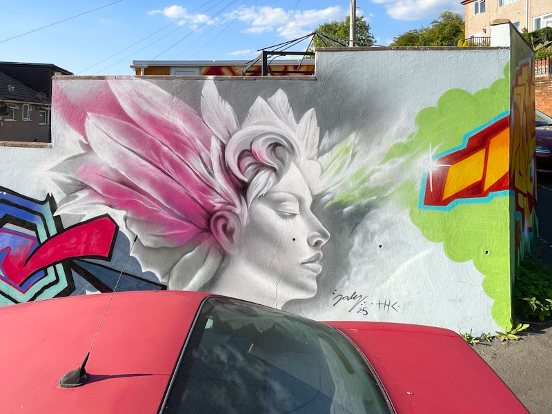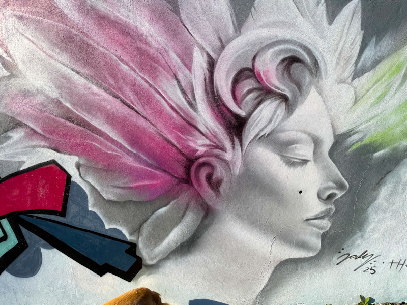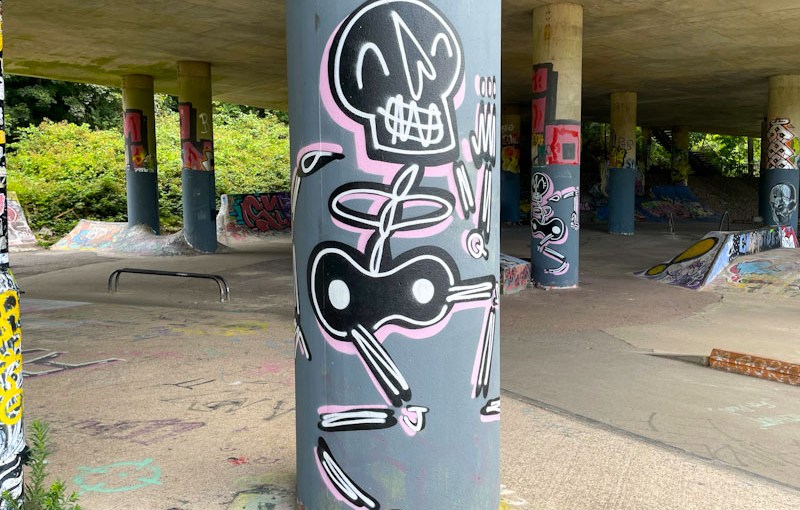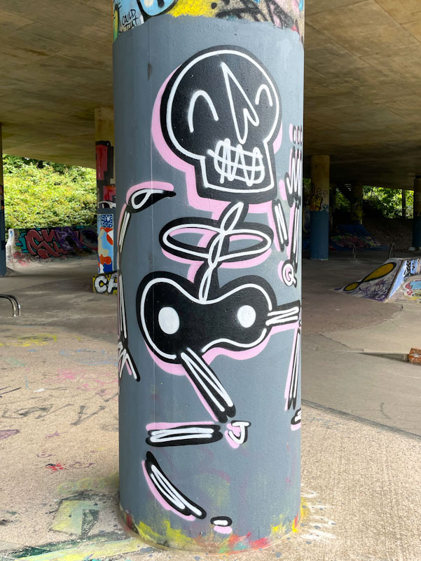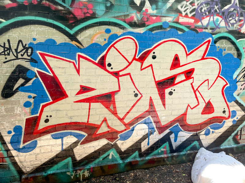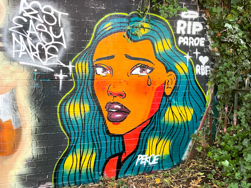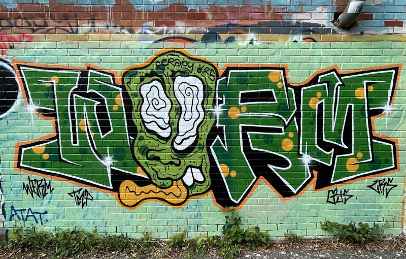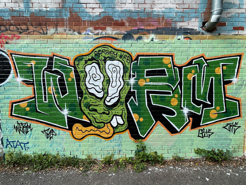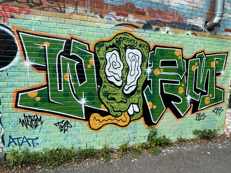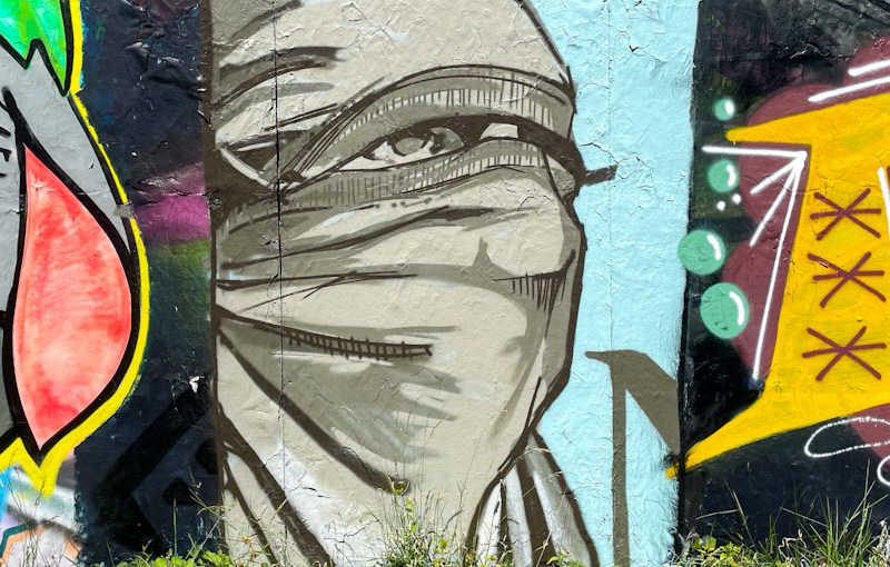
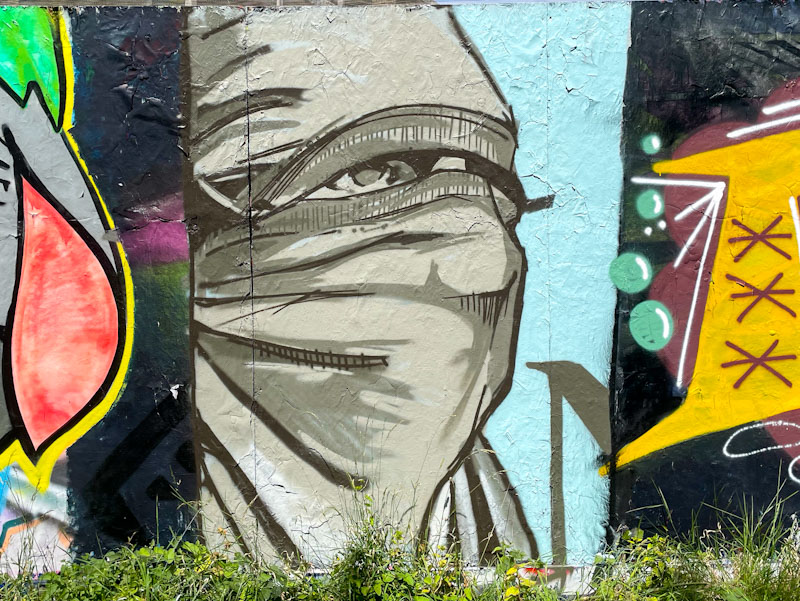
A gallery of unique (stained-glass look) scenes from one of my favourite Bristol artists, Creamylines.
Instagram: @creamylines
All photographs by Scooj


A gallery of unique (stained-glass look) scenes from one of my favourite Bristol artists, Creamylines.
Instagram: @creamylines
All photographs by Scooj


If, like me, you are interested in numbers, today’s post contains a rising sequence of numbers – 6789. In our base ten counting system, this is the last time this true sequence will be possible, because 78910 doesn’t work, and also even if it did I’d have to be writing posts for the next 100 years or more. Actually, I am wrong, so ignore that. The next number that will work is 12345, which I might reach if I carry on for 10 more years. Enough with the numbers already.
I am always delighted when Bean returns to Bristol and lets us know that he is alive and well. I hope that when he is finished for the summer with his studies, he will get busy on our streets.

I believe Bean to be one of the great talents emerging from the Bristol scene. His character pieces are growing in sophistication and here he has combined a joyful youth with the letters BEAN, which are reversed out on his T-shirt. There is a message ‘positivity and all that jazz’ which is either speaking to the viewer or to himself or, perhaps, both. I take energy and hope from this piece.

Biers was one of the first graffiti writers I met in Bristol, and back then he used to write the letters BIERS. He has undergone a few reinventions since then and currently writes WD40. I noticed yesterday that he has dropped off Instagram and hope that this is a temporary thing, and wonder if it signals another name change (probably not).

This is a nicely painted squat piece on the roundabout. Lately he has been painting fewer combination pieces incorporating characters, and concentrating on his letters, which in my view is a pity, because I rather liked his character interventions. This piece is on-point, clean and crisp… unpretentious and speaks of the joy of being a graffiti writer.
.
Next destination
Godalming town in Surrey
overnighter looms
.
by Scooj

Painted alongside a piece I featured recently by Desi, this super writing by Pura Decadencia took me several attempts to photograph on account of the wrong light conditions each time I visited. This third attempt was, as you can see, was on an unusually welcome overcast day.

Pura has been teaming up with Desi on a couple of occasions now, and they seem to be bringing out the best in each other. Pura’s letters are clear, regular and quite large, providing plenty of scope for playing about with fills. She has nicely blended three pink tones and added in some reversed spots to jazz things up a little. The atmospheric background is in a style I am seeing more frequently on the streets at the moment, a particular favourite technique used by Sub, for example. No vampire teeth this time, but a fine example of Pura Decadencia’s work.

The curved wall at Dean Lane has played host to so many fabulous pieces (and some not so fabulous). This collaboration from Conrico and Daz Cat is a wonderful piece, full of creativity and colour, with the two distinct styles coming together in great harmony.

The left hand side of the wall belongs to Conrico, who has written his name in one of his familiar landscapes, with a distant monster that might be Godzilla emerging from the stylised choppy sea. To the right, Daz Cat has painted a sage-like old fish/axolotl type character watches on as if he might have the answer to an unknown question. Is that an orange platypus in his packet? Lots of stories in this brilliant collaboration.
.
late afternoon sun
streams through the double windows
I bathe on the floor
.
by Scooj

I don’t visit this spot as often as some of the others, as it is a little further to drive for me and more difficult to squeeze into a lunchtime break. The upshot is that when I do go, there are usually a few new pieces for me to enjoy.

Omie is an artist who only came onto my radar about 18 months ago, and he has been turning out a wonderful variety of pieces in that time. He is a creative artist who changes his style completely with each new piece. The more I look at this one, the more I like it.
His chunky block letters in two shades of green and with a deep drop shadow are decorated with what I can only describe as what looks like drizzles of chocolate sauce or marmite (take your pick) running through the midline. A really clever idea and beautifully executed. The letters are set on a contrasting background of pink and orange bubbles, which provide contrast and help the piece stand out on the busy wall. Great stuff.

It was great to see this PWA collaboration recently, something that is a little less frequent these days now that Face 1st has moved away from Bristol, but true to his word, he does still come back now and again to decorate our streets. Here he is joined by Zake and Soap.

Face 1st has been experimenting with his letters recently, and perhaps it is a way of refining his technique and growing himself as an artist. There is a symmetry to the letters which spell out Face First, painted in a deep gold colour which contrasts with the pink background and sets the colour theme for the whole collaboration.

The centrepiece is a character face painted by Zake, with all the depth we are used to seeing in his work created by the use of light and shade. Zake has cleverly picked up on the gold colour and used it as the bottom-lit element, highlighting his character’s features.

Rounding off the triptych is a piece of writing from Soap, who also appears to be trying something a little different. His letters look like a halfway house towards calligraffiti, with some order and form to the letters in terms of shape and size, and some interesting details creeping in. A truly wonderful PWA collaboration from three beating hearts of the Bristol street/graffiti art scene.

I have said it many times, but Bloem is one of the most improved and gifted new artists painting the streets of Bristol, whose outstanding talent and creativity is put to good use for all to enjoy. It took me a long wait to finally get a decent picture of this piece, as there was a large black van parked in front of it for what seemed like an eternity. Patience is a virtue, and it was well worth waiting to get a shot from the front.

Once more, Bloem includes some of her favourite elements, including the hand with pointy fingernails, a chain and a beautiful flower. These elements bind together nicely, and I daresay that there is a fair amount of conscious or unconscious symbolism going on here. I think that the grey plants are orchids and if we are talking of symbolism, they are associated with love, beauty and refinement.

The big orange centrepiece flower looks like a chrysanthemum and acts as a fabulous focal point of the piece. Not only is the composition original and beautiful, but it is really well executed too. Great work from Bloem.