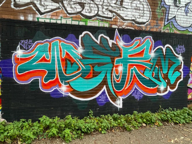
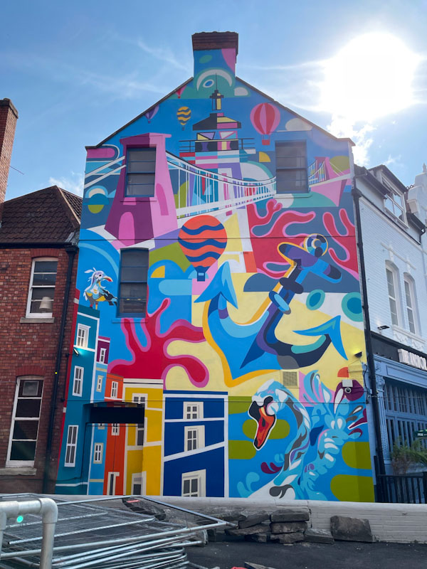
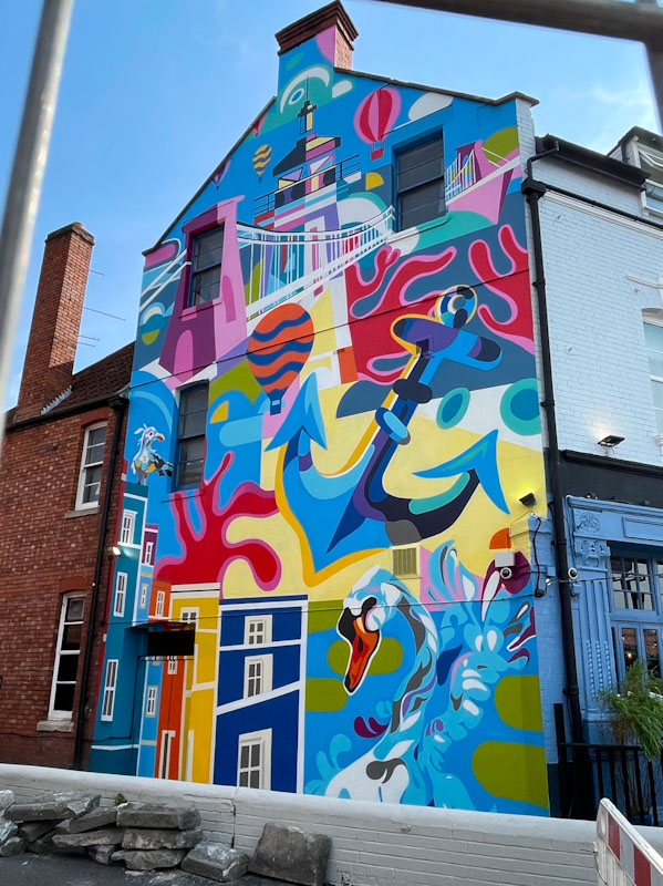
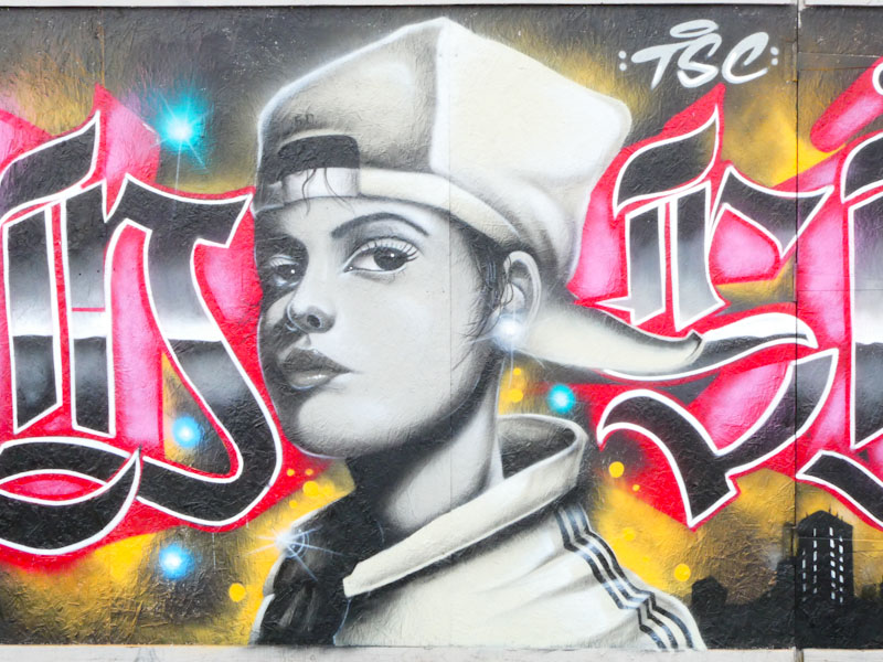
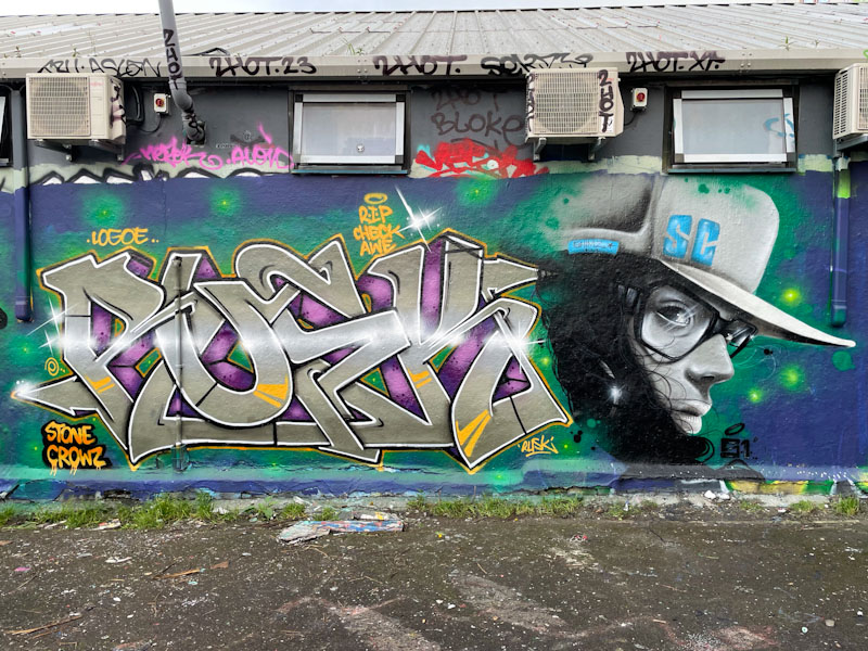
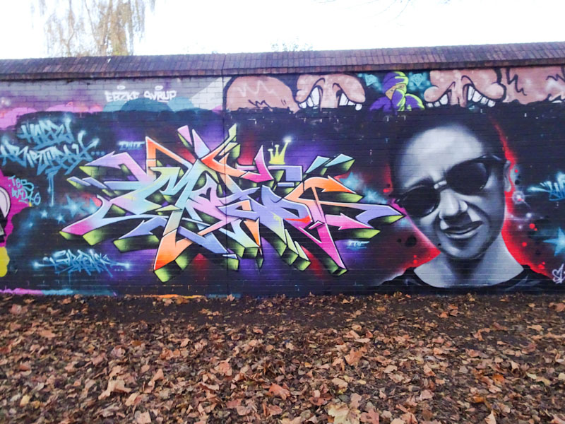
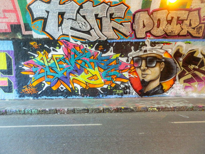
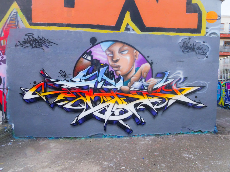
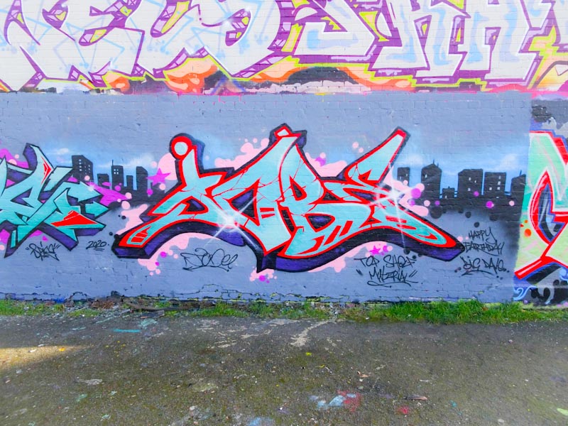
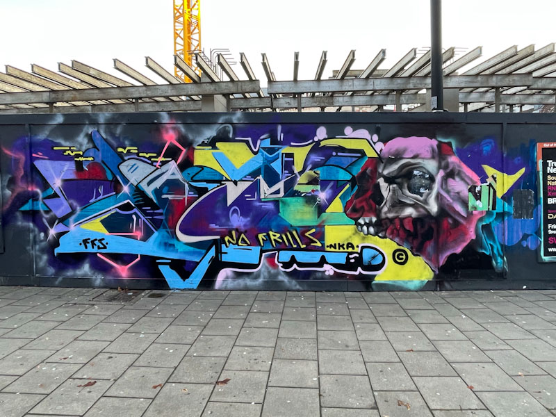
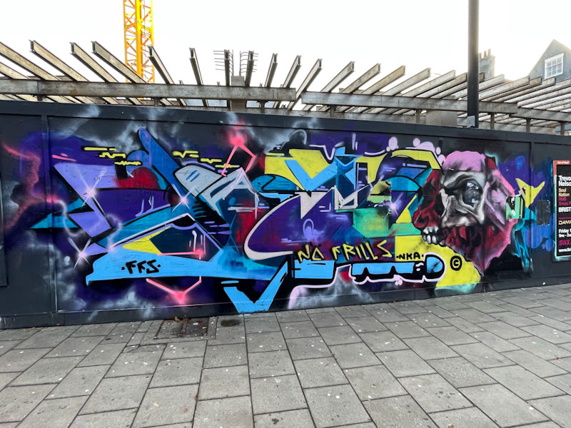
Not long ago, I met Lee Roy, whilst walking our respective dogs, and he informed me that he was hanging up his spray cans for a while, which was disappointing to hear, because I like his work and the way he expresses himself through it. However, this piece might signify a return for the anti-style(ish) writer.
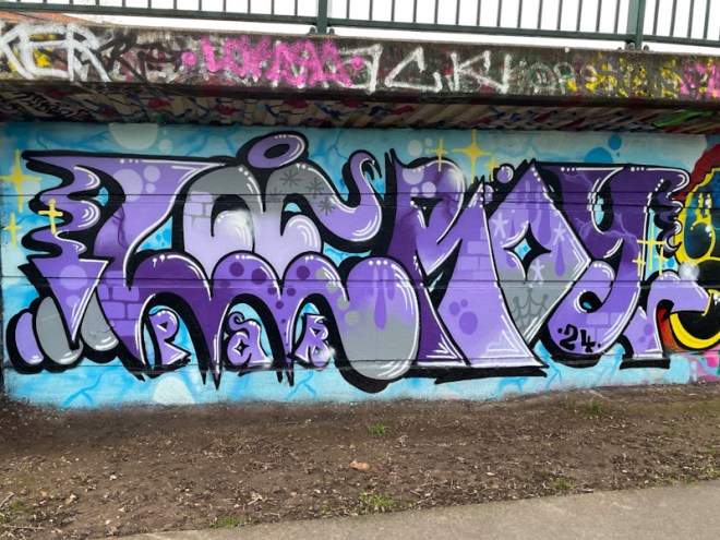
During his ‘lay-off’, he hasn’t lost his touch in the slightest, indeed, this is a rather sharp piece, beautifully presented and with an array of his favourite fill patterns and shapes. The purples and greys work well against the blight blue background, and this is a very fine ‘come back’ piece. Hoping this is more than a splash in the pan.