.
Fairy Godmother
helps a poor girl meet a prince
true love wins the day
.
by Scooj
- On seeing an outstanding performance of Cinderella by the Birmingham Royal Ballet at the Bristol Hippodrome last night.
.
Fairy Godmother
helps a poor girl meet a prince
true love wins the day
.
by Scooj
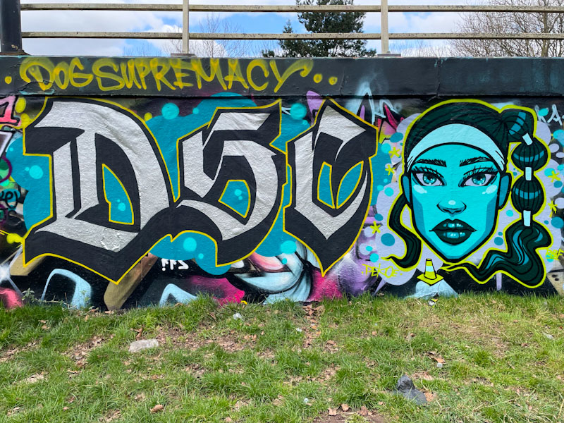
It was great to see this collaboration from Stivs and Pekoe recently, two artists who are knocking out some fabulous work at the moment. To the left, the calligraffiti letters are by Stivs and the character portrait on the right is by Pekoe.
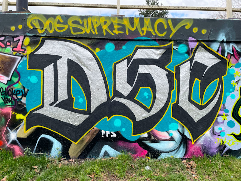
Stivs has written his familiar letters DSC, which stands for Dog Supremacy Crew (formerly Dog Shit Crew – I think). The beautiful letters are not quite as elaborate as some of his calligraffiti pieces, but are nonetheless impressive. From the size and intricacy of it, I would think that he painted this fairly quickly.

To the right, Pekoe, in keeping with the collaboration colour scheme, has painted this wonderful blue-faced portrait of a young woman with a fabulous hairdo. There is a symmetry in the face, and a slightly haunting stare. The piece is beautifully produced, and so very neat and tidy. I am not sure what the significance of the road cone is, but I’ll take it.

Conrico has a lightness of touch and an ability to tell stories through his pieces that is almost unique in Bristol. If I were to pick another artist who has similar qualities, it would be Daz Cat. This is a wonderful piece was painted as part of a paint jam I think to mark the birthday of Benry – I don’t know who Benry is, but there was some great art produced in celebration.
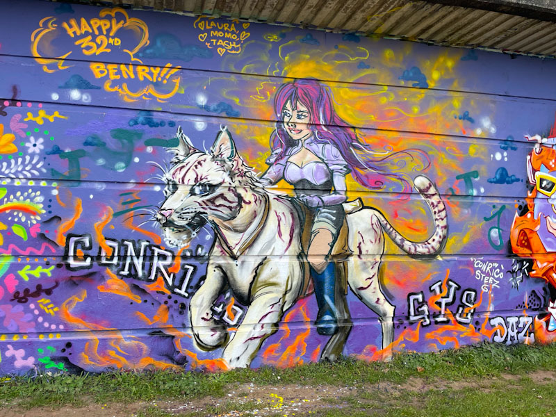
The piece features a girl riding a white tiger (or some mythical feline beast), and why not, and the orange atmosphere around the characters indicates something magical is going on. There is movement, excitement and fantasy in this piece which is beautifully painted by Conrico. Great stuff.
.
Colonialism
bullying annexation
so last century
.
by Scooj
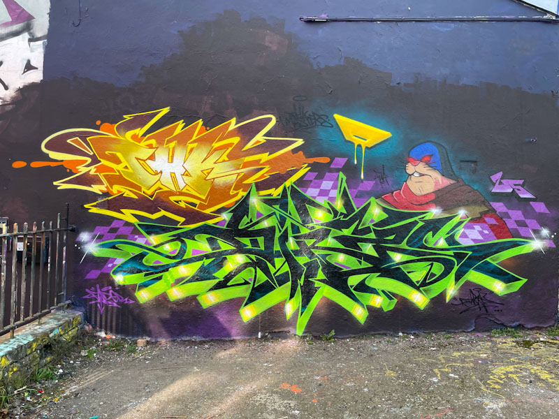
Although Dibz and Fade have had a reasonably quiet winter, they have still managed to get out frequently enough to collaborate on some very impressive walls. This wall is one of their favourites, and because of its shape requires them to paint closer together than some of the other longer walls they like to paint.
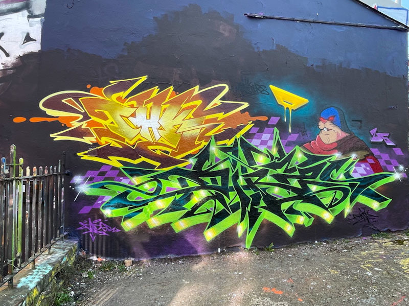
In this piece, they each get to showcase their style and technique, using different base colours. Stepping back you can see that Fade’s work, in yellow, has a slightly softer finish, with more curves, than the slightly less forgiving angles on the green writing by Dibz. I don’t know too much about the character in this piece, but I am guessing both artists contributed to it. Naturally there is lots more to come from these two.
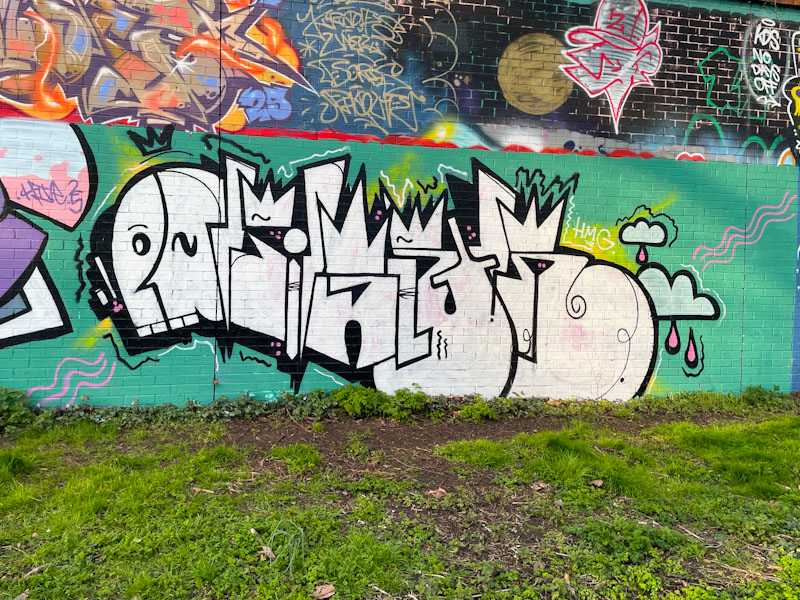
Although he doesn’t appear to paint all that frequently, Dirtygypo has an instantly recognisable style. I have tried on several occasions to work out what his letters spell, and I have come to the conclusion that they say DIRTY, although I have little confidence in this. I guess I’ll just need to meet him while he is painting sometime.
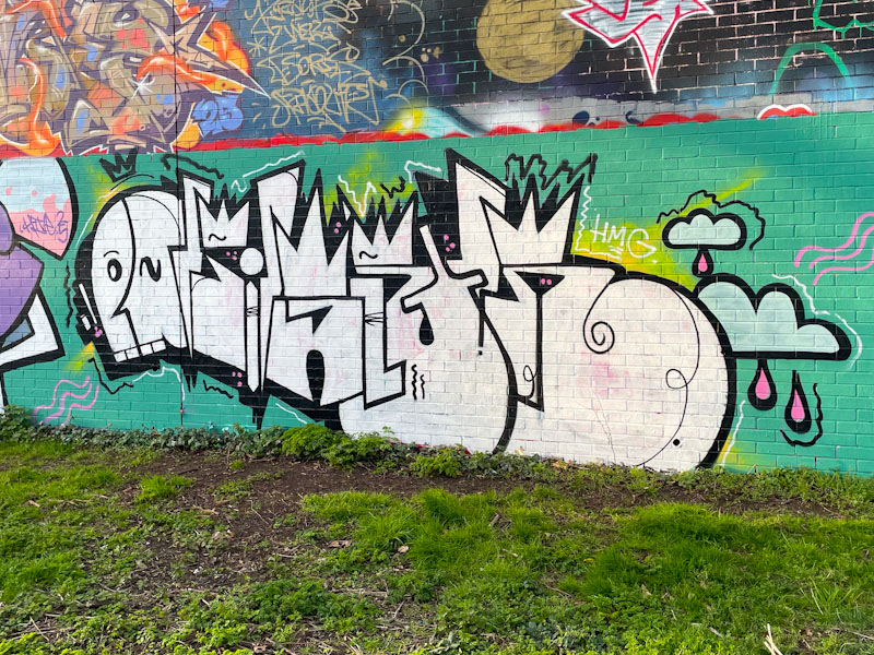
The colour scheme adopted by Dirtygypo for this piece is elementary, but I have to say that the jade green background colour works very well indeed with the white letters. There are a couple of splashes of lime green and yellow around the edges that add some extra interest. The letters are in the standard format that Dirtygypo uses and includes a stylised face at the start. Really nice graffiti writing, with some mystery sill to solve.
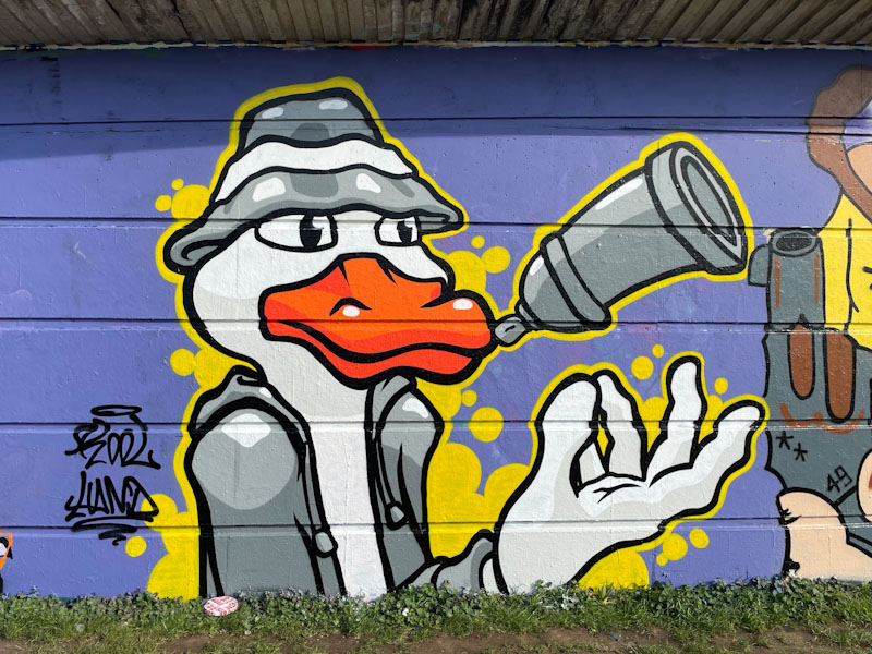
Kool Hand is a bit of an unsung hero on Natural Adventures. I kind of take it for granted that he will turn out regular pieces in his unique no-nonsense cartoon style, but that smacks of complacency on my part, and I feel I need to ‘big him up’ a little, because he deserves higher recognition of his work.

This is a lovely, clean and tidy character piece featuring a cartoon duck tossing a spray can in the air. Wearing a bucket hat, the duck in a coat has a friendly demeanour about him and seems to be having a good time. The piece is set on a solid purple background, and the superb yellow border bleeds out in countless places to form bubbles. A well conceived and executed piece from the fabulous Kool Hand.
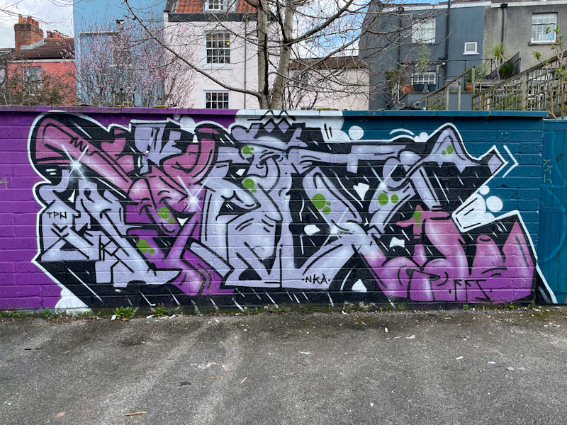
I rarely visit Picton Lane, so when I do, there is usually something new to find, and this piece from Kid Krishna made the trip worth it. Kid Krishna is on something of a roll at the moment, and he is definitely a bit of a ‘peaks and troughs’ kind of artist, but he is without doubt peaking at the moment.
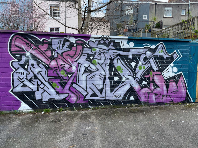
The soft colour palette is easy on the eye and sits nicely on the purple/blue background. As ever, his letters spell CRIE, although I find it a little difficult to see in this piece. His letters are made up of lots of shapes, many of which almost morph into something recognisable and then morph away again. Unusual, clean and tidy work from a superb artist and nice man.

.
A sudden flurry
crows cawing and gulls mewing
then return to calm
.
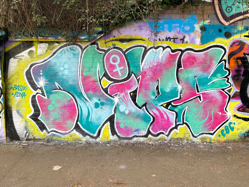
Aha! There is a certain consistency and reliability with Nips’ pieces that I am really attracted to. Her letters tend to be similar in shape from piece to piece, but it is in her fills where she really excels and shows off what she can do.
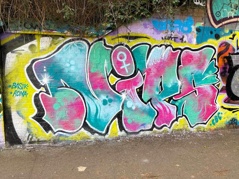
Set on a fairly elementary yellow backdrop, the letters NIPS are filled with a stunning patterned mix of pinks and blues, with some great designs and reversed out spots. The eye is drawn to the female symbol in the dot of the ‘i’, which is assertive and proud. Nips has included a couple of nice shout-outs to Basik and Roma too. I hope we see plenty more of Nips in 2025.


