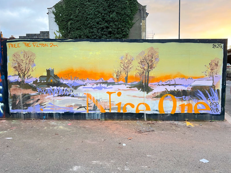
A gallery of small installations from the wonderful artist Mutatee. I’m not too sure if she is still active, and these pieces are from a few years ago.
Instagram: @mutatee_
All photographs by Scooj


A gallery of small installations from the wonderful artist Mutatee. I’m not too sure if she is still active, and these pieces are from a few years ago.
Instagram: @mutatee_
All photographs by Scooj


Every once in a while I find a piece of graffiti or street art and I say to myself, ‘I really like that’. This is one of those pieces. It is by a graffiti writer I haven’t come across before, Rusta, and I am guessing that they were visiting Bristol and took the opportunity to have a little paint.

I love the big fat letters and rather sketchy style of the piece, and I also like the way it has been painted on a clean white buffed background to help it make its mark. The colour selection is great and the way the colours blend and jump about is rather cool. The little pink shock lines through the piece give it that little something extra. A very nice piece indeed.

It is not often that I post Halloween pieces in time for the festival, but fortunately this one by Rowzgraff was painted a little while ago and has made it through my pipeline process just in time. I am not familiar with the artist, who I believe was painting alongside Lis and Ozuk.s in a mini paint jam on the swimming pool wall in Dean Lane.

The Halloween piece is nicely worked with the letters ROWZ incorporating a happy pumpkin and a wizard’s hat. The whole piece is set on a starry night sky – just the thing to get you into the mood for tomorrow night. There will be more Halloween pieces to share, but they won’t feature here for a little while, such is the backlog.

I have included this piece, not because it is amazing, but because it is by PL8o whose work I like and because it is representative of a great many tribute pieces in Bristol to Dorns who recently passed away.

There is something easy and accessible about PL8o’s letter style, and the colours in this piece certainly stand out. It is a nice tribute. Interestingly, this piece was over-painted by an artist who is not local and who probably didn’t know about Dorns or the tributes to him. That piece has since been tagged with ‘Dorns’ written all over it, and a comment which reads ‘You had the whole wall…’ basically telling the artist off for painting over a tribute piece – an example of the politics and rules (there are no rules) of street/graffiti art.

Towards the Horfield end of the Gloucester Road you will find the Horfield Dry Cleaners. Above the shop is a wonderful mural by Andy Council that has been there for well over a year, I just haven’t had an opportunity until recently to photograph it.

In all honesty, the photographs don’t do this piece justice at all, because the colours and detail are a little lost. It might have been better to zoom in on different elements of the mural to convey the artwork more fully. If you look carefully, you might spot a turtle, an octopus, a manta ray, an ammonite and a manatee with a football pitch on its back. Each of the animals is crafted with Andy Council’s technique of stitching component parts together to create a recognisable whole. A great mural.

Daz Cat is a brilliant character artist, and continues to develop his style, which is becoming increasingly sophisticated and detailed, as you can see if you scroll back in this updated gallery of his work. This piece is painted on a bridge column alongside the River Avon (it is mid-low tide when this picture was taken)

In this clever piece, a cat person is holding/cuddling a pet cat – where does that leave us? There is a load of personality and in both characters, and the pet cat doesn’t look overjoyed with the way it is being held. Some great colours in the piece too.
I managed to catch up with Daz Cat a week or so ago in St Werburghs tunnel where he was painting a superb piece for Kool Hand’s birthday celebration paint jam – Unfortunately, when I returned four days later, his piece had been painted over by Sled One and Oust, which is a real pity.

Frome Side, as I like to call it, is a spot that runs underneath a stretch of the M32. The concrete walls are on either side of the canalised River Frome, and crossing from one side to the other is perilous to say the least, across slender concrete slabs, about 2ft wide without a handrail. I tend to remain on the east bank, where the access is, and photograph the west bank from there, looking across the river. This piece from Totosoapcity was on the far west bank.

Totosoapcity has a unique and easy to recognise letter style which tends to remain pretty much as standard from piece to piece, and it is the decoration and fill that provides variation. The letters ARS(Z)A have a symmetry about them, and are filled with an unusual selection of colours in a radiating geometric pattern. The background is decorated with what looks like piles of rocks. Interesting stuff from Totosoapcity.

This small piece by Pekoe marks the return of her ‘XXX hates fascists’, theme, which in this instance declares that is it Bristol that hates fascists, and one can be on fairly safe ground that it is indeed the case. It would look odd if somebody raised a hand and said “well, actually, I quite like fascists” – we know that they are out there though.

The piece was painted for Dean Lane Hardcore, I think. I feel that I haven’t seen enough of Pekoe’s work this year, and there has been a period of quiet from the regular drumbeat of RBF (Resting Bitch Face) paint jams this year – Family life seems to be a factor for some members. As ever, I look forward to more from Pekoe.

Finding my way back down to the Frome Side spot after it had been gated off for a while was a bit of a treat, because there were plenty of new pieces and a handful of new artists waiting for me. Ont of the new artists is Sketch, who has been fairly busy underneath the M32.

This Picassoesque column piece really appeals to me. Of course the style is wholly derivative, but there is no shame in that at all, because the same could be said of most art. The features of the character are painted in black and white, set on a background of colours in the broad shape of a head. I think I met sketch a while back, and he told me he was learning and practicing, which is great to hear. As he develops, he will get bolder with his black lines, and stronger definition. I love this and celebrate this relative newcomer.

It feels like Asre’s comeback is complete. He is painting pretty frequently all over Bristol, although he has switched in the large part from his character portraits to his writing, and appears to be enjoying it.

This is a particularly neat piece from Asre, with some great colours, and precision throughout. The letters are beautifully filled reds and oranges decorated with reversed-out spots. The bold black border is thick and strong, helping the letters to stand out. The piece is set on blue ‘clouds’ which also have strong black outlines – a typical element of Asre’s work. Lots more to come from the artist.