A year or two back Hemper was smashing out pieces on a ridiculously regular rhythm, but since then has been a little quieter, although I have noticed a slight increase in his activity over the last couple of months. His work is always of such quality and class that it is always a pleasure to his pieces.
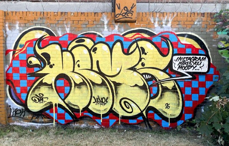
Hemper, Peel Street Green, Bristol, July 2026
This one in Peel Street Green, picks up on a theme he has used before, of a chequered background, looking almost like a tablecloth, over which is painted a rather crude, but beautifully worked piece of bubble writing spelling HEMS. The yellow letters , drips and all contrast brilliantly with the backdrop. The message “Instagram makes you moody” possibly speaks to all of us. A very nice piece.
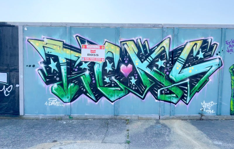
This is a lovely tribute piece for Tickz by Hypo, which is well over a year old now, but I have been slow to find this spot, hence the delayed post. The age of the piece is made more obvious with the ‘warning’ poster that has been slapped across the middle of it.
Hypo, Goodneston Road, Bristol, July 2026
Hypo has chosen some fairly modest colours that complement the sober grey hoarding to write the letters TICKS, a variant of Tickz. The drop shadow which has some streaks, stars and spots disappears to a central point behind the letters, and the whole thing looks very ‘Hypo’ if that makes sense.
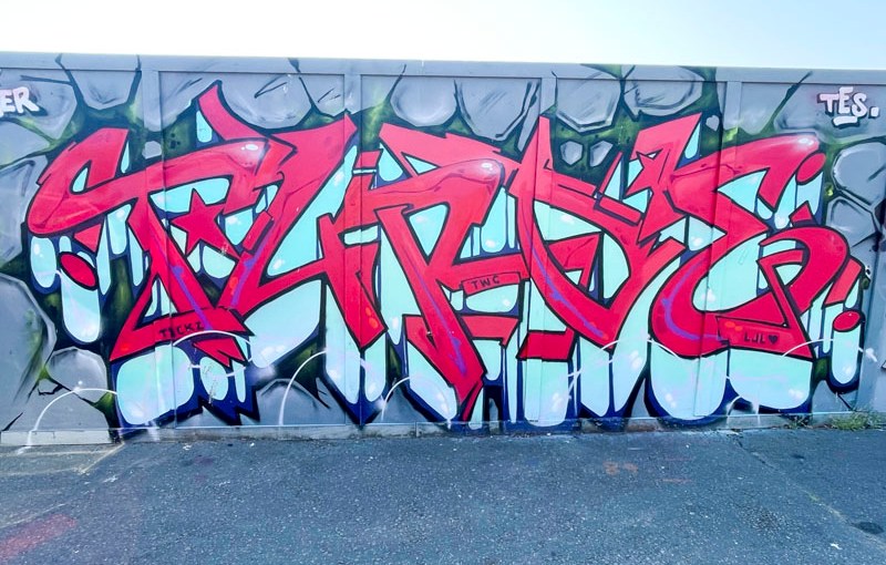
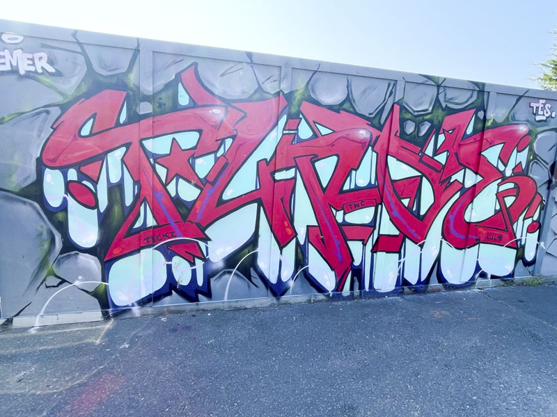
This piece from Turoe is an absolute blinder. The piece is painted on the long hoarding at Goodneston road, and I expect it has been there for some time – I discovered the spot very late in the day. Although the piece has a shout-out to Tickz, I don’t think it is part of the tribute paint jam to him.
Turoe, Goodneston Road, Bristol, July 2026
The stunning red letters, spelling out TUROE, are given a huge amount of depth by the large blue drop shadow and the boulder background that the letters appear to be emerging from. This is the work of a master graffiti writer who has maintained his outstanding standards for such a long time.
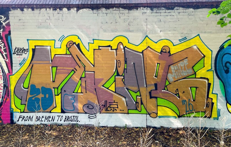
This piece is a little different, and just by looking at it I knew that it wasn’t by a Bristol writer. There was a clue to the artist’s identity in the phrase at the bottom “from Bremen to Bristol”. It was signed Peking, which left me with enough to do some Interweb searching and identify the graffiti writer as German artist, Peking, @beijing_zdf.
Peking, Sparke Evans Park, Bristol, July 2026
I guess the most notable feature of this piece of graffiti writing is the thick yellow border following the edge of the letters, and the contrasting lime green drop shadow. The organic browns of the letter fills round off the piece nicely which has an overall earthy feel of soil, vegetation and sun, consciously or unconsciously created by Peking. Welcome to Bristol, come back any time.
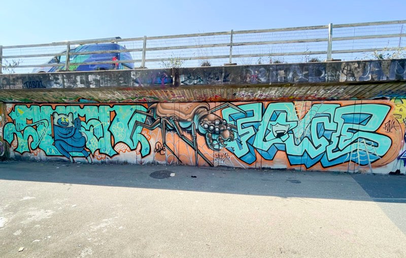
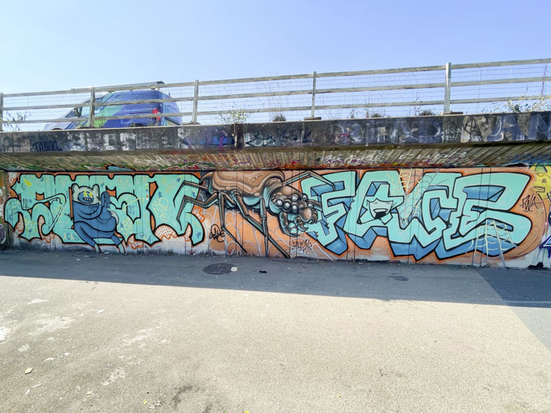
Soap, Zake and Face 1st, M32 Cycle path, Bristol, July 2026
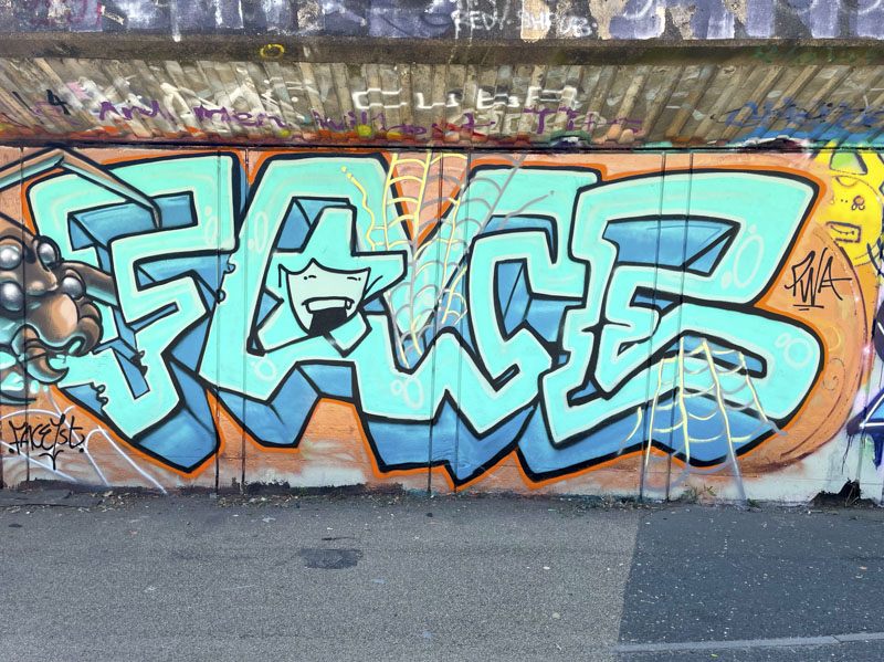
It feels like a real treat when the Pirate Wall Art (PWA) crew get together as it doesn’t happen all that often since Face 1st left for Herefordshire and Chill also left the city, but every once in a while there is a gathering, and in this collaboration, Soap, Zake and Face 1st have joined forces alongside the M32.
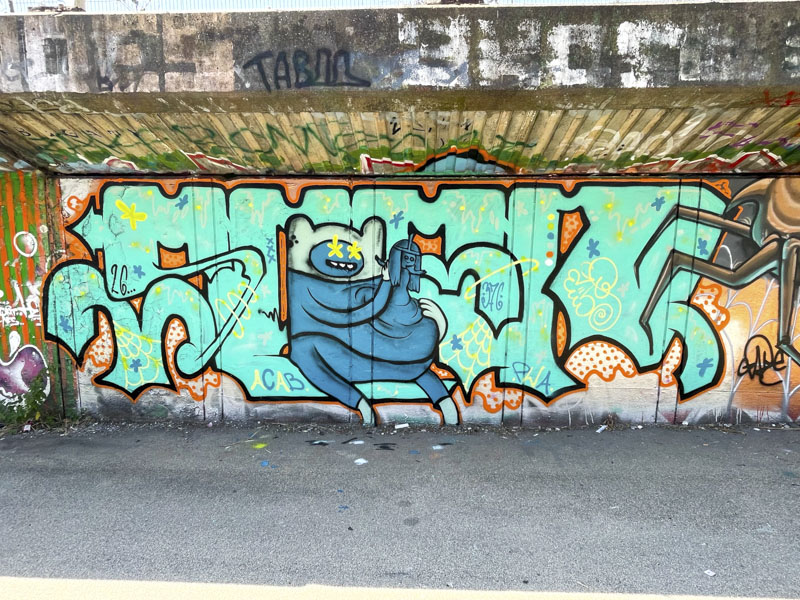
Soap, M32 Cycle path, Bristol, July 2026
Soap has painted a combination piece incorporating an Adventure Time character who appears to be crafting a mini character from his own flesh. The letters, spelling SOAP, have a rather flat presentation and are filled with a highly decorated turquoise colour. This is a highly attractive piece with plenty of detailing to admire.
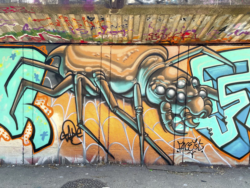
Zake, M32 Cycle path, Bristol, July 2026
In the middle section of the collaboration, Zake has painted a wild and wonderful beast, modelled on a spider, but not like anything I have seen before. The fearsome arachnid is nibbling away at Face 1st’s letters. This is something quite different and unusual from Zake, but great to see.
Face 1st, M32 Cycle path, Bristol, July 2026
To the right, Face 1st has painted his blocky letters with a considerable depth provided by the extensive deep blue drop shadow. I notice that one or two vertical lines might be missing under the C and E, but I am just being picky. A giggling girl makes an appearance inside the arch of the A, and some spider web rounds off the piece nicely. A fabulous PWA collaboration.
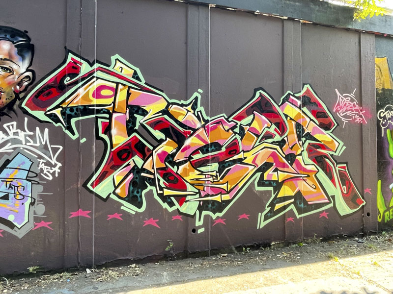
This is the second recent visit to Bristol by Tizer, and I have to say a very welcome one. The London-based writer, for me at least, encapsulates the London scene really well. I cannot put into words, but his style is different from the Bristol styles that we are more used to seeing on this blog.
Tizer, M32 roundabout, Bristol, July 2026
This piece is probably most notable for the colourful and busy letter fills, which are contained within a green border/drop shadow. Although parts of the writing look a little sketchy, that is the style and in fact the whole thing is tight as a nut, and the balance of the piece exceptional. One of the very best London writers.
I have walked past this piece several times, but had to wait for the absence of disruptive shadows cast by the sun. Photographing street art has been more than challenging this summer in Bristol as we have had about six weeks of continuous sunshine, with only the odd moment of cloud. It did rain for about an hour a week ago, but that is it. The country is parched and wildfire risk extreme.
Dirtygypo, River Avon, Bristol, July 2026
This is quite a bright and fiery piece by Dirtygypo and neatly fits the scorching theme of the summer. As always, I struggle with the letters, but it might spell PILGR. The little white skull character with a cap leads off the yellow remainder of the writing. The contrast is created with the whole thing set on a deep blue background – the sun and sky? A nice tidy piece from the artist.
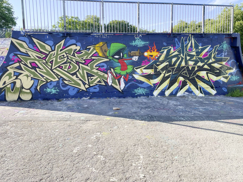
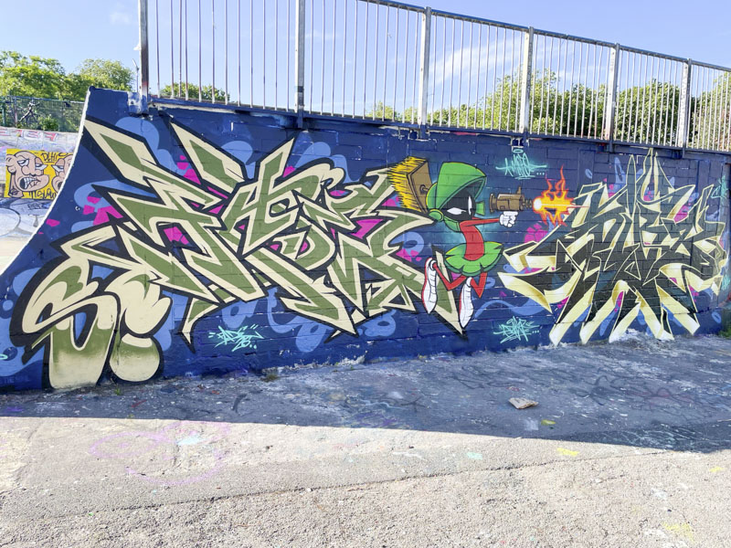
This is a fine combination collaboration from Fade and Dibz, featuring the cartoon character Marvin the Martian. The character is sandwiched between two fabulous pieces of wildstyle graffiti writing from the pair. It is surprising how many times I have seen this character used in a graffiti piece… note to self, do a Marvin the Martian special when I have time.
Fade and Dibz, Dean Lane, Bristol, July 2026
Unusually, Fade is to the left, and Dibz to the right. Looking at the two writing styles together, you can see that Fade’s work is much ‘flatter’ and 2 dimensional, whereas Dibz has gone for more depth with great use of a drop shadow around his letters. I suspect that the character was a joint effort, which is often the case with these two. Great work.
Only yesterday, I posted a piece by ARSA in which I said:
“ARSA’s work tends to be quite angular and sharp, and I can’t recall seeing a soft, rounded piece with blended fills by him – now that would be a challenge…”
Well, I dug this piece out which, although I only recently located, has been around for a while and completely undermines my own assertion above.
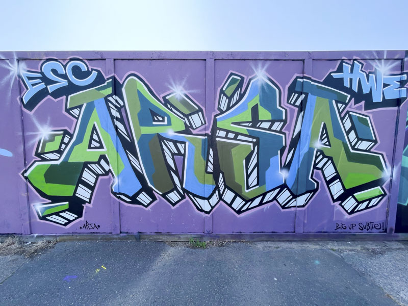
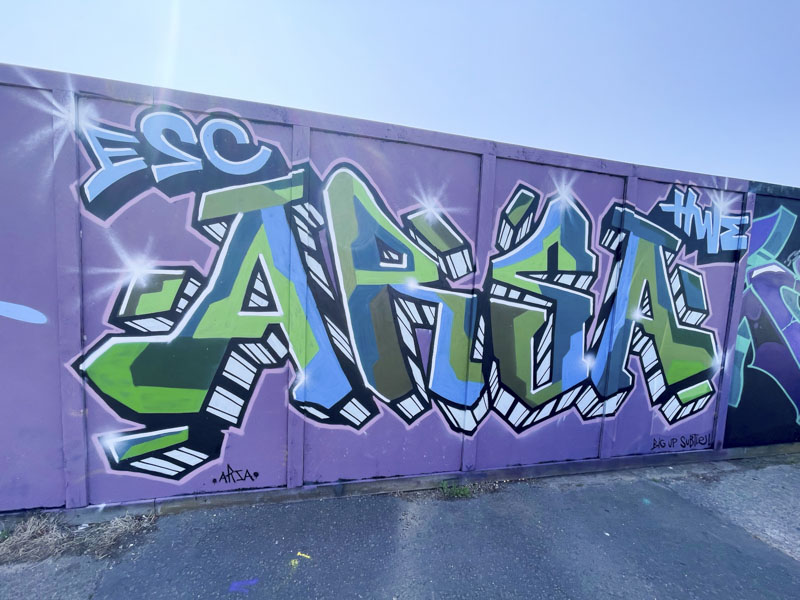
ARSA, Goodneston Road, Bristol, July 2026
The letters are smooth and rounded and rather more forgiving than his typical work, although he still likes to keep his fill colours separate, without any blending. A calm colour selection contrasts a little with the ‘barcode’ drop shadow. A nice piece from ARSA.
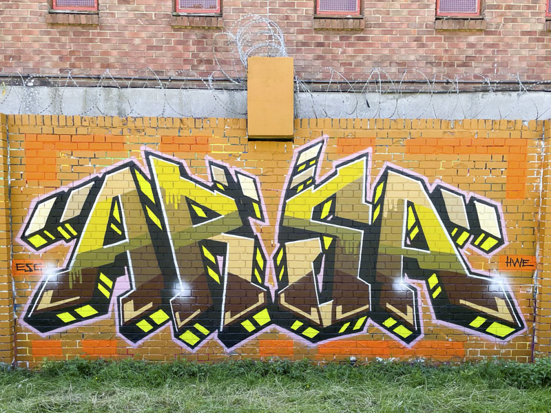
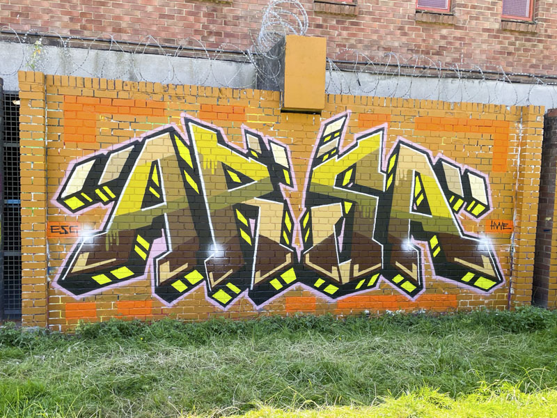
This is a rather nicely presented piece from ARSA that perfectly fits the wall and the surroundings. One of the things that strikes me is the fact that the grass is still green in this picture, but blistering heat and dry weather for much of June and the whole of July have rendered this green a brown now.
ARSA, Peel Street Green, Bristol, July 2026
The calculated symmetry of this piece, with a couple of deviations, is admirable. The fill colours have been thoughtfully applied in horizontal layers, but with hard edges between each colour. ARSA’s work tends to be quite angular and sharp, and I can’t recall seeing a soft, rounded piece with blended fills by him – now that would be a challenge…