

.
Our lives are enriched
with gifts bestowed upon us
in natural form
.
by Scooj
.
Our lives are enriched
with gifts bestowed upon us
in natural form
.
by Scooj

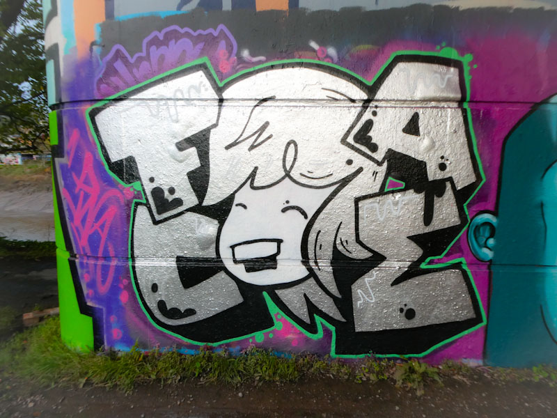
In case you missed it, Face 1st is one of my favourite artists in Bristol. I try to post all his work that I come across, but it is an uphill struggle, so I do what I can. This one is on the famous curved wall at Dean Lane.

This is a stock sure thing from Face 1st, with a laughing girl’s face surrounded with FACE hair. In gold and yellow on a sky-blue background, the piece stands out, and there are some additional drips and bubbles to keep the interest. I haven’t seen any of the PWA crew for a long while, but next time I do, I will have to ask them about the significance of the gemstone, which appears in so much of their work.

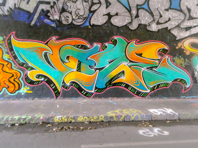
Taboo, is definitely going through a pink period, in fact it is a very popular colour all round in Bristol at the moment, and I don’t think I have seen so much pink paint since Stupid Stupid Meathole was active. I wonder what happened to him.
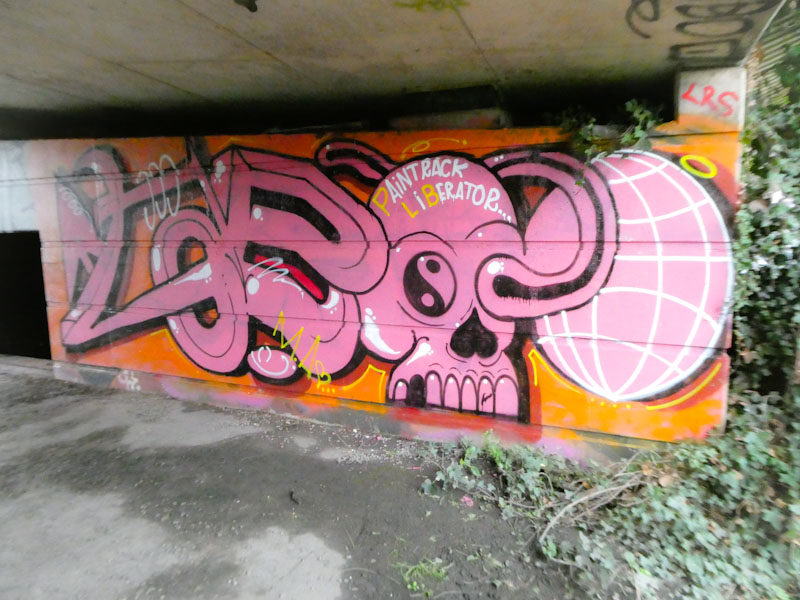
The unruly letters spell Taboo, with a skull and sphere making up the OO at the end. There are lots of little detail s and distortions to keep the eye busy in this piece, and a nicely worked PLB crew mention. Great work from Taboo, tucked away.
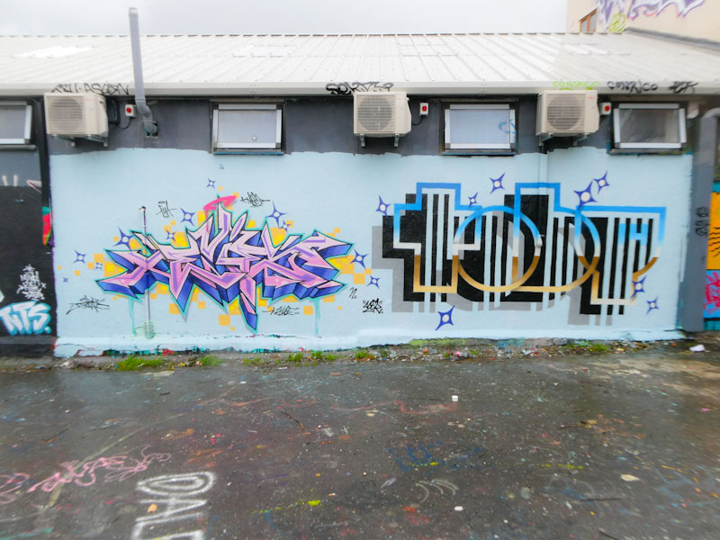
Two of the greats of the contemporary street art scene in Bristol, Dibz and Acer One, have come together to create this magnificent collaborative wall in Deal Lane. You could hardly get two more contrasting styles of writing side-by-side – perhaps the inclusion of someone like Stivs or Mudra might just do it.
Set on a buffed duck-egg blue wall, Dibz has painted one of his outstanding wildstyle pieces, which would normally spell DIBZ, but in this case it says EVIE. Using the tried and tested pink and blue (lilac) combination for the letters, Dibz has contrasted it with little yellow/orange squares, which personally speaking, I don’t think work very well with the background wall colour, and leaves me feeling a little queezy.
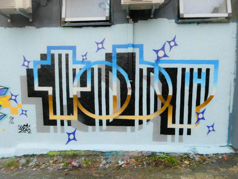
To the right, Acer One, who I was fortunate enough to have a long chat with yesterday in the tunnel, has also written something different. The name TOBY is the focus of this piece, which was a birthday tribute piece for his son. What better present could a person wish for? Some great colours in the letters, and the customary double shadow together create an amazing 3D effect, with the letters really standing out from the wall. Happy belated birthday, Toby.

There doesn’t seem to be any letting up from Klashwhensober, and you have to admire his grit and determination. Added to that, you also have to admire the constant improvement and development of his bright pieces, as he becomes one of the more prominent writers in the city.
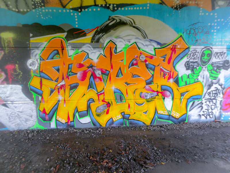
This bright SOBER writing is accompanied by a rather sinister gun-toting character, whose shooting has peppered the writing with bullet holes and bleeding. What marks this piece out, and indeed is a bit of a signature feature from the artist, is the objects and splashes bursting out of the middle of the writing. A fine grey-3D drop shadow and day glow green border (with drips) and cloudy background finish the piece nicely.
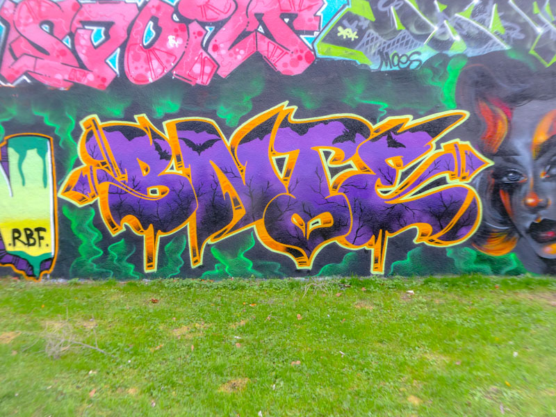
This post gives you an indication of how long it takes me to process a piece from seeking it out, to photographing it, to preparing it, to posting it. In this case it has taken about a month, and that is why you are seeing a Halloween piece on 30 November. My apologies.
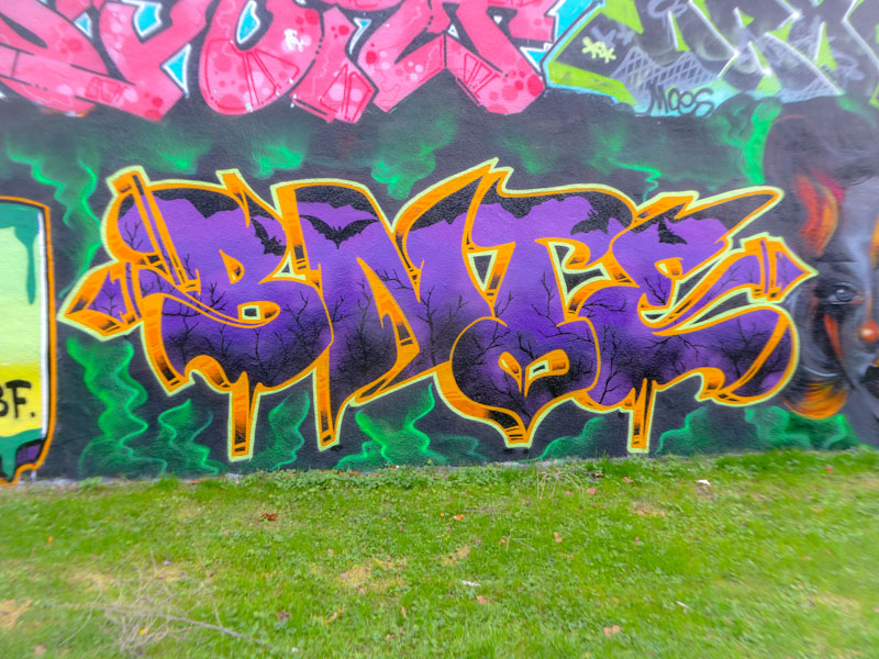
This is by the outstanding writer Bnie whose work grows on me more and more with each piece I see. The letters were painted as part of an RBF Halloween paint jam, which has been the source of some great content for Natural Adventures. Fantastic letter shapes and great colours are perfectly presented, together with the spooky scene playing out in the fill, and is exactly what you want from a Halloween piece. Woooo!

On the day that sees England play Wales in the football world cup, I find myself a little distracted. Before the tournament started, I was indifferent about England, and was rather more concerned that all the Arsenal players involved in the tournament come home unscathed and safe, but now I find myself caring. I’d like England to do well, despite their poor performance against the USA. As I say – distracted.
This is a fine piece from Acer at the entrance to the tunnel, painted in collaboration with Benjimagnetic (post to follow). Acer One has had an exceptional year on the streets, modifying and developing his style with outstanding results.

This piece, spelling out ACER 1, has all the components that he has been working on, such as the rainbow fill in his letters, the minimalist design of his letters, and the double drop shadows that serve to give depth and perspective. A real beauty, and a lovely touch to the right with a rainbow scale bar. A classy piece.
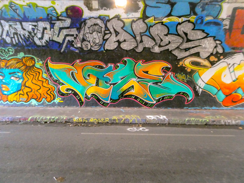
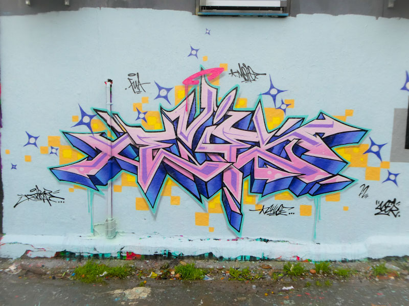
I was rather late to the party regarding Vozie, which is embarrassing at best, but better late than never. I might have to trawl through some archives to see if I have overlooked any of her pieces from before my ‘awakening’ at Upfest this year. What is clear is that Vozie is a massively talented and accomplished writer whose work is both beautiful and compelling.
This one in the tunnel, painted as part of Bnie’s birthday paint jam, is an absolute banger. Painted in the paint jam colours, the letters VOZIE are sensationally filled with fabulous transitions between the colours and delicious accent lines and patterns on the edges of the letters. Fast becoming a fave.

At risk of repeating myself, I love seeing new Desi pieces, because with each one there is a subtle but definite improvement. Confidence brings with it the opportunity to push boundaries and have new ideas, and this is something that Desi has done very well.
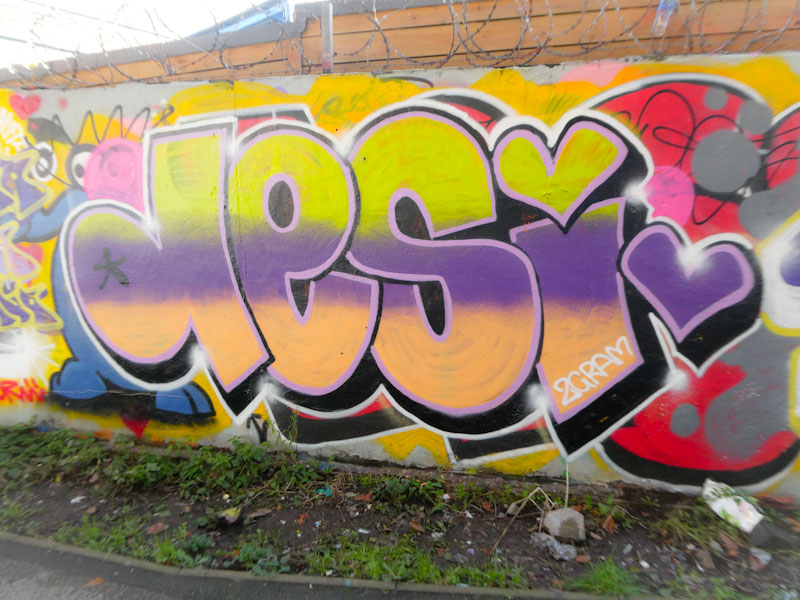
Although this looks like a quick one, the fills look a bit rushed, the borders and neat and the 3D drop shadow nicely done. Judging by the patchy fills, I wonder whether this was a bit of a ‘dregs’ piece, using up remnants of paint in used cans. Always great to see Desi’s work.
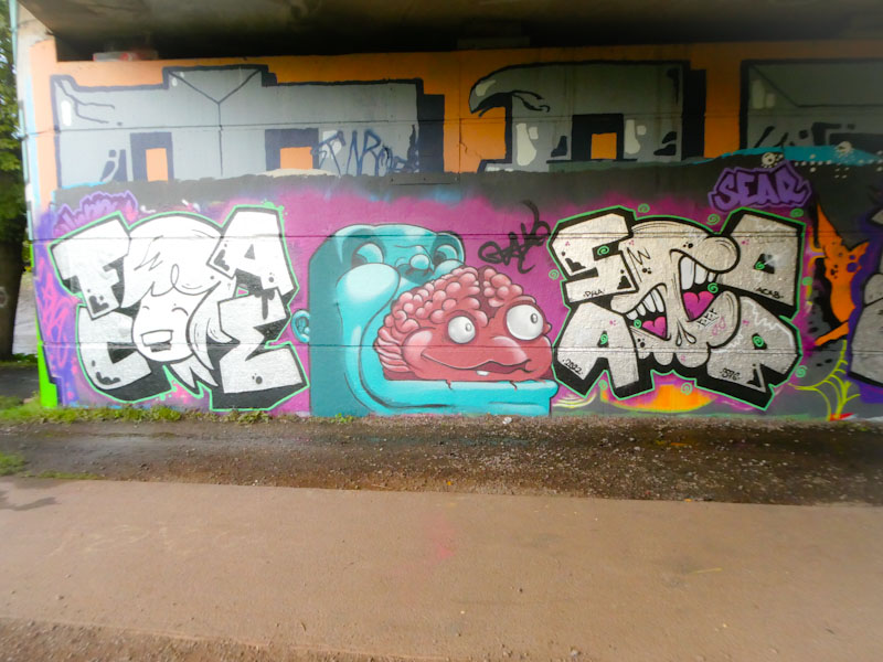
One of the great pleasures in life is coming across a PWA collaboration, and this little beauty painted under Brunel Way recently was a real treat. It is a well-balanced triptych, with Face 1st on the left, Zake in the middle and Soap on the right. It is an interesting observation that most of the time when Face 1st and Soap get together, they nearly always paint this way round – it must simply feel comfortable that way.
Face 1st’s piece in chrome is a nice simple girl’s face with the letters FACE neatly spaced around the edge, with a deep black 3D drop shadow and neatly bounded with a thin green line. Basic stuff done really well.
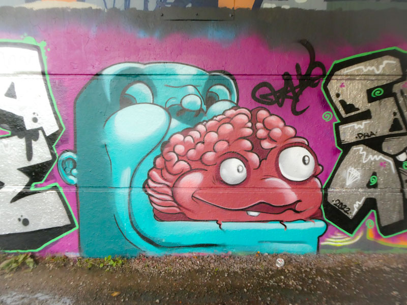
The middle section, or ‘filling of the sandwich’, is this unusual portrait piece by Zake. I am not too sure what is going on here, but it looks like the brain of the blue character is being expelled through his mouth, and that the brain appears to have a character all of its own. Quite bizarre, but beautifully painted with all the fine shading attributes associated with Zake’s work.
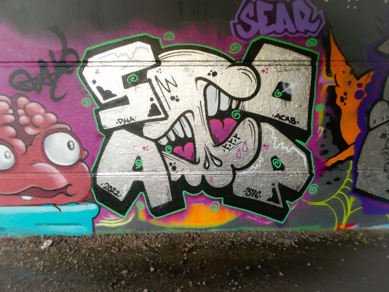
The symmetry is completed with another chrome piece, this one by Soap, to the right, reflecting the basic design of Face 1st’s on the other side. The central element is Soap’s characteristic mouth/skull ‘super tag’ with the letters SOAP encircling it. All in all, a wonderful piece from the PWA boys to brighten up our dull existence.


