
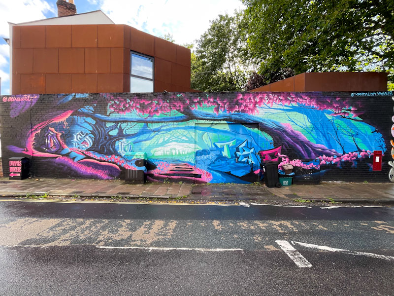
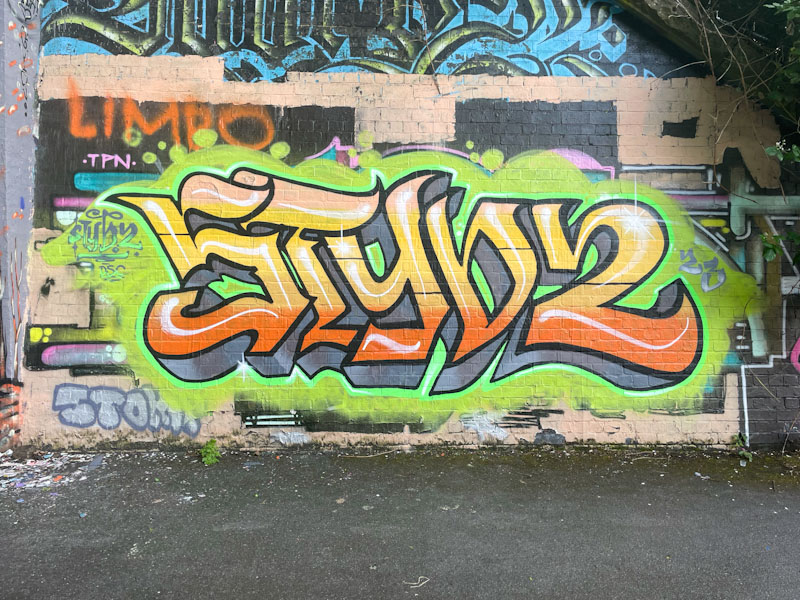
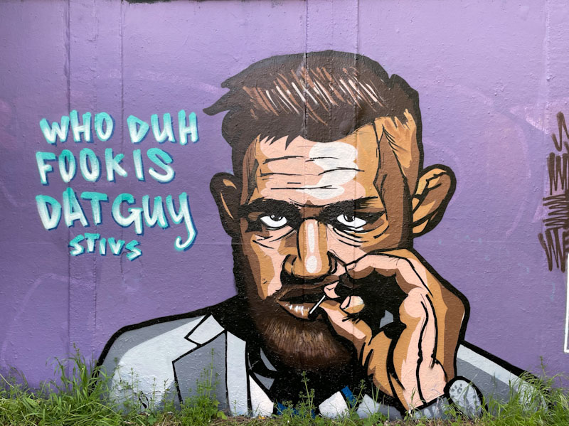
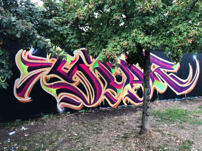
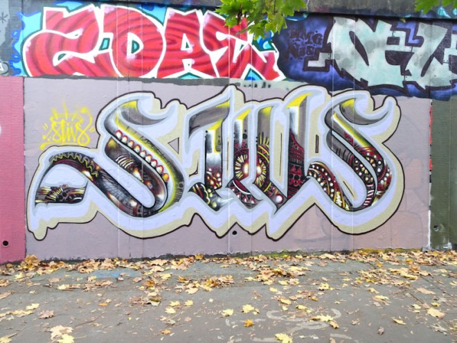
A gallery of great calligraffiti by Bristol artist Stivs.
Instagram: @stivsart
All photographs by Scooj


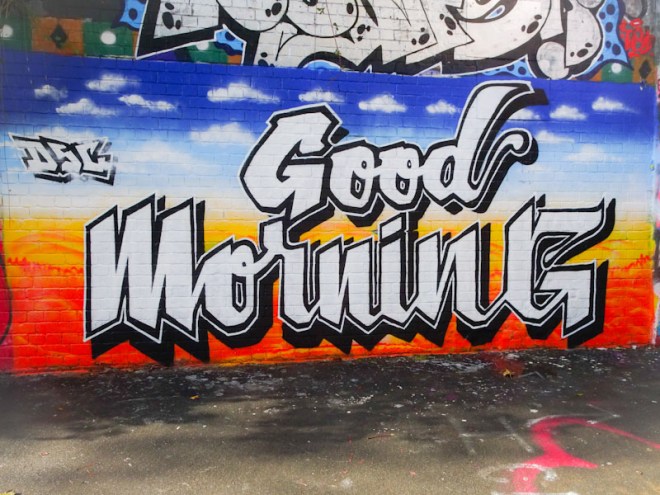


A gallery of great calligraffiti by Bristol artist Stivs.
Instagram: @stivsart
All photographs by Scooj
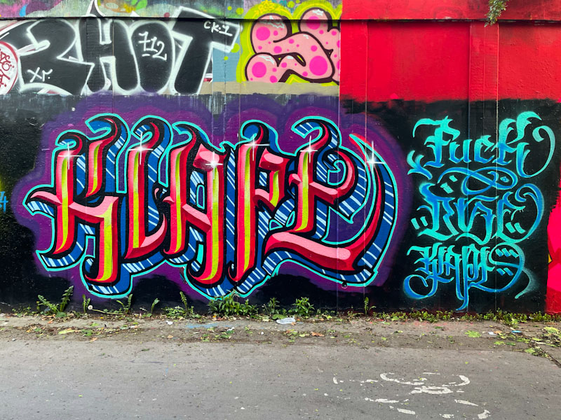
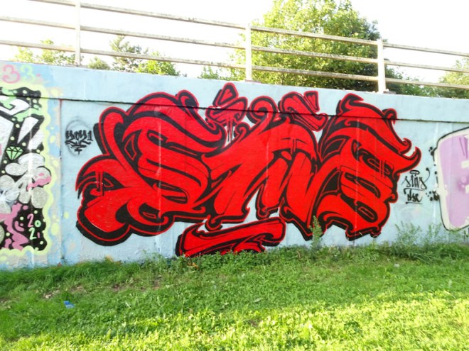
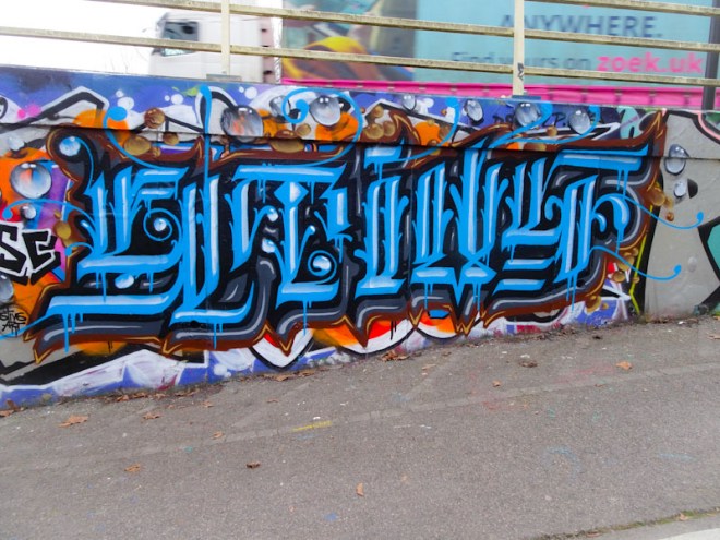
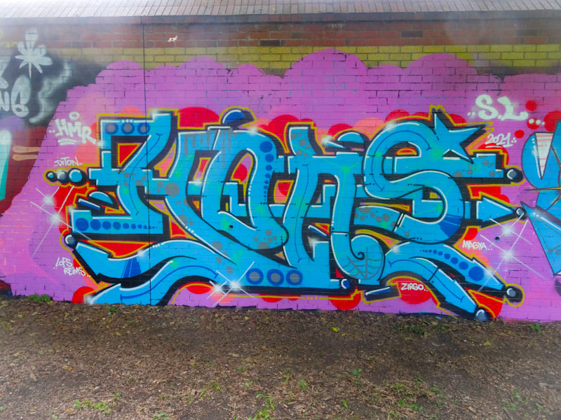
In this piece on the long wall under Brunel Way, we see Claro_que_sssnoh doing what Claro_que_ssnoh does so well – that is create distinctive interesting writing that creates a wonderful pattern of shape and colour.

His work usually spells out HONS and his combination of curvy and straight lines are decorated with lines, patterns and dots in equal measure. In this piece it is the colour palette that is most notable, brightening up this drab and dingy corner. Painted as part of an HMR paint jam, it was the pick of the bunch alongside Dabuten Tronko.
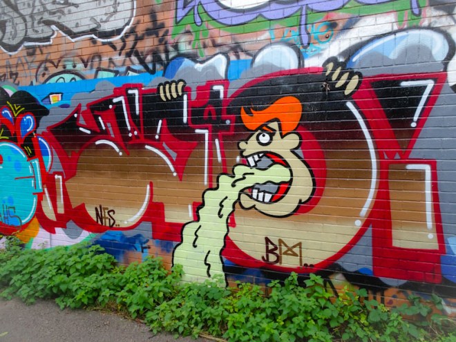
I posted a piece by Biers last week, that was actually painted after this one in Dean Lane, both representing a bit of a come back from this No Frills artist. Thanks to Paul H, I now know that Biers is writing WD40, it would have taken me a long time to work that out on my own.

This piece comes with a little bit of text saying: “I can’t wait to feel the weight of nothing on my shoulders” – a message that certainly chimes for me. The letters/character combination is tight as always, and the ‘0’ lends itself to all sorts of character opportunities which Biers has grabbed in this instance. It is so good to see his work appearing again.
To use urban slang, this piece is sick (metaphorically and literally) and is a long awaited resumption to spraying walls by Biers (who goes by several other names, but Biers is the one I use).
I find it hard to read exactly these letters, but I am confident that Paul H might be able to enlighten me. This is a tight piece; the letters are bold and clean, the fills nicely horizontally graded, the white accents neat and tidy and the character clean and simple. Overall this is the work of a talented and experienced graffiti writer and it is great to see him getting busy again.
Finding and photographing this wonderful collaboration between Haka and Logoe was a very special moment, because I met Haka for the first time, just as he was tidying up and photographing his work; and what a phenomenally nice bloke he is.
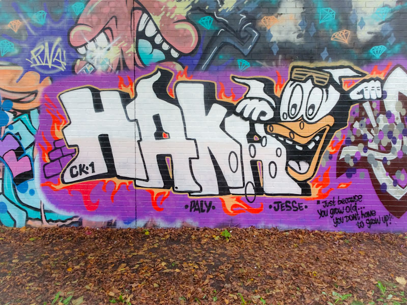
On the left is a fairly typical piece of block letter writing combined with a cheeky character. His somewhat chaotic style belies his talent as a graffiti artist of great merit. It is always great to see too his everlasting tributes to CK1.
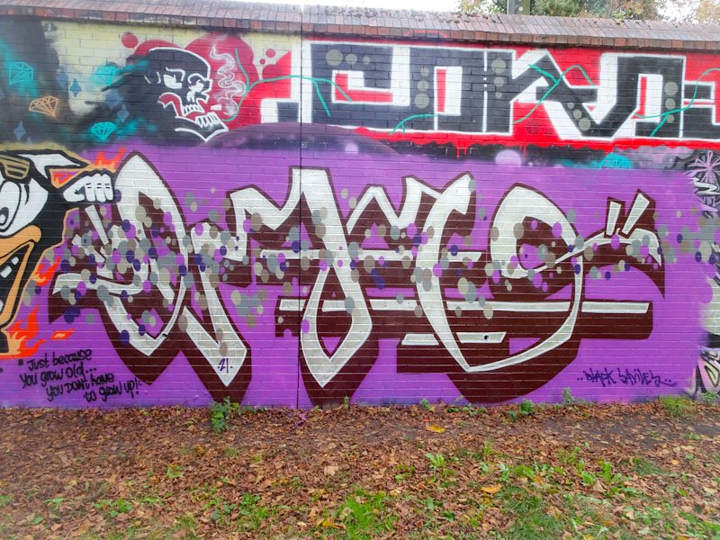
On the right is another Logoe piece from his recent prolific assault on Bristol’s walls. Haka was able to shed some light on this peak activity. I understand that Logoe lives in Pembrokeshire and only occasionally visits Bristol. When he does come he brings with him loads of sketches and ideas for pieces and paints like there is no tomorrow. This is, of course, great news for us. This script style piece decorated with shades of grey and purple carries the message “Just because you grow old… you don’t have to grow up”. Makes sense to me. More to come from this Logoe marathon.
Having only recently started to post pieces by Dopes, it was particularly gratifying to find this absolute beauty recently. Sprayed during a recent paint jam celebrating the opening of a relocated eatery, this piece really stood out, and ticks a lot of my boxes.
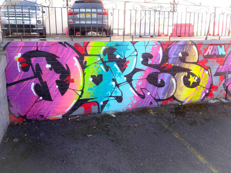
The multi-coloured, beautifully and skilfully patterned fills are truly exceptional, and the white spots and trims provide the depth and 3D look. Dopes’ letter shapes are all very nice too, particularly the elaborate D. This is a belter of a piece of graffiti writing from the RAW man.
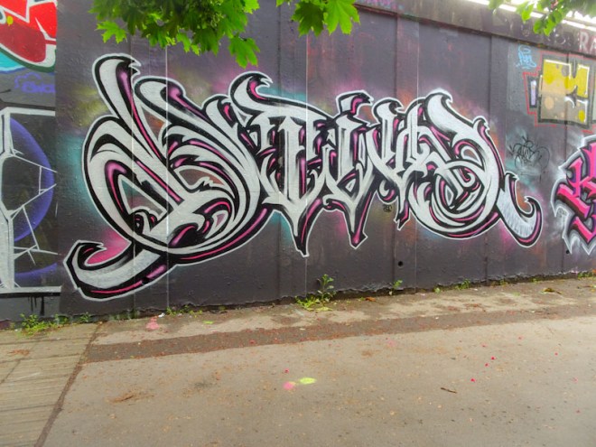
As with my previous post, this Subtle piece has languished in the ‘departure lounge’ of Natural Adventures since September. I had intended to publish it almost immediately, as I like to try and do with pieces that I really admire, but somehow it got leap-frogged and then fell down the list. I am very happy to have revived it.
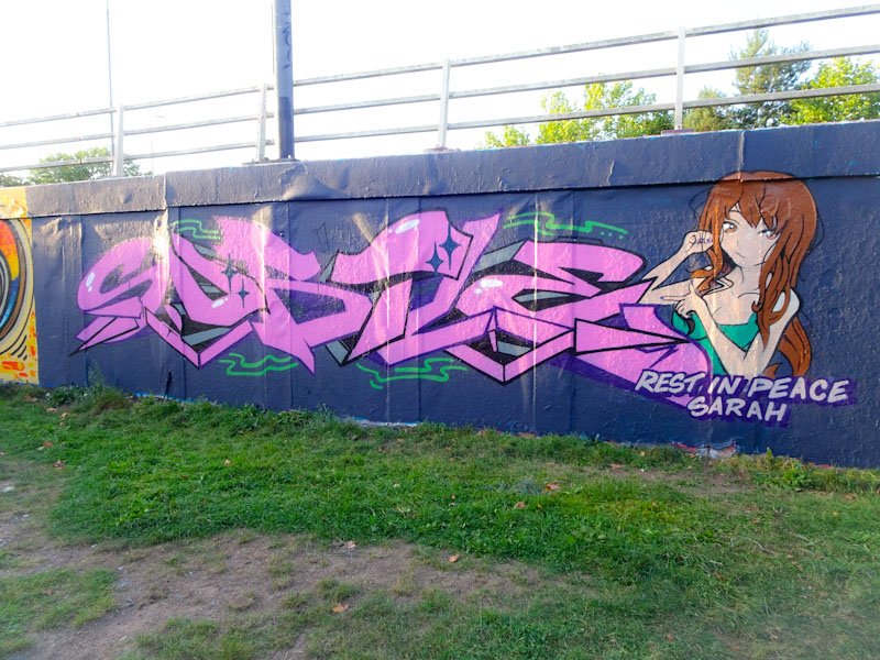
Subtle has not painted a huge amount this year, so finding this one was a real pleasure. This is a beautiful and touching tribute piece by Subtle for his cousin Sarah, who sadly passed away in September this year. It must have been difficult to paint, but probably means a lot to him, and to the family. It is a beautiful thing to do.

Although Subtle doesn’t often do characters, I think that this is very nicely done, and it is something he should consider doing more of – the ones I have seen I have liked, and they offset the writing really well. A very fine tribute piece.
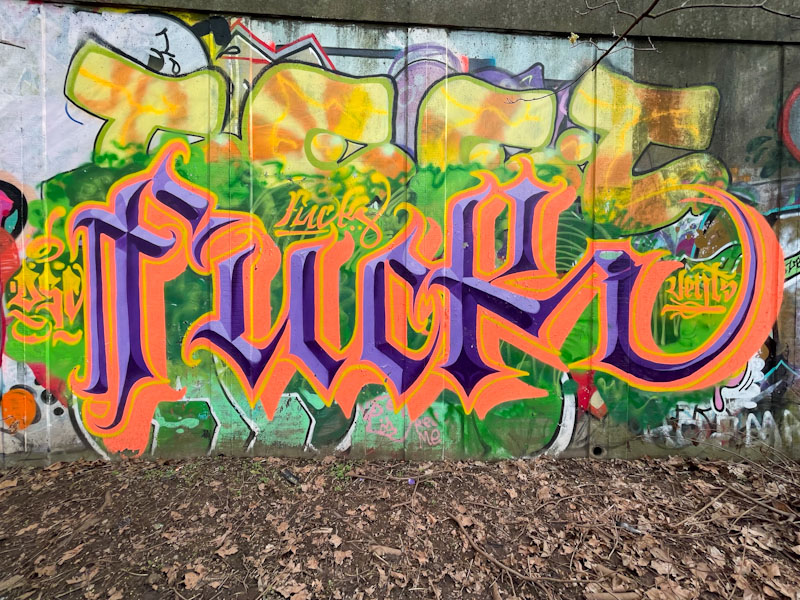
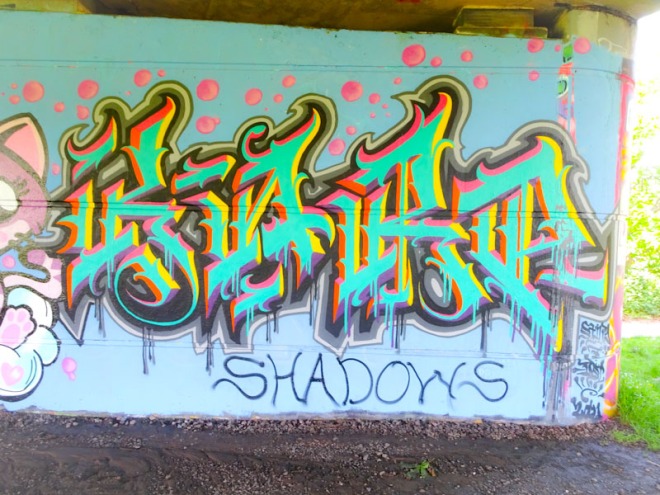
This lovely piece of graffiti writing from Claro_que_sssnoh has been sitting in my ‘departure lounge’ for months and months, it got left behind and dropped off my radar. In a recent clear up, I found it again, and have dusted it off for posting.
The colours work quite well, although I am not too sure about the pink and the red being comfortable bedfellows, something doesn’t quite feel right. The letters, spelling HONS, are in typical Claro style, that is long and thin, combining smooth curves with angular elements, and filled with lots of circles and other decorations. Glad to have hauled this out of the pending list.
The Bristol street art scene simply wouldn’t be what it is without the metronomic consistency of artists like Face 1st. These artists provide the foundations upon which all other artists build their works and reputations, but without this underground culture, street art would likely struggle in the city. Just look at those towns which have no culture of graffiti or street art and then host a festival, the legacy although stunning dies off and appears to be fake. Don’t get me wrong, I love seeing street art wherever it is, but people like Face 1st provide an authenticity that you simply can’t replicate through commissions alone.
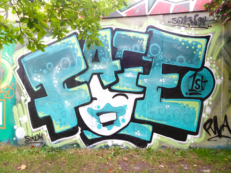
This is a revisiting of one of Face 1st’s favourite themes, a girl’s laughing face with a hairdo made out of the word FACE. Lovely colours, nicely painted and everything I would want it to be.
This lovely collaboration on the M32 roundabout took me a little while to unravel, although once unravelled it is blindingly obvious. To the left is a very ‘Haka’ Haka piece and the right hand side is a blended collaboration between Logoe and Sepr.

I probably haven’t posted nearly as many Haka pieces as I should have over the years, and might need to do a bit of digging in my archives to get a few more out there. This is a simple but joyful piece of writing from Haka with the ever-present shout out to CK1 RIP.
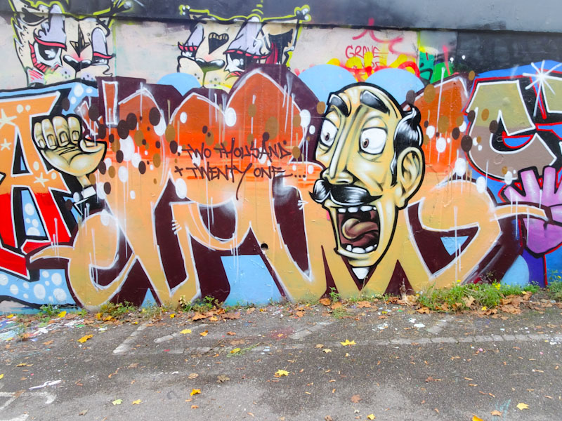
The Logoe/Sepr mash up is simply brilliant, and the second recent piece in a burst from Logoe who appears to have woken from a long slumber. The letters are by Logoe in his unique script style and the writing isn’t his usual message or lyric, but the year spelled out. The fills are beautifully done and colours reflective of the time of year. Sepr has contributed a face and hand into the mix and as a whole it works really well. This must have been a fun session.


