
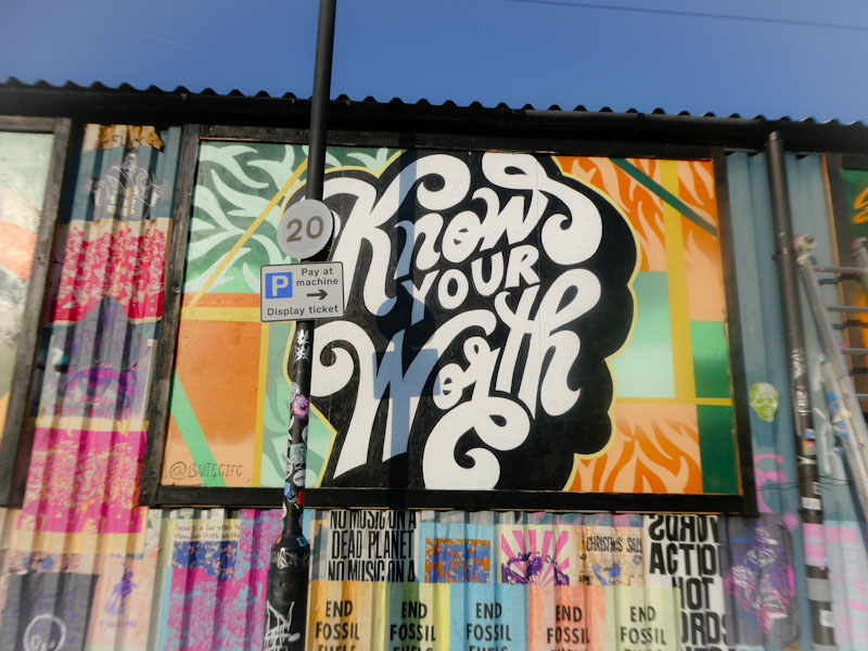
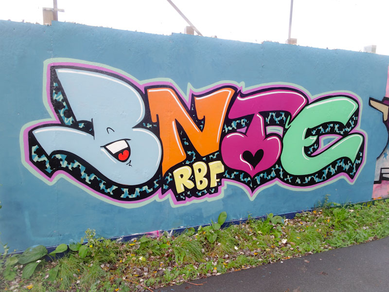
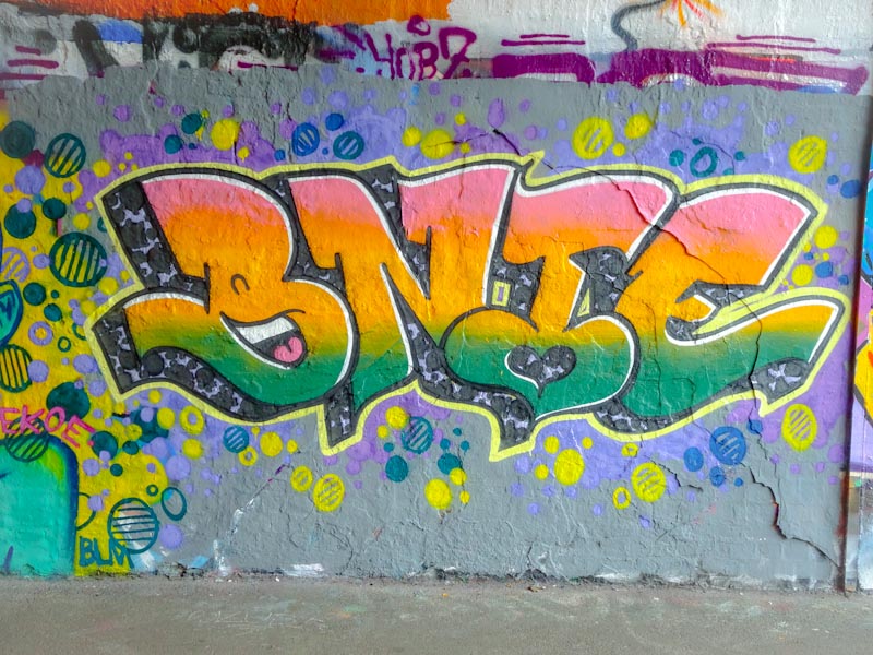
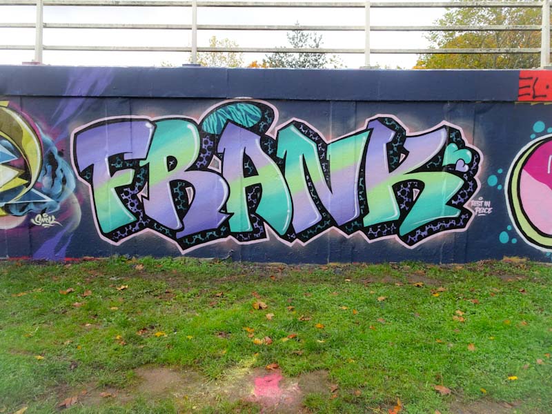
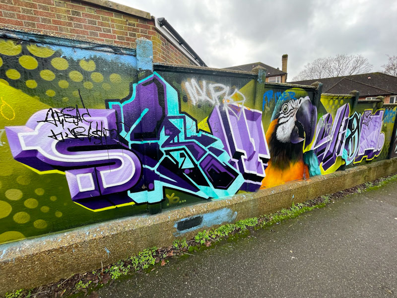
A gallery of fabulous graffiti writing from the amazing Bnie, RBF.
All photographs by Scooj
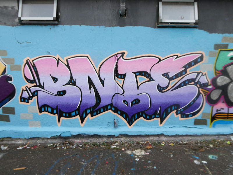
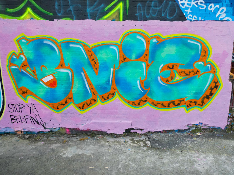


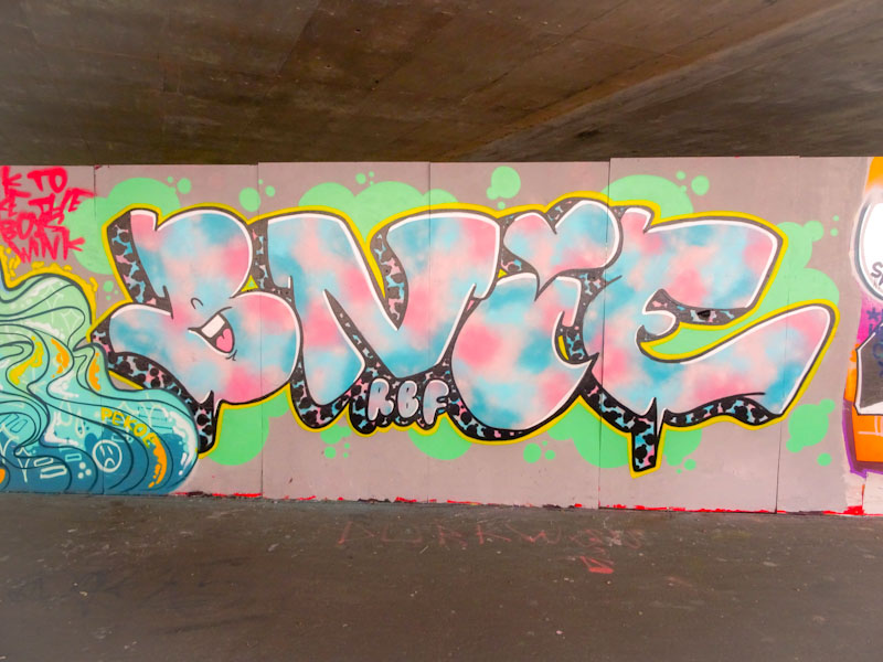


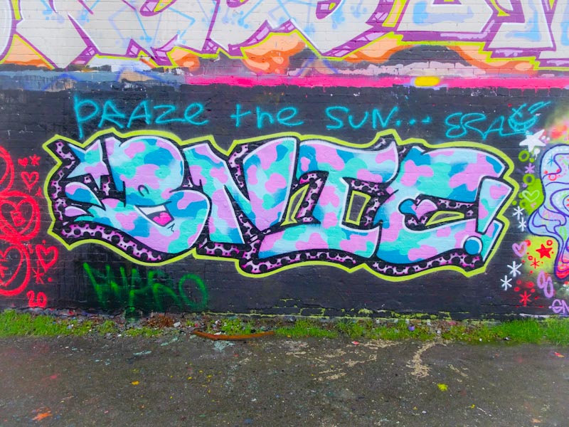

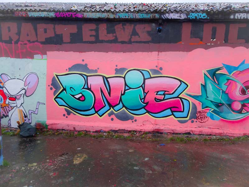

A gallery of fabulous graffiti writing from the amazing Bnie, RBF.
All photographs by Scooj
I was lucky enough to meet Mest when he was painting this piece, just a couple of days before the Italy v England Euro 21 cup final. Perhaps the less said about the result of that match, the better, although being an Italophile, losing to the Italians wasn’t so bad.
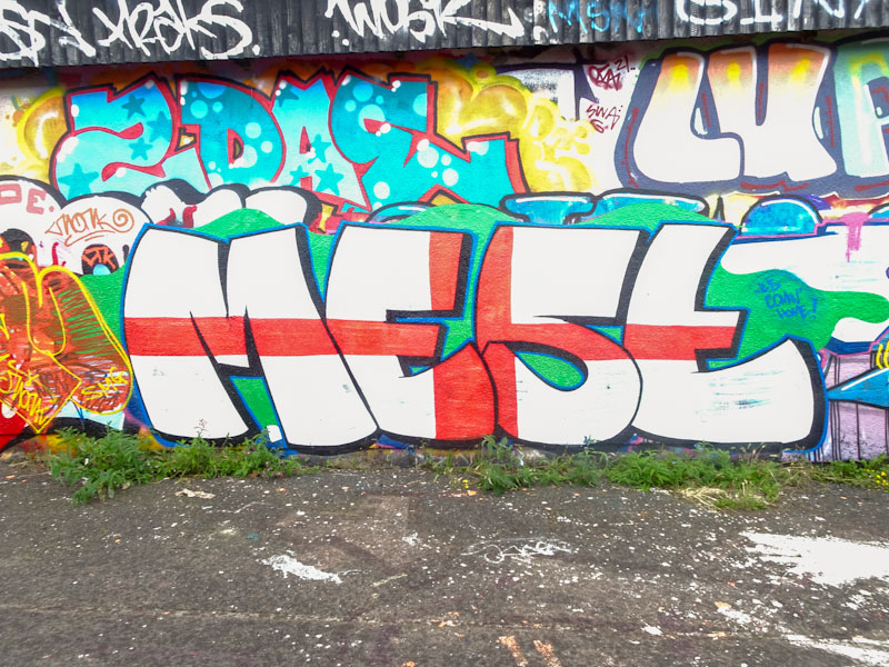
Mest wasn’t at all what I expected, but then I can’t think of a single artist who looked anything like I thought they might before I met them. His simple large letters in white are embellished with a large red cross through the middle to create a Mestivellian St George cross, The whole thing neatly bound with a black and blue border. A nice patriotic football piece. I must be getting close to having enough of his work for a gallery.
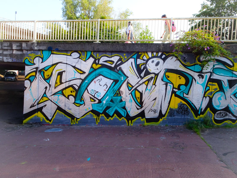
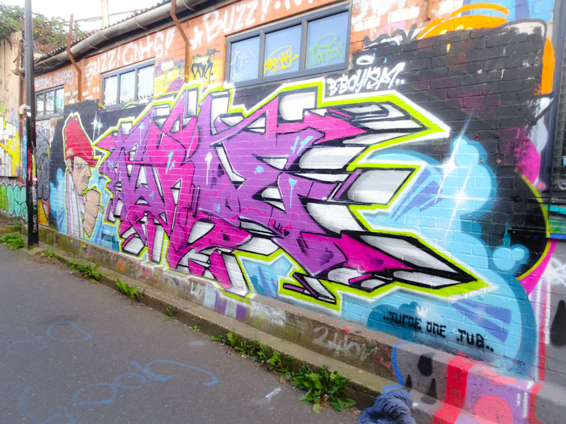
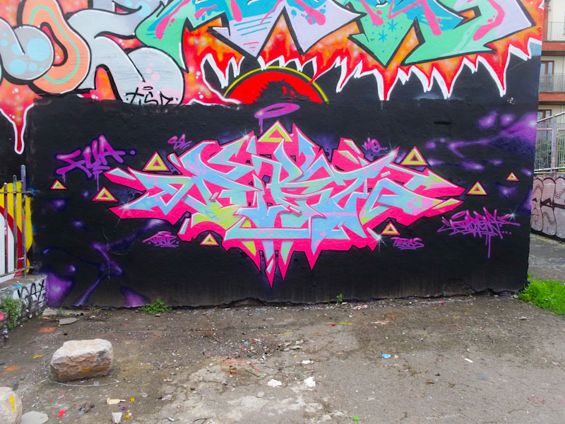
There is an interesting crossover with this piece from Soker in so much as it is an Upfest 75×75 piece from a Bristol graffiti writer who produces this kind of thing regularly all around the city to this high standard, without being ‘special’ event pieces. I’m not sure if I articulated that very well, but perhaps what I mean is that we are spoilt in Bristol with having so many outstanding writers like Soker.
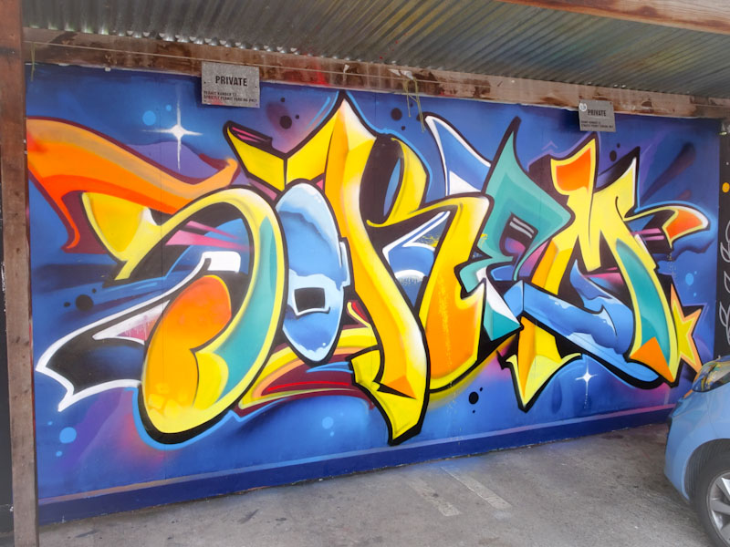
This is a lovely clean and colourful design from Soker, spelling SOKEM. There are two or three colour/fill themes going on through the letters and a central vanishing point for the 3D shading. This is what great graffiti writing looks like.
Not long ago, I said that Stivs was rather underrepresented on Natural Adventures. This post is a deliberate effort to address this imbalance, and there are more pieces in the pipeline. This piece was painted in Sparke Evans Park alongside Counterfits and Maesyhook.
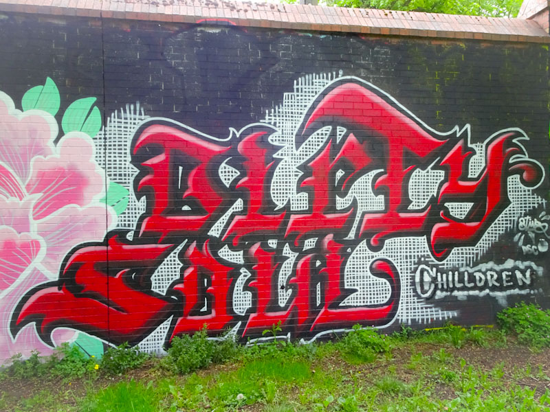
The beautiful calligraffiti spells out ‘Dirty Soul’ and is composed of large red letters with some nice pink shading on the upper surfaces and a black surround, set on a background of tiny white grid work, which must have taken a while to paint. A high quality piece of writing.
Never too far from my mind are the exploits of Soap and Face 1st, hardly surprising really considering that I see their work on such a regular basis. I must admit though that I was a little surprised to find this collaboration recently, because this isn’t a wall I would normally associate with the pair.
I would start by saying I don’t think that this is one of their best collaborative efforts, but I think that is mainly down to the colour selections which are a bit muted, they don’t really shout out from the wall. On the left are the letters SOAP from Soap with some nice little details like the sun and the little face in the O. There is a quality and an assuredness about Soap’s work that makes it quite easy on the eye.
To the right is a classic face from Face 1st. He certainly seems to be enjoying his ‘splats’ at the moment, and the girl’s face has a blue mess about her mouth. Surrounding the face are the letters FACE. It looks like the PWA boys had some fun painting this one.
This is a curious collaboration from painting pals CD.TC and Daz Cat. I don’t know why, but the whole thing doesn’t quite work for me. I love the work of both of these artists, so it is surprising to me when I see something that looks a little bit clunky.

The piece on the left is by CD.TC in which he combines his letters, in full caps, with one of his trademark monster faces breaking the letters up in thee middle. The monster is nicely done and the letter details and decorations well thought out.
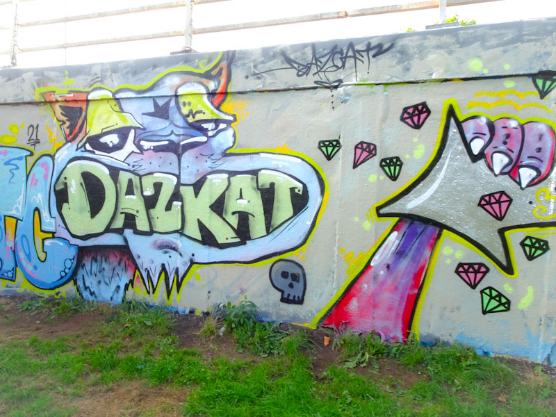
To the right is the Daz Cat contribution, and I think that this is where I have a bit of an issue. I don’t like the letters in the mouth, and I’m not too sure the paw clutching an arrow adds much to the piece. Also, the way that the two pieces join I feel is a bit average really. I can only put this down to Daz Cat having a bit of a bad hair day when he painted this, because it bucks the trend of some truly outstanding pieces he has painted recently.
There is nothing like a bit of old school graffiti work to remind us where all of this started. This is a lovely collaboration from Veks and Turoe on the M32 cycle path on a wall that has a pretty slow turnover, so I would expect it to be hanging around for quite a while.
On the left is a classic character by Veks, holding a cigarette in his clenched fist and wearing a variation on a flat cap. This is a classy character piece and amply demonstrates Veks’ experience and skill.
The writing is by Turoe and is finished off with nice deep 3D work on the letters. Both elements are nicely bordered with a lime green and white line, cleanly applied. I managed to get these pictures on about my fourth visit – this particular wall usually has a shadow cast across it during the day, which makes photography rather challenging.
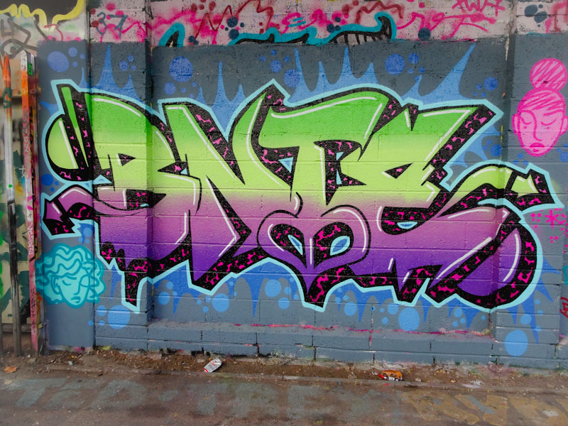
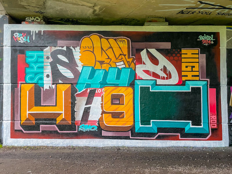
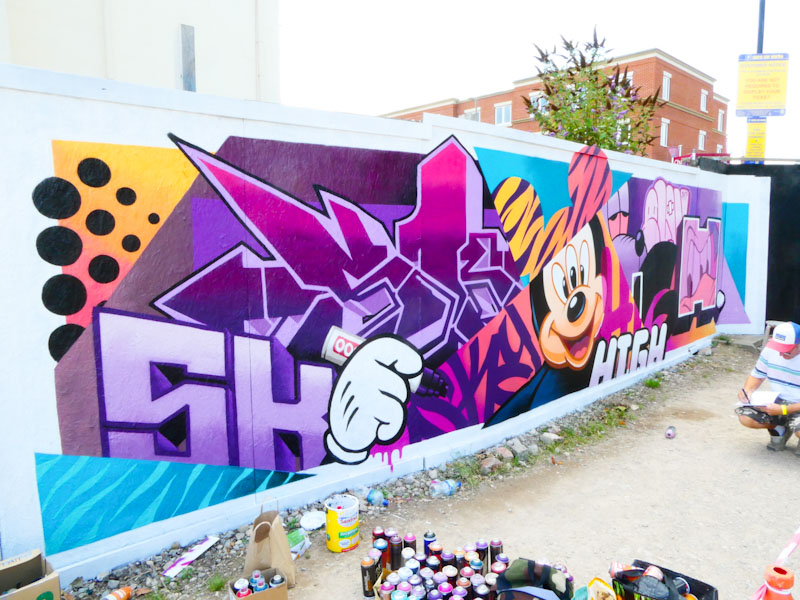
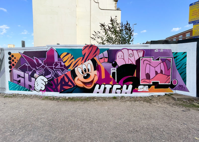
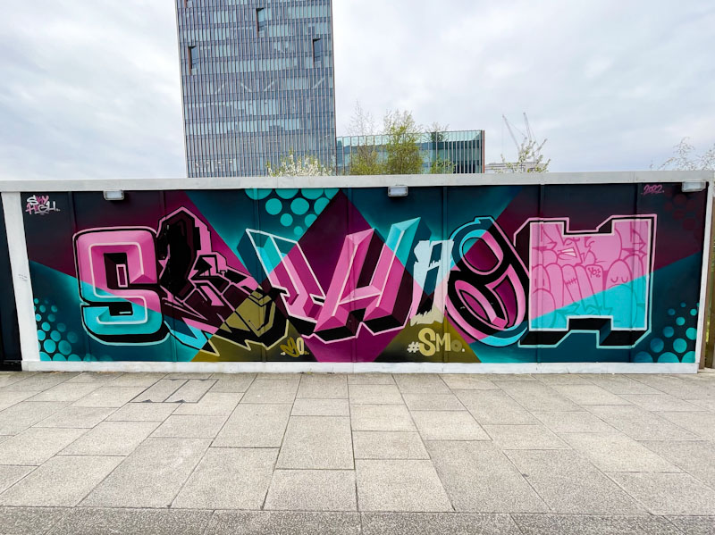
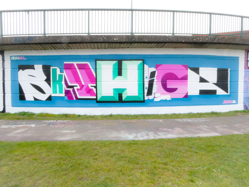
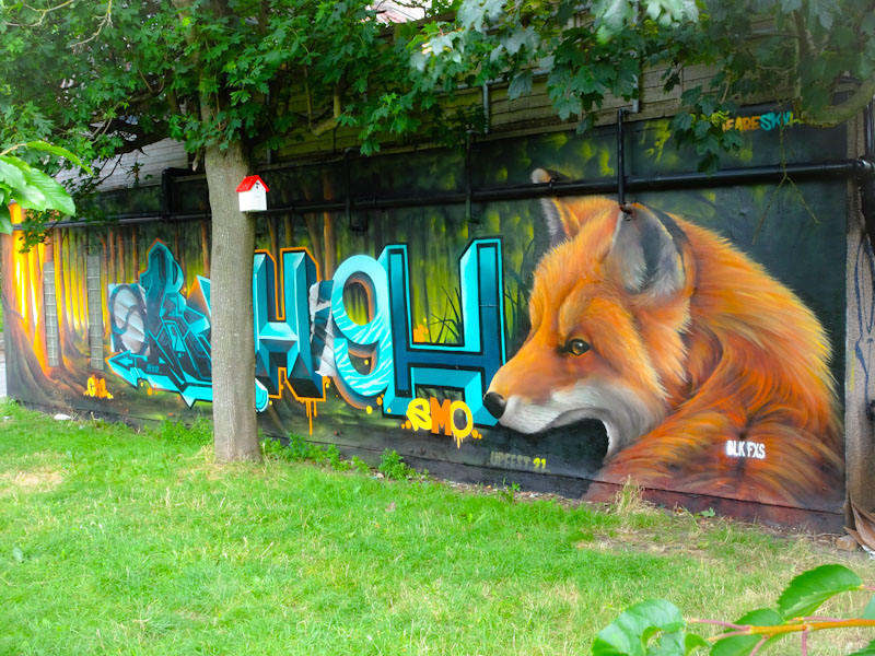
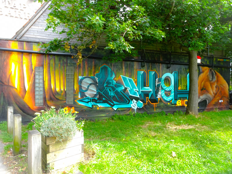
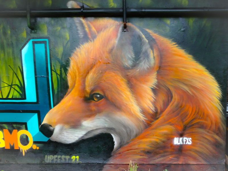
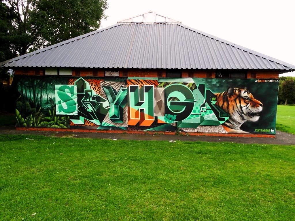
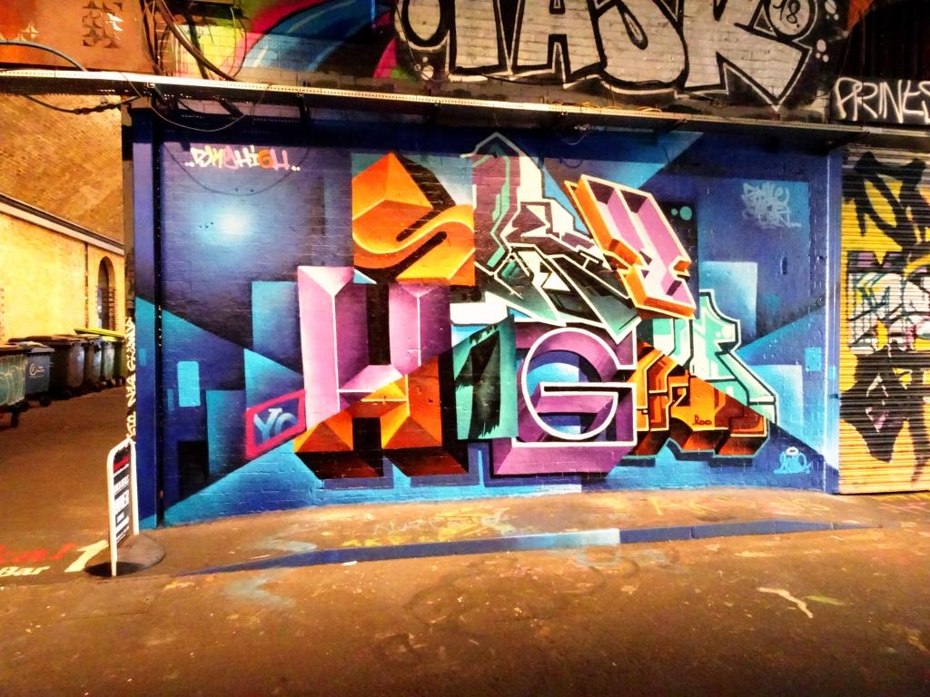
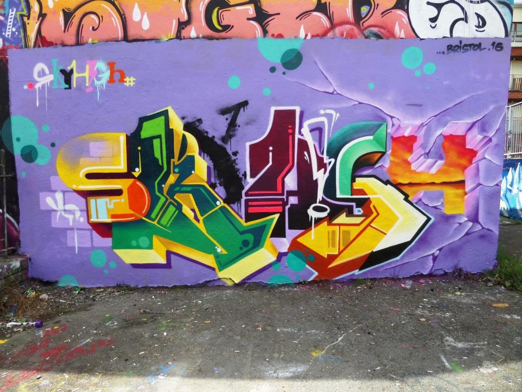
A gallery of outstanding graffiti writing and street art from SkyHigh
all photographs by Scooj


For the last year or so, there has been absolutely no stopping Dibz. I don’t know what happened (apart from the obvious pandemic impacts), but his occasional, sometimes rare, appearances turned into something approaching weekly. Of course this is simply great news for those of us who like his work.
There are several key hints that help to identify Dibz’ work and this piece illustrates them nicely. He usually preps his wall nicely so that everything is neat and tidy. The overall form of his writing is diamond shaped, starting and ending small with a fatter middle. His wildstyle letters usually spell out DIBZ but this can be tricky to make out sometimes. He usually adds depth to his letters with a well worked 3D shadow without a border.
So beautifully turned out, this piece is an archetypal Dibz work. Utterly brilliant.
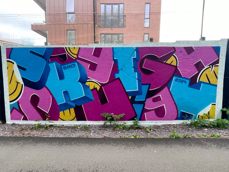
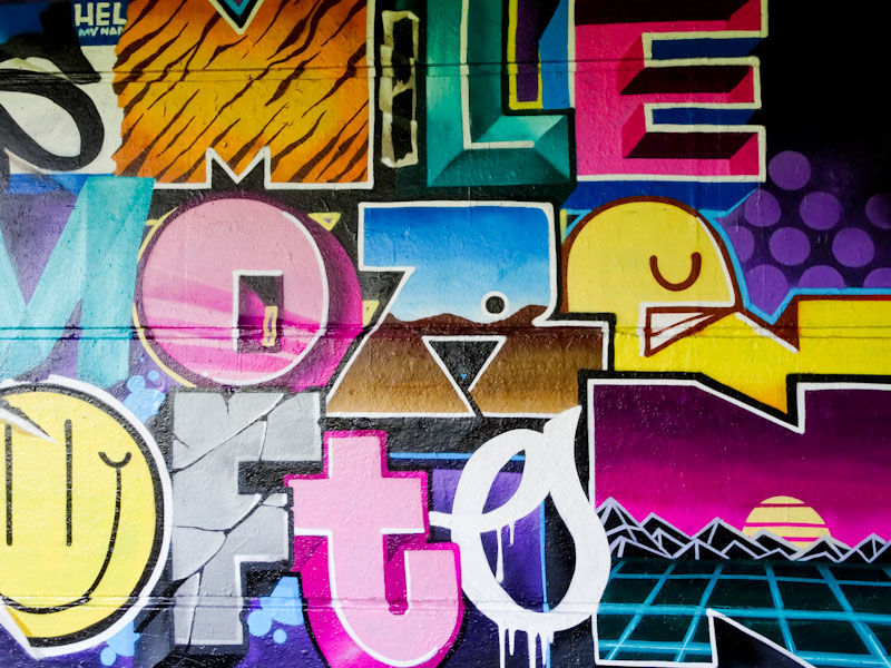
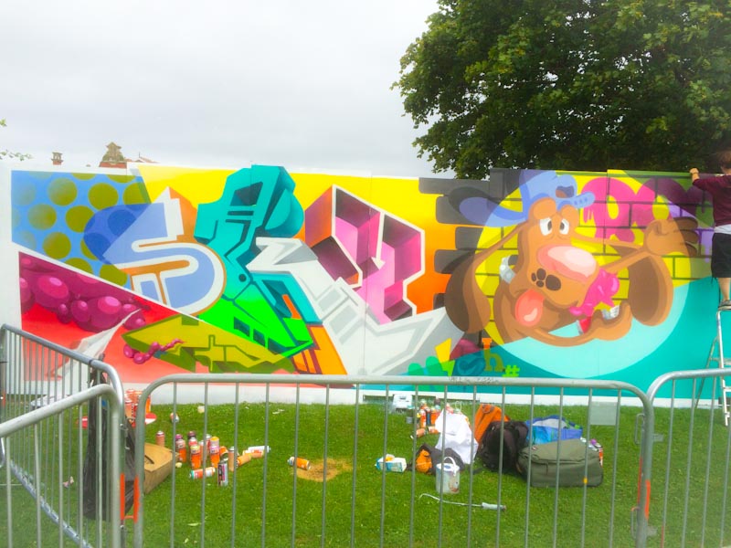
There are times when you get lucky, right? And I got so lucky with this early evening ‘dog walk’ in Bedminster and Dean Lane in particular, as SkyHigh was just finishing off this remarkable block graffiti writing piece, that he is so well known for.
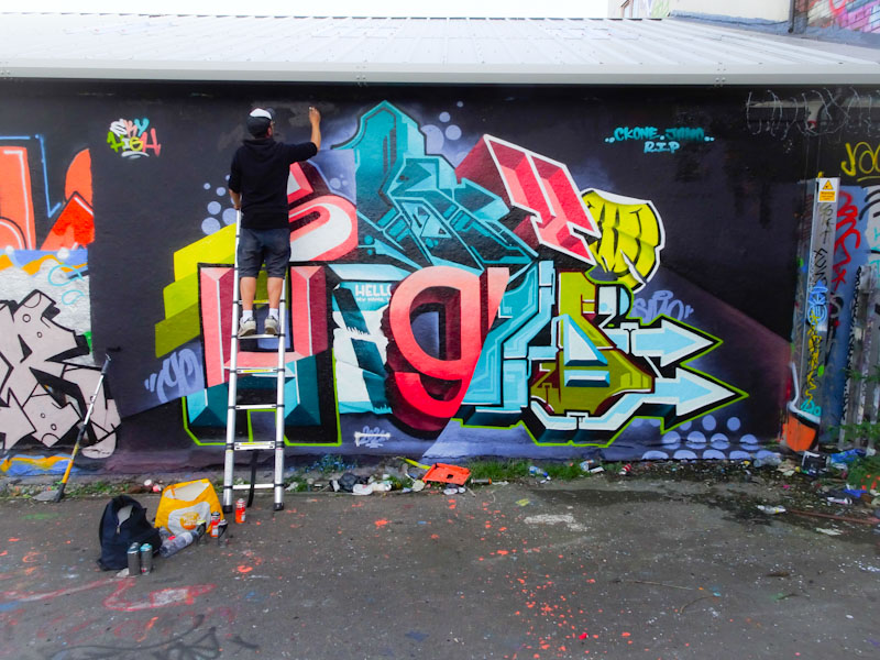
I don’t know what we in Bristol have done to deserve this, but this is the second visit by SkyHigh in as many months. We chatted for a while, as he tidied up the piece and it became blindingly obvious that I was in the presence of a perfectionist. Every small blemish was addressed and made good.
The block letters have become second nature for the artist and he makes what looks terribly complicated, simple… he paints with the confidence and ease of someone at the top of their game. I love the inclusion of the ‘Hello my name is’ sticker in the letter ‘I’, a common icon in street art. Another stunner from the London artist.


