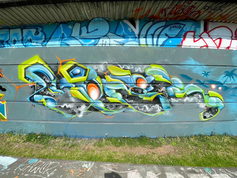
More colourful fireworks from Hypo. This piece reverts to his symmetrical style of lettering, where the ‘H’ and ‘O’ are broadly similar in shape and the ‘Y’ and ‘P’ generally reflect one another. This is a design that Hypo has played with for years and tends to work really well.
Hypo, M32 roundabout, Bristol, July 2024
It is the fills though that grab the attention in this piece, with several horizontal layers of colour, I can count at least four, each of which is decorated with well-placed spots. There is a lot of energy piece, which is provided by the depth created and the sparkles at strategic points on the letters. Another great piece of graffiti writing for the collection.
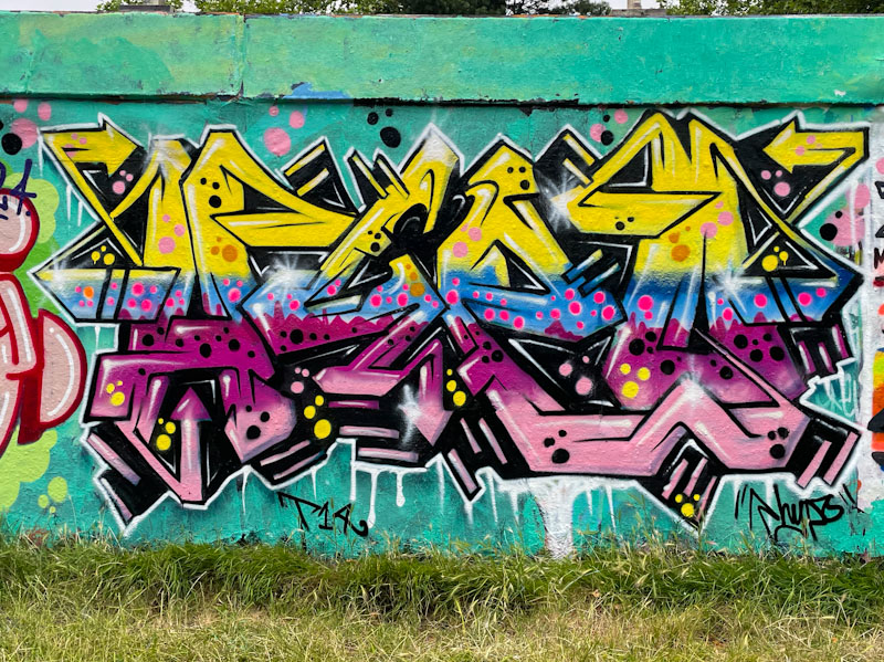
Dibz, Jody and Fade, Brunel Way, Bristol, July 2024
If ever you want an example of the perfect triptych graffiti writing/character portrait piece then look no further than this magnificent piece by Dibz, Jody and Fade underneath Brunel Way bridge. As always, these three have smashed it, and I just don’t know how many more ceilings they can break with their work.
Dibz, Brunel Way, Bristol, July 2024Fade, Brunel Way, Bristol, July 2024
To the left, Dibz’ writing in black and pink is reflected on the right-hand side by Fade, where their writing is almost becoming indistinguishable except to the most experienced eyes. The key difference is that Fade’s letters tend to be ever so slightly softer than Dibz’. Both have created something special and finished it off with a splash of ‘liquid’ gold running behind the collaboration.
Jody, Brunel Way, Bristol, July 2024
Sitting pretty between the graffiti writing is this outstanding skull painted by Jody. One of the great benefits of Jody joining these writers over the last couple of years is that we get to see so much more of his work on the streets, which I dare say we wouldn’t see so much if he was painting alone. When I see Jody’s work, I am still baffled how he manages to get such extraordinary detail and texture using a spray can. A trio at the top of their game.
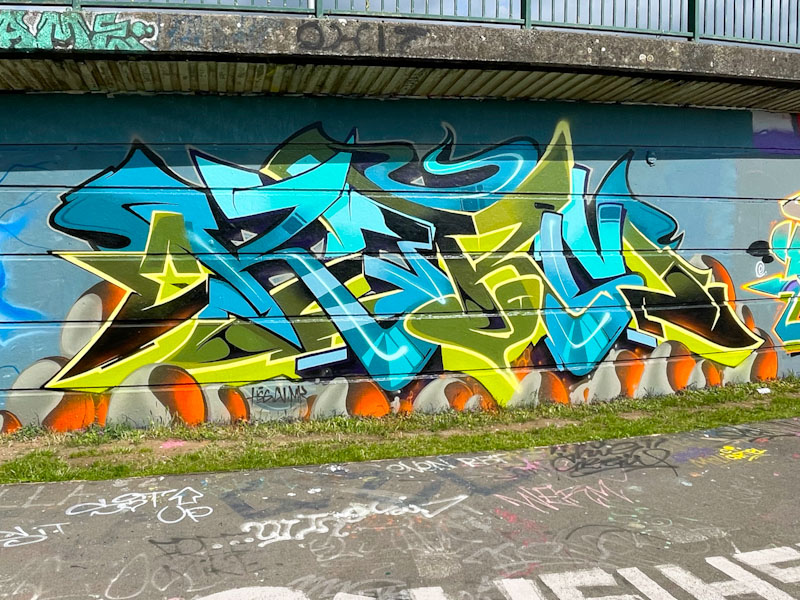
Following on from the previous post, this piece by Karmone was painted during the same paint jam. Karmone is an occasional visitor to Bristol, from his home in Wales, and through his connections with Bristol artists, is invited to paint jams from time to time. As I always say on Natural Adventures, it is a constant pleasure to be able to welcome visiting artists to share their talent on our walls, adding to the mix.
Karmone, Cumberland Basin, Bristol, July 2024
Karmone has, like the others, followed the convention of colours for the collaborative wall, and added a sprinkling of orange and grey to liven up the base of the piece with some interesting yin-yang spherical designs. His letters are exceptional, spelling out KARM, with tidy fills and mid lines. The arrangement of the letters and the 3D shadows cast give them a great deal of depth and dynamism. Some great work from Karmone.
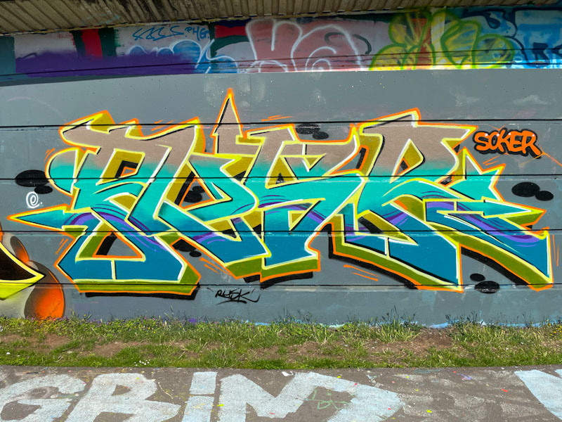
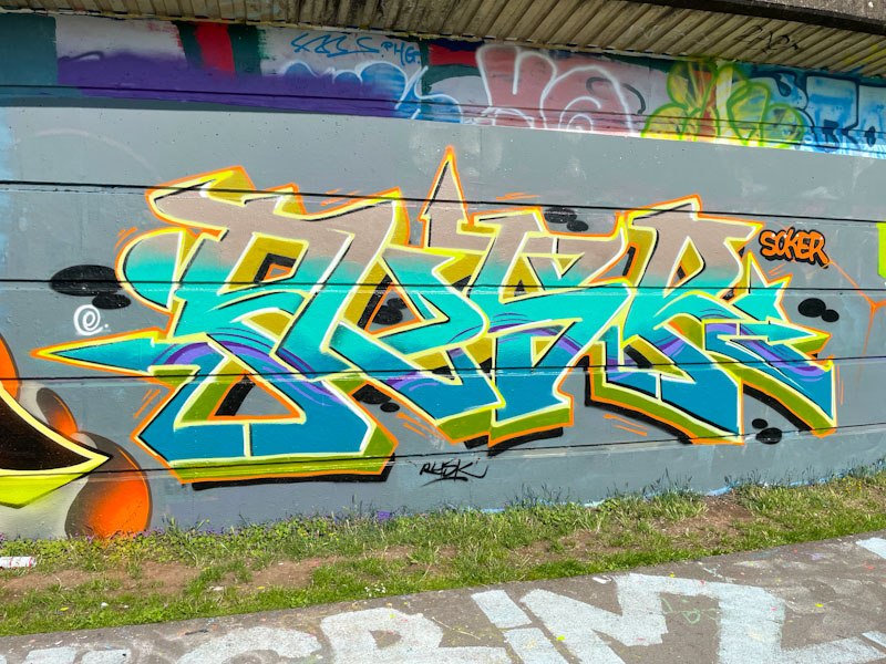
Rusk is an established graffiti writer in Bristol who tends to paint in fits and starts these days. He is currently going through a rather productive phase at the moment, which is great news indeed. This piece in Cumberland Basin was created during a paint jam organised by Smak and the Art of Sok, a couple of weeks back.
Rusk, Cumberland Basin, Bristol, July 2024
The general colours of the collaborative wall were light blues and yellows, and Rusk certainly stuck to the task with this tight piece. Rusk is known for his dedication and diligence and his work is always beautifully turned out. The highlight of this piece for me is the purple thread that runs horizontally through all of the letters. A fine example of on-point graffiti writing.
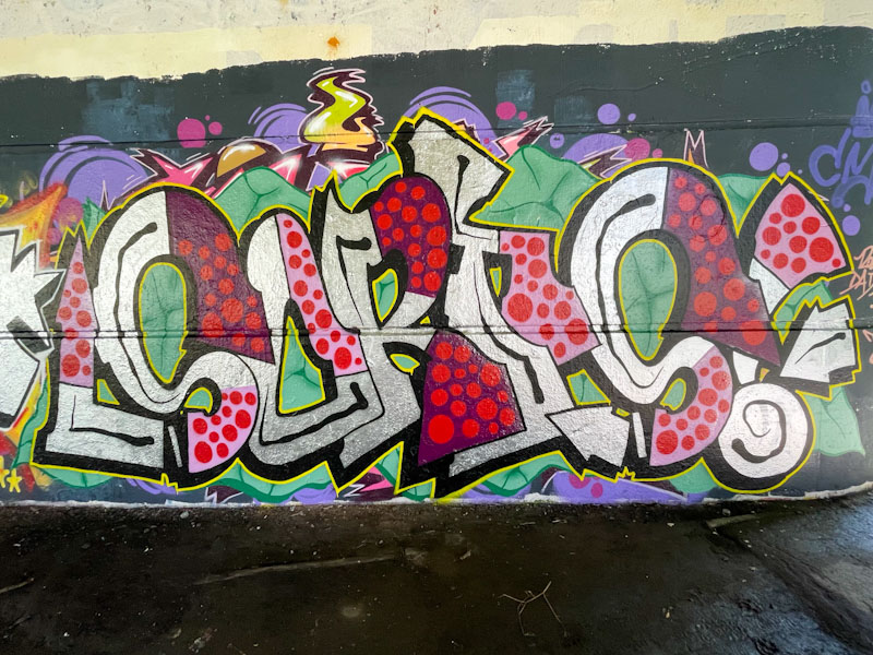
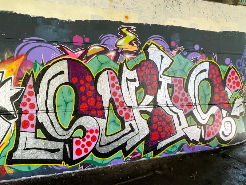
So, after a rush of high-end Upfest murals, I feel it is time for a switch back to some of the more grounded and authentic street pieces that are rolled out every day for those who choose to find them. This is a really nice piece of writing under Brunel Way, by Sorts.
Sorts, Brunel Way, Bristol, July 2024
Sorts presents some nice irregular letters, with a chrome base which are augmented with some really nice pink and purple fill sections decorated with red spots. The whole thing is nicely balanced and works really well. The letters are set on a creative green background with ‘cracks’ painted into it. Great honest stuff from Sorts.
I’ll let you into a small and rather unimportant secret… I wrote this post yesterday because today I am going to visit Cheltenham tomorrow for the Cheltenham Paint Festival, which this year has an extraordinary line up, so expect some rather nice posts in about 2-3 weeks time. I am so pleased for Dice67, AKA Andy Davies, who has been running the festival since its inception, which is just becoming bigger and bigger with each year.
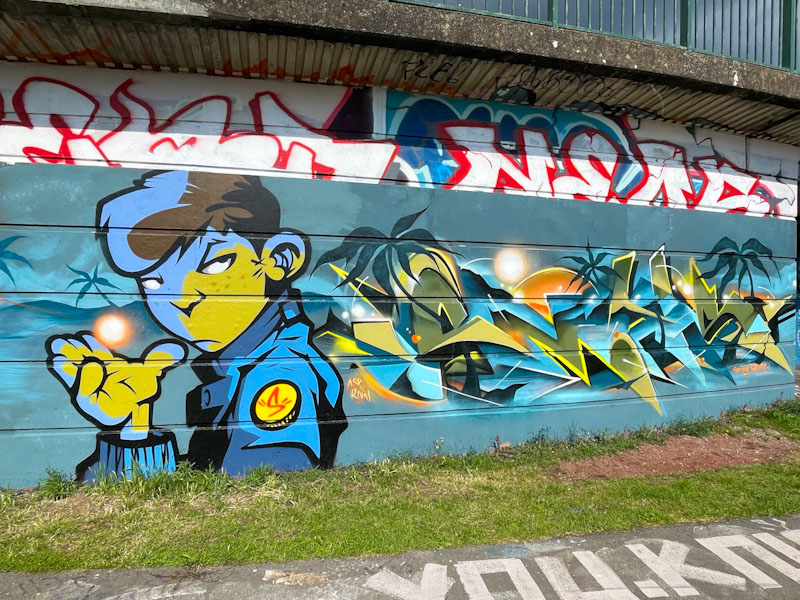
Zake, Dean Lane, Bristol, July 2024
This is a rather nice collaboration from PWA duo Zake and Face 1st in the narrow bit between a building and a skate ramp, hence the rather odd angle in the top photograph. Zake has painted a character yelling, painted with as much relief and texture as it is possible to get.
Face 1st, Dean Lane, Bristol, July 2024
Face 1st has painted his name in rather fetching reds and pinks with some interesting cross-hatching in the ‘c’ and in the hair of the laughing girl. I like the way that Face 1st has been experimenting with his writing a lot lately, although I miss his full body character pieces – I guess you can’t have it all!
This piece from Ments, painted as part of a wider paint jam, is a joy to behold. I am always going on about how we just don’t see enough of Ments’ work these days, and here is the second piece since May, the other being at Upfest. There is no doubt that Ments has pulled out all the stops with this one.
Ments, Cumberland Basin, Bristol, July 2024
His characteristic ‘organic’ writing is full of mystery and shapes and textures of planet earth, like chemistry mixed up with geometry and art – a delightful combination. From what we see, there is no way of knowing what the letters spell, but it is probably a good guess to imagine that it says MENTS. There is so much to admire in the intricate details and interactions between the forms and colours in the piece. Outstanding.
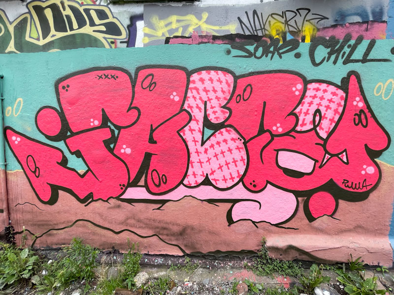
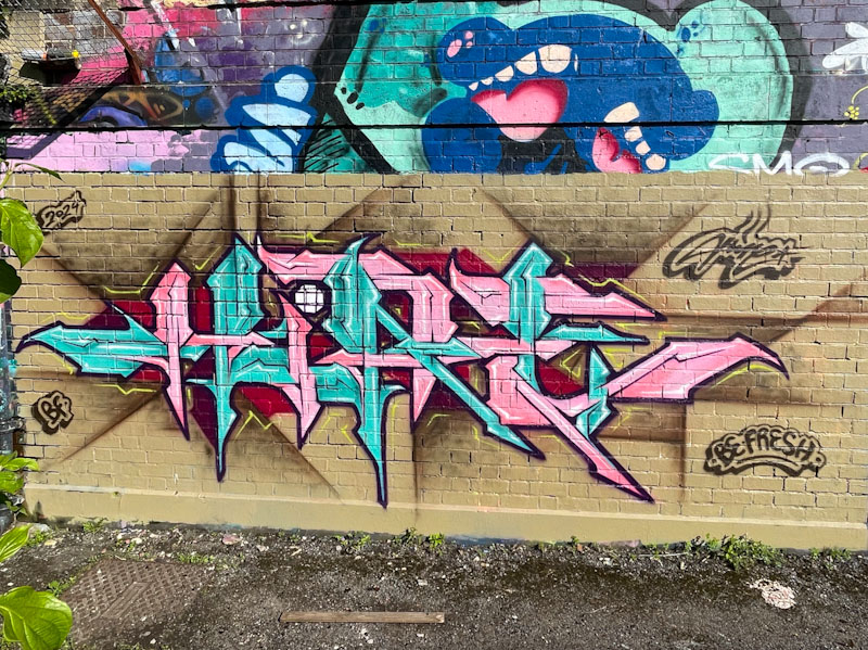
Recently I have managed to miss out on a couple of Hire pieces, because I have just been too slow, and for some reason, his work has been getting overpainted quite quickly lately. I think it is bad timing on his part more than anything more sinister than that. So I was particularly pleased to catch this one.
Hire, Dean Lane, Bristol, July 2024
I have been an enormous fan of Hire’s since the first pieces I saw, many years ago. He consistently turns out brilliant graffiti writing and occasional rabbits to such a high level of precision. In this piece he has used the willing combination of pink and blue to create his HIRE lettering, but what I particularly like here is the interaction between the letters and the brown background, which is impacted by, and augments the letter shapes. Very nice work from Hire.
The Art of Sok and Smak, Cumberland Basin, Bristol, July 2024
In the seventies I might have described this piece as ‘smashing’, and as a child of the seventies I am going to describe this outstanding collaboration between The Art of Sok and Smak as smashing. I was lucky enough to meet with and chat to both artists the night before they painted this wall as part of a larger jam, at Merny’s exhibition opening, which had a great turnout.
The Art of Sok and Smak, Cumberland Basin, Bristol, July 2024
The two artists have worked together perfectly to produce this character/writing combination. Smak’s writing is absolutely sensational and in addition to that, he has created a perfect tropical sunset backdrop with The Art of Sok’s character presented in the foreground – beautifully comnposed.
The Art of Sok, Cumberland Basin, Bristol, July 2024
During his short trip to Bristol, The Art of Sok, who it turns out is a lovely bloke, dropped a few pieces about the place which I will naturally post in due course. The cartoon-style character is pretty much perfect in its precision, which is how The Art of Sok rolls. He told me that he likes to get his finished pieces to resemble as closely as possible his draft, so it is all very much worked out in advance, and he has the skills to execute his plan to the letter. This is an excellent collaboration.
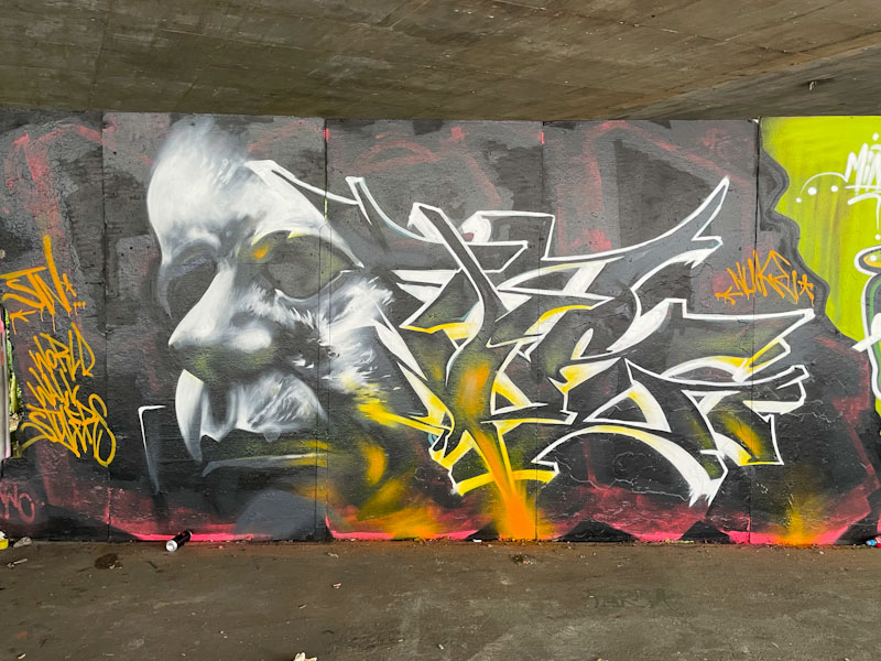
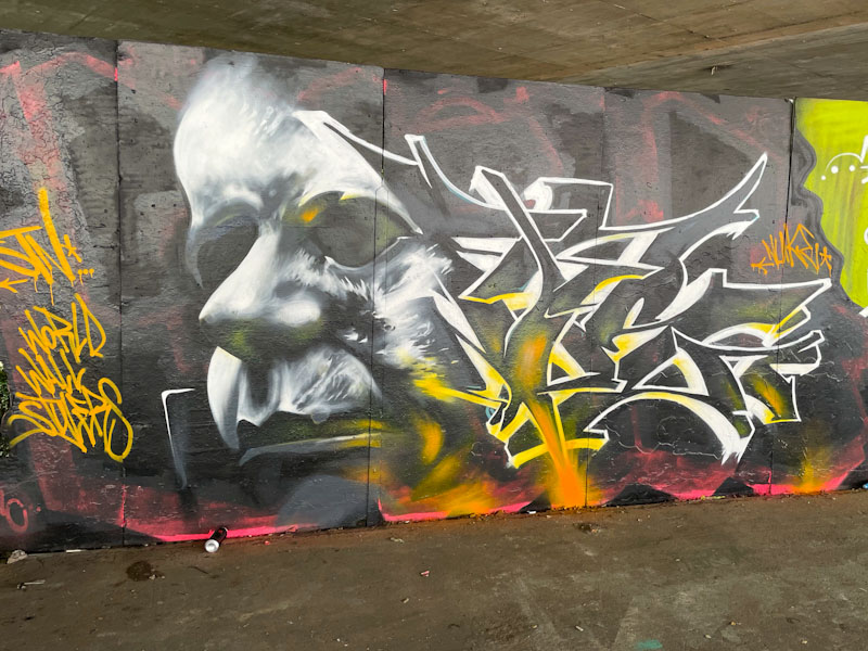
This is the second piece by Nuke to appear on Natural Adventures, although it was the first to be painted, in chronological order, of the two. I’m not too sure if the two pieces were a one (two)-off and left during a visit to the city, or whether we can expect more to follow. I suspect the former.
Nuke, M32 Spot, Bristol, July 2024
His work, even though I have only seen the two pieces, is instantly recognisable in the delivery of a character/writing combination that has a haunting and slightly dark vibe about it. There is a blending between the ghostly portrait and the wildstyle letters, that works really well, and the colours reflect upwards from the base, and the white light is projected from the top left. Very nicely done.