
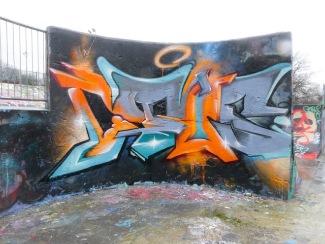
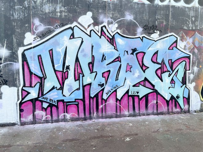
A gallery of wonderful graffiti writing in Bristol from Spanish artist Ceus.
Instagram: @javiceus
All photographs by Scooj


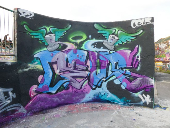


A gallery of wonderful graffiti writing in Bristol from Spanish artist Ceus.
Instagram: @javiceus
All photographs by Scooj
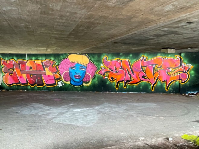
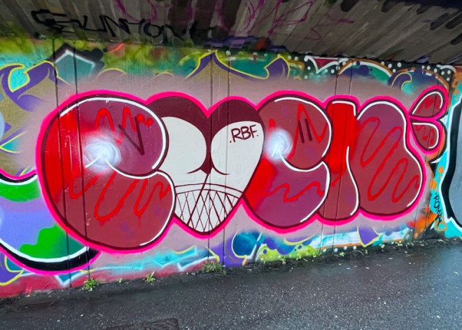
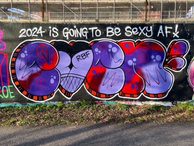
This is a pleasurable post to write because it involves one of my favourite walls with one of my favourite groups of artists. The RBF ladies have been a little quiet this month, but this collaboration from Evey, Pekoe and Bnie has laid that to rest pretty well.
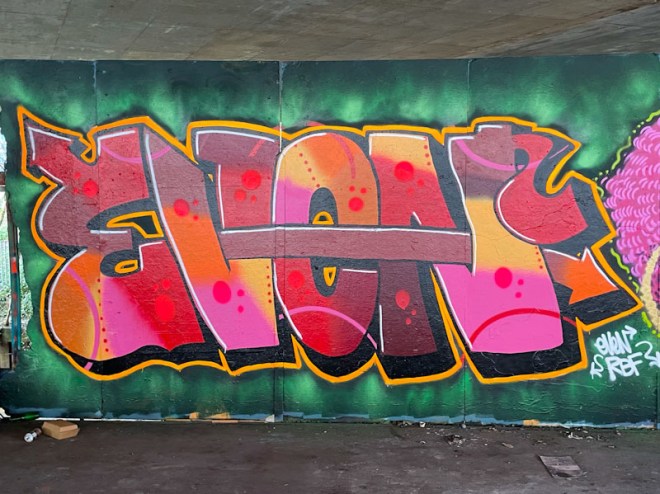
Evey continues to smash it each time she paints and her improvement from piece to piece is so gratifying to witness. The letters here are nicely designed and cleanly finished, with good fill transitions and well organised spotty details. She appears to be building her confidence with is an important part of improvement.
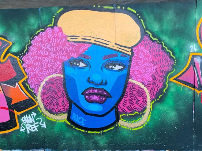
In the middle is another Pekoe portrait piece, full of fun and style. The subject has beautifully painted big hair and a rather smart yellow cap or beret. The blue face is rather RBF, if you know what I mean and the whole piece has an interesting dot – dash border. For me though, the hoop earrings steal the show, they are brilliant.
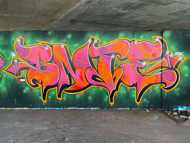
Finally, Bnie never ever disappoints with her beautiful letters. This is classy writing, with stunning fills, a wonderful drop shadow and yellow border complete with drips. The colour selection of pinks and oranges works really well against the green patterned background. It is good to note a small Palestinian flag under the ‘B’, should we forget what is happening in Gaza right now. A wonderful collaboration from this RBF trio.

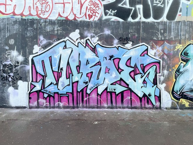
I am so far behind with my posts that since this piece by Dibz and Fade was painted, the left hand side has gone, and the right hand side augmented. The more these two work together, the more difficult it becomes to determine who has painted what, and I was lucky enough to meet them yesterday and Fade said that the both contribute to both bits of their work, and that it might be easier to attribute the pieces to both of them, rather than trying to isolate one artist from the other.

Having said all of that, on the left, the writing is the work of Fade, containing plenty of spots from the cheetah. Some great letter shapes and the crossover fade from orange to black is expertly handled.
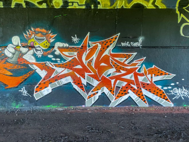
On the right the letters spell out Dibz, and the character, which I have only just realised as I write this, is the cheetah from the Cheetos snacks brand, hence the words “it’s not easy… being cheesy”. The cheetah and the writing have been incorporated into a full wall Alice in Wonderland piece from the pair, which I hope to be able to stitch together from several visits. There is no stopping this Dibz/Fade juggernaut.
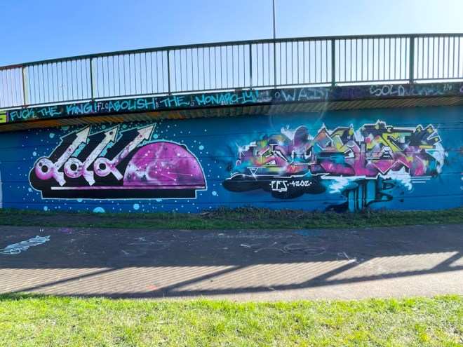
Marckinetic and Kid Krishna have been having a rather productive spring following what might be described as a reasonably lean winter. This collaborative pair of pieces, sharing a background and elements of a colour palette, is on the long wall at Cumberland Basin.

To the left Marckinetic has written the letters FFS, which would be difficult to know if you didn’t already know, if you know what I mean. His trademark galactic space cloud kind of fill is incorporated in the letters and the semicircle, to great effect. He has also painted a very nice black shadow, in the same mode as often used by Acer One. This is a creative and, as ever, interesting piece.

Kid Krishna, who has recently changed his Instagram account to @name_dropin, has been smashing it of late, and here he is again with one of his CRIE pieces so full of colour and interest in a fairly abstract presentation. I particularly like the ‘canyon’ at the bottom of the piece. I have so many unpublished pieces by Kid Krishna in my archive, and I am trying to figure out how I can post them all. A very nice collaborative wall.

Collaborations from Fade and Dibz are becoming part of the furniture these days, and it would be easy to slip into complacency or to take their work for granted. What I have to remember is that we are very lucky in Bristol to have two artists of this calibre at the top of their game and painting on at least a weekly basis.

It is becoming increasingly difficult to determine who paints which bits of their collaborations these days, but my guess is that Dibz painted the letters FADE and Fade painted the character piece. It appears that the pair are on a bit of a Dragon Ball frenzy at the moment, as this is the second recent character from the cartoon series to appear in Dean Lane. This time it is the turn of Majin Buu.

The work of Dibz and Fade is pretty much always tight, and rarely, if ever, do they turn out anything that looks scruffy or rushed. This is what they do and they look like they are absolutely loving doing it. The benefactors of their labours are those that seek out and find their work.

What a wonderfully playful and cheeky piece by Evey alongside the M32. This is the second time I have seen her use this device of replacing the ‘V’ in EVEN with a saucy bottom, and I have to say I rather like it. If anything, I would say that the Bristol street art scene is quite earnest (and sometimes up its own backside), so it is great to see a bit of seaside postcard humour being injected from time to time.
The letters are nicely presented in what looks a bit like a neon display sign – one could almost imagine this piece hanging over the door of a seedy nightclub in a red-light district. It is refreshing and imaginative, and yet another great piece in a string of excellent work from thee prolific Evey.
We don’t get to see Turoe’s work all that often these days, so when a new piece does appear it is always worth celebrating. This beauty was painted with his friends Hemper and Hypo on the M32 roundabout at the beginning of the month.
Turoe has painted his letters in old school style, filled with subtle colours and patches, but it is the drop shadow that makes the piece. The very deep shadow extends to the floor in a soft pink with black borders, and is very nicely executed. Shadows like this are quite unusual, but very effective, and I am a little surprised we don’t see it more often. A nice reminder of the exceptional talent of Truro.
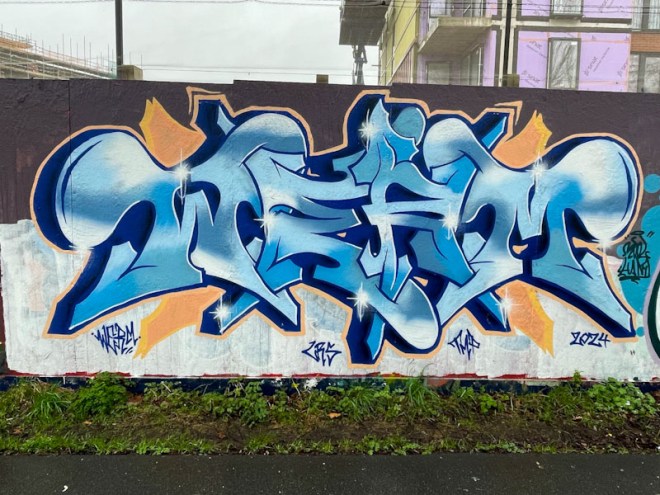
Over the last few months Werm has calmed his pieces a little, from the highly complex and technically brilliant pieces into something slightly easier on the eye, and this piece, for me, represents a mature approach from an artist who doesn’t need to impress any more, but rather, can concentrate on creating a thing of beauty.
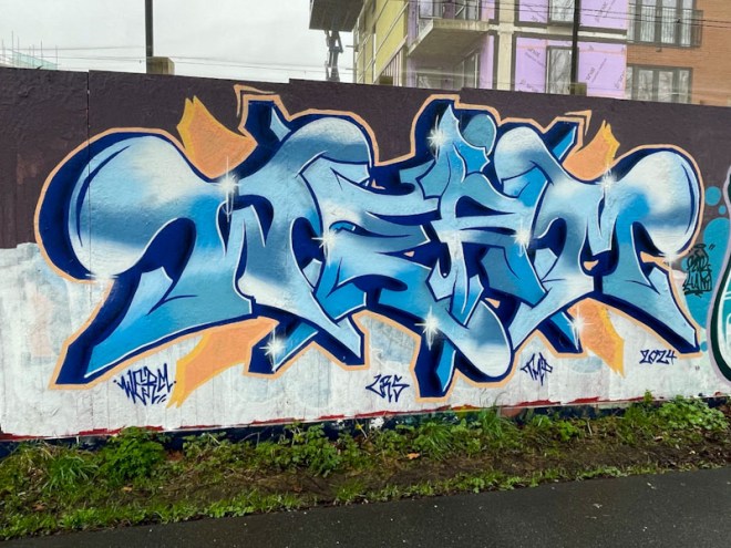
The colour palette for this piece seems to work really well, and Werm has blended the fill colours expertly. The orange border and accompaniments augment the writing perfectly, the test of which is to imagine the piece without that splash of colour, rendering it greatly diminished. I like and welcome this new direction from Werm, and greatly admire this piece.
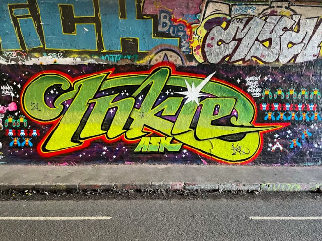
With this piece in St Werburghs tunnel, Inkie demonstrates his versatility, and shows that he can paint way outside his ‘house’ style that is so familiar to folk in Bristol. This piece was painted during the incredibly well attended February paint jam organised by Ryder.
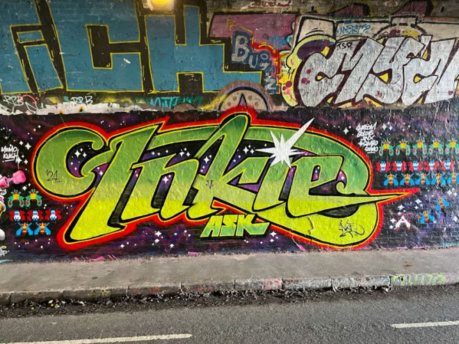
Inkie has painted something of a tribute to Galaxian, a computer game from 1979 that could be found in pretty much every pub or arcade in the early 1980s usually alongside Asteroids. The INKIE letters have been painted in the Galaxian brand style, and he has included rows of spaceships in formation. This is a wonderfully painted piece of ’80s nostalgia, which would have resonated with most of the other artists who participated in the paint jam.

The day I originally photographed this wonderful piece by Kid Crayon was very wet indeed, and although most days have been wet this winter/spring, that day was particularly wet. I mention this because, unfortunately, my original set of photographs were blurred with a spot of rain on the lens. Of course, by the time I returned to get more pictures, the piece had been tagged, so this post has a blurred untagged image and a crisp tagged one. It can be difficult to win at this game sometimes.

Kid Crayon has been out a couple of times recently, and it is great to see, I certainly miss his work during the long gaps of street inactivity. In recent years, his work mainly consists of a letters/character combination and with this piece he doesn’t disappoint. The letters are painted in modest colour tones, and the ‘seams’ ‘bolted’ together with ‘rivets’, a writing technique used by other artists in Bristol.
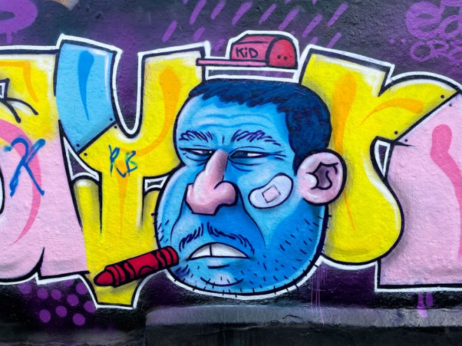
The character face is the star of the piece in my eyes an harks back to Kid Crayon’s early wheatpaste faces that got me curious about street art in Bristol in the first place, back in 2015. The trademark crayon is present, floating in front of the character’s face – who needs a signature and letters spelling out your name when you only have to include a floating crayon?

At the time of painting this wonderful piece, Kid Crayon left a little extra, as he often does, by painting the bin at the far corner of the skate park. Stylish stuff.


