Is it just me, or have WordPress been goofing around with default settings again? I hate it when they do this, because one has to spend time adjusting, or finding the formats that you are used to and comfortable with. Grrr. To offset this morning irritation, I bring you this lighthearted piece from Foksymoron.
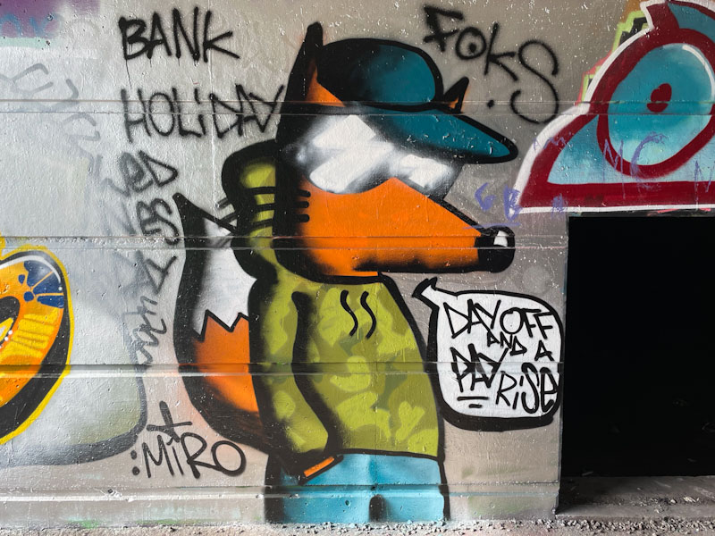
Foksymoron, Cumberland Basin, Bristol, March 2025
This humorous piece talks about Bank Holiday Wednesday – of course there is no such thing – Foksymoron adds to this with a speech bubble ‘Day off and a pay rise’. Well, someone was in a good mood when he painted this. The cool fox, with his customary sunglasses, is wearing a camouflage hoodie and jeans. A picture of contentment.
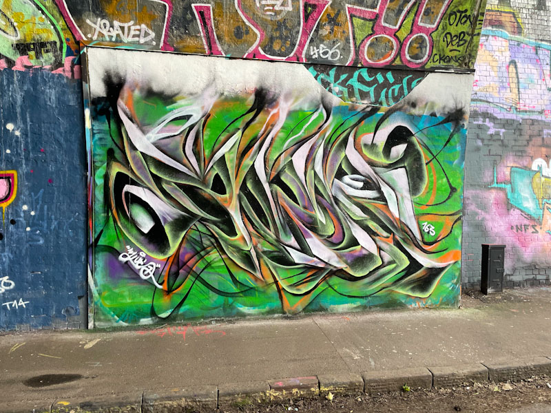
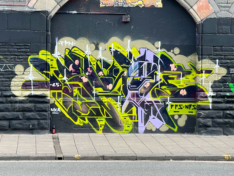
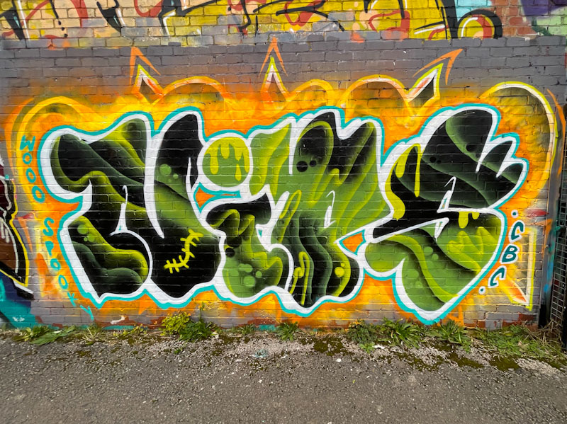
I would say that Mr Klue is the (undisputed) king of St Werburghs tunnel, on a measure of number of pieces painted there. It seems to be the place he enjoys painting most, and it is rare to not be able to find something of his at any one time.
Mr Klue, St Werburghs, Bristol, March 2025
This is a colourful one, as ever spelling out KLUE, which is notable perhaps for the way the wispy tops of the letters bleed into a cloudy mass, which might have been there from a previous piece. The central colours are green and orange, which often work well together, but there are also injections of purple and white. The use of these colours combines to create depth to the piece which is on the cusp of being anamorphic. We can be certain that there will be more to come.
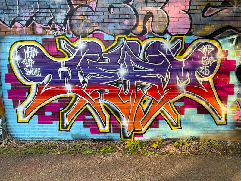
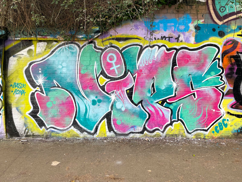
There is no question about it, Stivs is an extremely talented artist. Whether it is his extraordinarily tight calligraffiti, his cartoon characters or his portrait pieces, his natural ability shines through in all of his work. Recently he painted this stunning portrait piece in Dean Lane, bringing enjoyment to many.
Stivs, Dean Lane, Bristol, March 2025
I don’t know whether it is easier or more difficult to paint portrait pieces in single tones or in full colour, but either way, I am in awe of anyone who carries it off. This is a beautiful cartoon portrait piece, that feels like it has a Japanese film influence, but I am only guessing. The different tones and shades in the face create wonderful depth, and the subtle streaks in the hair hint at the shape and style of it. An outstanding and quite unexpected piece.
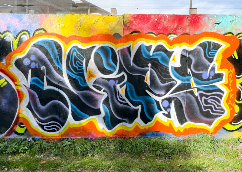
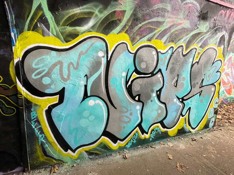
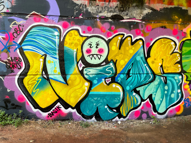
Werm is becoming one of those consistent, drumbeat graffiti writers whose work is always there and reminds us what the Bristol street/graffiti art scene is all about. His current style takes us through his playing with symmetry of the letters WERM, forever striving for perfection.
Werm, River Avon, Bristol, March 2025
In addition to his beautifully presented letters, Werm has set the piece on a pattern of pixelated cubes, adding just enough interest to lift the piece. Unfortunately, the afternoon sun has crept into the right-hand half of these pictures, but that is a daily hazard when photographing street art… and bins, and parked cars etc.
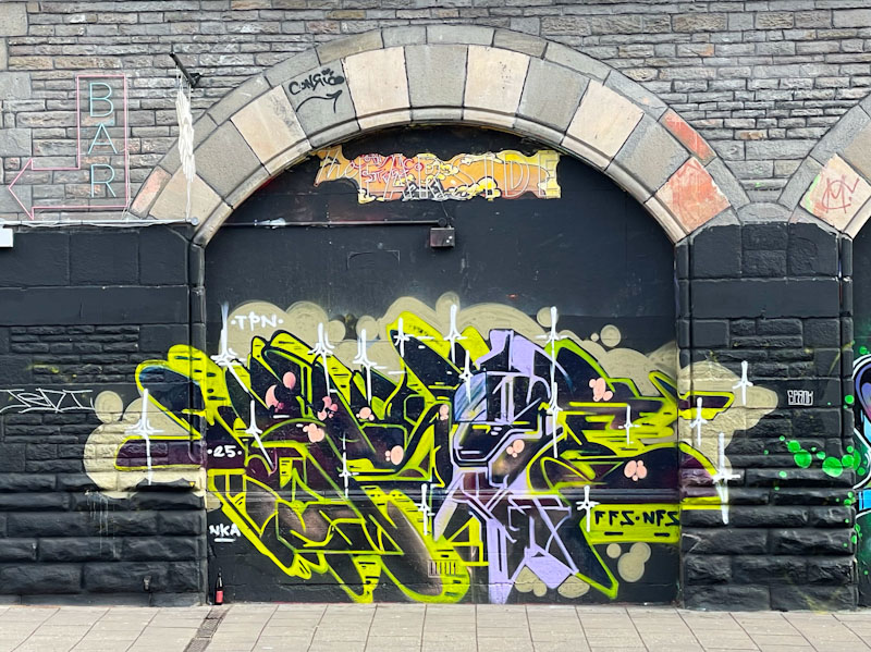
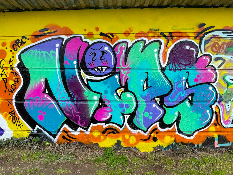
Kid Krishna, The Carriageworks, Bristol, March 2025
There was a time, when the Carriageworks was being redeveloped, that I thought we’d never see graffiti or street art appear on the arches again. That is true for the two right-hand arches, which have now been replaced with large windows, but the left-hand arches continue to play host to the occasional piece. This is a beauty from Kid Krishna.
Kid Krishna, The Carriageworks, Bristol, March 2025
The artist has a real eye for form and colour and combines these with his letters CRIE, to create a whole that is greater than the sum of its parts. I can almost see the emergence of a masked character in the purple section – is it real, or am I imagining things? Clever and technically brilliant work from Kid Krishna.
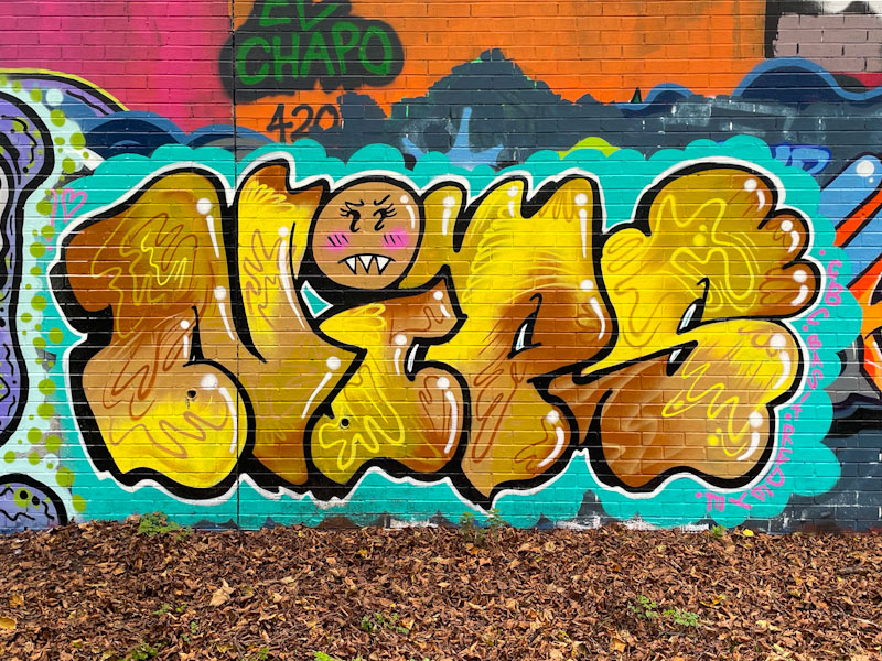
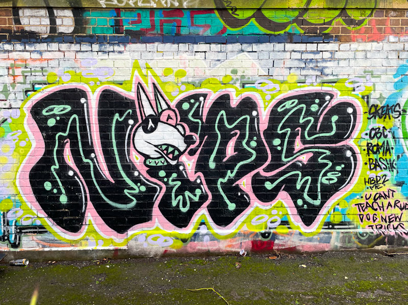
Nips, M32 Cycle path, Bristol, February 2026Nips, Greenbank, Bristol, January 2026Nips, St Werburghs, Bristol, December 2025Nips, River Avon, Bristol, November 2025Nips, St Werburghs, Bristol, October 2025Nips, Greenbank, Bristol, September 2025Nips, M32 roundabout, Bristol, March 2025Nips, St Werburghs, Bristol, March 2025Nips, Frome Side, Bristol, January 2025Nips, River Avon, Bristol, December 2024Nips, St Werburghs, Bristol, November 2024Nips, Sparke Evans Park, Bristol, November 2024Nips, M32 Cycle path, Bristol, October 2024Nips, Greenbank, Bristol, October 2024Nips, Greenbank, Bristol, September 2024Nips, St Werburghs, Bristol, August 2024Nips, M32 Cycle path, Bristol, July 2024Nips, Brunel Way, Bristol, July 2024Nips, M32 roudabout, Bristol, July 2024Nips, Cumberland Basin, Bristol, April 2024Nips, Dean Lane, Bristol, February 2024Nips, M32 roundabout J2, Bristol, January 2023Nips, Sparke Evans Park, Bristol, December 2023Nips, St Werburghs, Bristol, October 2023
Part of my work involves a bit of travel around the country supporting the establishment of new National Nature Reserves. I took a trip last month to Godalming in Surrey, where I was running a partnership workshop. Naturally I took the opportunity to wander round town in the evening and early in the morning to photograph the architecture, and doors in particular. I was not expecting to find any street art (it is not that kind of place), but my in-build radar and trained eye brought me to this piece by Hendog, lurking behind some bins. I think it might be the only piece of street art in town.
Hendog, High Street, Godalming, March 2025
Hendog is a stencil artist, who seems to paint around the south-east area of England, from what I could make out, and I haven’t come across before, although I think he might have a piece in Bristol which I will need to hunt down.
There are hints or references to Banksy’s famous ‘mild, mild west’ piece as he features an urban teddy bear up to a bit of mischief with a traffic cone on his head and a beer bottle in each hand. The stencil work has plenty of depth, aided by the clever shadow work. I have no idea what the locals think of it, but it has been there for a while, so I imagine they might be quite fond of it. A pleasurable and unexpected find.
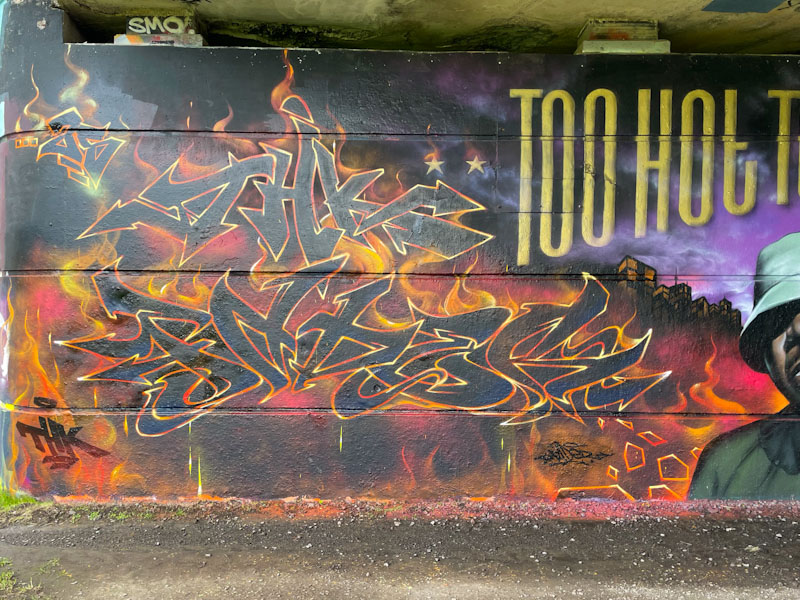
Fade (Acer One and Jodi), Dibz and Sikoh, Brunel Way, Bristol, February 2025
This production wall is one that has been revisited several times by Dibz and Fade, and they have brought in others along the way. The portrait and writing above it by Jody and Acer One respectively have remained intact, but everything else around them have been repainted several times. This latest fiery reincarnation is by Dibz, Fade and Sikoh.
Fade, Brunel Way, Bristol, February 2025
Starting with Fade, flames engulf his letters FADE and nestled above, THK (Tru Headz Kru). The black letters are bordered with a flame line, incorporating reds, oranges, yellows and whites – absolutely incredible. The flame background is equally impressive, and he has also managed to incorporate some drips into the piece too.
Dibz, Brunel Way, Bristol, February 2025
Dibz’ writing mirrors that of Fade, and is also out of the top drawer. Slightly more angular than his painting partner, his letters have the same multicoloured border – how do they do that? Dibz has also managed to create a little bit more depth with his letters, and has added a yellow, melting, halo above his letters.
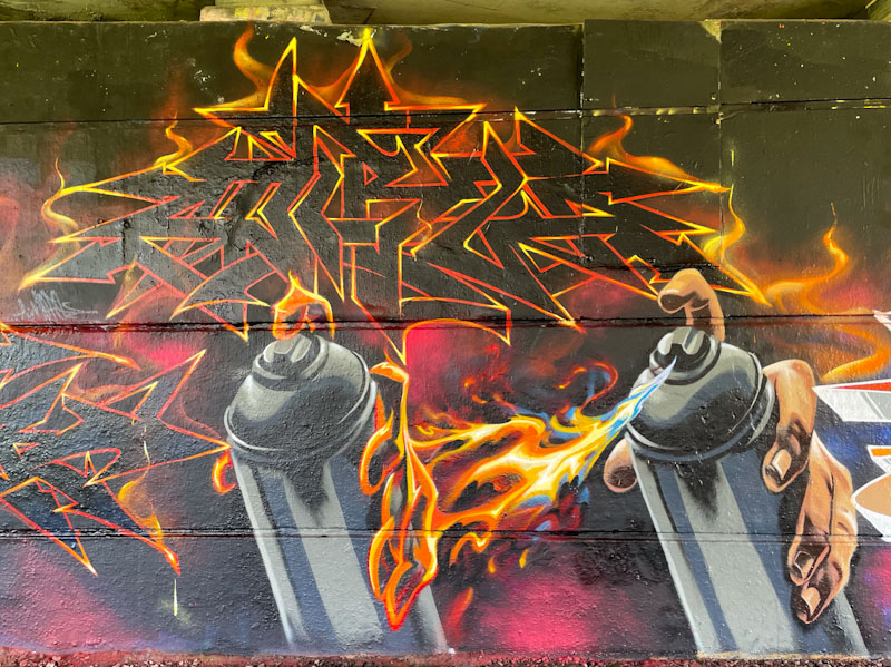
Dibz and Sikoh, Brunel Way, Bristol, February 2025
It is a pity that we only get to see Sikoh’s work occasionally, because he is without doubt one of the most talented artists around. Here he has painted two spray cans, one with a flesh hand spraying out flames, which is mimicked to the left with a fire hand holding the can. The collaboration is utterly outstanding, and has remained intact for over a month for all passers-by to enjoy.
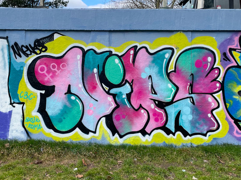
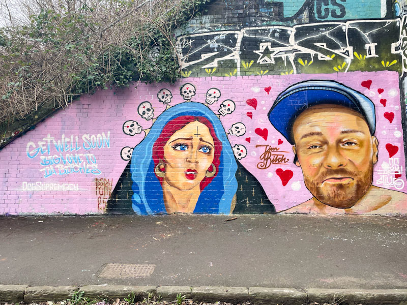
Badger Feral and Stivs, St Werburghs, Bristol, February 2025
This slightly unusual collaboration from Badger Feral and Stivs has been turning a few heads, and not surprisingly, as it is rather striking. While I am very familiar with Stivs’ work, I believe this is the first piece I have come across by Badger Feral.
Badger Feral, St Werburghs, Bristol, February 2025
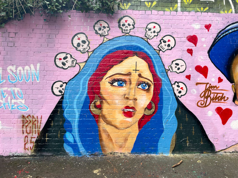
Starting with the Badger Feral piece, we are presented with a portrait of a hooded woman, with red hair and gold earrings. Her blue eyes are matched by the hood around her head. The portrait has a slightly darker side, with an inverted cross on the woman’s forehead, and her hood is suspended by a line of little skulls. Lots to take in here, and plenty of symbolism too.
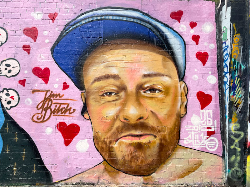
Stivs, St Werburghs, Bristol, February 2025
Stivs on the other hand has painted a portrait of a jolly fellow wearing a cap. I don’t know who the character is, but there might be a clue in the ‘Jim Bitch’ that accompanies the piece. Stivs has painted the portrait in a photorealistic style, and it looks like, from subsequent pieces, that he is rather enjoying portrait work at the moment. There is so much to take in from this ever so slightly weird collaboration.
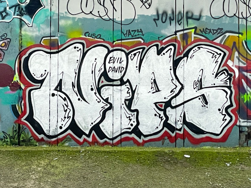
This stunner by Hemper (who else?) has caused me a lot of grief. It was painted at the farm end of the tunnel, and had a black van parked in front of it every time I went to visit. I never did get a clean shot of the piece, so I have had to decide whether to share some rubbish pictures of it or not to share at all. I chose the former.
Hemper, St Werburghs, Bristol, February 2025
This is one of a series of outstanding pieces from one of the most imaginative graffiti writers in Bristol. He has been operating at full tilt this year, and has already clocked up countless pieces, no two looking even remotely similar. It is probably a good time to update his gallery (I have just done it), which is swelling, in a positive way. These bubble letters spell out HEMS and are set on a delicious red background. The pink and blue fills are expertly worked, as you would expect. So much more to come from Hemper’s renaissance.