.
On the horizon
reduced hours, then retirement
getting my life back
.
by Scooj
.
On the horizon
reduced hours, then retirement
getting my life back
.
by Scooj
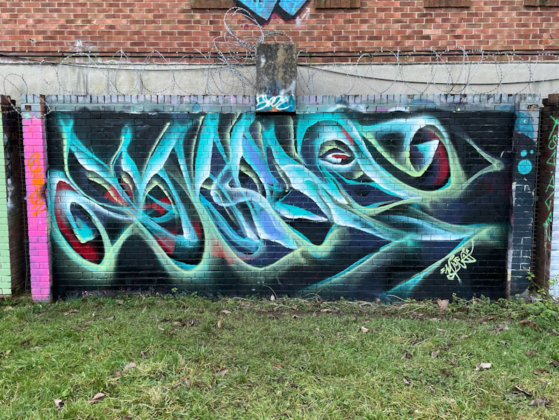
Mr Klue has definitely woken from his winter slumbers and is doing what he does so well, and decorating the walls of Bristol with his unique abstract ethereal letters. I am not too sure though that I have ever seen a piece of his on this wall before, and it is nice to see him break away from the security of his favourite spot in the tunnel.
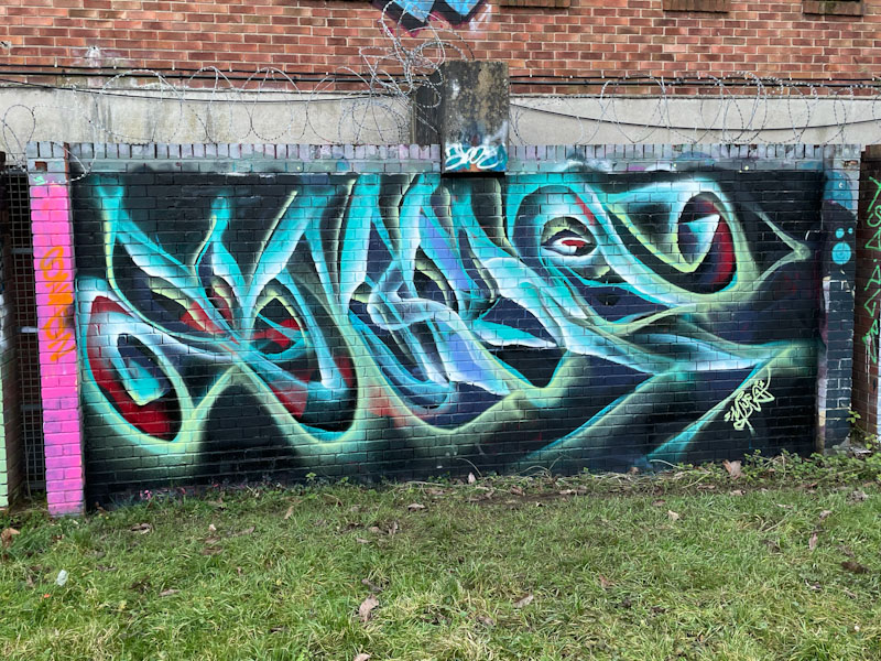
I suspect that Mr Klue has a large stock of blue, green and white tints, as his last three pieces have all had very similar colour schemes. The letters spell, as usual, KLUE, but are so very well disguised. I am guessing, and hoping, that this early year flurry of pieces extends well into 2024.
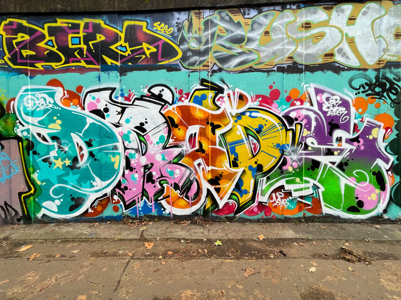
There was no stopping Hemper during the Covid period, but now things have returned to relative normality, his productivity has fallen back considerably, which makes it extra special when he does get out and paint one of his stunning burners.
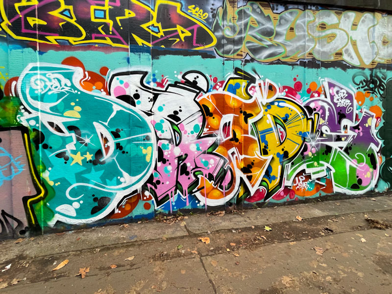
This is a wonderful piece of graffiti writing bursting with colour and energy, spelling out the letters DRAPE, which I am guessing is a shout-out, rather than a tribute. Each letter in this piece has been given a different colour treatment and fill patterns. There is lots to look at and enjoy in this skilfully pulled together writing.
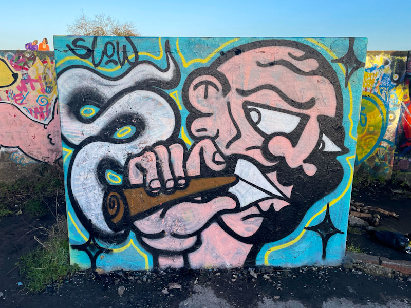
I think I have met Jevoissoul only once, and we had a great discussion about his emergence on the scene and his likely direction of travel. He told me at that point that he had ambitions to be very busy and to paint all over Bristol. Fast-track a few months, and he appears to be realising his plans, with new pieces popping up all over the place.
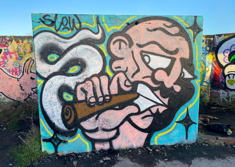
This typical piece is on one of the square concrete slabs of the WWII gun emplacement at the top of the hill at Purdown, with commanding views across Bristol. The picassoesque character is clutching a rather large joint from which a slug of smoke wafts upwards. I like Jevoissoul’s work and I would like to see him develop his ideas to create new scenarios. I’m sure this will come in time.
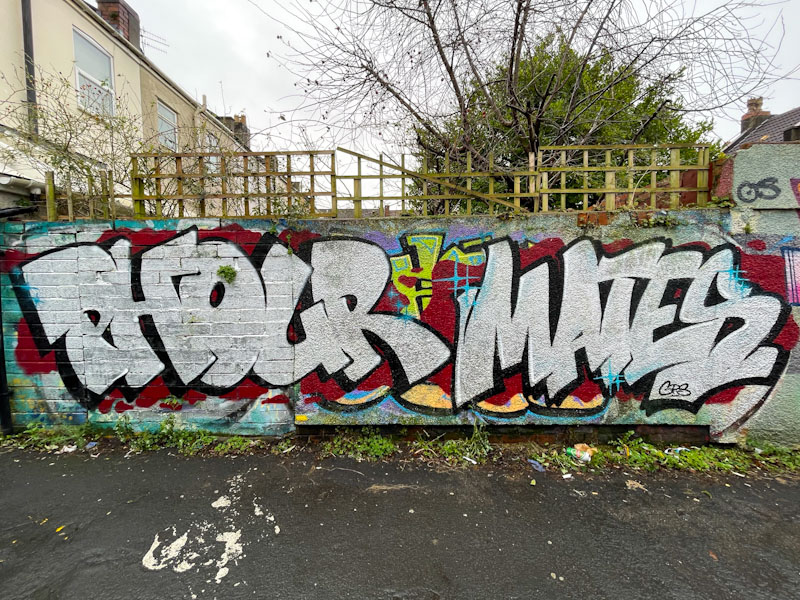
For a little while, now, I have been aware that Phour has been painting with a new companion, Mates. Their combinations can be seen in walls and fences all around Bristol, but I think that this is the first post with both of them on Natural Adventures.
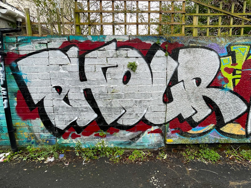
This collaborative wall is themed with chrome lettering on a red background. Phour, painting his distinctive and clean letters in a way that is very pleasing on the eye, kicks things off in this straightforward piece. Judging from the little bit of greenery in the letter ‘O’, I would guess that the piece has been here for a little while.
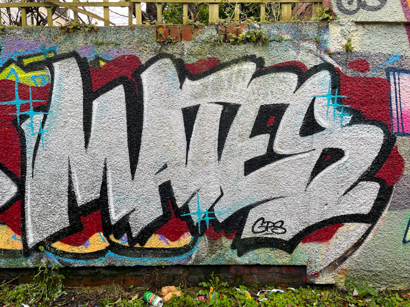
To the right, Mates makes his debut on Natural Adventures with some very nice letter shapes in chrome, with a black drop shadow on the red background. The letter design feels very familiar, and reminds me of the kinds of fonts you would see in children’s comics like Beano, The Dandy, Beezer and so on. Watch this space for more from this pairing.
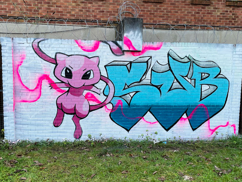
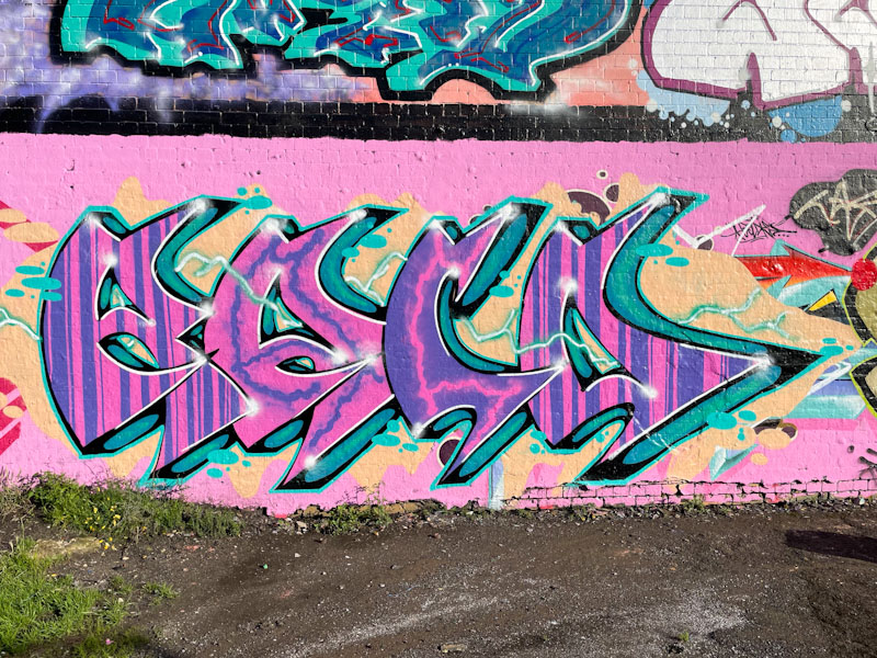
Having only recently graced the pages of Natural Adventures, Sub, I have a feeling, is going to feature more and more going forward. This large piece in Peel Street Green combines his big letters with a pussycat character. The piece was overpainted last week with some writing that incorporated (and by implication, took credit for) the cat… Sub has since returned and restored his own letters.
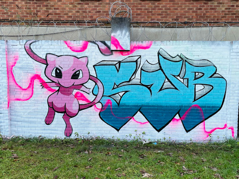
Sub’s letters tend to be super-large and simply filled, but it is the inclusion of his cartoon, manga-style cat, that adds lots of interest to the piece. This is a nice clean and tidy piece, and it will be interesting to see if the incorporation of characters will become more of a thing for the artist. Nice work.

I am mildly hungover following a wonderful wedding party for our niece, in the extraordinary setting of Farnham Castle on the border of Surrey and Hampshire, and am writing this post sitting in the car, waiting to get home back to Bristol. Fast forward a few hours, and I am now completing this post at home, a little later than usual.

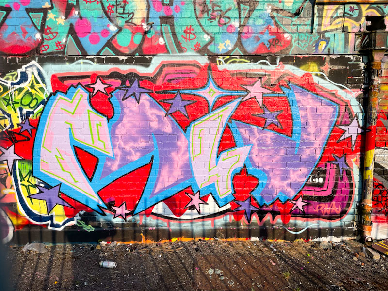
This is a fabulous collaborative wall from Marckinetic and Kid Krishna, a duo who have started off 2024 in vigorous fashion. Marckinetic’s disguised FFS letters are written in such a unique style and filled with his wonderful ‘cosmic’ patterning, that they simply couldn’t be by any other artist. Creative and wonderfully presented, his work is always a pleasure to see.
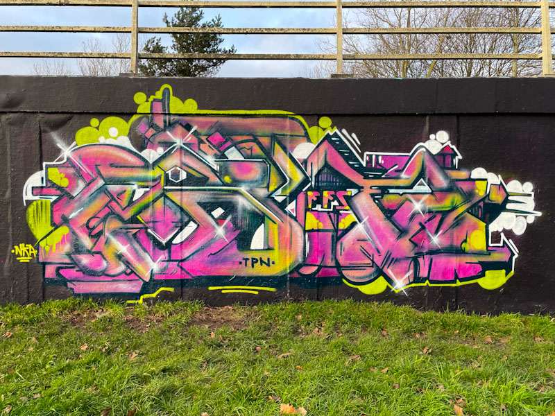
Kid Krishna has been on fire this year too, after a relatively quiet period, so much so that I am going to have to gather up several of his early year pieces into a single post soon. The colours of this piece broadly match those used by Marckinetic, and create a feast for the eyes, enhanced by being painted on the black background. The letters CRIE are probably there somewhere. This is a fabulous collaborative wall from these unconventional graffiti writers.
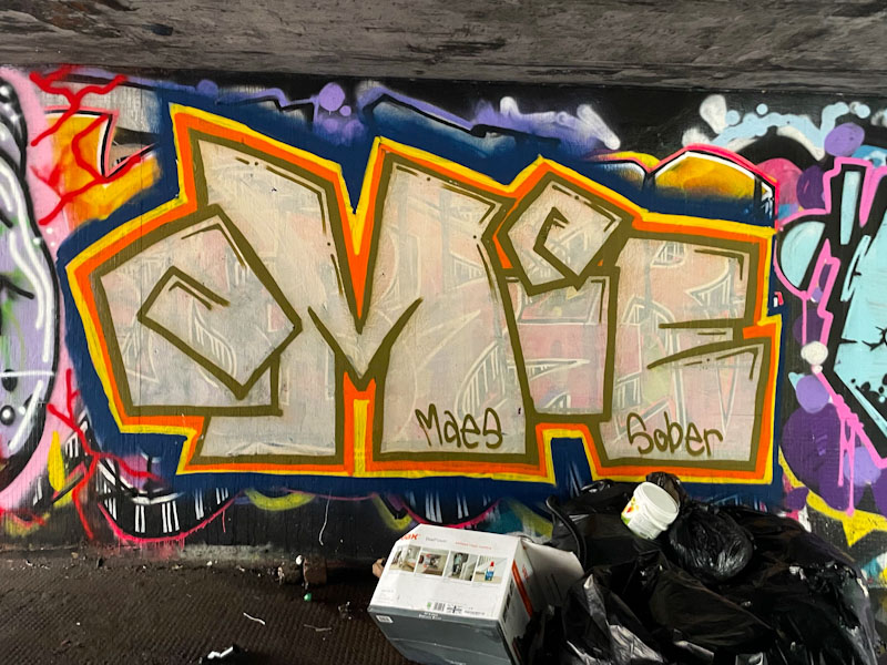
I love it when I start to notice an artist that I hadn’t been aware of, but has been out there for a little while, and Omie_wan_kenobe is one of those. Now that I am aware of the artist’s presence I am seeing their work everywhere, and the best thing about Omie_wan_kenobi’s work is its variety and lack of a ‘house’ style.
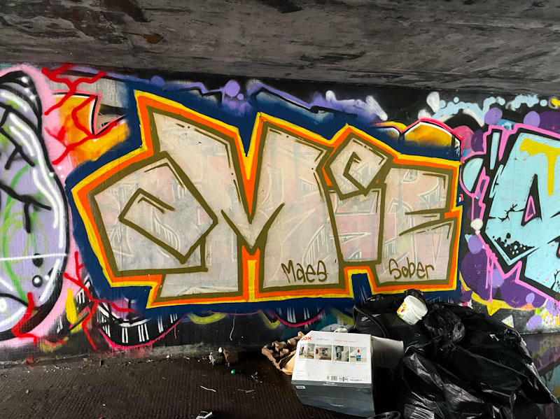
This piece, in the burnt out tunnel, is big, bold and rather unusual. The fill paint is rather thin, and the Klashwhensober piece beneath it is clearly visible, and almost passes for a fill pattern. I don’t know whether OMIE is said ‘oh my’ or ‘omee’, but I guess the ‘wan kenobi’ would suggest the latter. Watch this space for more from this emerging talent.
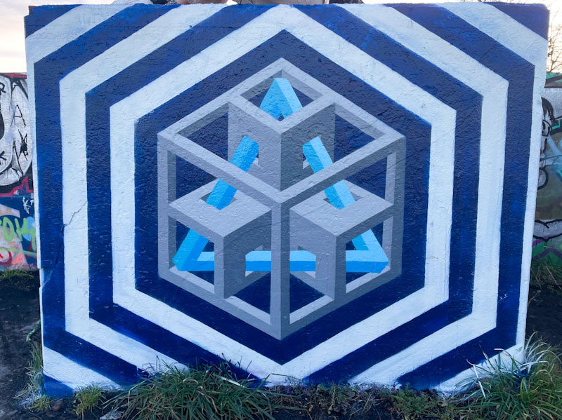
Acer One struck gold with this concept of building a geometric design around an impossible triangle, and this is a sister piece to one he painted about a month or so back. The piece plays tricks with the eyes, because everything inside the concentric hexagonal stripes is three dimensional , which makes the centrepiece stand out from the wall.
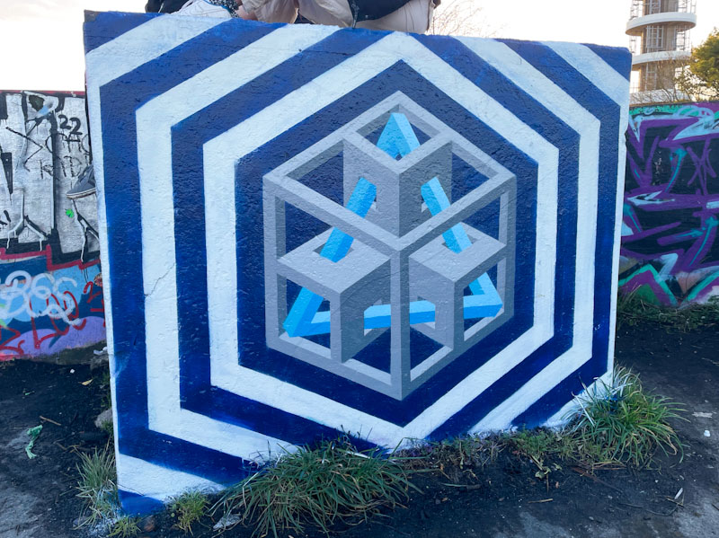
There is a lot of skill to designing and painting geometric pieces like this and there is absolutely no room for error. Unfortunately there were some people sitting on top of the concrete block, and so I have tried to crop them out of the photographs, which is a pity, because it would have been nice to get a shot from a little more distance. These studies by Acer One are a rather fine direction of travel in my view.

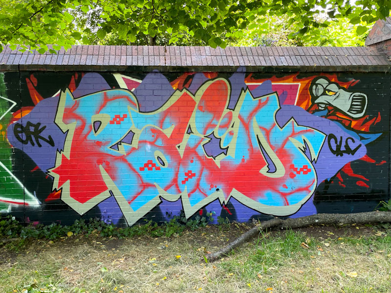
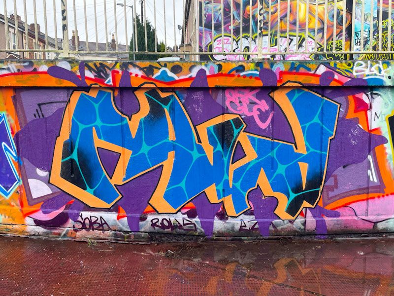
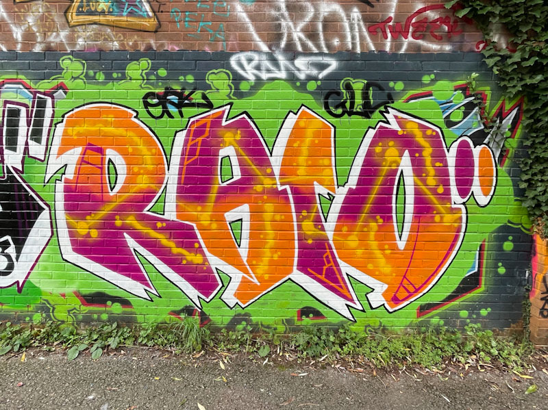
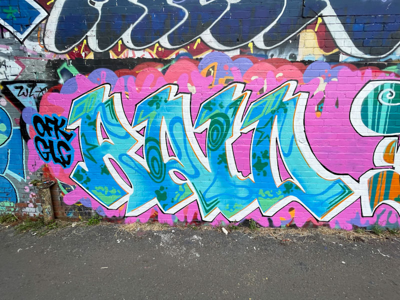
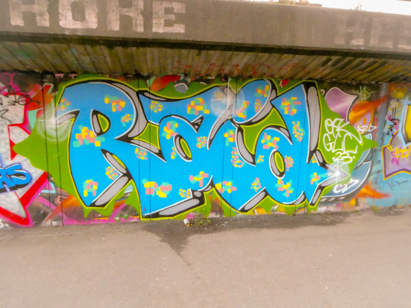
A gallery of fabulous graffiti writing from Bristol artist Raid – now writing as Mage
Instagram:@neighbouthoodraider and @mage.ya.look
all photographs by Scooj