old wooden drawers
branches from the garden
perfect for kindling.
by Scooj
old wooden drawers
branches from the garden
perfect for kindling.
by Scooj
At a bus stop, just opposite Ashley Road, there is a hoarding which has slowly and steadily been claimed by graffiti artists. The building owner has tried to shoo them away, but it is a bit of a relentless tide. The initial graffiti that went up was mostly quick burners and none of it up to much, with the odd exception. Then with accelerated pace, more pieces have been going up recently and this lovely quick one from Jee See appeared a couple of weeks ago.
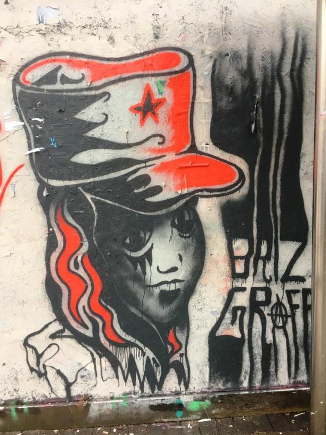
Of course, it was over -sprayed a couple of days later, but I was very pleased to capture it. This is a revolutionary motif that Jee See likes to use a lot, and I have to say I really like it. It was a piece like this that first put him on my radar. Power to the people! Briz Graff.
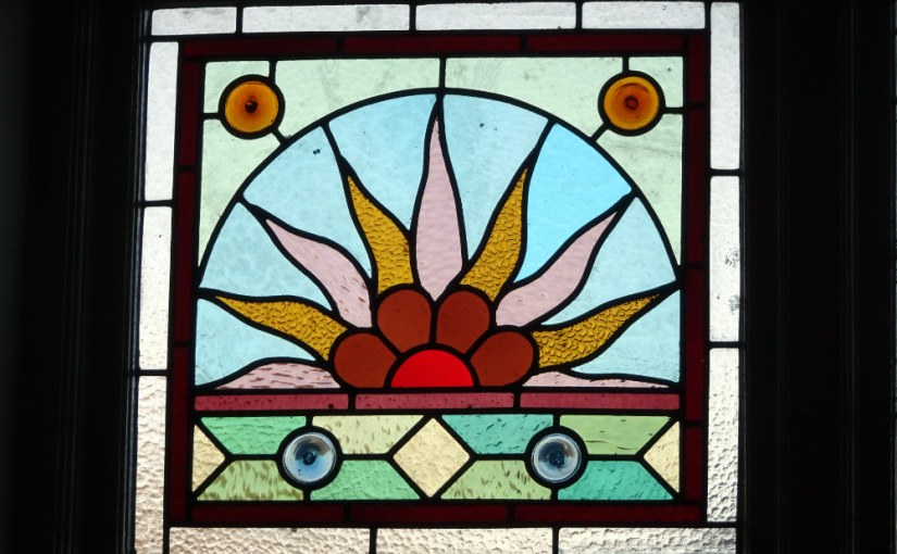
The first photograph
snapped on my new camera;
a stained glass window.
by Scooj
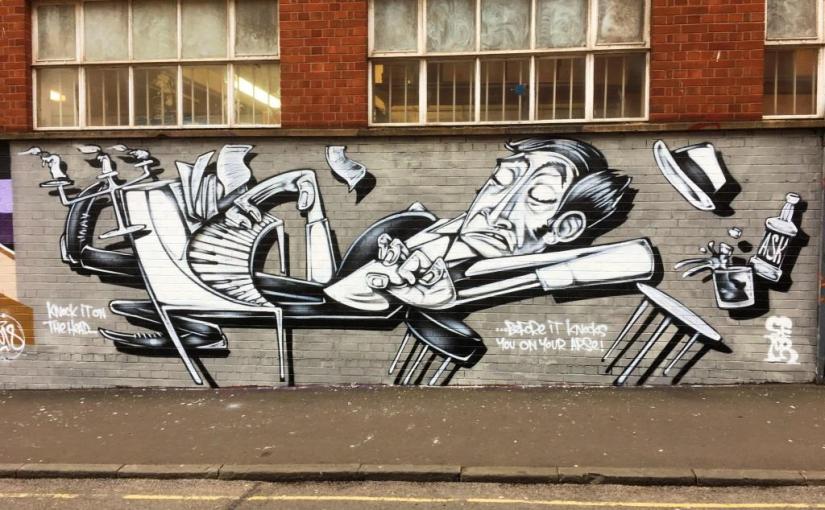
This has been a winter where some of the giants of Bristol street art have awoken and decorated our walls with some of the finest works for a while. Sepr is one such giant who seems to be painting most weekends and turning out some really high-quality work.
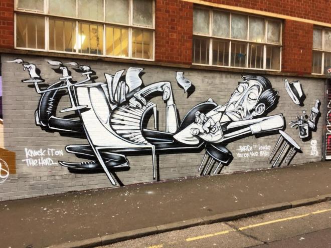
What a stunner this is – ‘knock it on the head – before it knocks you on your arse’. I’ve not heard the expression before, but am willing to adopt it on the back of this wonderful Sepr work.
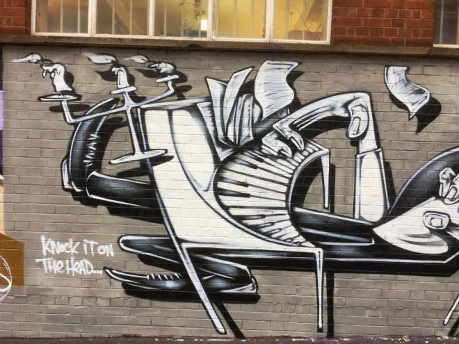
The common thread running through much of Sepr’s work is music, and musicians and here he has painted a pianist stretched out and toppling off his stool. For me, his works have a very strong retro feel and remind me of 1950’s cartoons – the hairstyle and the trilby are not of this decade.
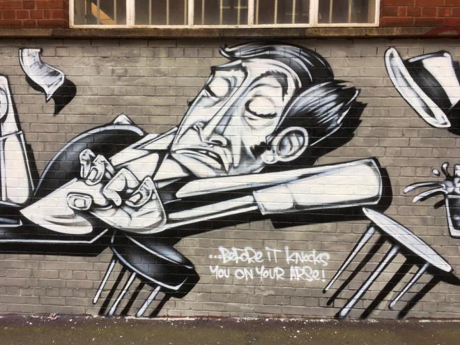
These cartoons, beautifully drawn are pulled out from the wall by some expert shardos that govo it a bit of a 3D feel. Definitely worth a look.
Perilous flagstones
outside Bristol cathedral;
stairway to heaven.
by Scooj
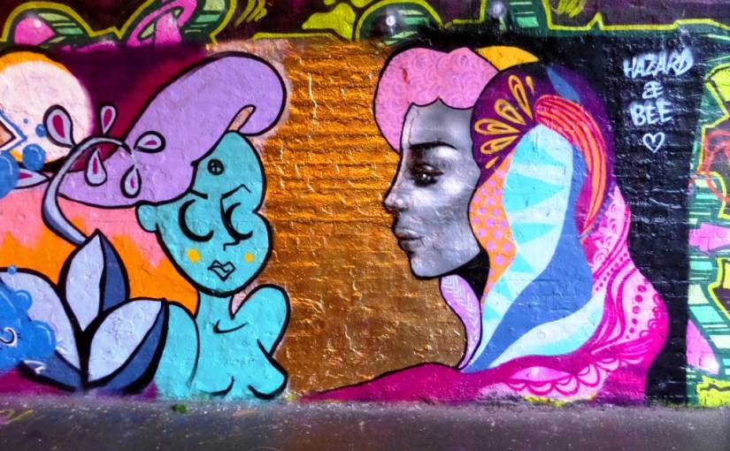
The turnover of work in St Werburghs tunnel is quite eye-watering. I don’t visit very often, but every time I go, pretty much everything is new. I went down there deliberately this time to find this piece by Hazard.
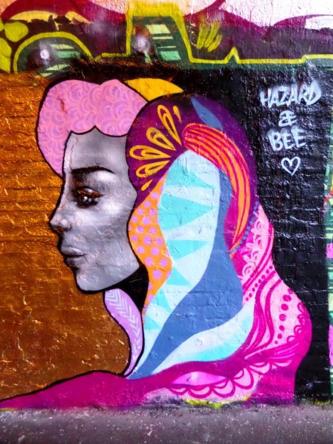
It is hard not to be utterly captivated by her work (hers is on the right) which usually features a female portrait, either face on or profile, with beautifully ornate hair and head decorations.
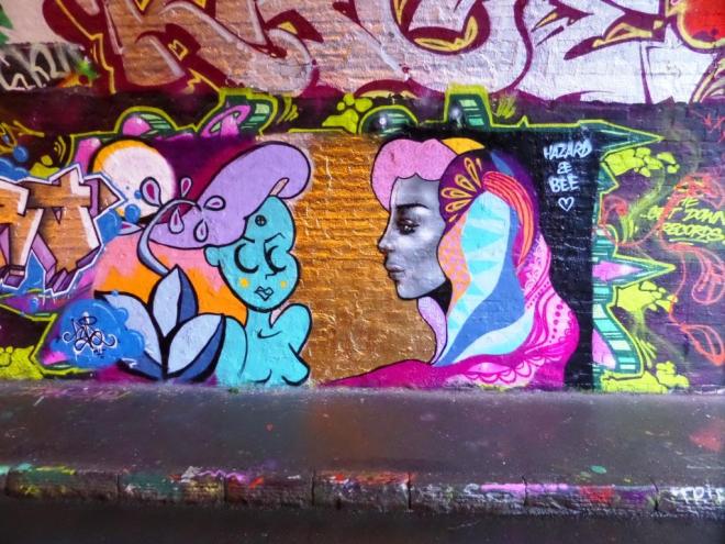
I am not too sure who the piece on the left is by, but the contrast in styles is really interesting and in fact both work quite well together. I’m not sure that this was a collaboration, but I might be wrong. A fine piece.
There is a comment below from Tasha Bee who painted the lady on the left, she says it was a collaboration, and seeing the joint signature now, it all seems obvious.
Winter-stripped branches
offer scant cover for the
marauding magpies.
by Scooj
I have driven past this piece dozens of times and caught a glimpse of it out of the corner of my eye, but parking is tricky. Finally I found some time to double park, nip out and take these pictures.
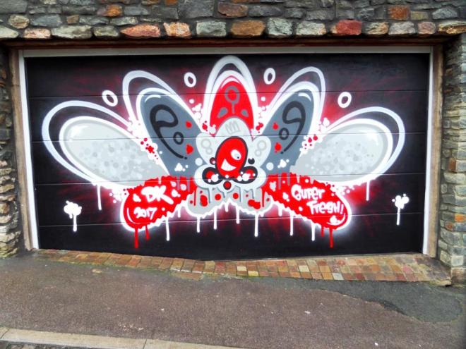
It is a wonderful piece by Decay and one that is likely to be around for some time as it looks like a private commisssion. Many of his pieces, particularly in the centre of town get oversprayed, so it is nice to have a spot where it will be around for a while.

Decay is the master of these abstract designs and his work is easy to identify due to its distinctive shapes and use of the colours red, white, grey and black. This one is a stunner.
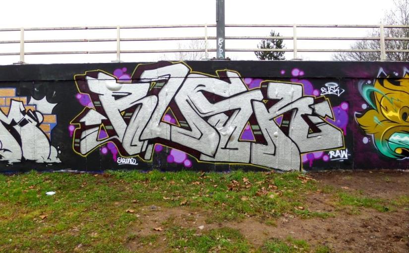
Sitting snugly next to an Elvs work is this great chrome piece by Rusk, set on a black background and decorated with pink and purple bubbles. A friend of mine, who is a designer, asked me what is this thing for drawing arrows on the end of graffiti letters all about. Is it simply a design feature? who first did it? does anyone know? I don’t know the answers, but they do feature in most wildstyle writing.
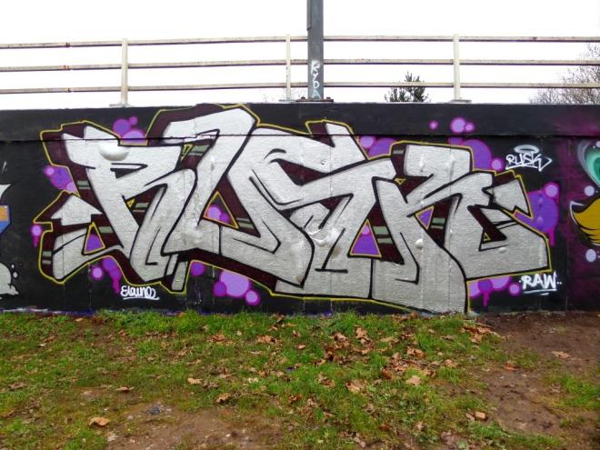
Rusk as always has smashed it with this piece, which is rather different from some of his work I have been posting recently. Maybe I’ll ask him about the arrows next time I see him.
Door 18

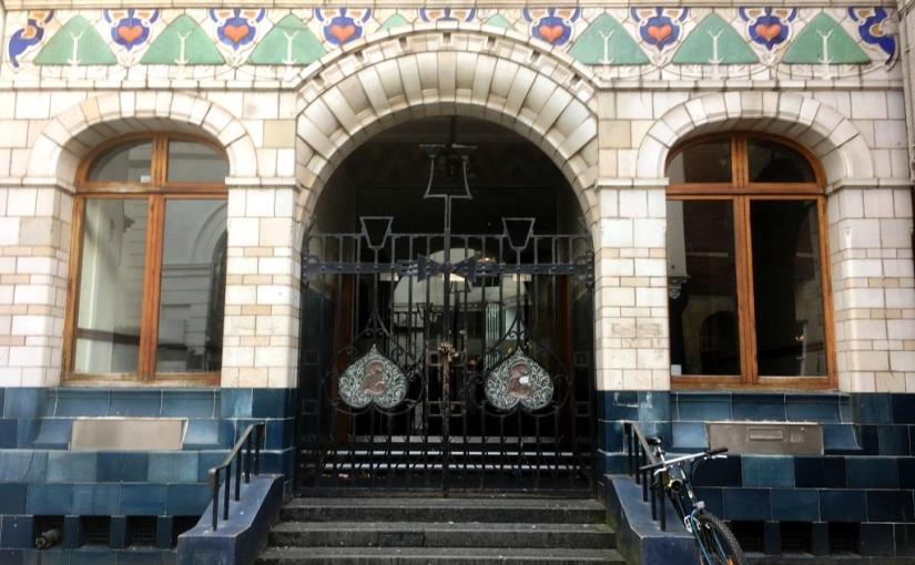
This is the front entrance to one of the most remarkable buildings in Bristol. It was the Edward Everard Printing Works and is tucked away in the narrow (and perhaps inappropriately named) Broad Street. Edward Everard was a well known and prosperous Bristol printer who commissioned Henry Williams to build the print works in 1900 and the pre-Raphealite art nouveau facade was by William Neatby.
Much of the original building was demolished, but this facade remains and the building has been used as as offices by the NatWest bank, although judging by the chain and padlock on the gate it doesn’t look much in use at the moment.
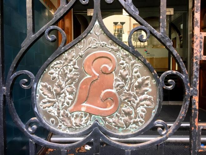
The beautiful craftsmanship on the gates is really worth a closer look – some fabulous oak and mistletoe designs and a very grand E.

The entrance arch and gates are impressive, but it is the stunning facade above them that sets this building apart from all others. More about this building on the Bristol past website.
by Scooj


 Natural adventures