The nicest street art dog walk that I do fairly regularly is the circuit up to the Narroways nature reserve which loops back down the hill and through St Werburghs Tunnel. The dog particularly likes this walk too. I get to combine three loves – my dog, nature and street art, all in the space of 45 minutes.
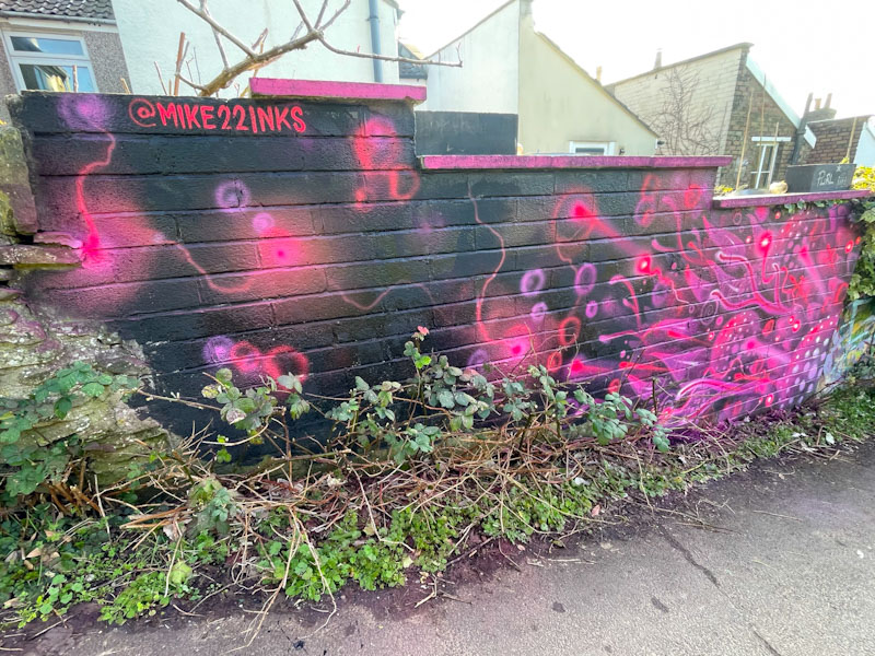
3Dom, Narroways, Bristol, March 2026
I was pleasantly surprised to find this unlikely piece by 3Dom on a wall just up the hill from the climbing centre. This wall has hosted a lot of terrible throw ups and tags, but 3Dom has done it proud. I love his organic designs like this one that have a familiar and yet other-worldly look to them. A nice treat for the owners of the house whose garden wall this is. 3Dom really is awesome.
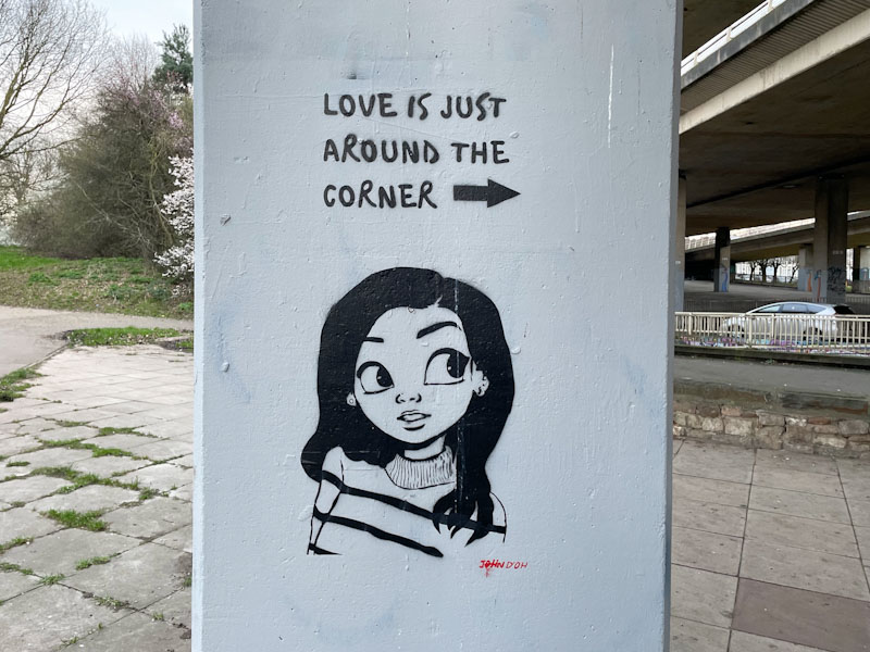
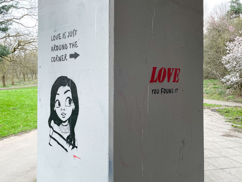
In a world filled with terrifying and depressing headlines, it is refreshing to be able to enjoy a moment of lighthearted humour, and this lovely column piece by John D’oh under the M32 is just what the doctor ordered.
John D’oh, M32 roundabout J2, Bristol, March 2026
How often have we heard that ‘love is just around the corner’? Well, John D’oh takes the saying literally with this two-part stencil. A simple and clever piece that would bring a smile to even the most cold-hearted viewer. Just another piece in a superb ‘gallery’ of John D’oh’s work under the M32 adjacent to Eastville Park.
Whenever you see a street art Thursday Doors post from me, it indicates that I am very busy and have little time to prepare new pictures to post. These street art doors have already been posted here on Natural Adventures in August and September 2024, but not in the context of Thursday Doors.
The reason I am so busy I will be able to reveal next time, but I have a huge focus on Thursday for an event that should make the headlines in the UK media – we’ll have to wait and see.
This post was hastily pulled together on Tuesday evening before settling down to an appointment with the TV and a rather important football match.
I hope you enjoy these doors, and things should get back to normal next time.
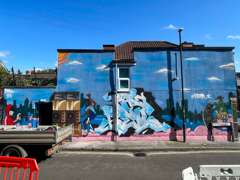
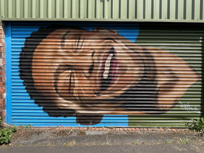
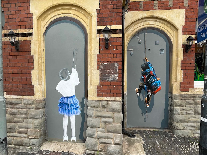
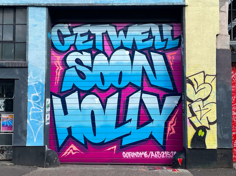
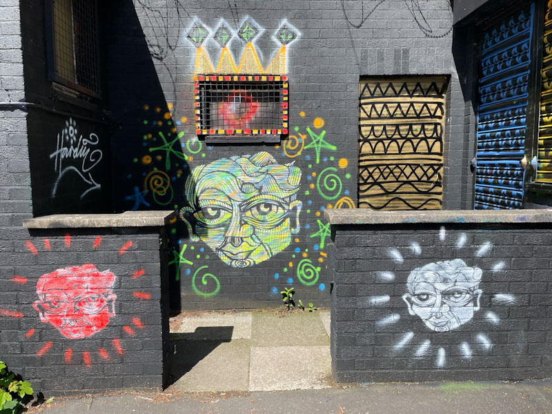
Bloem, Muriel Alleyway, Bristol, August 2024Esme Lower, Muriel Alleyway, Bristol, August 2024Krome, Dalton Square, Bristol, August 2024Billy, Muriel Alleyway, Bristol, August 2024Merny, Muriel Alleyway, Bristol, August 2024Mind 49, Muriel Alleyway, Bristol, August, 2024Taqi Spateen, Upfest 2024, North Street, Bristol, May 2024Philth and N4T4, High Street Leicester, July 2024Erviti and Caro Maggs, Muriel Alleyway, Bristol, August 2024Vane, Jamaica Street, Bristol, July 2024Tymon de Laat, North Street, Bristol, September 2024Hardy, Upfest 2024, Greville Smyth Park, Bristol, May 2024
Have a great weekend all.
If you have made it this far, you probably like doors, and you really ought to take a look at the No Facilities blog by Dan Anton who has taken over the hosting of Thursday Doors from Norm 2.0 blog. Links to more doorscursions can be found in the comments section of Dan Anton’s weekly Thursday Doors post and his Sunday recap.
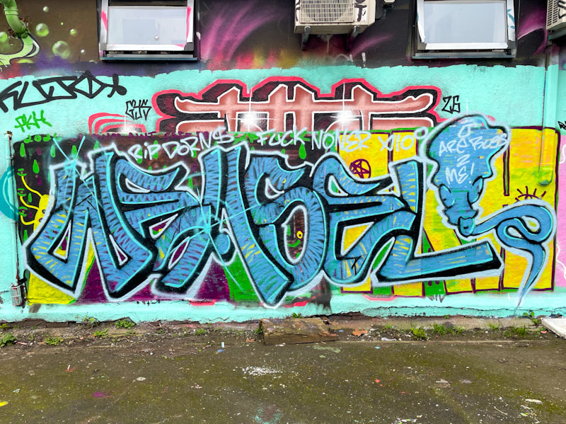
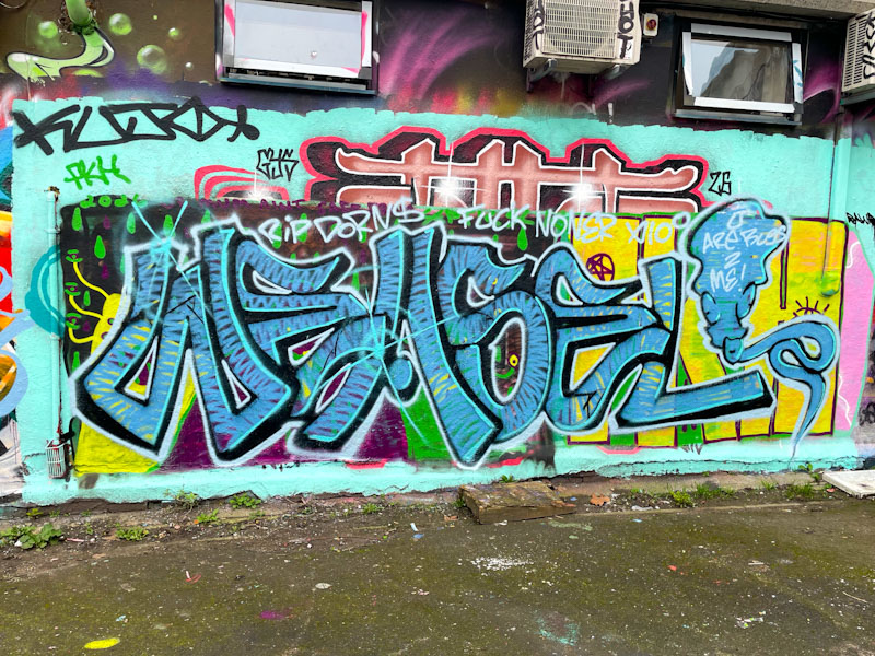
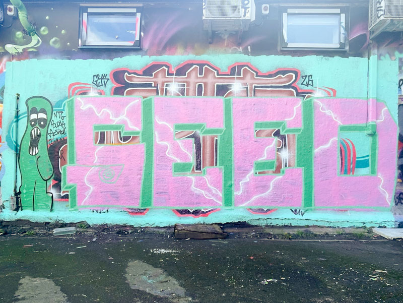
The lifecycle of a wall is often fascinating, and under this piece by Weas(el) is a little bit of recent history that can be made out, because artists have painted over one another without buffing the wall. The sequence, over about 10 days or so was a beauty by Werm, then a piece from Seed, followed by another piece that I never saw and finally this one from Weas – I’ll show the others at the end of this post.
Weas, Dean Lane, Bristol, March 2026
Weas’ work can be found literally all over Bristol – one of his tags has even made it onto a utility box very near my house. Although his ‘mega-tags’ are fun, he actually is, in my view, a much better artist when he turns his attention to his graffiti writing. His letter fills always give the impression that he is a man in a hurry, or that he likes his paint to go a long way. His letter style is quite easy on the eye, and of course combines the writing with the mega-tag I mentioned earlier. Weas certainly likes to make his mark.
Werm, Dean Lane, Bristol, February 2026Seed, Dean Lane, Bristol, February 2026Weas, Dean Lane, Bristol, March 2026
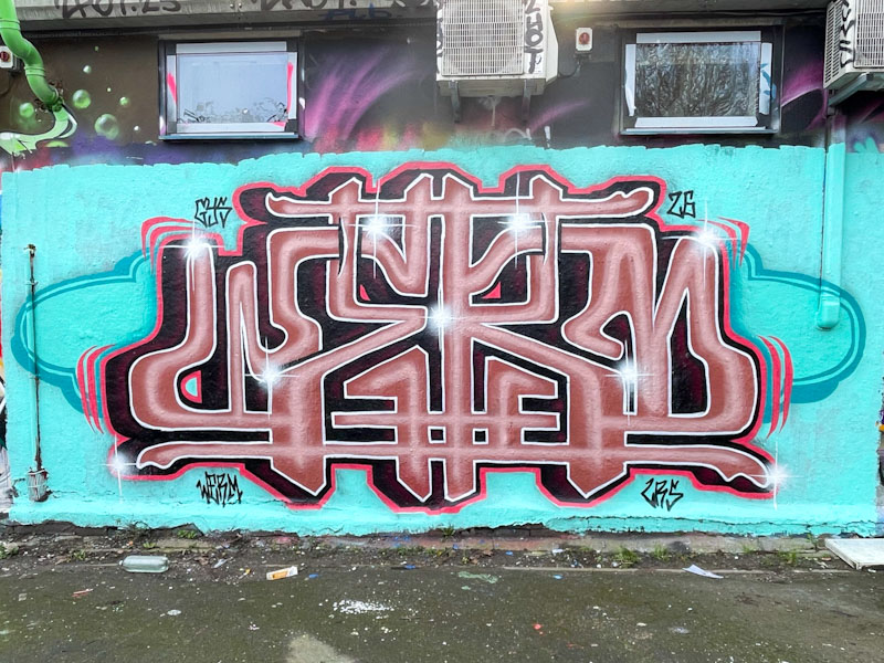
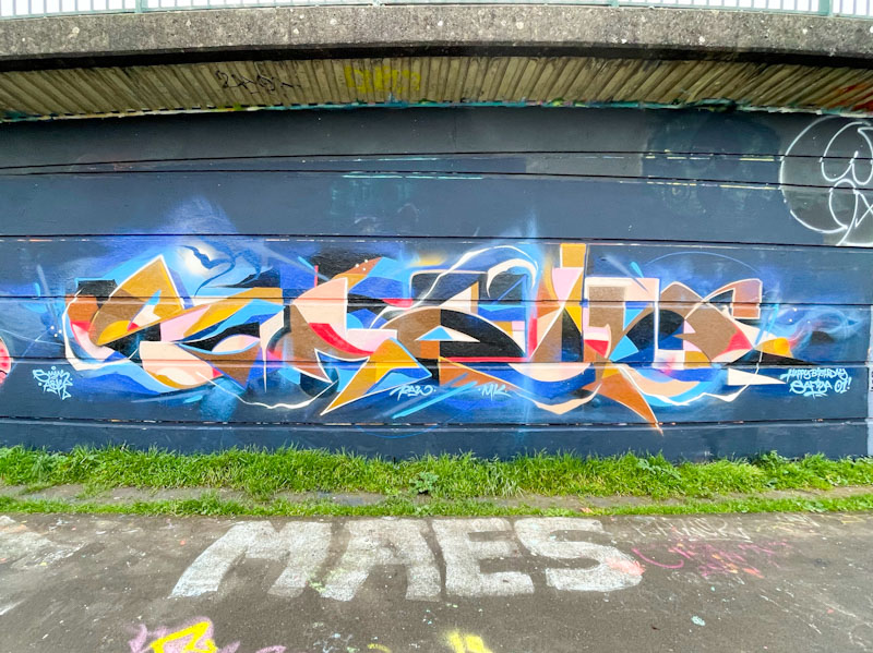
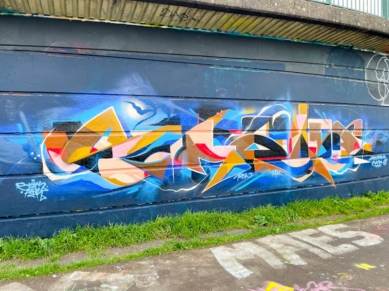
One of the joys of looking for and photographing street art is that every trip turns up surprises. These might take the form of a new artist or an entire wall decorated during a paint jam or sometimes with a jaw-droppingly great piece. This beauty from Smak falls into the latter category.
Smak, Cumberland Basin, Bristol, March 2026
Over the years, Smak has managed to stretch out his SMAK letters with elaborate details and beautifully worked designs. The patterns, shapes and colours disguise the letters so well that they can be difficult to make out at times. This is a classy and confident piece by one of the best graffiti writers around.
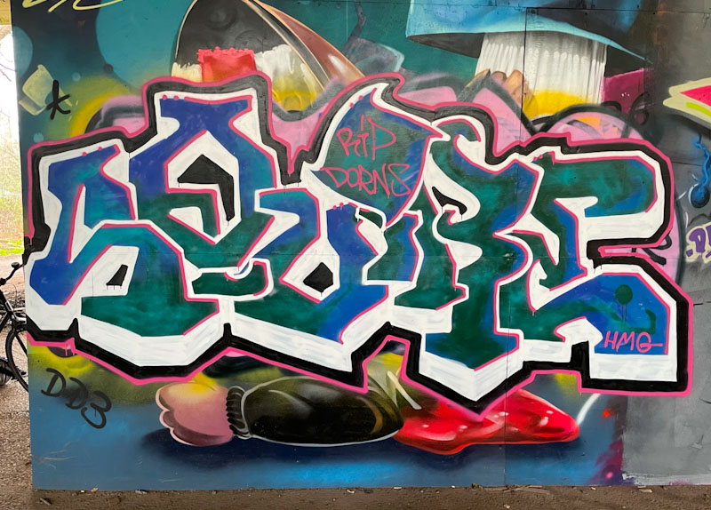
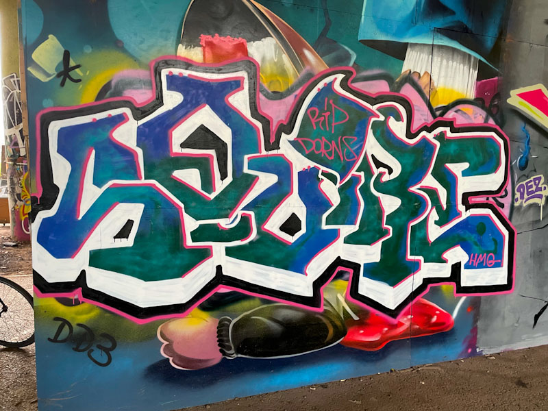
Squire is becoming a bit of a regularly featured graffiti artist in the pages of Natural Adventures. His lettering is distinct and there is something rather interesting about the word ‘SQUIRE’ that has some meaning and connection with the past, it is something of an old-fashioned word.
Squire, Brunel Way, Bristol, March 2026
This piece has unequal and unruly letters that somehow fit into a form, probably contained by the deep white drop shadow. I think that there is something slightly confused with the drop shadow beneath the ‘Q’ and the ‘I’ that doesn’t quite work for me. There is a nice RIP shout-out for Dorns and a small HMG crew tag rounds the piece off. Squire seems to favour this area beneath Brunel Way, which is good news, because turnover here at the moment is quite slow.
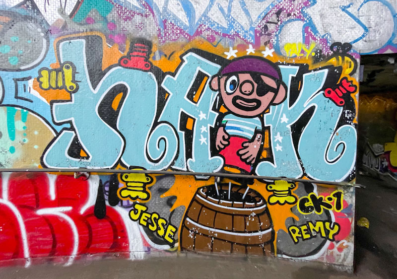
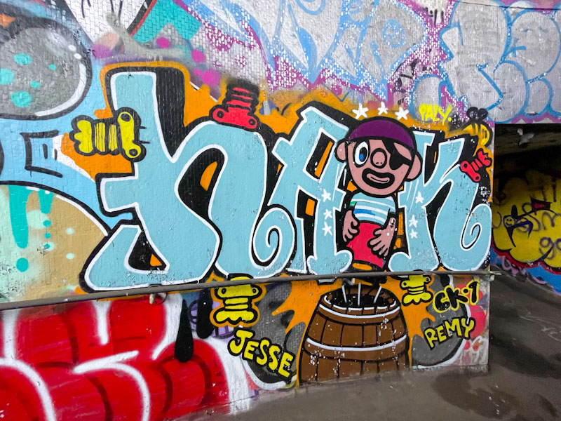
In my wanderings in search of Bristol street art and graffiti, I tend to visit the ‘honey pots’ most often, and then radiate outwards to the spots where turnover is lower, or where wall space is limited to one or two pieces only. This means that I tend to miss quite a few pieces from these less visited places. I was pleased therefore to stumble across this Haka piece in a tunnel under the M32 recently.
Haka, M32 roundabout J2, Bristol, March 2026
I think that Haka painted this some time ago, but it still looks in fair condition. Haka’s combination pieces usually feature children’s picture book characters. The pirate in the piece, standing on a barrel is unknown to me, and a quick Google search didn’t help. A fun piece for the kids.
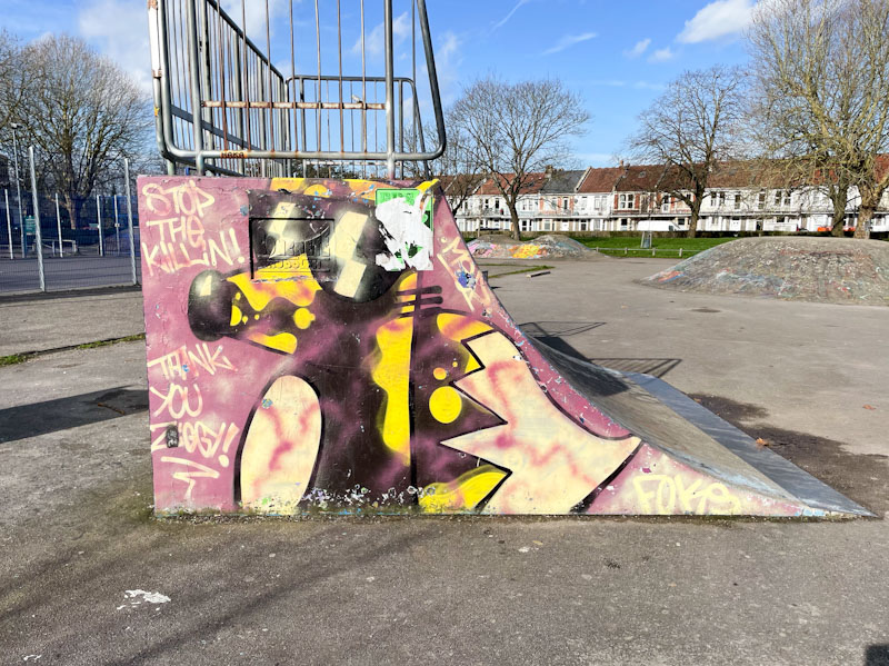
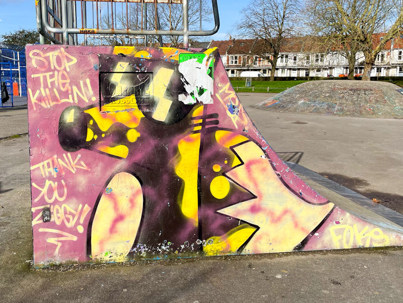
Foksymoron, St George skate park, Bristol, March 2026
This might not be Foksymoron’s finest piece, and it looks like it might have been here for a little while, but I include it because I like the sentiment expressed in the top left-hand corner ‘stop the killin’, which feels particularly relevant right now.
Foksymoron, St George skate park, Bristol, March 2026
This particular ramp side is a favourite for graffiti artists in the park and has hosted many fine pieces. The fox here, still looking very cool in his shades, has been decorated with some yellow fill patterns, which is not something I have seen all that often from Foksymoron. Nice work.
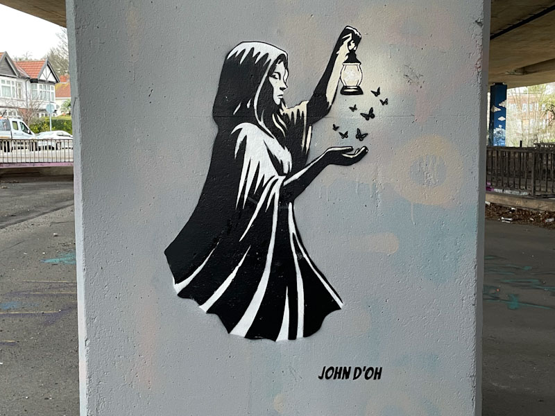
This is an absolute beauty from John D’oh in amongst the treasure trove of column stencils under the M32. There is no overt political commentary as far as I can see, although meanings can be read into almost anything if you put your mind to it.
John D’oh, M32 roundabout J2, Bristol, March 2026
A cloaked woman is holding out a lamp, which is attracting some moths over her gently extended hand. This is actually a three-colour stencil, with a very subtle yellow white colour used in the lamp, and blended onto the woman’s arm and cloak. This is really nice work from John D’oh and rather touching. It demonstrates that sometimes overcomplicating things isn’t needed to create something beautiful and meaningful.
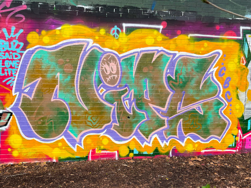
Nips continues to delight with her work and her pieces seem to be coming thick and fast at the moment. Although the last piece I featured here by Nips was a chrome delight, it is her fills that are the trademark of her work. The letters are separated from the background with a contrasting purple drop shadow, but it is the outstanding letter fills that are so captivating in this piece.
Nips, Sparke Evans Park, Bristol, February 2026
Nips’ letter shapes tend to remain fairly constant, so the interest is around what she does with colour and form in her fills and background. Here she has mastered both. Starting with the background, Nips has opted for a fairly minimal coverage but used it well with a blend of fiery oranges and yellows. A combination of greens and browns are washed together, creating something similar to a tie dye effect. This is brilliant and presented by an artist who shows confidence with her colour selections. Excellent.