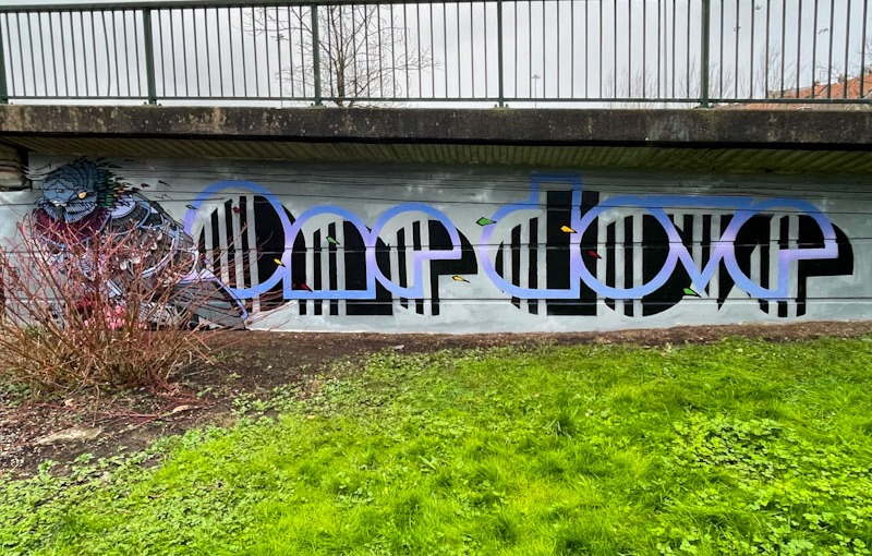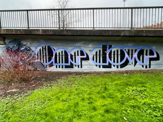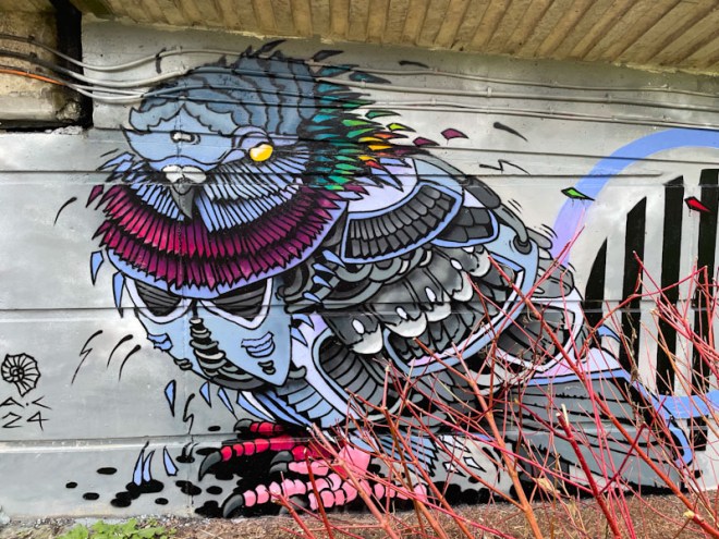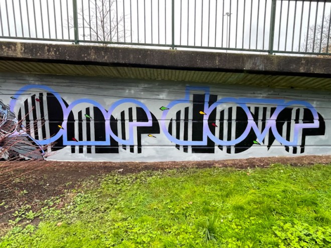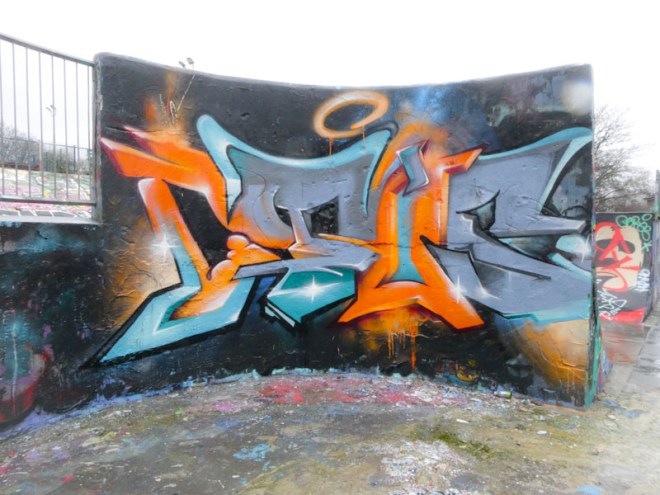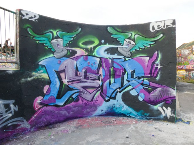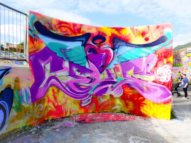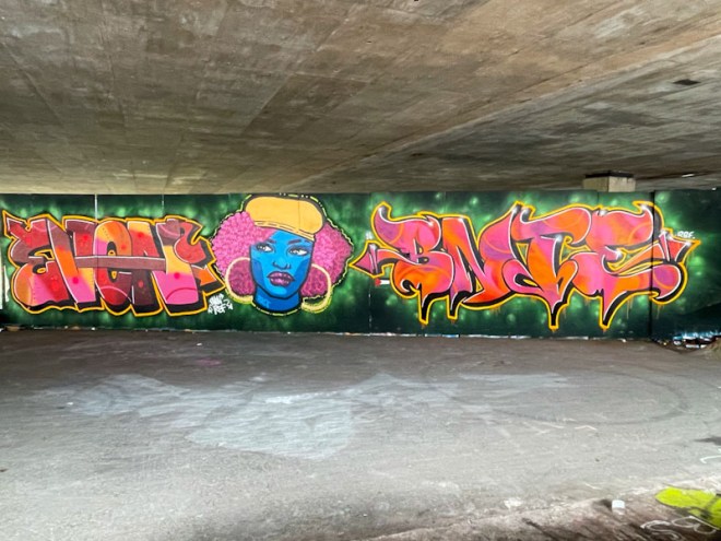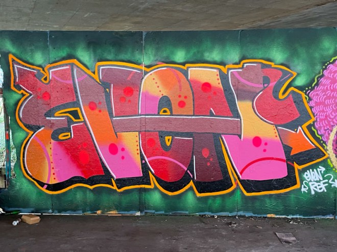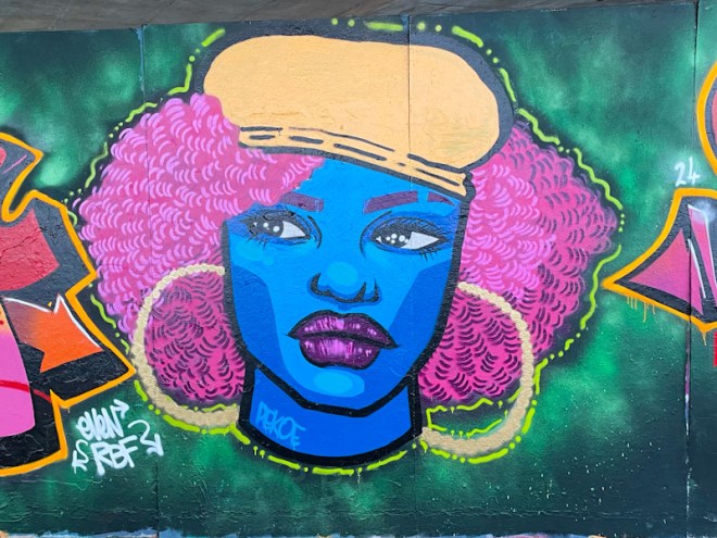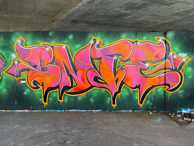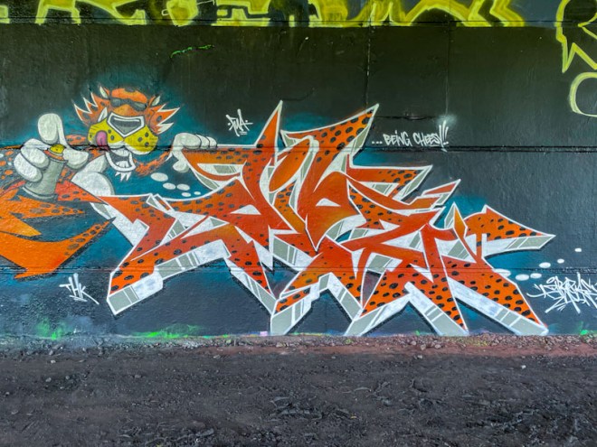
A gallery of fabulous graffiti writing from Bristol artist Raid – now writing as Mage
Instagram:@neighbouthoodraider and @mage.ya.look
all photographs by Scooj


A gallery of fabulous graffiti writing from Bristol artist Raid – now writing as Mage
Instagram:@neighbouthoodraider and @mage.ya.look
all photographs by Scooj


What a nice surprise it was to find this collaboration from Werm and 3F Fino, who I thought may have left Bristol (which he might have done), given the almost total drop-off in his work in the city. It felt coincidental, too, that I found this piece only a day or two after publishing a gallery of 3F Fino’s work.

To the left, Werm has worked a wonderful piece of writing painted using a fabulous colour palette of purple shades and gold. This sumptuous colour scheme creates an interesting effect, where the letters, counterintuitively, are a little more disguised than you might expect. The gold colour, although contrasting with the purple colours, doesn’t ‘pop’ the piece as much as you might expect, instead it has a rather more subtle impact.

To the right, a character that 3F Fino has painted many times, is holding up letters that are painted in the same colour scheme used by his neighbour. The letter fills are very nicely painted and go a long way to obscuring the letters themselves. I would like to think the letters spell FINO, but can’t be certain, and have a feeling that the fills might also spell something out. Altogether, this is a very nice collaboration from the LRS pair.

It is always a great pleasure to find any writing by Rusk, and this relatively simple piece in the tunnel under the M5 at L Dub came as a nice surprise. There is a nice shout-out to DJ Perks, whose work dominates this spot, and I am guessing that they painted together on this occasion.

The bubble style writing is nicely filled with graded browns and a red base. Unfortunately the red paint is a little thin and looks a little patchy. What stands out for me though is the way the little white spots at the tops of the letters, create an incredible 3D effect helping the letters to pop out from the wall. Classy work from Rusk as always.

It would seem that Rusk took a moment out to leave his mark nearby, too.

There is a convention in the world of street art, that is rarely followed, which suggests that when you paint over a piece by other artists, you tag them in your piece, and it is great to see that Conrico has followed that convention, with his piece on a garage door in St Mark’s Avenue, acknowledging Soap and Face 1st whose old piece he overpainted.

Conrico has a style all of his own, often looking like brush work, rather than painting from a spray can. This piece features a snail in a horrible dam setting, with a shell that presents an altogether more inviting scene. The contrast between the two parts of this piece tells a wonderful story of hope and possibilities. This is a really nice piece from Conrico.

Something a little different from Dibz on the curved wall in Dean Lane skate park, illustrating the point that Dibz is anything but a one-trick-pony (some trick at that). The writing feels a little bit retro, and the incorporation of a series of black and white pixels adds to that effect.

Interestingly, the pixel squares are a little uneven and most unlike Dibz’ precision work – I wonder if there is a tiny chink in his perfect armour… The piece includes the word Metal Headz, which I assume means something to Dibz, but sadly nothing to me. Some fun and variety from the maestro.

The series of Mr Crawls and Mote collaborations simply goes from strength to strength, and as far as I am concerned, they can just keep on coming. This is a recent one from the M32 Cycle path not too far from the M32 Spot.

Painted on a chrome-buffed wall, the two birds sit snugly side by side, the different styles complementing each other perfectly. The bird on the left is by Mr Crawls and features the hollow and haunting eyes. On the right, another Mote monster bird comes up trumps. Although they have used different colours, they both adopt minimal colour palettes, so the whole thing isn’t over fussy or complicated. Such a great and productive.

Throughout the winter, Laic217 has been in a good rhythm of painting, and I think that it has a lot to do with teaming up with the PWA. Although this wonderful piece isn’t part of a collaborative wall, it was painted at the same time as an adjacent PWA collaboration.

This skull piece draws on so many of Laic217s trademarks, such as the brick wall, which hasn’t made an appearance for a little while, and the wonderful folds in the fabric of the clothes the skeleton is wearing. I don’t think I will ever tire of his work, or lose that spark of excitement I get every time I find one of his pieces.

Although he only paints occasionally, Serm always leaves a good impression. This is a nice large piece of graffiti writing on the long wall at Peel Street Green. One of the interesting features of this wall is that it is broken down into about eight equal sized sections, each one just the right size (actually on the slightly large size) for an individual to showcase their work. Each ‘frame’ is rarely dogged, and some pieces can remain here for quite a while.

Serm writes with large chunky letters and a deep 3D drop shadow, in this case in lilac/purple shades that contrast with the green/yellows in the letter fills. There is a certain amount of panache about his work, and it is a genuine pity that he doesn’t manage to get out and paint more often.

This wall is adjacent to a shop called Veeez, a name that might be familiar to regular readers of Natural Adventures, because of its close association with street art in Bristol and Weston-super-Mare. Every now and again the wall is handed over to a street artist who may be holding an exhibition of art in the shop, and I think that is the case with this brilliant piece by Peanutsdeli.

The artist’s style is without doubt influenced by manga comics – my first introduction to which was the fabulous TV cartoon series Marine Boy in the 1960s. This bright and colourful piece acted as a prelude to the magnificent clothes and prints that were inside the shop. I am a huge admirer of Peanutsdeli’s work and am overjoyed every time he paints in Bristol.

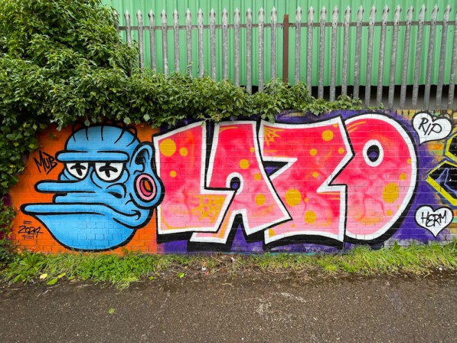
I am so pleased that Donz is starting to get more of a presence on Natural Adventures, an unfortunate underrepresentation which is an artefact of the fact that I don’t visit L Dub all that often, and Donz rarely paints anywhere else in Bristol.

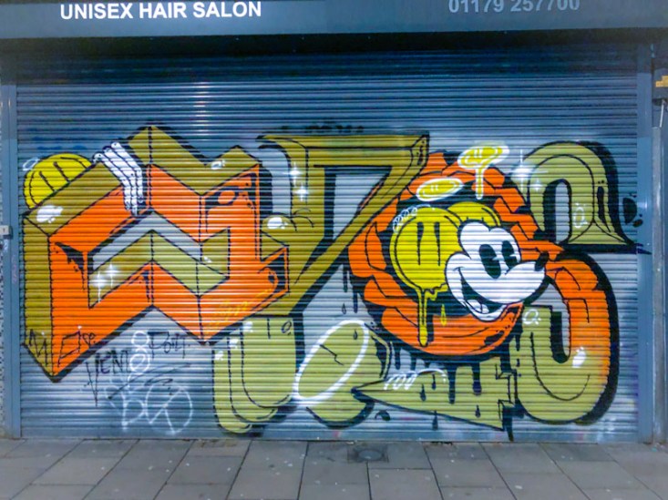
This is a fun piece in a typically wacky style from Donz made all the more fun by the inclusion of a character face replacing the ‘O’ in his letters. It is a fact of life in street art writing, that the letter ‘O’ more than any other can be fiddled around with and replaced, for example Biers and his WD40 and Boogie with his double ‘O’s. There is some nice lettering here that bleeds away at the top.
Either Donz needs to come into the centre more often, or I need to get out to L Dub, but until one or both of those things happen, Donz will most likely only make occasional appearances in these pages.