
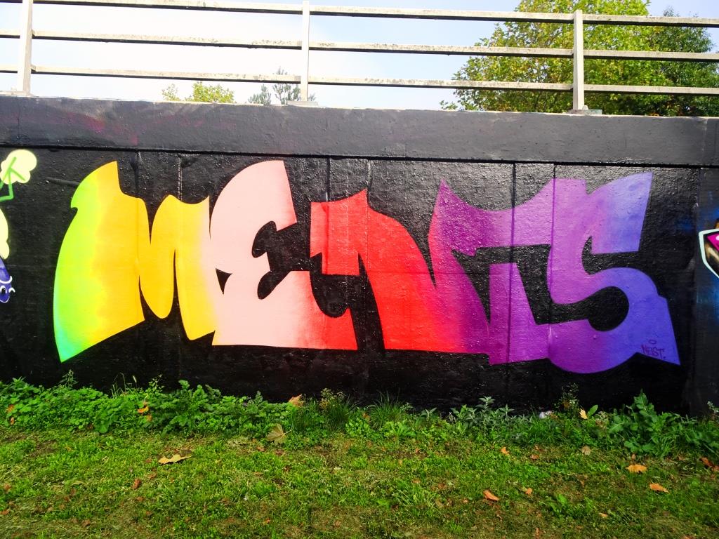
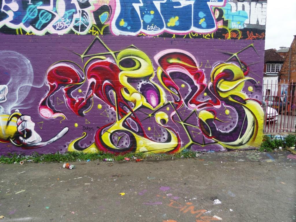
A gallery of extraordinary ‘organic’ graffiti writing from Bristol artist Ments
All photographs by Scooj


A gallery of extraordinary ‘organic’ graffiti writing from Bristol artist Ments
All photographs by Scooj
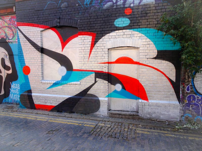
Moon Street still holds an important place in my heart. Although it rarely hosts ‘top end’ pieces it represents, for me anyway, the beating heart of the Bristol graffiti scene. The area around Moon Street is steadily being gentrified, and in time these images of street/graffiti art will be distant memories. I don’t recall seeing a Taboo piece in this street before, so I was thrilled to come across this one recently.

This new piece is beautifully laid out on a blue background that gives it some prominence. In typical fashion, Taboo’s unconventional lettering style spells out TABOO with a long-nosed character on the left and a ghostly face constituting the second O. As is often the case, there is a little shout-out to his girlfriend Amy. I’m really enjoying Taboo’s work at the moment.
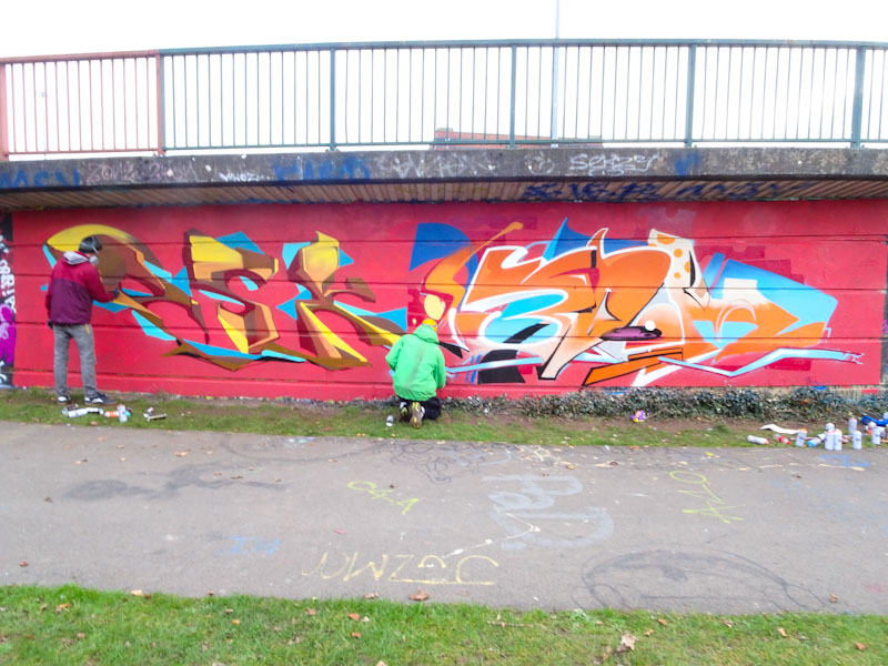
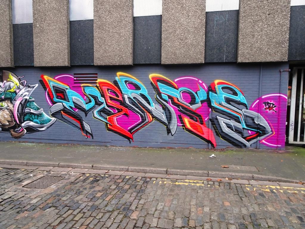
It feels like an eternity since I last saw a Biers piece that actually spelled out ‘BIERS’ rather than ‘OhYeah’, and I have to say it makes me very happy. I remember the first piece I ever posted by Biers – it had a piece of toast in it, and shortly after that I met him on several occasions while he was painting and we struck it off really well – it has been a while since I last saw him though.
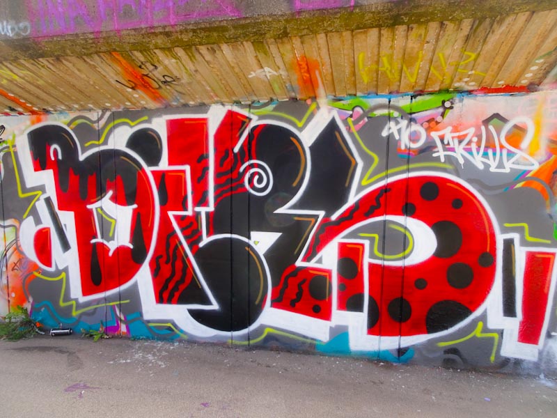
This is a regulation piece of Biers writing and all the more splendid for it. His irregular sized letters are expertly filled with black and red patterning. This is a most satisfying piece.
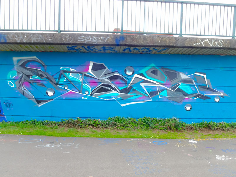
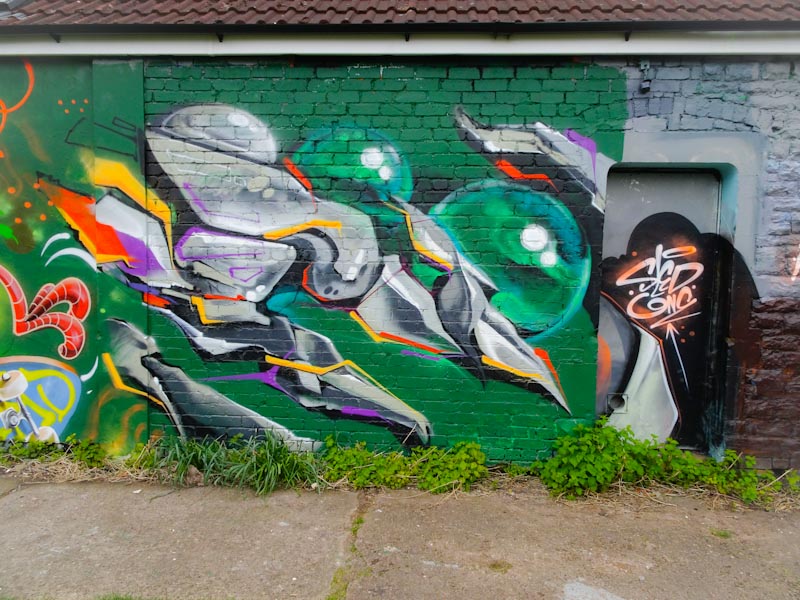
This might look like a solo piece by Decay, but it is actually a collaboration between Decay and Sludge. Now I don’t know much (or indeed anything) about the latter artist, but it appears the pair teamed up at least twice recently, and this is one of those combined efforts.
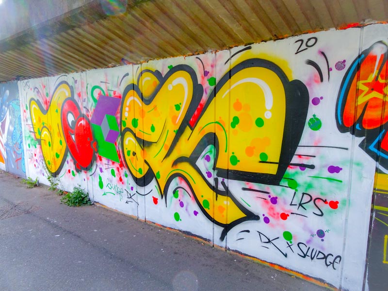
The work has all the hallmarks of a fabulous Decay burner painted with some bright colours and the customary red Chuck character, but it is the geometric form in the centre in green and purple and some of the surrounding decorations that have been provided by Sludge. As a whole, the piece is bursting with colour and energy – a confection almost. I love it.
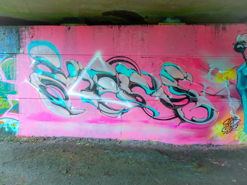
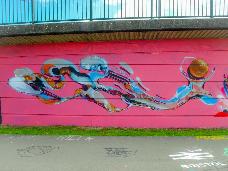
I mentioned in my last Mr Klue post that the artist tends to paint in spates with periods of absence interspersed with three or four sessions in quick succession and then all quiet again.
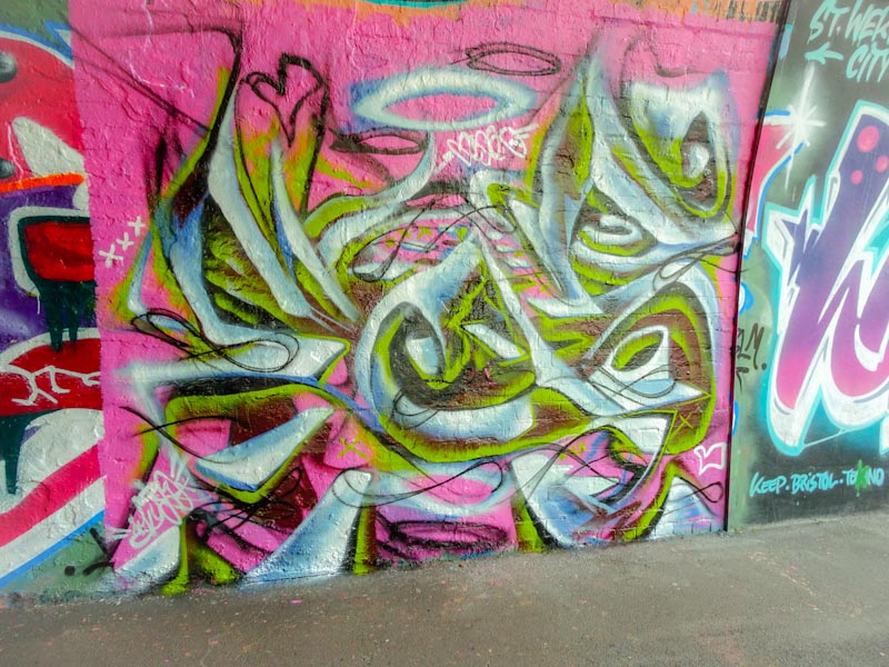
This is a modest little piece from a week or so ago near the entrance of St Werburghs tunnel. Set on a pink background, the abstract writing swirls about in a semi-solid state, which Mr Klue does so well. Usually his pieces spell out KLUE, but I am not too certain about this one.
He doesn’t visit Bristol often (enough) but when he does he always leaves us something special and on a recent visit Kleiner Shames painted this stunning piece which is a slight departure from his more recognisable FOIS letters that we are more familiar with.
Using colours that KleinerShames favours, and that help with identification, and a couple of designer block letters, the piece spells out the artist’s initials K S. I have missed seeing his work since he left for London, but we are blessed in Bristol that he makes these occasional trips to his old home.
I feel like I have been a little starved of pieces from Nightwayss, and I think the last one I posted was his large and stunning tribute to the NHS at the M32 roundabout. This is an altogether much smaller and intimate piece.
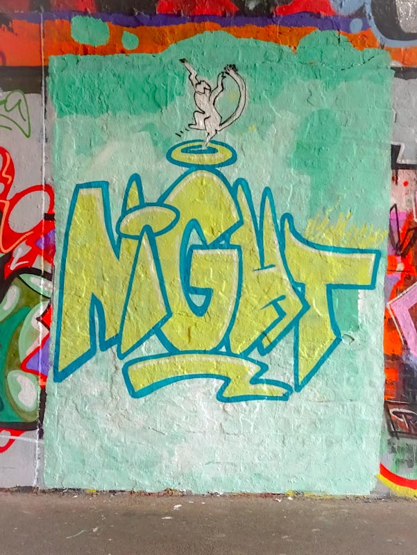
Nightwayss’ signature element is his little monkeys that appear in practically all of his works and he doesn’t disappoinnt with this one. His little monkey is dancing on top of a halo which sits atop the G in NIGHT. The letter style is tending towards cartoon and beautifully presented. This is a small, modest and fun piece from Nightwayss that made me smile when I saw it.
Varo is a really interesting artist whose work is most recognised for the large and dominant bull super-tag that he paints around the place, but this somewhat betrays his talent as a great writer. This colourful piece appeared on the M32 roundabout a week or two back and shows off Varo’s talent.
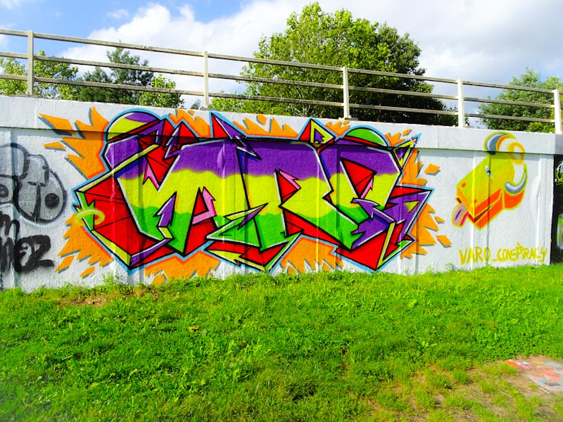
The left hand side is a beautiful piece of writing, spelling out the name VARO, with a quite unique 3D shading that gives the whole thing a sense of movement and energy. On the right is a fabulous 3D rendering of his bull tag which has something of the exotic about it – maybe something to do with its Spanish creator. A wonderful And energising piece.
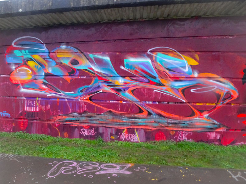
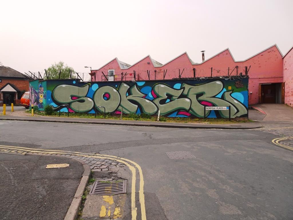
Soker got off to a slow start after lock down, but is gathering speed now, which is great for anyone interested in the work of this great graffiti writer. This lovely piece along the M32 cycle path spelling out SOKEM is a real treat.

The colour scheme is one he has used before in Bedminster although the style of writing is quite different. Of particular note in this work are the red stri[es on the 3D shading, proviting extra depth, and the blue bubbl;es for interest. Overall a sumptuous piece.
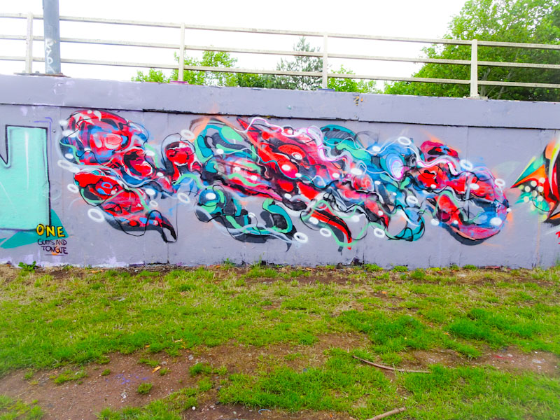
Unlike other artists in Bristol, Rezwonk has been relatively quiet since lock down restrictions have eased, although I am aware of a couple of new pieces in Lawrence Hill, there have only been a handful from this master graffiti writer.
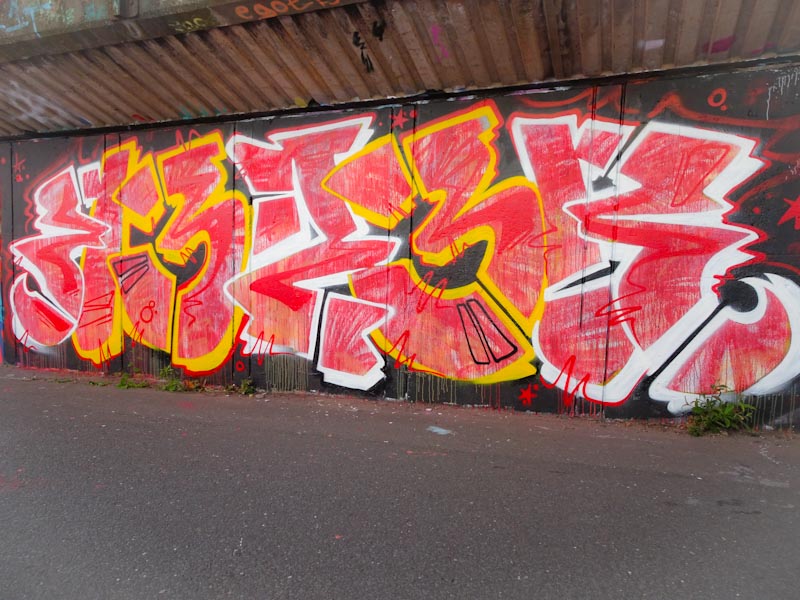
This gorgeous piece in red, with alternating white and yellow outlines looks deceptively child-like, but is technically complex. The fill, which would have been laid down first, looks almost like crayon, a technique Rezwonk has used before. The two elements that set the piece off nicely are the red detail lines and the copious drips at the bottom of the letters. Great to see,


