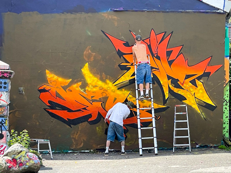
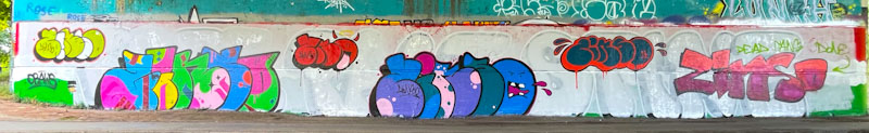
I am rather liking it that Sub is starting to switch things up a little and push his boundaries. Because he has only three letters to play with, his pieces tend to be quite large and impactful, perhaps at the expense of subtlety or detail, but this piece is quite different from his usual fare.
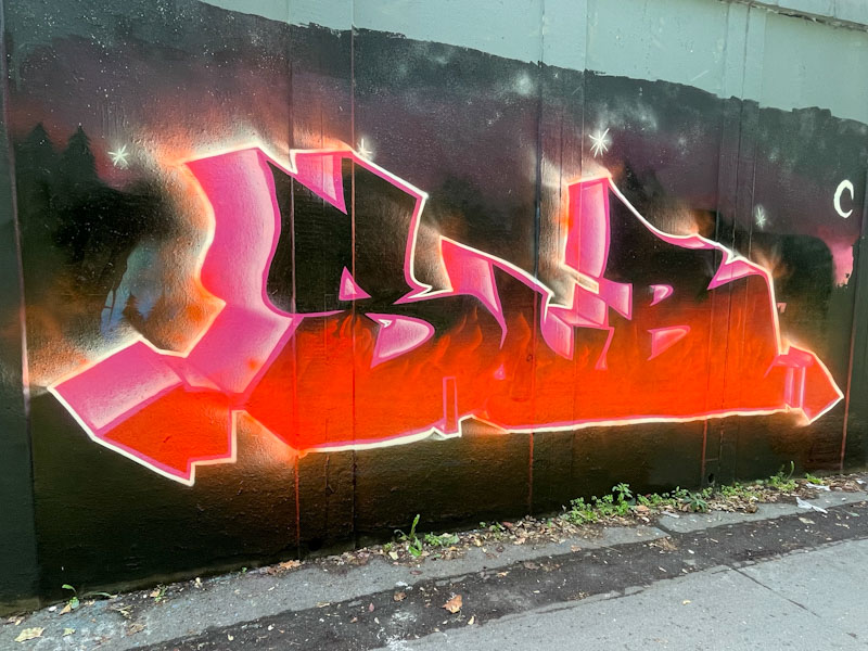
Sub has offered up a scorching scene of burning letters, that meld into one block, set in a nighttime landscape. This is a great creative advance, and probably took him some distance from his comfort zone. One small detail that I’m sure he will have learned is to do the border last, so that it retains the crispness between the letters and the background. All good stuff, and plenty more to come soon.