
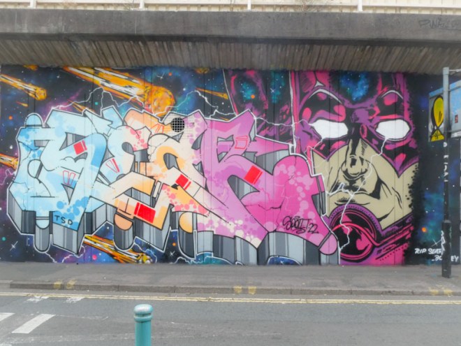
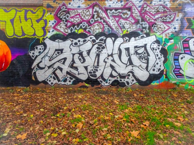
A gallery of outstanding graffiti writing from Bristol’s Dott Rotten (Spoilt)
Instagram: @dottrotten
All photographs by Scooj


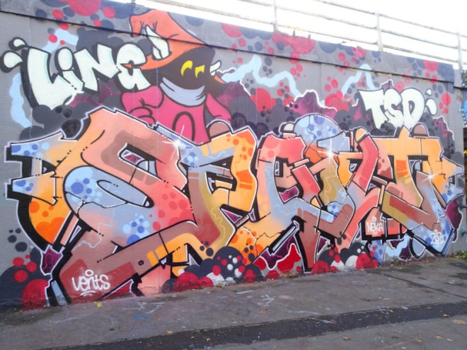


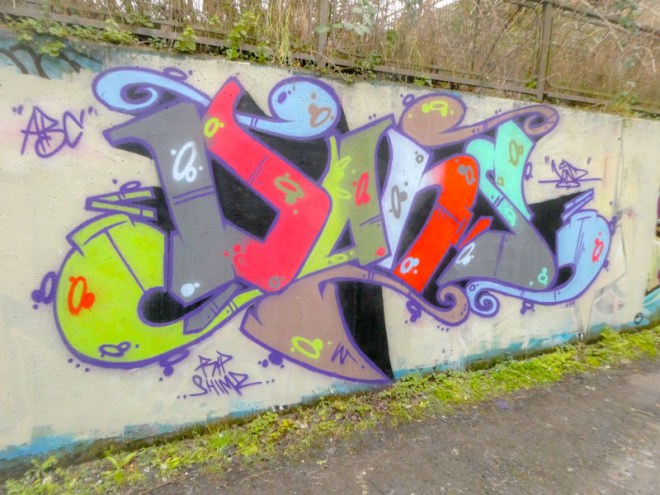
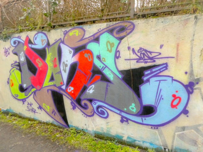
A gallery of outstanding graffiti writing from Bristol’s Dott Rotten (Spoilt)
Instagram: @dottrotten
All photographs by Scooj
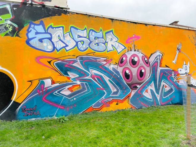
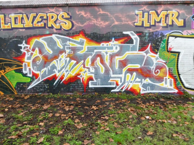
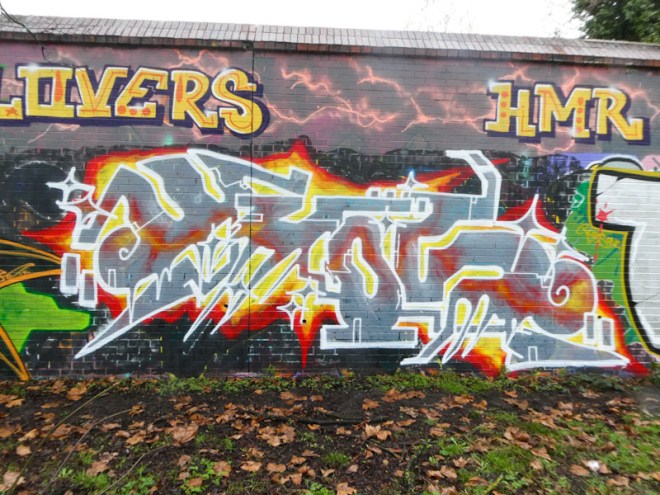
I expect that if I went back into my archives I would find plenty of pieces by Donz, but I have only recently, consciously, picked up on his work, and have some catching up to do. Donz is a friend of DJ Perks and their work is often co-located, particularly at L Dub.
This is a rather unusual piece of writing, to my eye, because of the colour selections, which don’t seem to follow any convention, but simply hit you in the face. The letters are nicely designed, the fills solid and borders sharp, it is technically very nicely done. I particularly like the inclusion of scrolls at the top of the piece. Great work from Donz.

If I posted all of Klashwhensober’s graffiti writing, then there would be precious little else on Natural Adventures. I believe that he might be slowing down a little, as when I last met him he told me he has recently managed to get a new job, and I wish him the very best with that.
I decided to pick this one out for posting because it is typical of his work and has repeated some colours that worked so effectively before in a December 2022 piece in the tunnel, although the colours are divided horizontally instead of vertically. What you will always get with Klashwhensober is creativity with his writing. There is always something going on, together with the form of his letters. There is lots of dripping happening in this one, for example.


I really haven’t seen enough from these two of late. I guess that both of them are pretty busy with real life, and that happens, but it means that the class they both bring to the streets of Bristol is missed. This collaboration from 3Dom and Sepr also included the beautiful FOIS writing from Kleiner Shames (already posted).
On the left is a superb example of 3Dom’s superb writing style, including an eye character that looks to have dropped from the sky. There is a fluidity and confidence that oozes from 3Dom’s work, and just by looking at it, you can tell that it has been crafted by a master at the top of his game.
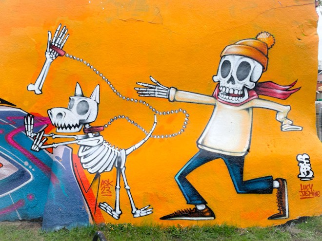
Sepr brings with his some of the best character work in the city/country. His unique style is instantly recognisable and more often than not humorous. In this piece, a skeleton is out walking his skeleton dog, who has run off, pulling his forearm away with him. Great fun. A measure of the quality of this piece is the care and attention given to the bead lead, which in close-up is meticulously painted. What a great collaborative wall, well worth a look.
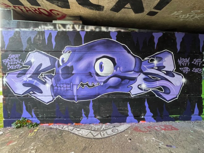
I haven’t seen a character piece from Werm for quite a while, so it was really great to find this one in the little tunnel at Cumberland Basin. Werm has definitely been concentrating on his writing, which has been going from strength to strength, but I have to say that I miss his characters, because they brought something a little different to our streets.
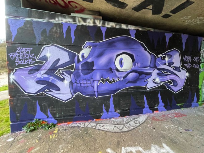
In this piece, Werm hasn’t entirely dispensed with his letters. The skull makes up the letter ‘R’ in the three-letter acronym LRS – an international crew that Werm belongs to, called Last Radical Souls. The shading work on the skull and letters is beautifully executed, and the white border is nice and sharp. This is another great piece by Werm.
An artist who had completely fallen off my radar over the last couple of years is Whos. His anti-style of graffiti writing could be seen from time to time about the place, but this curious piece is the first I have seen for a long while.
This fiery piece doesn’t follow any particular convention and is free from constraints. Spelling WHOS, one of my favourite elements of this piece is the flame plasma line running through the grey letters, looking like it is behind them. This is a nicely crafted piece, and a welcome return to the pages of Natural Adventures.
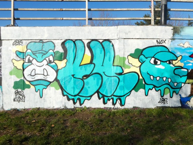
Kool Hand is another artist who has been keeping things ticking over nicely pretty much for the last year. His characters have been diversifying a little over that time and new favourites have emerges, like the dog in this piece. There was a time when his work was almost entirely confined to orangutans and crocodiles.
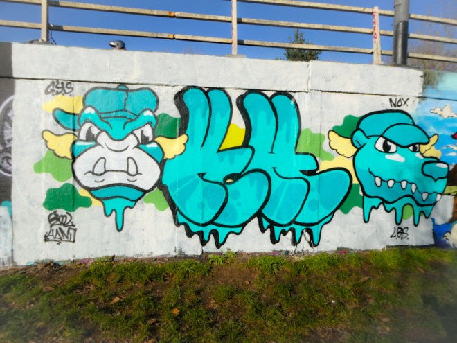
The letters KH are book-ended with two characters, his trusty orangutan wearing a cap on the left and a toothy dog on the right. Both characters have wings, although I am not sure of the significance of this addition. The colour scheme has focussed on blues, and works really rather nicely. The piece was painted as part of a larger paint jam a few weeks back.
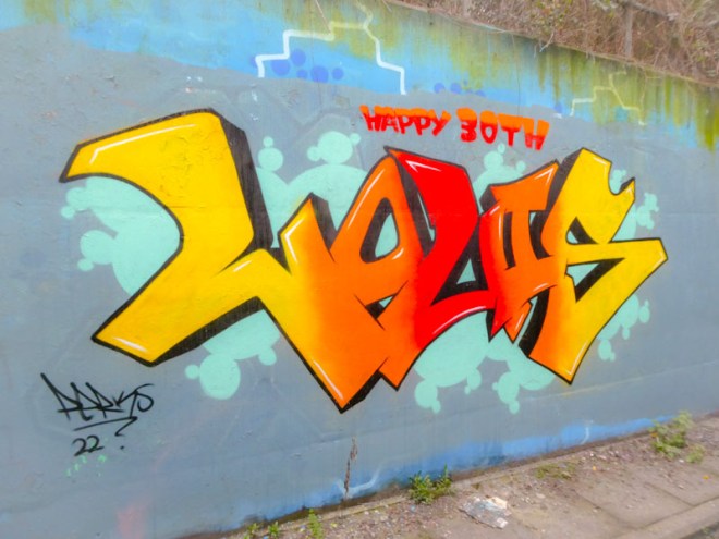
One of the joys of being a talented graffiti writer or street artist is that you can paint lovely things to commemorate your friends and family with living, contemporary, bold statements of your affection and love, in public, or sometimes not so public places.

In this lovely piece from DJ Perks, he celebrates his son Louis’ 30th birthday. How I would love to be able to do such a thing (I have tried once or twice, but my skills are rudimentary). The colour transitions in the piece are immaculate and the little white accents create an incredible illusion of depth, helping the letters to pop out from the wall. Finished so cleanly, this is a lovely piece from DJ Perks.
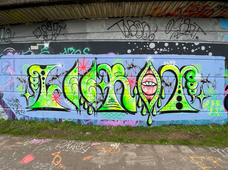
It feels like Lee Roy is a man in a hurry. I haven’t seen much from him over the last couple of years and now all of a sudden his work is appearing all over the city and it is difficult to keep up. This is a recent one on the long wall at Cumberland Basin.
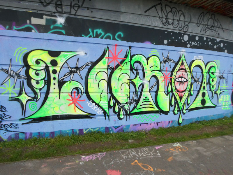
Lee Roy likes to paint his letters in a rather unconventional style, verging on anti-style. The letters are beautifully designed, but unruly and unfettered. There is scope for the artist to do whatever he likes, and he does. Weirdly, some kind of order is restored with the inclusion of a strand of barbed wire running through the piece. This is a really imaginative, creative and curious piece from Lee Roy. Watch this space for a whole bunch more from him.
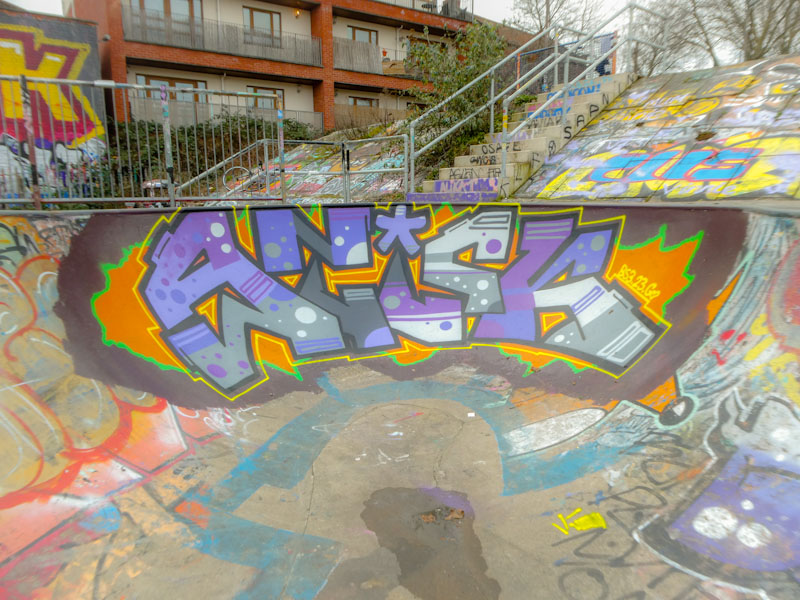
I was lucky with my timing when I found this piece. The paint was still wet, and there was a lovely smell of spray paint hanging in the air. It is always good to capture fresh work in skate parks, because the wear and tear from skaters kicks in very quickly.
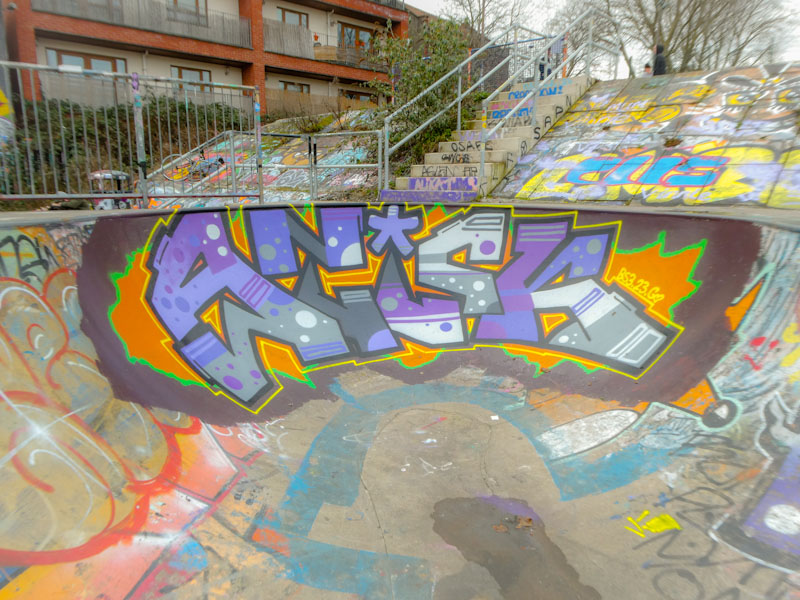
It just so happens that Corupt was sitting on the other side of the wall, watching Stivs, with Mozzarella, painting another wall. I stopped for a nice chat with both of them. As always with Corupt, this piece is perfectly finished, with very clean lines and fills. It seems that he prefers to write STICK rather than CORUPT these days, which works equally well. So much about photographing and chronicling street/graffiti art is about timing, and I got it just right on this particular day.


