
A gallery of outstanding graffiti writing and character pieces from Bristol’s Taboo
All photographs by Scooj


A gallery of outstanding graffiti writing and character pieces from Bristol’s Taboo
All photographs by Scooj
This beautiful piece of calligraphic writing is from Todoaciem and a part of a large collaborative wall from an HMR crew paint jam a few weeks back. I have already posted the Dabuten Tronko piece from the same wall, and now it is the turn of Todoaciem.
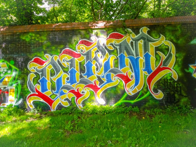
The wall itself can be problematic to photograph, because the sun shines through large trees, creating a dappled effect. The only solution is to come early in the morning or on an overcast day, but beggars can’t be choosers, so dappled pictures is what I have.
Set on a green smokey background, which is amplified by the light quality, Todoaciem has written the letters CIEM in the most beautiful font and with a heraldic colour palette. If medieval knights did graffiti, perhaps this is what it would look like. A hugely accomplished and brilliant piece of writing.
Although we don’t see too much of Hire these days, what we do see is of the highest quality. I am really enjoying Hire’s relatively recent reinvention pieces like this one in which he writes the word ODIAH
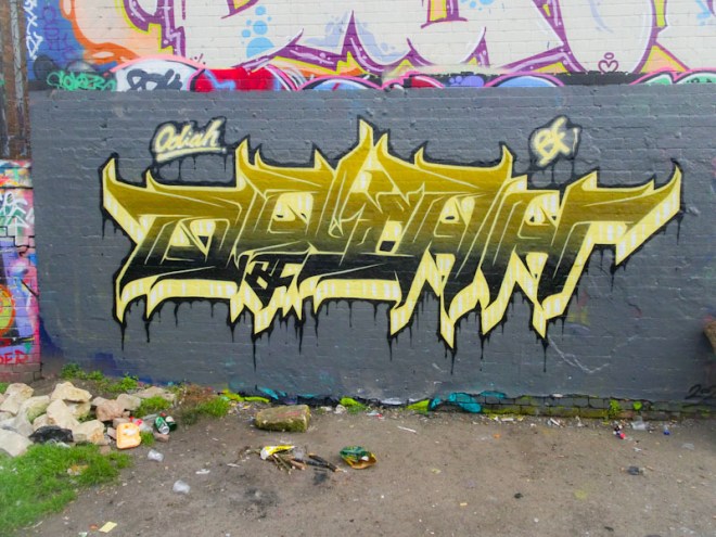
This beautifully presented piece incorporates some of the jagged elements of Hire’s customary style but softens them into a rather more conventional writing style. The colours are nicely selected and the grading of fill from light to dark is masterful. A really nice piece.
What a delightful surprise it was to come across this unheralded piece from Haka on the M32 roundabout. Haka is one of those artists who very much does his own thing in his own way, and pretty much every piece is a tribute to his friend CK One, which is really touching.
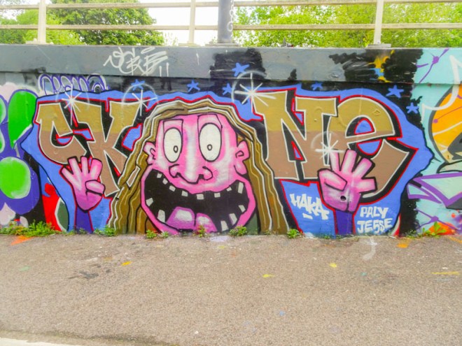
This particular vibrant and wild portrait is, according to Haka’s own Instagram feed, a self-portrait. Having never met the artist, I can’t vouch for its accuracy, but I haven’t seen anyone looking like this in the Bristol area before. Great fun piece.
An outstanding calligrapher who is possibly a little underrepresented in Natural Adventures is Stivs. This beautiful piece of calligraphic writing from not too long ago so perfectly demonstrates his extraordinary ability to paint such beautifully formed letters.
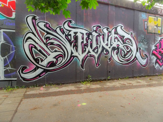
The whole shape and size of this piece is really most aesthetically pleasing and easy on the eye. The writing which spells STIVS is elaborate and complex, but in the hands of the artist is expertly executed. Note to self – time for a Stivs gallery?
I have to take my hat off to Claro for even attempting to paint this wall, but to do it so well is truly awesome. This bit of wall on the M32 cycle path is made of stone and is very textured, horrible and lumpy and bumpy, not that you’d know it from looking at this piece by Claro.

Claro’s style is so very distinct and quite unlike anyone else’s in Bristol. Spelling out HONS his writing combines curves with angular straight lines that at times looks quite uncomfortable if you know what I mean. The letters on their own might be a little boring, but with all the decorations and border colours, the whole thing ends up looking pretty good. More to come soon.
As mentioned previously, Lee Roy has had an exceptionally busy spring, and although he has been painting for a while he only appeared on my radar in February this year, and for every piece posted, there is at least another one in the archive.
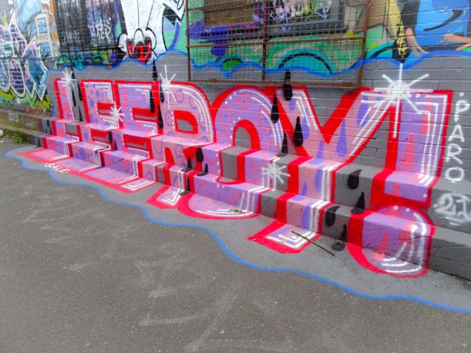
What I like about Lee Roy is that he is constantly rethinking his work and his most recent ‘reimagining’, to use a contemporary word, has been to drape his pieces onto the ground and cascading down steps as in this example from the M32 cycle path. A great idea very nicely executed. Inevitably, there is more to come from the artist.
Here is another fine piece from the slightly unloveable Turoe. This wall is in my view one of the best in Bristol, but it rarely fulfils its potential. I would love to see it fully buffed and some large-scale collaborations painted on it because these days it tends to look a bit messy.
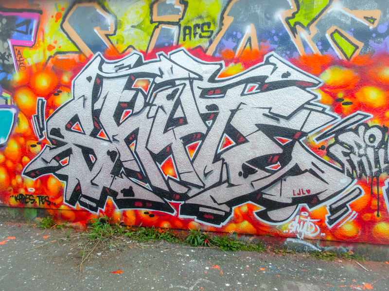
This ‘shyte’ piece was painted back in April and stands out in chrome on a hot yellow, orange and red background. This is a classic wildstyle burner and another in the vast collection of pieces from Turoe.
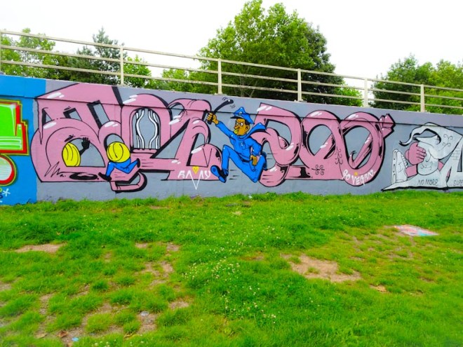
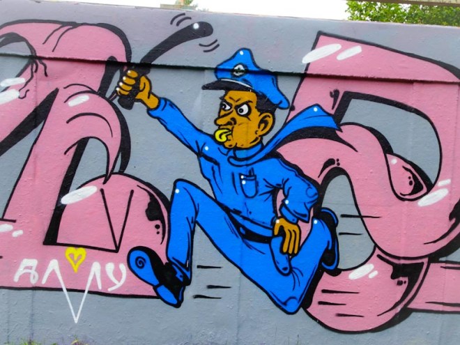
Eman is an artist who has been knocking it out of the park recently, and this piece in the little underpass underneath the M32 is a bright, cheerful and exceptional writing/character combination from the artist.
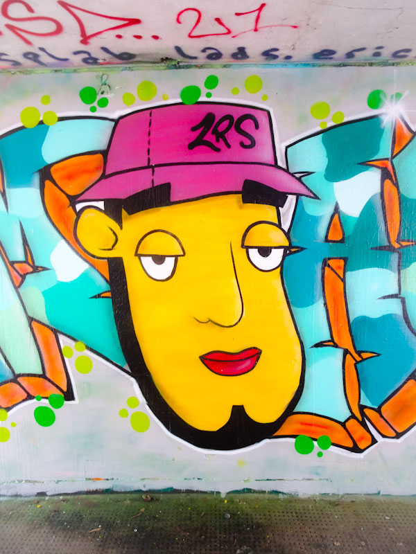
The character part is one that he has been working on recently and has a strong impact thanks to the clean design and great use of colours. The shadows underneath the eyebrows is a really nice touch too.

The writing spells out EMAN and is presented in bright uplifting colours, perfect for this gloomy spot. The cracked letters are filled with various shades of blue in a random pattern, but it is the orange 3D shadow and green decoration dots that add som inch to the overall outcome. A very nice piece indeed.
When I saw this piece I heard a voice in my head shouting out the word aaciiid! In that rather annoying 1980s way, if you know what I mean. This is a lovely piece from Mr Draws in Dean Lane in which he uses letters other than his customary DRAW. Good to see.
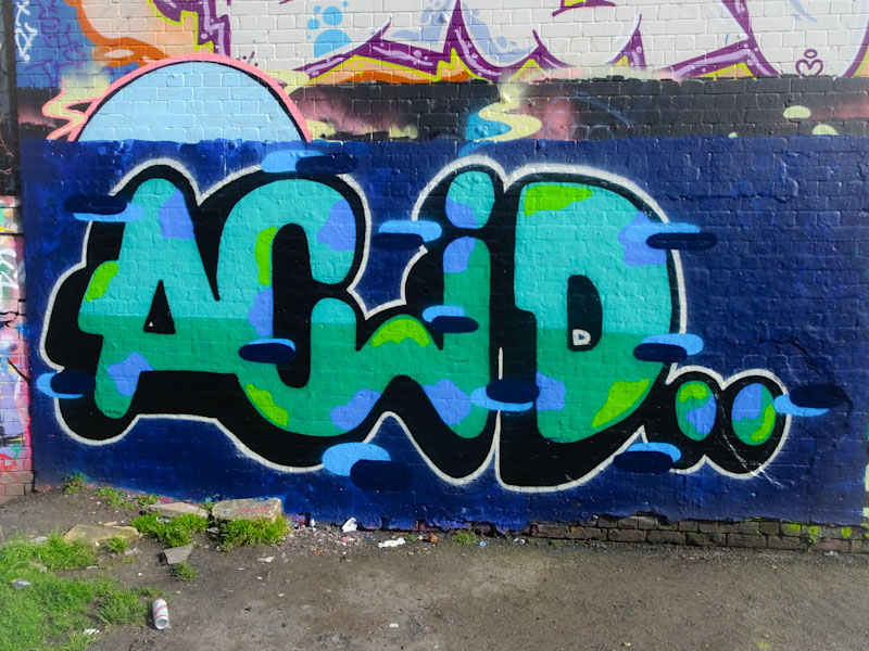
I think that this is a beautifully executed piece with a good solid wall wash, great colour selections and some nice decorations in the form of blue horizontal lines with darker blue shadows. A tight piece from the Bristol stalwart.


