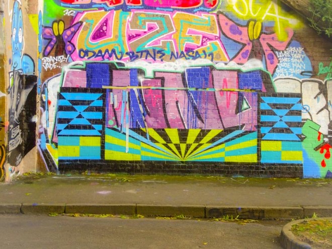
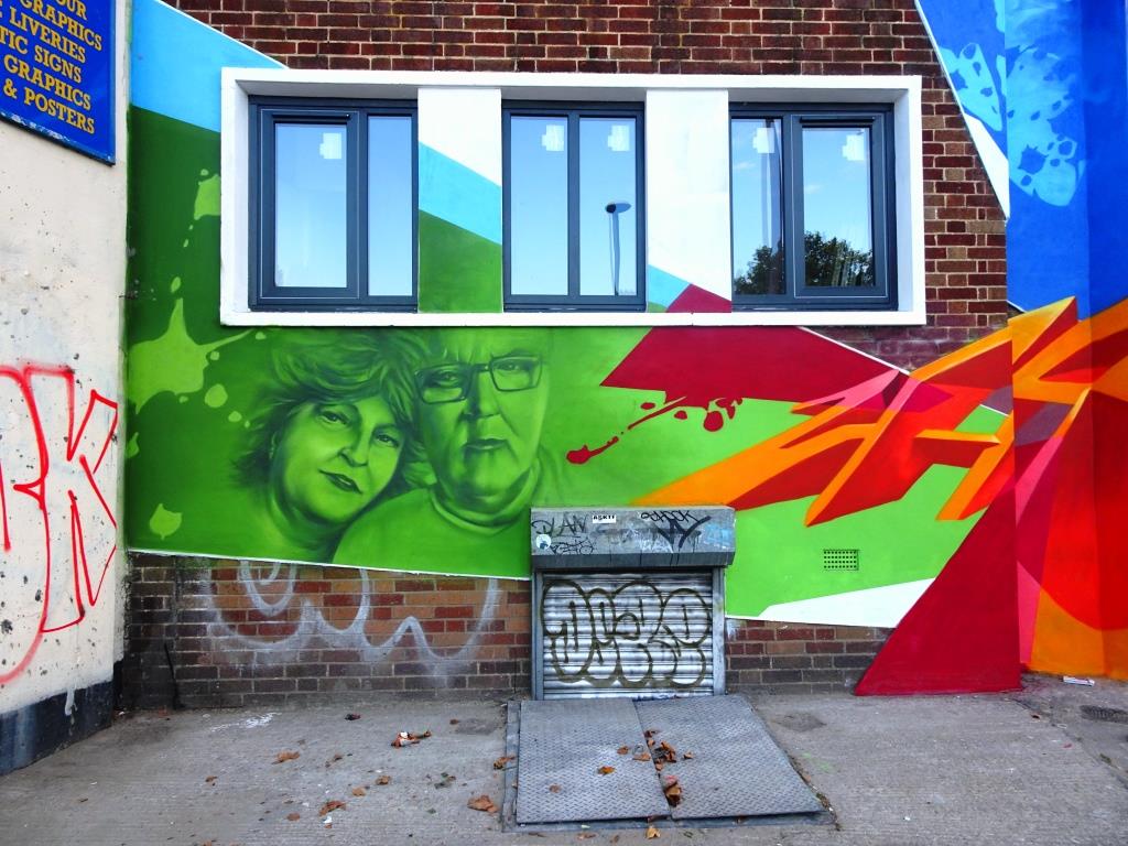
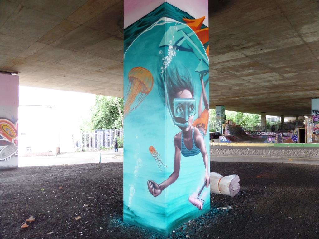
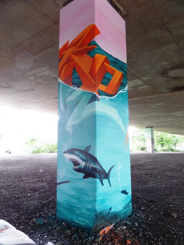
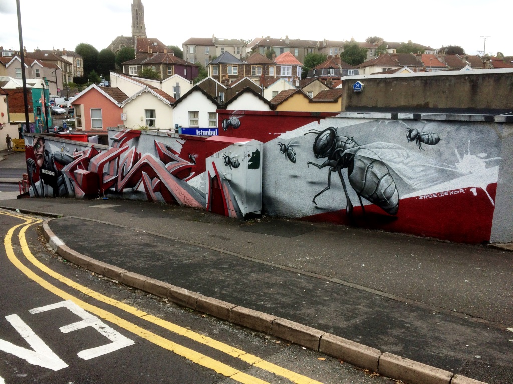
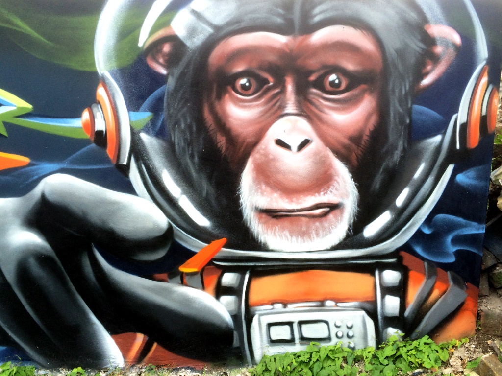
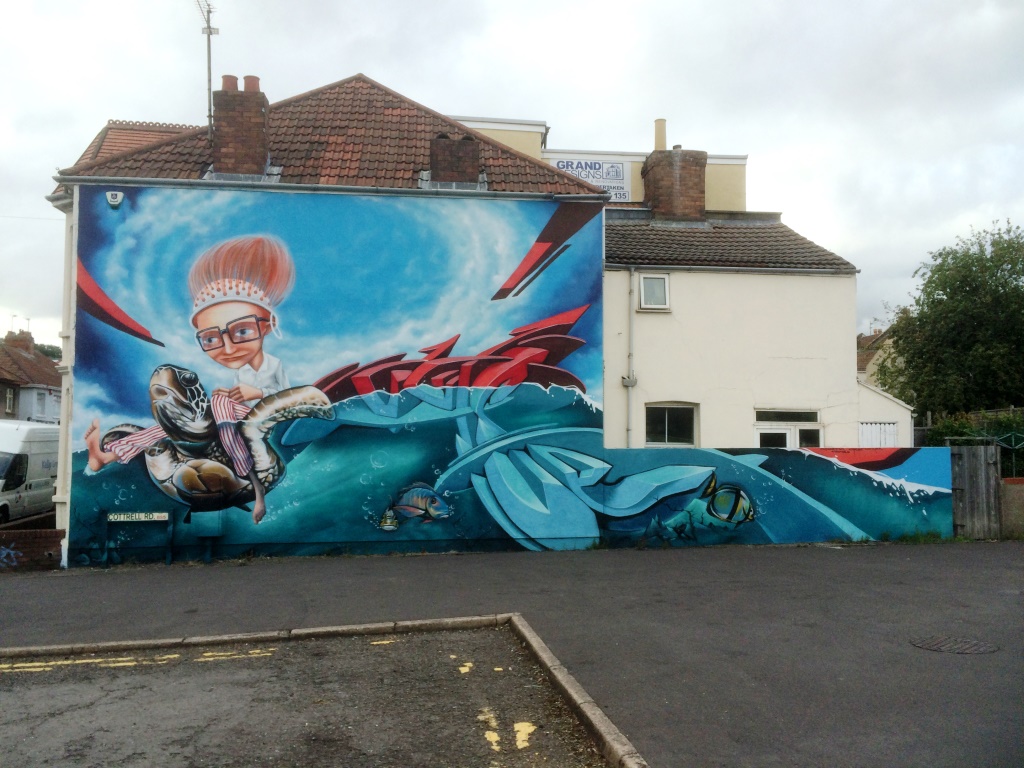
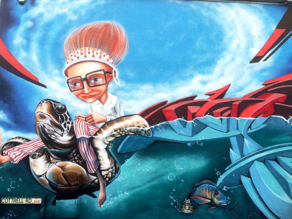
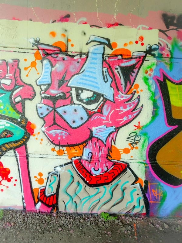
It is always good to return to my old favourites from time to time, keeping Natural Adventures grounded and not obsessed with high-end pieces, which could be very tempting but nowhere nearly as representative of the Bristol scene. The beating heart of graffiti and street art lie in the hands of people like Mr Draws and Face 1st – the unsung heroes of our city.
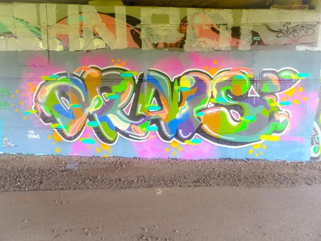
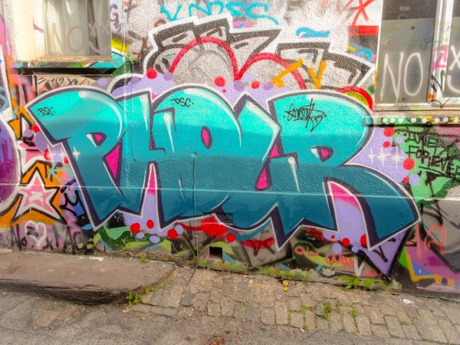
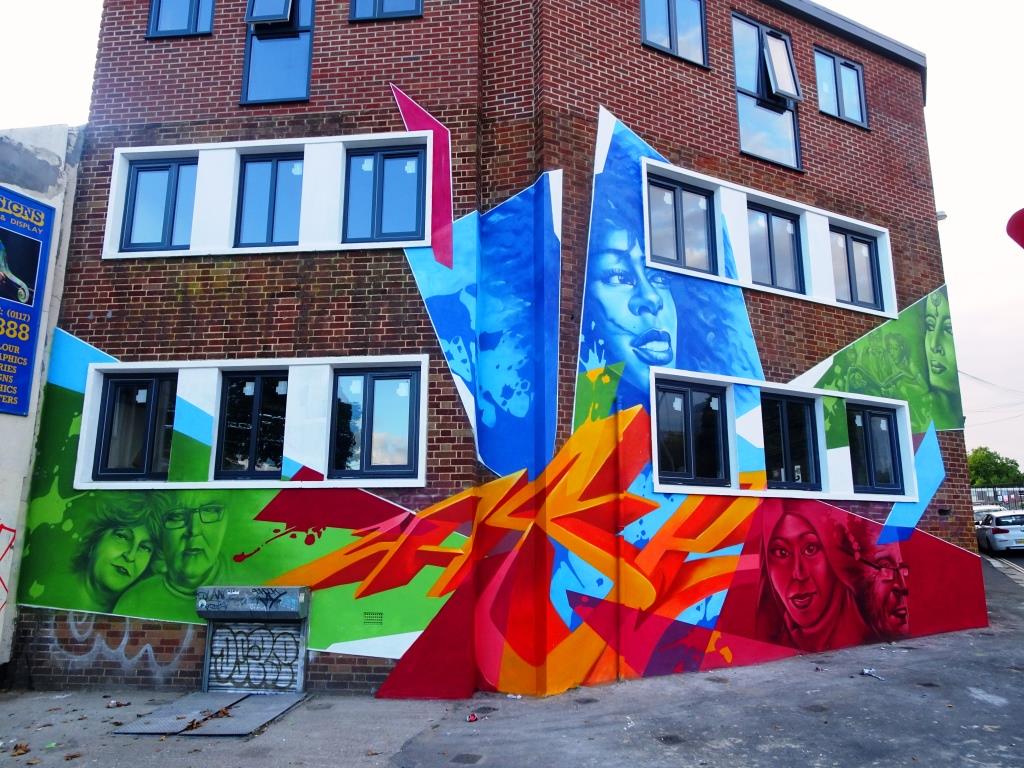
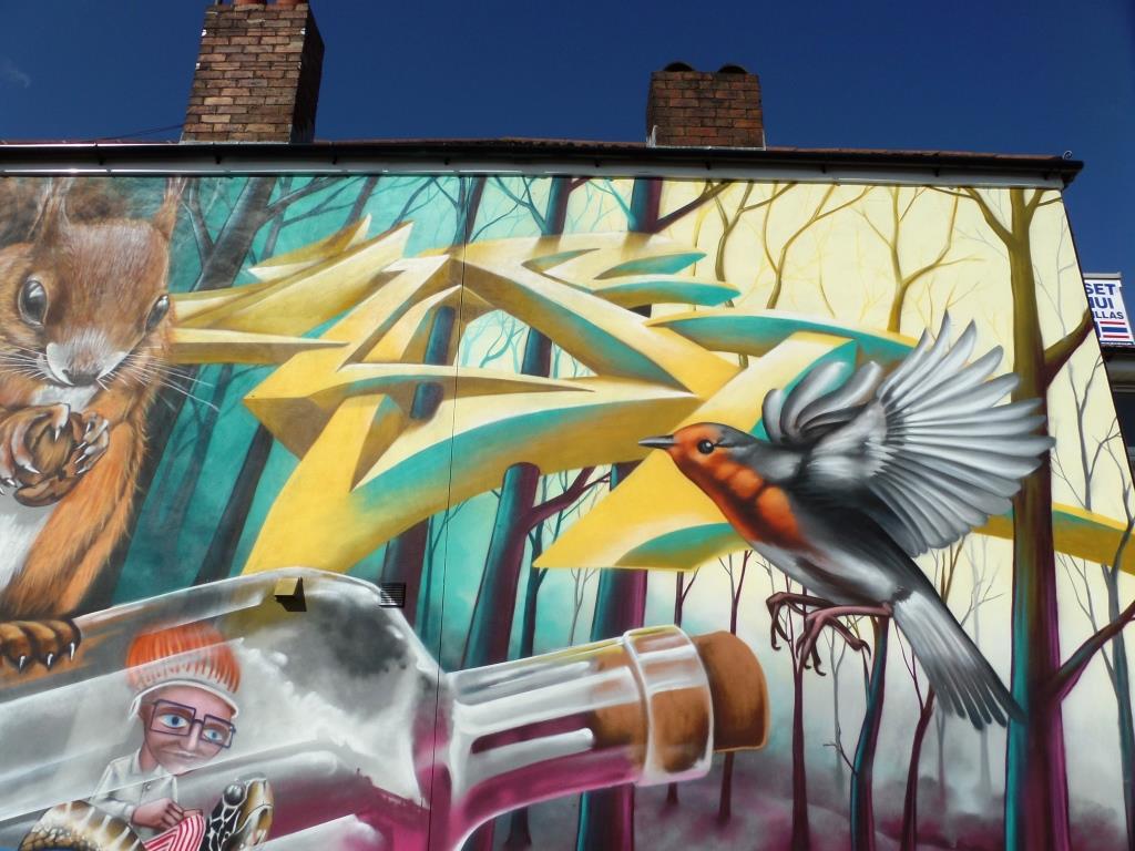
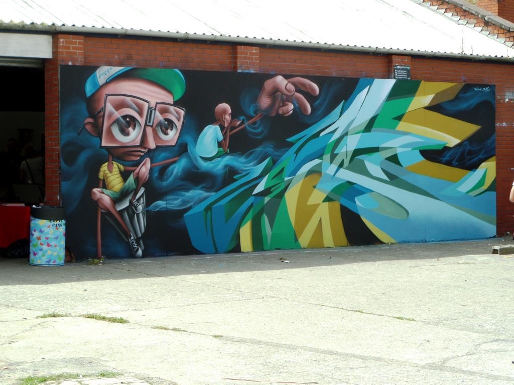
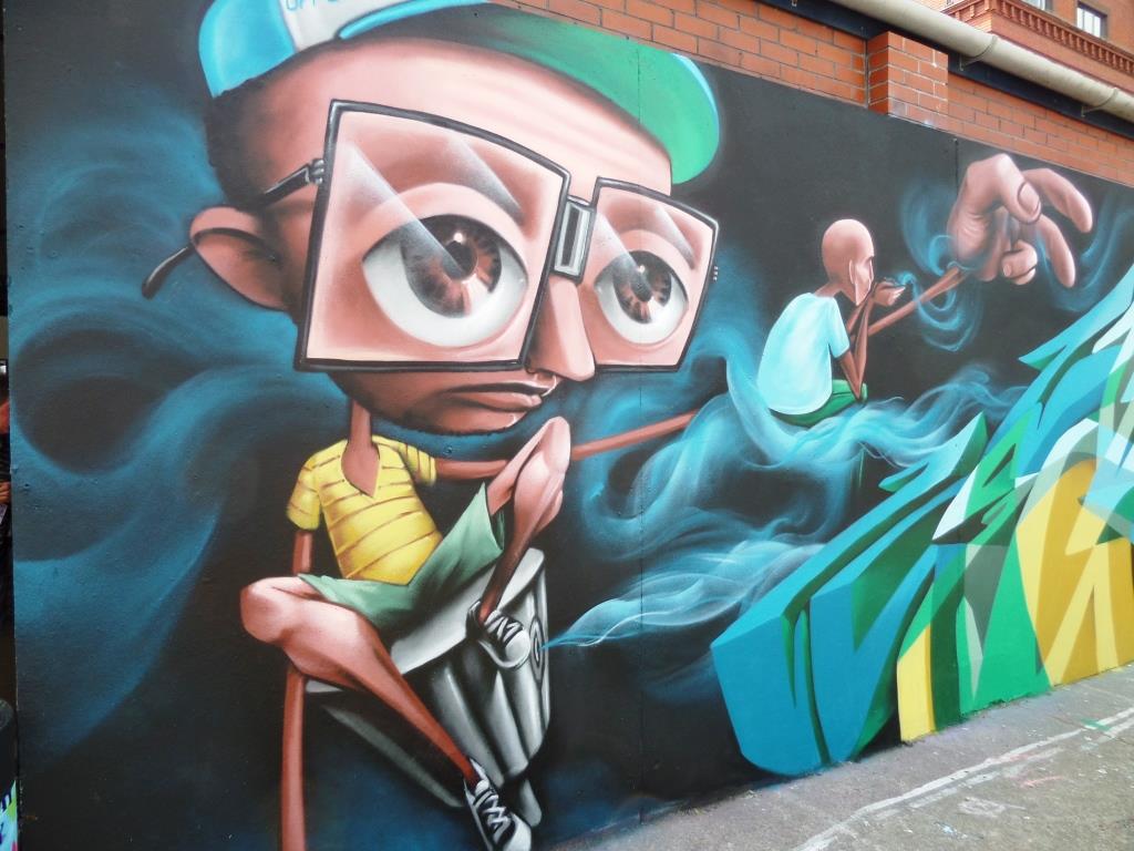
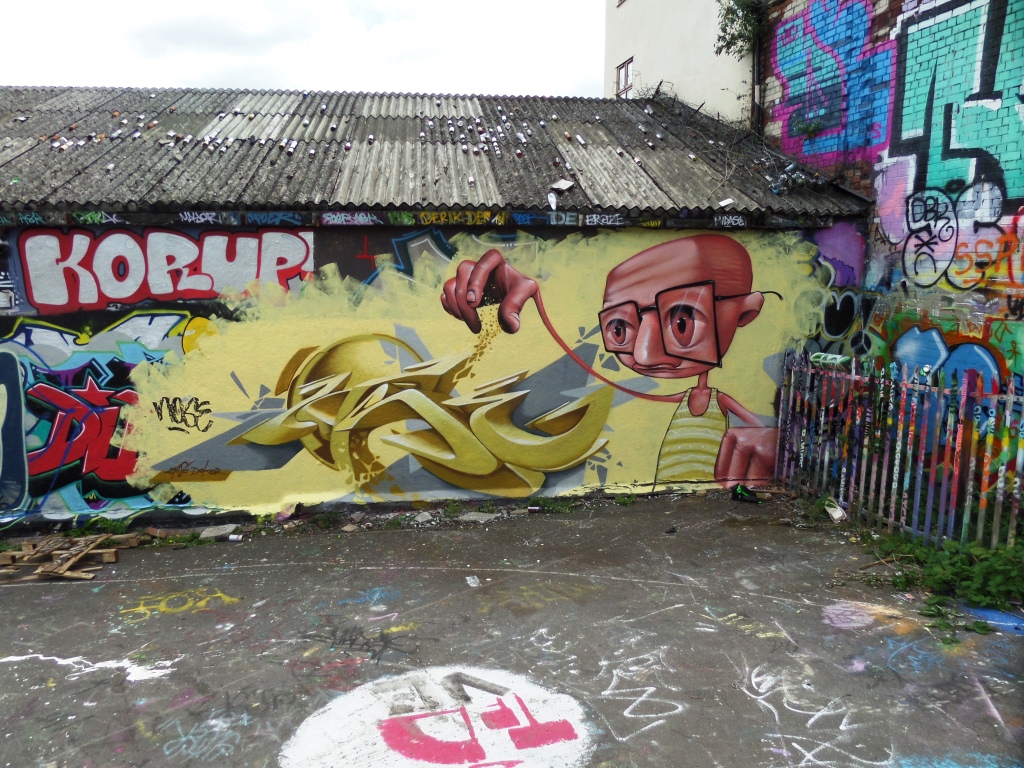
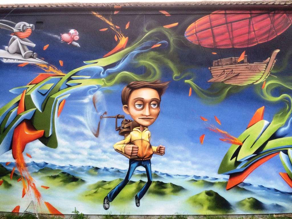
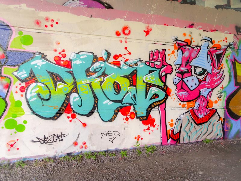
This is a piece from a short while back by Mr draws that has a rather lovely feel to it. The colour fills are rather interesting and unruly, but somehow work really well and the whole thing, spelling out DRAWS, lifts nicely off the wall and the vibrant colours make it nice and lively. A decent piece that many might ignore and walk past.