
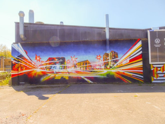
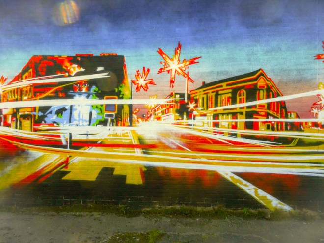
A gallery of outstanding graffiti writing and cityscapes from Bristol artist Acer One.
All photographs by Scooj




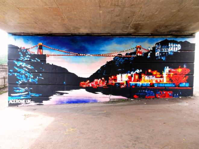
A gallery of outstanding graffiti writing and cityscapes from Bristol artist Acer One.
All photographs by Scooj
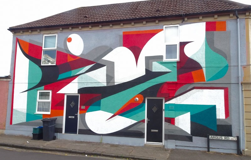
With this year’s Upfest being spread over 75 days on 75 different walls, it is quite a challenge to know what is being painted where and by whom. On the upside, you get to meet a lot of artists while they are working, but on the downside, there are some pieces that go under the radar and are quite easy to miss. The watch word here is vigilance combined with keeping your ear to the ground.

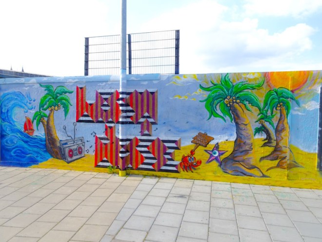
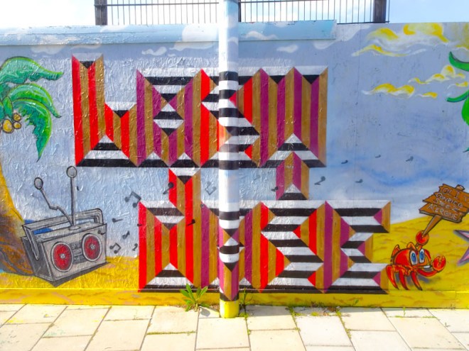
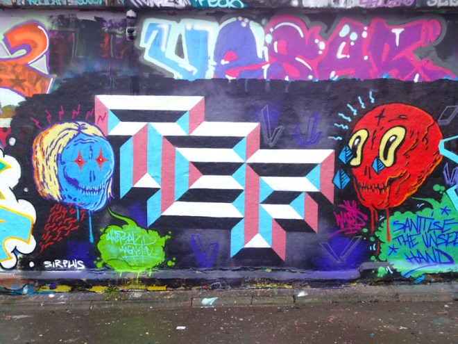
I found this outstanding mural by Bristol old-boy Kleiner Shames while looking for another piece nearby, and what a surprise. One of my absolute favourites so far. I actually have a couple of Kleiner Shames originals hanging up in my home which I bought from before he moved to London and I have a hugh soft spot for his work. Many of his pieces used to spell out FOIS, but I’m not sure if I can see it in this one but I do think there is writing in there somewhere. The shapes, colours and overall design are magnificent, and remind me of what we are missing since he moved away. Bravo!
It can become confusing sometimes when you are on the hunt for a specific piece. When there are hundreds of images swirling around your head that you have seen on social media, it is easy to forget what pieces you have gone out to photograph, and this confusion very nearly led to me missing out on this magnificent piece by Laic217. I had walked past it, thinking that I had photographed it before, and it was only on my return journey that I realised it was new but not the new piece I was looking for… that was somewhere completely different.

Laic217 has been creating some amazing pieces recently, and he is definitely on an upward trajectory. This skeletal figure, puffing away on a joint, is another fine example of the artist’s work, once again showcasing his craft in painting materials and fabrics that his characters wear. More good work. I was fortunate enough to bump into Paul H on this trip, and it is surprising how often that happens, but here, miles away from our usual haunts on the same day at the same time, was quite bonkers. We stopped and chatted for a while before I had to scarpa back to work.
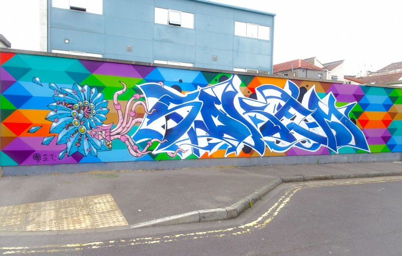
This is a very special wall, indeed all the walls around the Sofa Project are special. A special wall deserves special treatment and this fabulous recent collaboration from Paul Monsters, Andy Council and Soker, is, I would say, very special.

To the left of the collaboration is a stunning nautilus or ammonite piece by Andy Council, who seems to have strayed from constructing his creatures from architecture to painting blocks that are ‘stitched’ together with bits of ‘chord’. The outcome is a very clever effect of life that is constrained from inanimate parts. Andy Council has been unbelievably busy on the streets over the last year, and I can’t remember a time when I have seen so much of his work. This is very good news.

To the right of the creature is a high-end piece of wildstyle writing from Soker painted in shades of blue with a white border/3D shadow. Spelling SOKEM, the whole thing is very easy on the eye and so obviously painted by a creative master. It is near perfect.
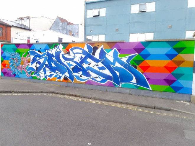
This collaboration just wouldn’t be anywhere near as good without the outstanding geometric pattern piece from the fabulous Paul Monsters acting as a backdrop, but contributing so much more than that. Paul Monsters pieces might just be the most recognisable in Bristol, and he has really carved out a niche for himself with this unique style and palette.
Overall an outstanding collaboration and a real treat.
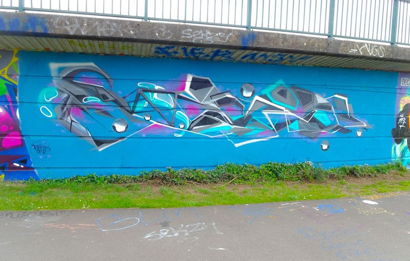
It is a funny thing, that I don’t fully understand, but consistently, whenever I post Ments pieces on Instagram they just never get as many likes as other artists’. The only conclusion I can draw from this is that these complex organic pieces don’t translate very well onto the small screen of a mobile device. In the flesh, these are always magnificent.
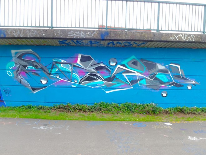
I love Ments’ work, it is always carefully considered and technically challenging and while it might not be to everyone’s taste it is consistently of the highest quality. In this one Ments presents us with his disguised writing in fairly angular lines, softened by the ‘marble’ decorations. A very nice piece indeed.
I got rather lucky with this piece, managing to time my walk perfectly to be able to catch up with the artist mid way through painting it. The very large piece is by an artist I had never met before and didn’t even know about, Vents137. For an artist who specialises in painting trains, this was something of a departure (no pun intended), but very impressive nonetheless. Vents137 wasn’t at all happy with the colours though and just wanted to get it finished quickly, and he was very quick.

The piece is a classic writing and character arrangement with the letters spelling out VENT and the character taking the form of a hooded robot kind of thing, reminding me a little bit of a Snub23. It is all quite unlike anything I am used to seeing in Bristol and I hope that Vent137 takes to the walls more often.

Yet another debut on Natural Adventures from an experienced artist. How on earth am I expected to keep on top of all of this, I ask you? Great piece that unfortunately didn’t last too long.
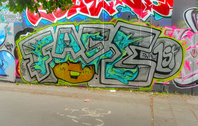
I am thoroughly enjoying this relatively recent design format from Face 1st, and I think that this is roughly the fifth or sixth piece that I have seen in this style. One of the pleasures of taking an interest in street art is watching how each of the artists evolve their styles and subjects… what they practice and what they choose to discard. Few things on the street/graffiti art scene remain static.

This piece appeared a couple of weeks back, quietly and quickly and unusually not as part of a collaboration with PWA friends. The block letters spelling FACE are filled with the dynamic (crazy) blue hair belonging to the smiling girl, whose omnipresence is at the heart of all of Face 1st’s work. I like the darker tones of the piece, which seem to work really well. Another beauty.
I am struggling to keep up with the sheer volume of new pieces appearing in Bristol, which means that there are increasing delays in sharing some of the superb artwork with you. I have a time-lag on average of about two weeks between photographing and posting, by which time some of the pieces will have already been painted over. Fortunately, this collaboration from Pekoe and Bnie is still there for all to see.
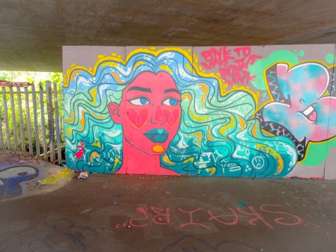
This is a stunner from Pekoe, entitled ‘pink to make the boys wink’. The pink face, in three quarter profile, is following the trend of recent pieces with dotted hearts and circles on the cheeks and chin, and of course, no Pekoe piece is complete without voluminous hair decorated with little symbols and layered colours. A lovely portrait piece.

To the right of the portrait is some lovely writing from Bnie, who has been very active in recent months. The ‘bubblegum’ colours of the letters are blended beautifully, but once again it is her 3D shadow that steals the day. I must find her and watch her paint to see how she creates this wonderful effect.
A very nice collaboration on one of my favourite walls from this RBF duo.
This is just wonderful, a large organic piece from Petro and the second to appear on Natural Adventures. Petro is an artist that I have taken an instant liking to. His unusual, subdued colour selections and desire to fill as much space as possible with his writing really appeals to me.

In this piece, it is the 3D purple shading that catches the eye as it sucks everything from the right to the left. As well as spelling out PETRO, he also includes the letters TFWH, although I don’t know what these relate to – a crew possibly. Big, bold, psychedelic and modestly outrageous – I love it.
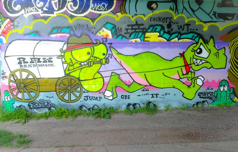
I think that the paint was probably still drying when I saw this lovely collaboration from Ryder and T-Rex under Brunel Way. And what a fun piece it is, with a taste of the Wild West about it. Ryder posted a little cartoon of it on his Instagram feed, which is great.

To the right of the piece we have a Tyrannosaurus rex 🦖 pulling a cart, so full of movement, and mischief. I expect that T-Rex could paint these characters in her sleep. I love the western touch of a red neckerchief round the dinosaur’s neck.
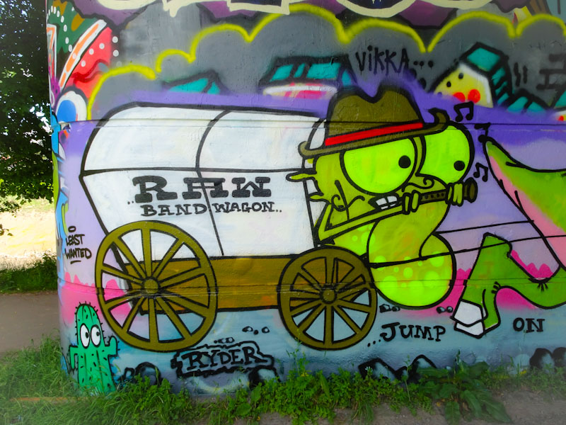
Being pulled by the T-Rex is a RAW ‘band wagon’ with a Ryder googly-eyed letter R playing an instrument. What madness is this? The whole thing is a bit of a riot and the collaboration a memorable one. Great to see that both of them are able to get out and paint together.




 Natural adventures