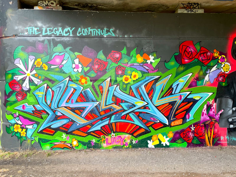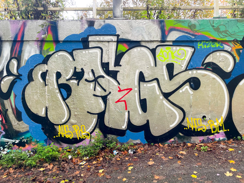
2025 has been an outstanding year for Bloem and Sub, with both artists making great strides forward with their work. In particular, Sub’s steady progress is beginning to bear fruit as he introduces more ideas into his letters, particularly with his fills.
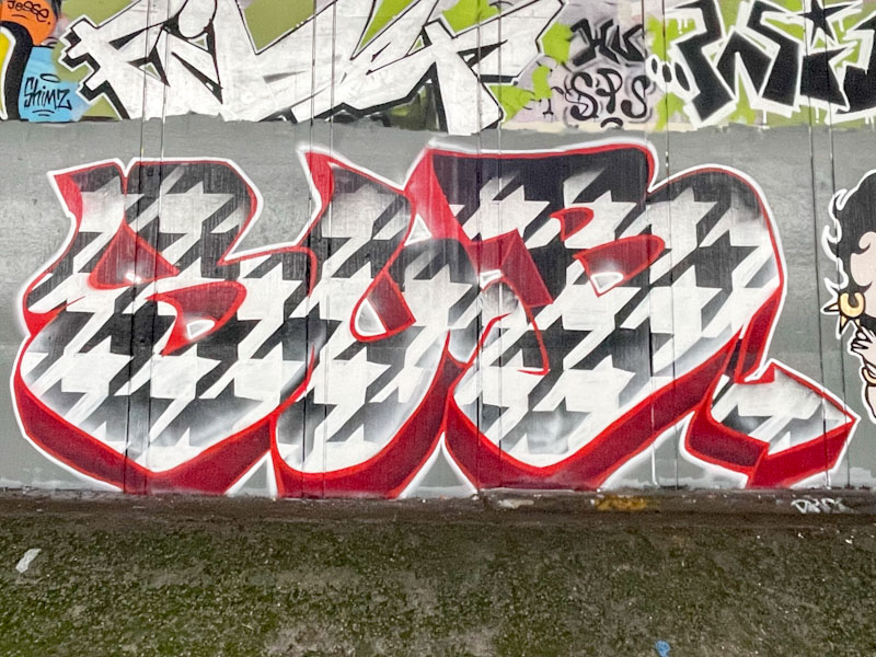
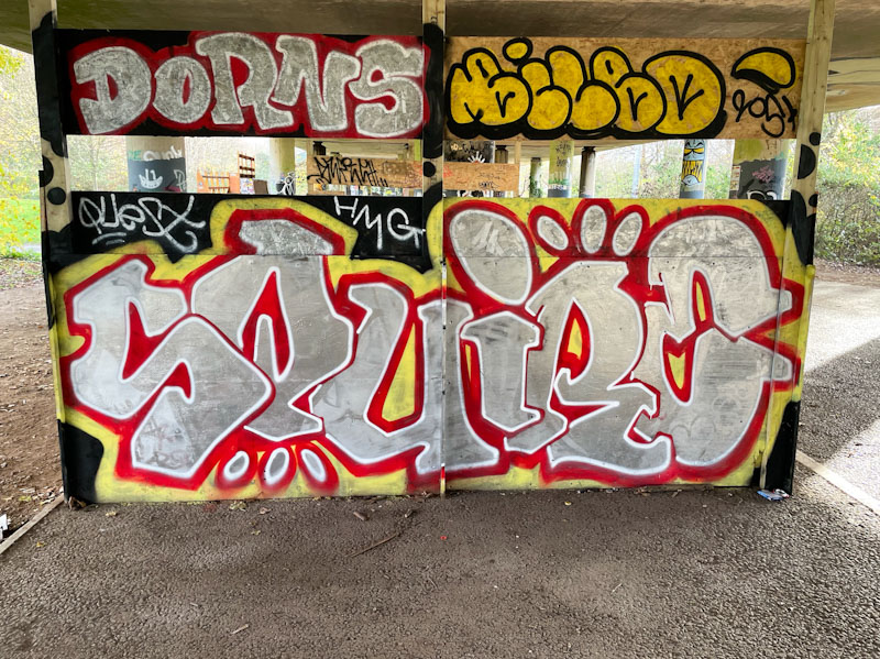
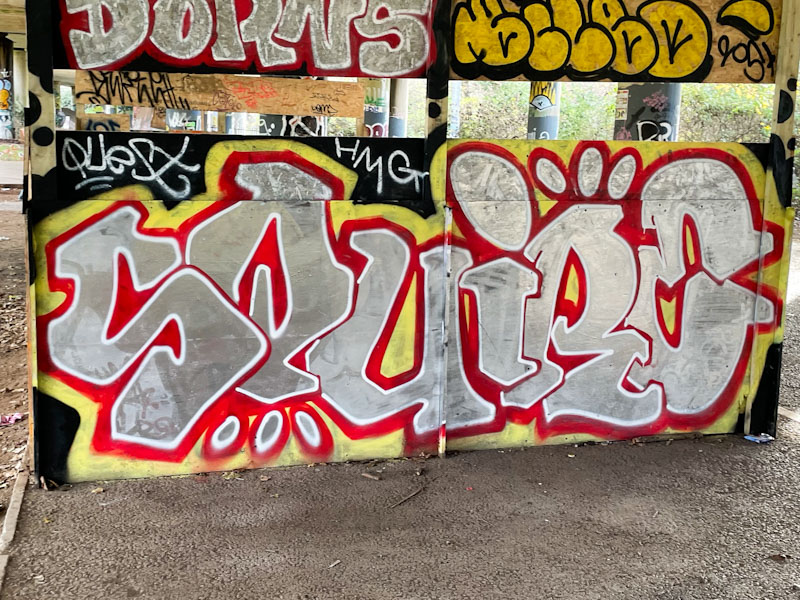
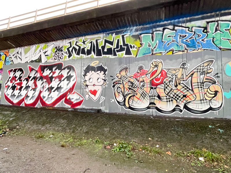
I have always felt that Sub’s letters were a little over large, but now that he is being more creative with his fill patterns, the space lends itself to something quite grand, like this repeating black and white pattern. This must have taken a while to complete freehand, but it was certainly worth the bother. A deep 3D drop shadow in dark red sets the piece off beautifully.
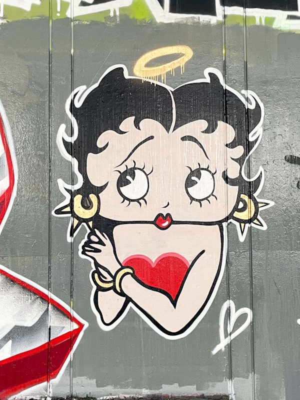
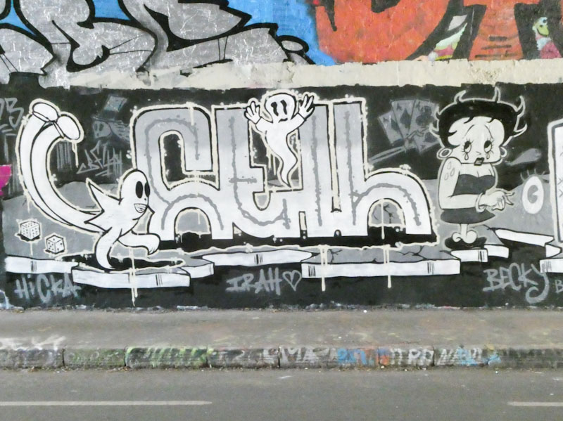
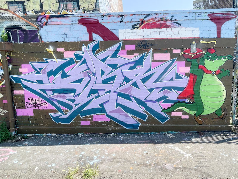
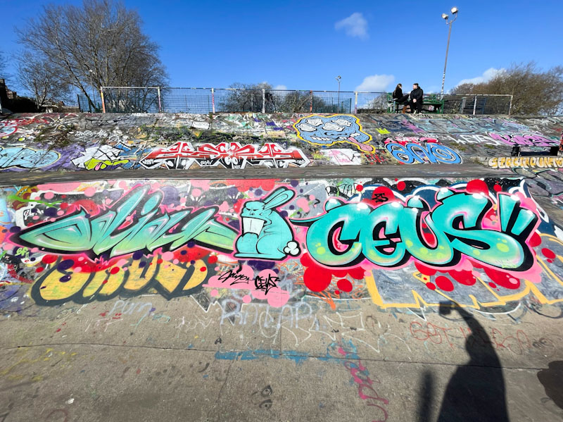
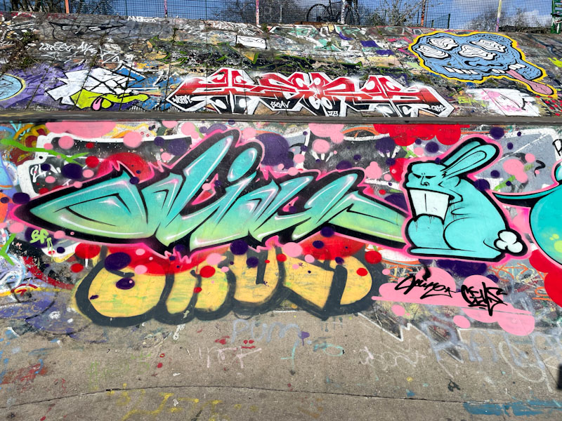
In the middle of the two pieces is a wonderful character piece of Betty Boop, skilfully and faithfully reproduced by the pair. I have a feeling that both artists were involved in the creation of this character. It is not the first time that Betty Boop has appeared in Natural Adventures (see below).
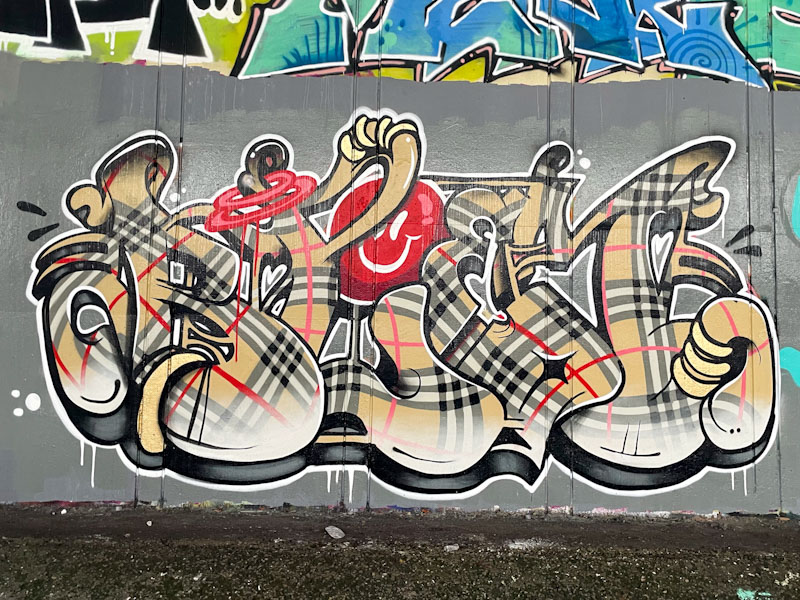
Bloem continues with her outstanding work, and this Burberry check piece is simply brilliant. The letters spell out BLOEM, and the check design flows beautifully through the piece, swishing in all directions. I love the red smily face and strap handle. This is a supremely well crafted piece and a wonderful collaboration. Bravo!