.
Another party
the gift that keeps on giving
Ma’s 91st year
.
by Scooj
- I ask ya… how many parties does an old lady need?
.
Another party
the gift that keeps on giving
Ma’s 91st year
.
by Scooj
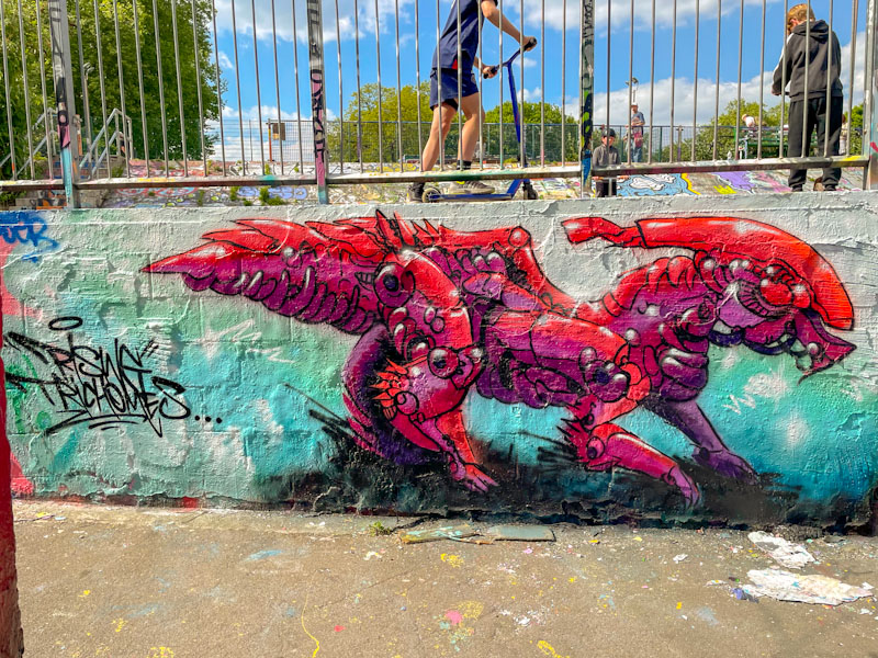
Andy Council has painted this exact spot a number of times, and I can only think that the shape and size of the wall suits his pieces really well. I had to make a return visit, because I arrived only moments after he had completed the piece, but there was a dirty great big shadow running right through the middle of the piece. Obviously, I managed to get some better pictures the second time.
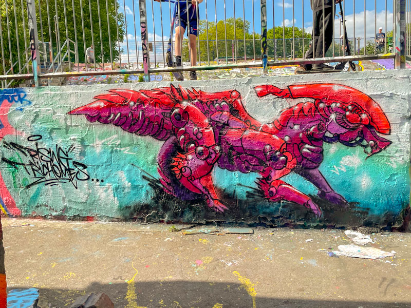
The creature looks like a cross between a dinosaur and the Alien creature from the film series. It is, as you’d expect, beautifully crafted from a load of component parts that come together beautifully to make the whole. The writing to the left ‘Rising Trichomes’ I think might be a reference to cannabis buds, and not, as I first thought, the dinosaur species name, haha. A fine piece from Andy Council.
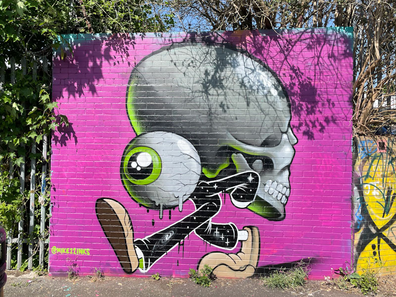
Ordinarily, I would expect a 3Dom piece to stick around for a month or two at least, but this wonderful piece only lasted a couple of weeks, which is a shame, but at least it was painted over with a decent piece, and it wasn’t tagged or bombed.
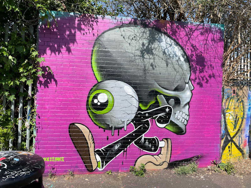
There is always a great deal of symbolism in 3Dom’s work, and here is a large eye character bearing the heavy weight of a skull. There is so much more going on here than simply the idea. The colour selections, light cast, shadows and perspectives are all impeccably presented and sets a bar for character artists across the land. You might spot a yellow Mr Bloopy in the background too.

It is a little disappointing that I have missed a couple of pieces by Hire this year, which is a real pity. You have to be quick off the mark in this game, and if you snooze, you lose. However, it does feel like Hire’s pieces, a bit like Kid Crayon’s pieces, tend to get painted over rather quickly. I am not sure if this is deliberate targeting or simply bad luck, I would like to think it is the latter, but whatever the reason, it makes their work feel even more precious.
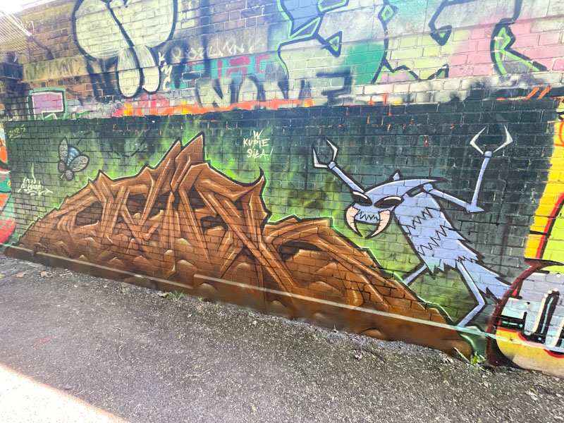
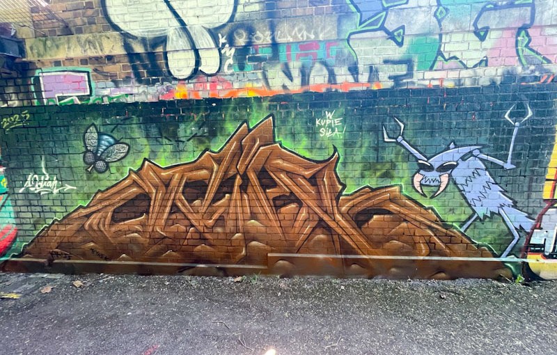
This is a slightly strange piece by Hire, which I think is meant to represent a pile of poo, with some excited insects making the most of it. Certainly it is an unusual composition in brown (why is everyone painting with brown this spring?), spelling out ODIAH, letters which Hire likes to use from time to time. How much better the piece looks with the subtle green glow on the edge of the letters, without which it would all look a little flat. Unusual and interesting work from Hire.
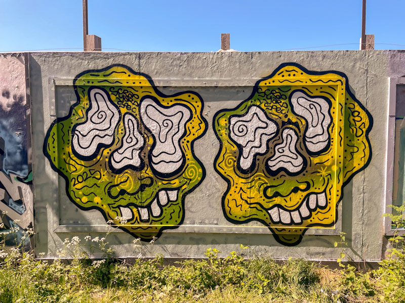
There are a number of artists who have a signature piece or style that through repetition become recognised, and lean towards iconic. Examples in Bristol would include Full Time Ghoul, Mr Underbite and perhaps most famously, Slim Pickings, who writes TES. The visiting Scrapyardspec is one of these artists.
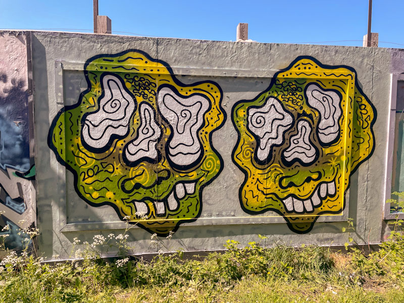
This is a fine double character piece from Scrapyardspec, looking a little golden in the late afternoon sun. His endearing, wibbly/goofy characters haven’t deviated much from the archetypal form and are beautifully filled with green and yellow colours that match the parched grass verge perfectly. His regular visits to Bristol are more than welcome.
Doors 308 – Copenhagen, Denmark (part VIII), September 2024
I made a mistake last week. Today is not my last post from Copenhagen, it is in fact definitely the penultimate post and next time will be the last one – I promise.
I am getting a little overwhelmed with work and real life distractions, but my blog is my safe space where I can exercise a little mindfulness and calm, for me. I try to make time and space to write every day, and even though some of it is absolute nonsense, it is a great discipline. I say all this, to try and explain my error last week. It is, however, trivial and unimportant.
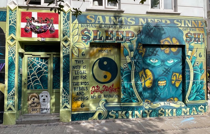
This week’s doors are from a slightly less affluent area of Copenhagen and is a series of graffiti doors. My knowledge of Danish street/graffiti artists is negligible, so I won’t even try to identify them. I do like the way doors are used in this way, whether it is high-end art or simply tagging, it adds a layer of story to the doors. I hope you enjoy them.
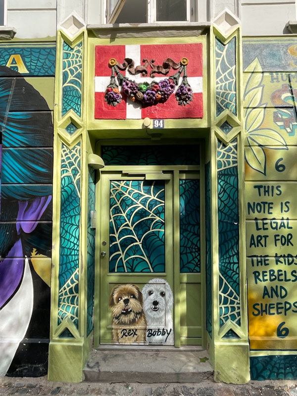
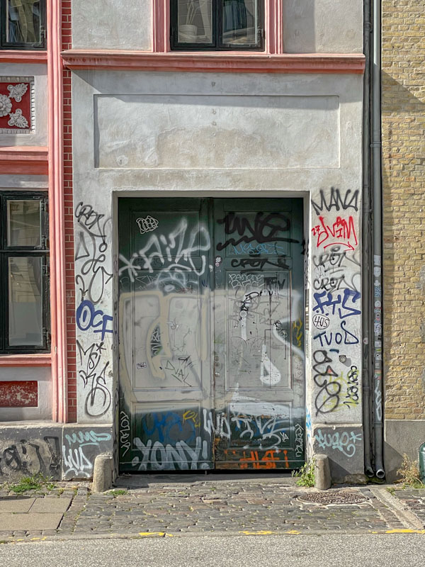

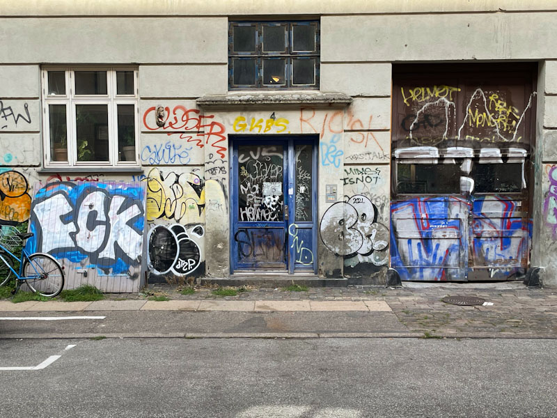
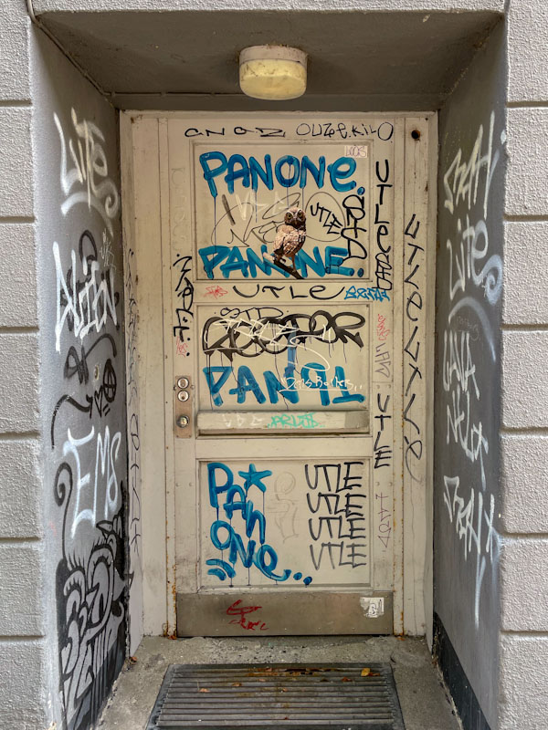


While I recognise that this selection of doors might not be everyone’s cup of tea, they further illustrate a different aspect of how doors are seen and used. Next time, I will be bidding a fond farewell to the doors of Copenhagen, I hope to see you then.
If you have made it this far, you probably like doors, and you really ought to take a look at the No Facilities blog by Dan Anton who has taken over the hosting of Thursday Doors from Norm 2.0 blog. Links to more doorscursions can be found in the comments section of Dan Anton’s Thursday Doors post.

.
Winds of change blowing
charter for sycophancy
to be seen to do
.
by Scooj
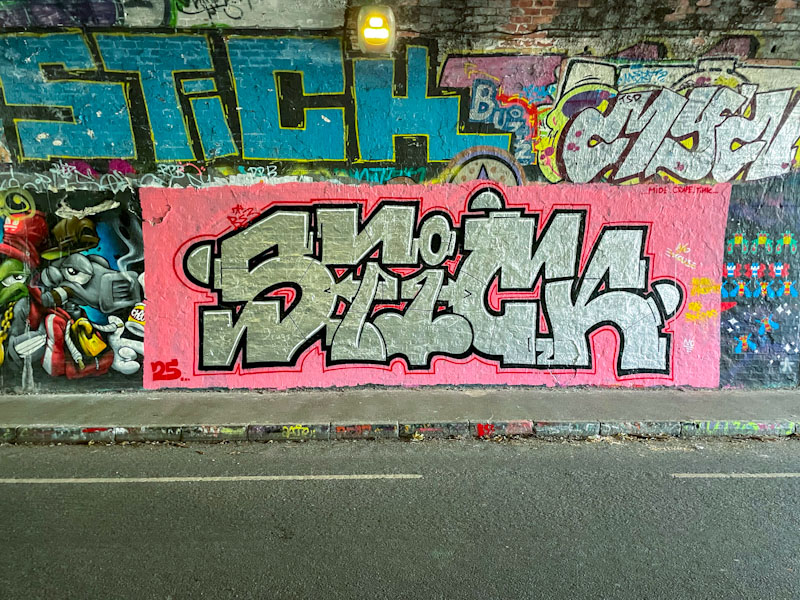
This bold piece by Corupt is in the darkest part of the St Werburghs tunnel, and I had to do a little bit of brightness and colour manipulation to bring out the best in these photographs. The tunnel is a great street art/graffiti spot, especially in wet weather, but the light conditions can make photography very challenging at times.
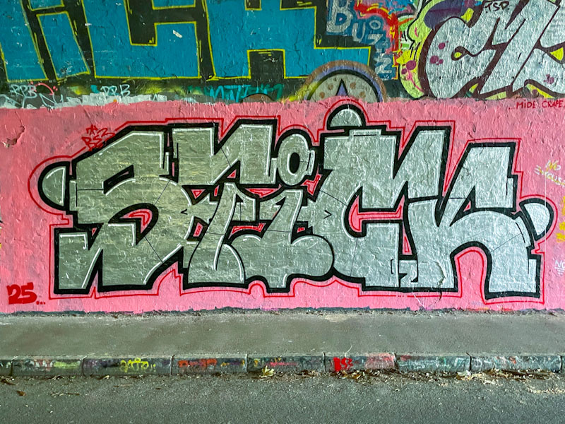
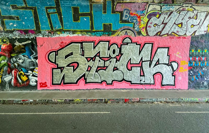
This is a really beautifully presented Chrome piece, spelling out STICK, set on a pink background, with a fine red line outside the thicker black border, a design element that is a bit of a signature of the artist’s work. There is something rather unusual and appealing about his letter style. Great piece if you can actually see it in the gloom.
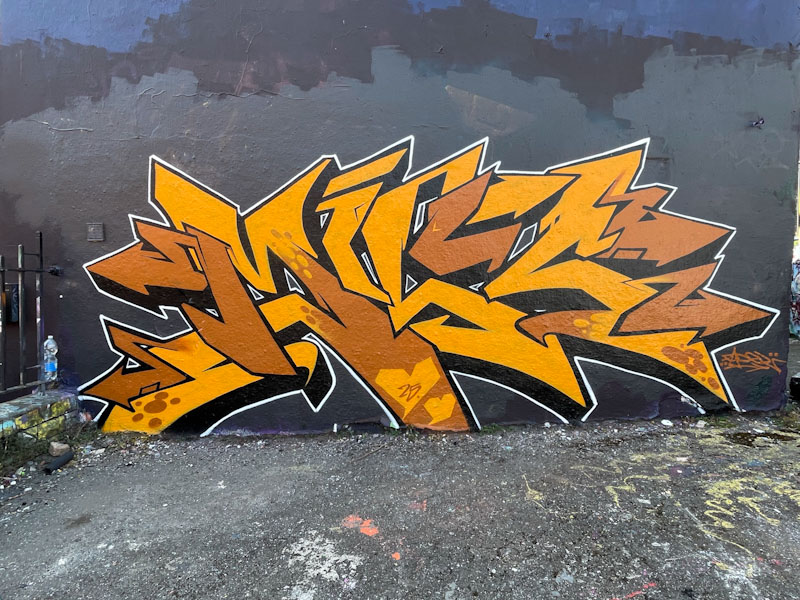
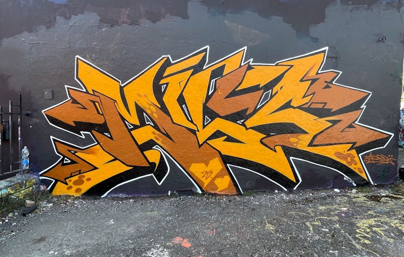
There are a couple of things that are slightly unusual about this piece by Fade. The first is that it is a solo piece and not a collaboration with Dibz and second, it has unfamiliar letters, as it is a tribute to ‘the Mrs’ to use Fade’s words, although I can’t remember her name, and I am struggling to decipher the letters.
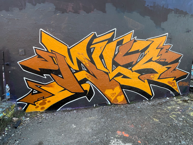
The graffiti writing is flawless, as you would expect, and stands out on the large wall with a black background. There is a little too much brown for my own personal taste, but I have spoken enough about that in recent posts. Really stand out work from Fade
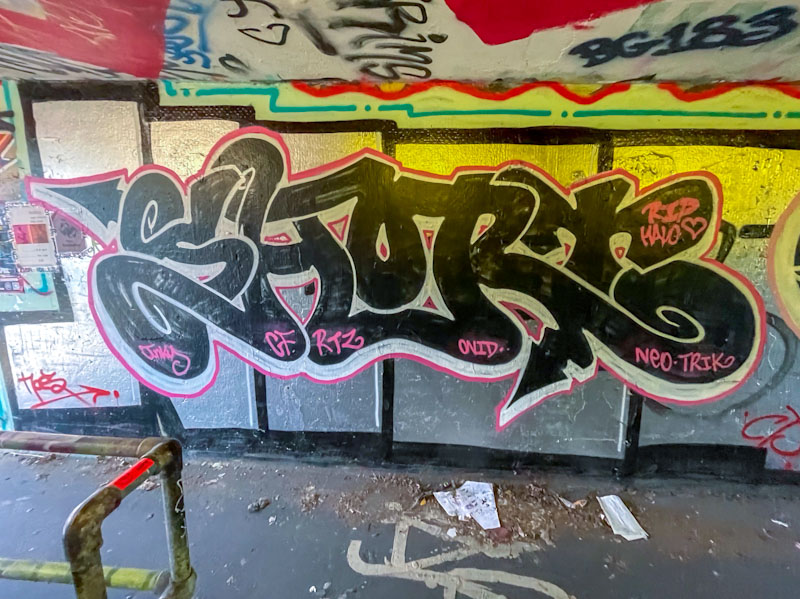
This piece, by Short, is really easy to miss. It is in one of the tunnels under the M32 roundabout where the lighting is poor, and one’s mind is focussed on not being run down by a bicycle or e-scooter rather than stopping to look at the graffiti writing. If photographing such pieces is hazardous, I can’t imagine what it is like to try and paint in such a confined space.

The black, joined-up letters, spelling SHORT are somewhat augmented, deliberately or otherwise, by the background created by a previous artist’s large chrome letters, which creates the perfect backdrop. I am enjoying the way that Short is popping up in different places around the city, and offering us a type of graffiti writing that is a step up from throw ups, and developing all the time.




 Natural adventures