I’m beginning to regret ever having said that, unlike other street art hubs in the country, Bristol is rather light on paste ups. Ever since I first made that comment, I seem to have found wheatpastes all over the place. Whether I am just seeing more because I am looking more or whether there has been an influx, I cannot say, either way, it is good news.
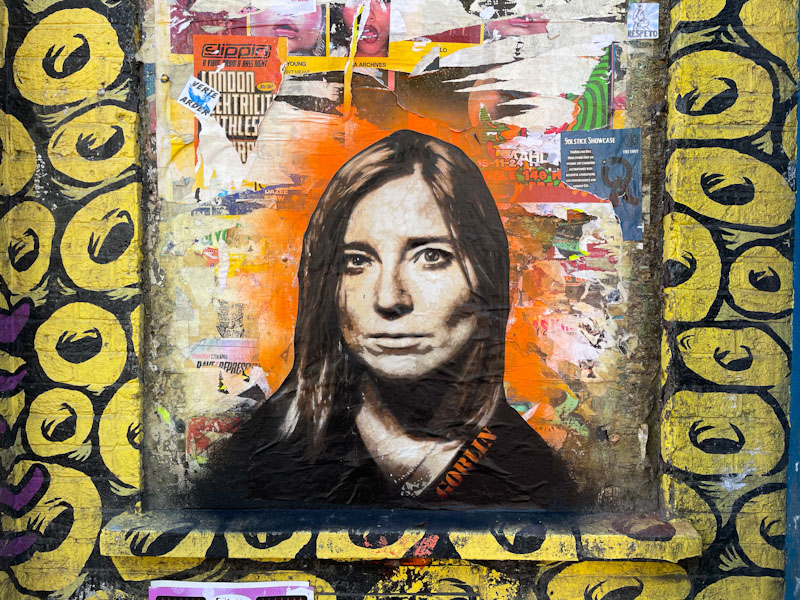
Mauro Goblin, Stokes Croft, Bristol, May 2025
This is a stunning portrait piece by Mauro Goblin, an artist I believe from Valparaiso, Chile, featuring Beth Gibbons from local band Portishead. The stencil piece is sprayed on to paper which is then pasted up, hence the sharp edge around the portrait. A little bit of orange spray paint behind the piece significantly adds to the impact. What a privilege to have this piece in Bristol.
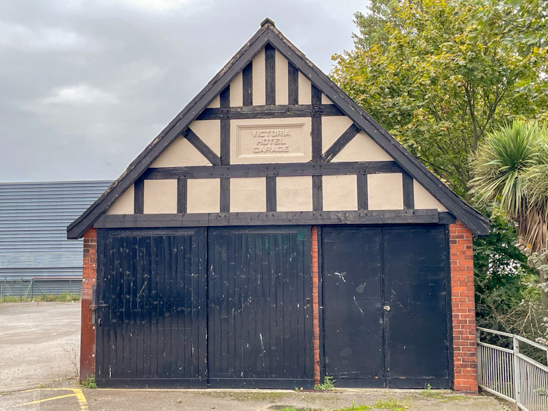
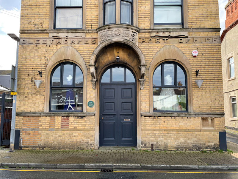
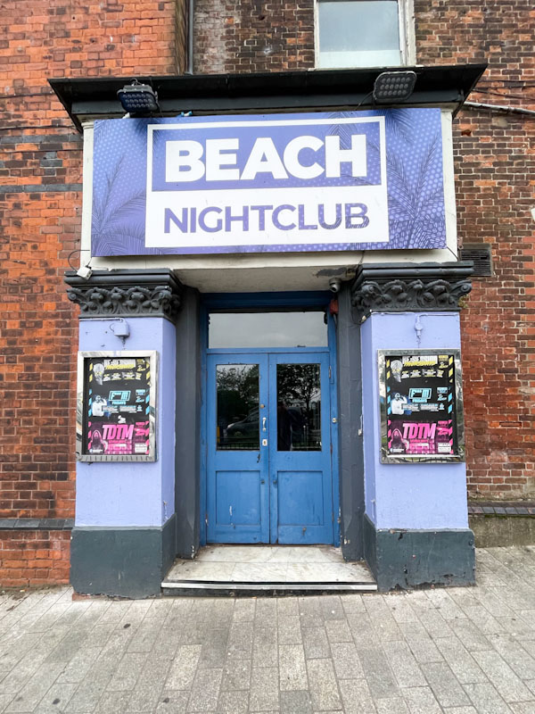
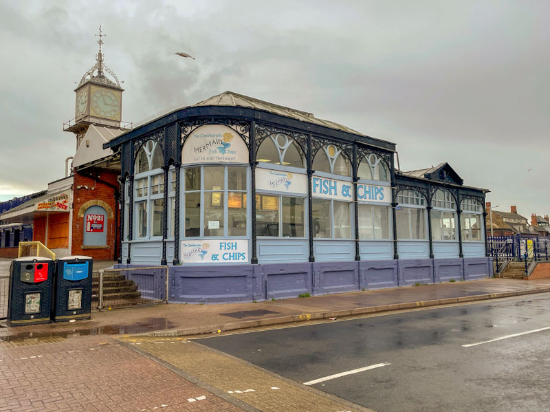
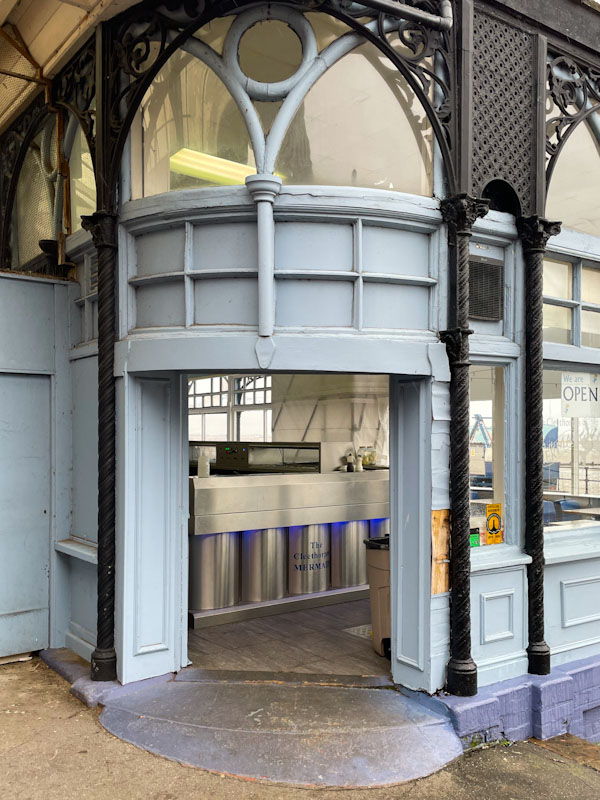
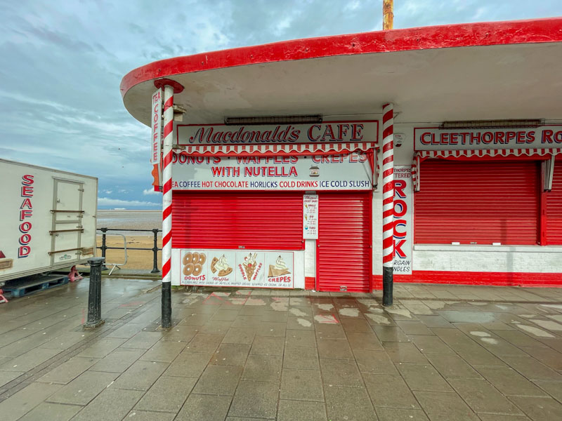
Doors 310 – Cleethorpes, Lincolnshire, September 2023
This week I am taking you to a sleepy Lincolnshire town, once a celebrated seaside destination, but now a faded Victorian haunt where poverty and deprivation is intermingled with former prosperity.
I was lucky enough to visit Cleethorpes in September 2023 for the launch of the first of 25 new National Nature Reserves (NNR) being declared over a period of five years called the King’s Series in celebration of King Charles III coming to the throne. These National Nature Reserves are bigger, better and more joined up, allowing nature to overspill into surrounding areas. This first one (the Lincolnshire Coronation Coast NNR) spans a long stretch of the Lincolnshire coast adjacent to urban areas, providing opportunities for people to easily connect with nature on their own doorstep. It incorporated some already well established nature reserves, such as Donna Nook, famous for its seals.
While I was stopping over, I managed to get a long walk under my belt and snapped a few doors, which is pretty much my modus operandi wherever I go these days. I hope you enjoy these doors, and of course the mandatory English Victorian seaside town pier.
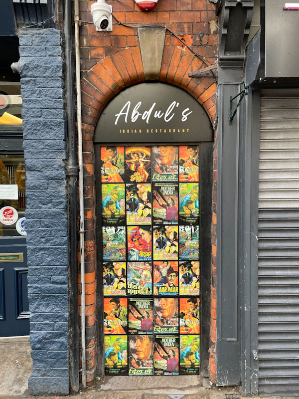
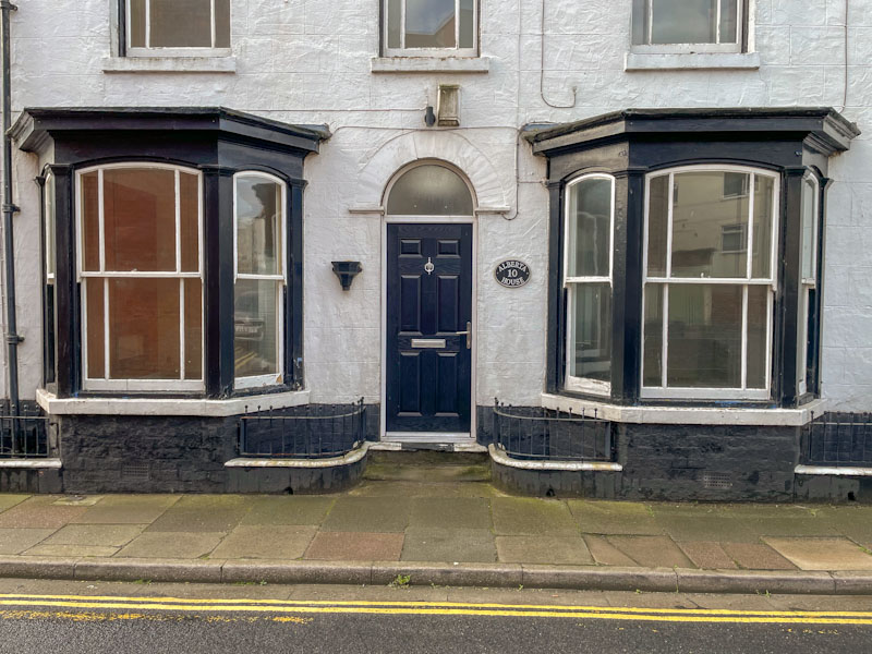
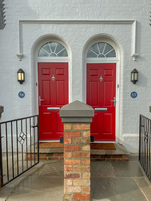
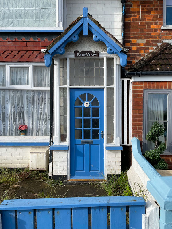
Cleethorpes Pier, Cleethorpes, England, September 2023Victoria Hotel Garage doors, Cleethorpes, England, September 2023Door and fine doorway to the re-purposed Cleethorpes Post Office, Cleethorpes, England, September 2023Rather forlorn Beach Nightclub doors, Cleethorpes, England, September 2023Pub door with a wonderful Tetley’s lamp, Cleethorpes, England, September 2023Abdul’s wonderfully themed restaurant door, Cleethorpes, England, September 2023Classic seaside town door and house frontage, Cleethorpes, England, September 2023A nice pair of red doors, Cleethorpes, England, September 2023Superb blue door and Victorian gable fronted porch, Cleethorpes, England, September 2023The Mermaid fish and chips restaurant, Cleethorpes, England, September 2023Doorway into the Mermaid fish and chips restaurant, Cleethorpes, England, September 2023Classic seaside town beachfront food stall, shuttered up, Cleethorpes, England, September 2023
Before I went to Cleethorpes, my expectations were quite low, generally it is considered to be an ‘eyebrow raising’ moment when you tell anyone you are going to Cleethorpes, but I have to say I rather fell in love with the place. The coastline with its marshes is spectacular, the seafront shops and guest houses, and there is something rather wistful about the place.
I’m not sure where I’m going for Thursday doors next time – it’ll have to be a surprise.
If you have made it this far, you probably like doors, and you really ought to take a look at the No Facilities blog by Dan Anton who has taken over the hosting of Thursday Doors from Norm 2.0 blog. Links to more doorscursions can be found in the comments section of Dan Anton’s Thursday Doors post.
Hypo continues in his rich vein of form and is working his colours really hard at the moment, but not in a chaotic or random way, but rather in a considered and thoughtful manifestation.
Hypo, M32 roundabout, Bristol, May 2025
Each of the letters HYPO are given an individual colour scheme with blended tones beautifully worked. The letters are afforded a chunky 3D effect, thanks to the skilfully placed white highlight lines that deceive our eyes. Another fabulous piece in an outstanding and lengthy series of graffiti writing.
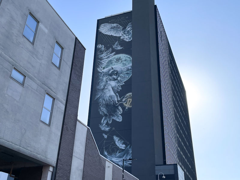
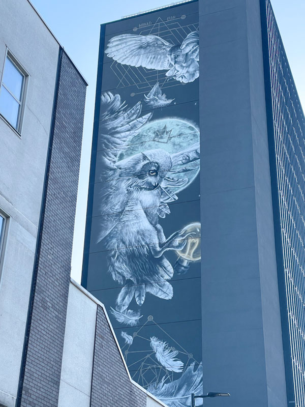
This was a most wonderful surprise as I headed towards Leeds Station to catch a train back to Bristol. When I arrived, I had left the station from another exit and so hadn’t spotted this enormous and rather famous piece by Nomad Clan. It is quite difficult to give a sense of scale, but the mural spans several floors on the side of the building.
Nomad Clan, New Station Street, Leeds, May 2025
Photographing this piece is near impossible, and definitely one for those with drone cameras. Owls are a symbol of Leeds and appear on the city’s coat of arms, and can be found all over the centre. These greyscale owls are obviously in recognition of this and beautifully painted against a full moon and a lightbulb. One of the owls also has a crown – it’s a graffiti writing thing, which gives this high-end piece a bit of street credibility too. Like I said at the start, simply wonderful departing gift from the home city of my late father and his family.
It is totally awesome to see Subtle again after quite a long break. His work, for me, epitomises the Bristol style of graffiti writing. I have mentioned that different towns and cities, regions or countries have distinct styles, and this piece by Subtle oozes Bristol.
Subtle, M32 roundabout, Bristol, May 2025
The piece itself is painted in rather dark colours and a little difficult to pick out with the light behind the wall. Great big fat letters on a buffed wall with a dollop of red decoration is just what the doctor ordered, and a great way to start the day. Classy and beautifully executed. Welcome back Subtle.
I wrote this last night, because I had a very early start this morning (1:30am) taking my daughter to Heathrow airport followed by a full day at work. The things we do! So a couple of quickies today.
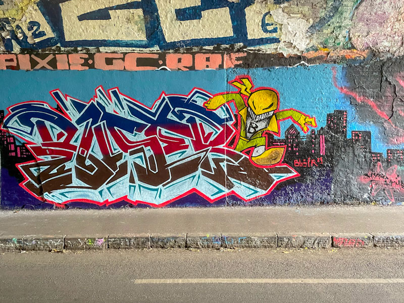
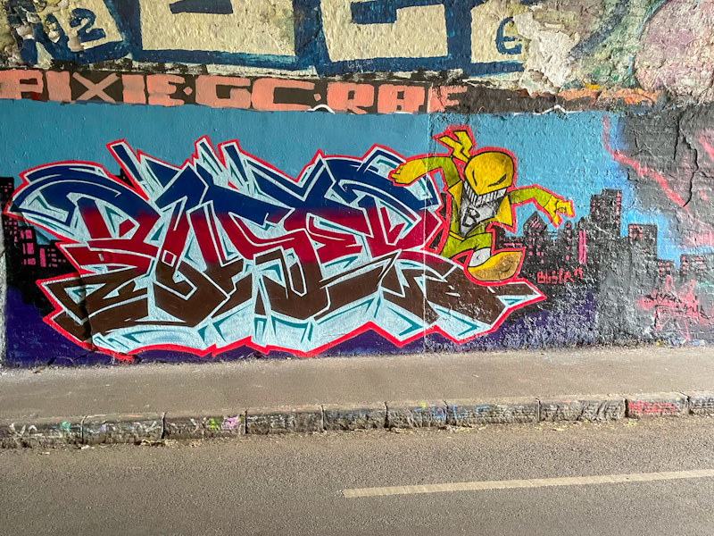
Buser, St Werburghs, Bristol, May 2025
This is a fun combination piece by Buser in the tunnel. I don’t recognise the character and think it might be from the artist’s imagination. The writing is of the highest order with great fills and an exceptional ice-blue drop shadow. I’ll be looking out for more from Buser.
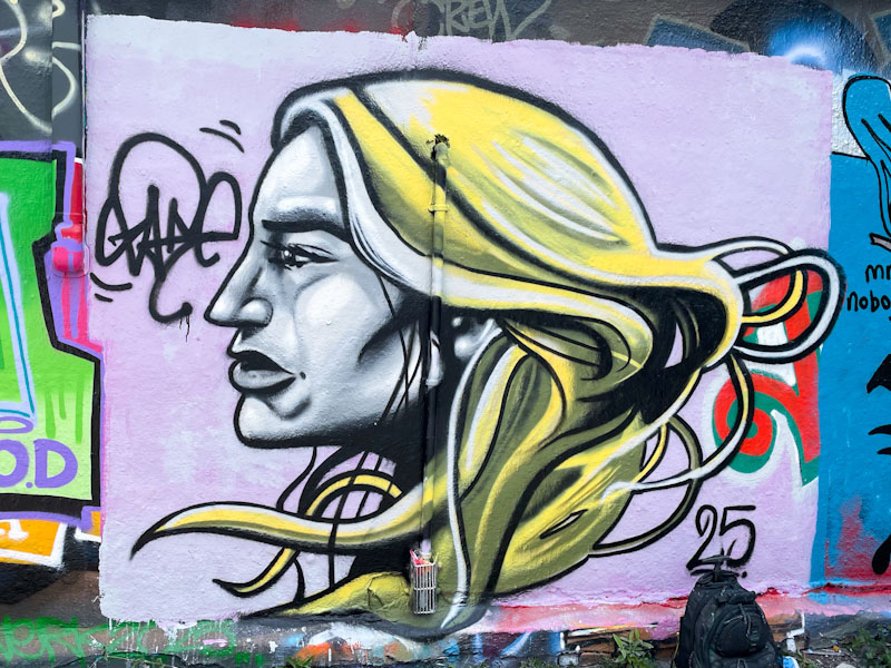
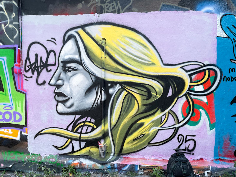
I am used to seeing Zake character pieces that tend to be head-on round faces in a cartoon style with lots of light and shade creating depth, so this is something a little different.
Zake, Dean Lane, Bristol, May 2025
The profile portrait of an androgenous person draws more on a realistic version of a character than the cartoon style I am used to from Zake. The hair, in particular (most of his characters are bald), is great to see, demonstrating that Zake is far more than simply a one-trick pony. Definitely an unusual piece from one of the most prolific artists painting in Bristol at the moment. I have updated my gallery of Zake’s work so you can see what I mean.
Mr Underbite’s appearances are few and far between these days, so it was great to find this one in one of his favourite spots recently. I’ll not make reference to the brown background.
Mr Underbite, Brunel Way, Bristol, May 2025
The Hapless character is painted in vibrant green, has his customary underslung jawline and is wearing a baseball cap for good measure. Signed MUB (Mr Underbite) and dated 2025, this is a piece without pretension or complication – what you see is what you get.