.
Searching for that gem
matching our criteria
doubt its existence
.
by Scooj
.
Searching for that gem
matching our criteria
doubt its existence
.
by Scooj
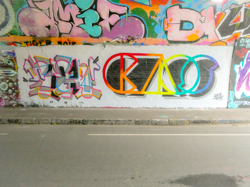
The last time I met these two, Benjimagnetic and Acer, they were painting this exact spot with an epic piece that regrettably had been painted over by the time I went back to photograph it. I wasn’t going to make the same mistake again, and having seen it on Instagram, made the tunnel my first port of call.
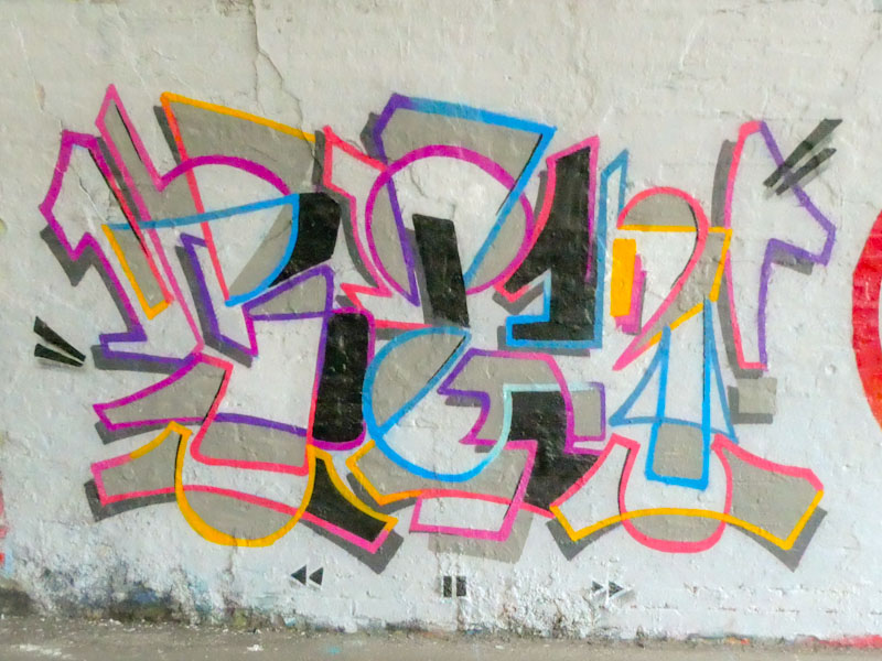
The left hand of this collaborative wall is a superbly clean and light piece of wildstyle writing from Benjimagnetic, spelling out BEN. The colours and shapes are inspiring, and the little grey shaded areas provide a little bit of solidity to the frame. Lovely work.
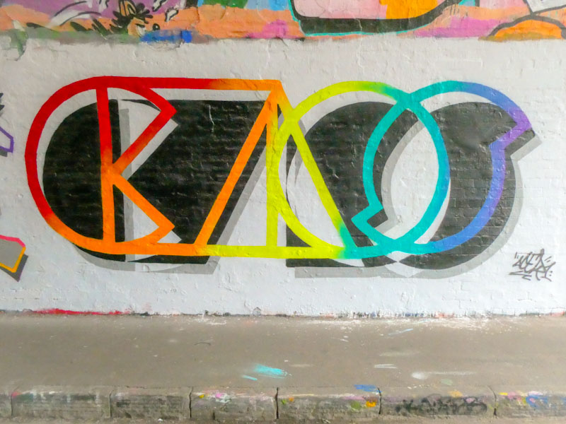
On the right, Acer continues to dazzle us with his highly stylised rainbow lettering, spelling out CHAOS. Is this a random word, or a description of the mad, mad world we live in? This is a thing of beauty and great skill, I love the grey shadows of the black shadows. An absolutely fabulous collaborative wall.
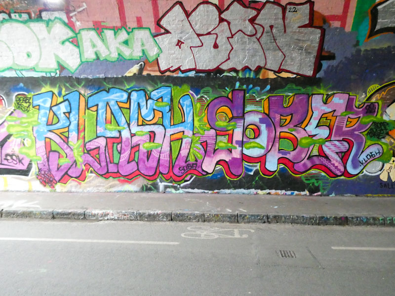
This is definitely one of those occasions when you get more for your money, to loosely use an expression, because as we already know, street/graffiti art is completely free… imagine that, completely free art for all to enjoy, no entrance fee required. A double helping from Klashwhensober, which is surely a treat to savour. In this double act, we have two of his monikers, ‘Klash’ and ‘Sober’.
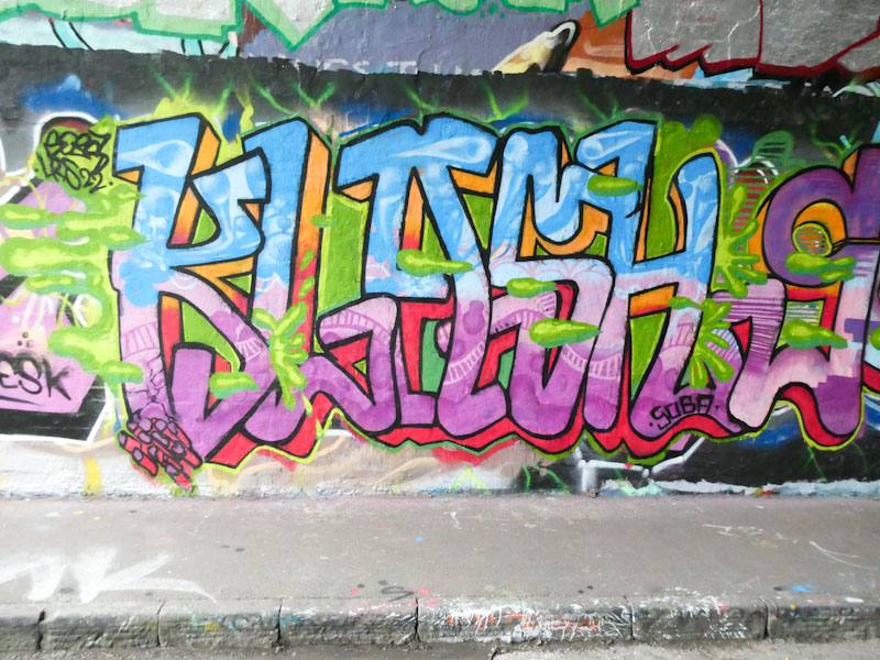
To the left is Klash written in his long slim lettering and a gorgeous transition fill from blue to pink, with some lovely patterns spanning the letters. The whole thing is coated in a kind of green goo, that Face 1st would approve of.
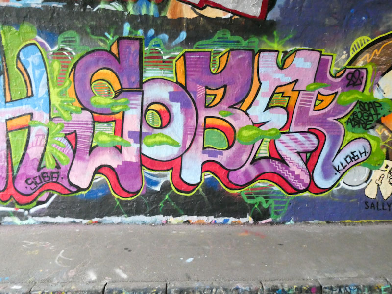
To the right of the pair of the work is the word Sober which again has lovely slim curvy letters and a superb red/orange 3D shadow shared across both words – with regard to the 3D shadow, Klashwhensober has a vanishing point somewhere behind the piece and the shadows work in both directions. The imaginative patterns and fills are a joy to behold, and a specialism that Klashwhensober works really hard on.
I met Klashwhensober again yesterday on the M32 cycle path, and it was another pleasurable experience. We chewed the fat for a little while, and discussed different pieces and styles, amongst other things. I think that we must have similar body clocks, as we keep meeting – three times now in just over a week.
Dopes is an artist who appears to like spraying in tight little spots tucked away on the margins of popular graffiti spots, or maybe I just happen to find his pieces in such places. This one is underneath the bridge in Sparke Evans Park, alongside a Maesyhook piece that until a week ago had been there forever (to make an appearance on Natural Adventures soon).
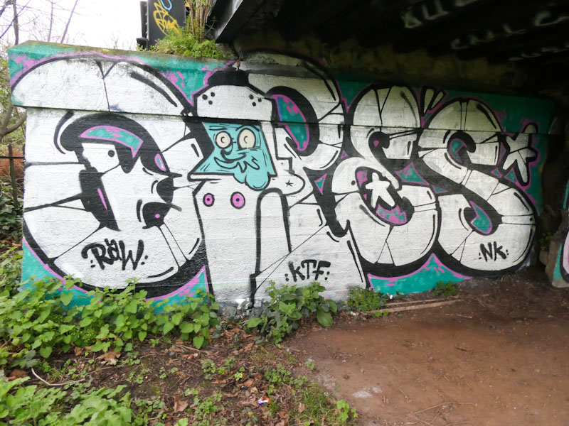
Set out in chrome on a turquoise background, Dopes spells out his name, with a rather curious character figure making up the ‘O’. A subtle splash of pink decoration and border gives the piece a little bit of zing and lifts it up above other chrome throw ups.
.
Nature’s assemblage
communion, harmony
our beautiful world
.
by Scooj
For a little while I feared that Maesyhook might have abandoned Bristol in favour of some other city or country, as her work appeared to drop off, and some of her Instagram posts were not from Bristol, but thankfully it would seem that she is here, and normal service is resumed.
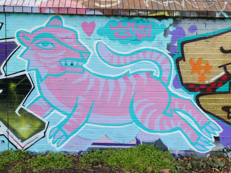
I have always really liked Maesyhook’s work as it is unlike anything else we see, which makes a refreshing change. This tiger in her preferred pink and blue colours is low-key but rather beautiful. It is very illustrative and could easily be a character in a children’s picture book ‘the pink tiger who came to tea’ maybe. It is so, so good to see maesyhook painting again.
I think that I could quite easily fill up all my posts with work from about four or five artists in Bristol who seem to be unstoppable in their quest to brighten our streets and practice their art. One of those artists is Face 1st, who has been a constant drumbeat through the development and progress of Natural Adventures. Always there, always painting.
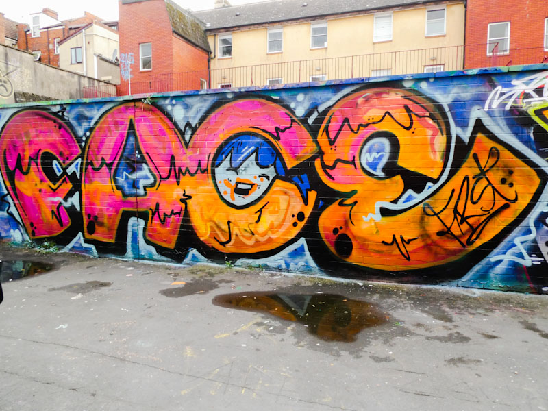
This piece is in my favourite street, for sentimental reasons really, in Bristol, Moon Street. Definitely a quick one from Fac 1st, as so many of his pieces are, but even though it probably only took an hour or so to paint, there is a lot to like about it. The change of pink to orange as you read left to right, and the blending of the colours, works really well. Of course, no Face 1st piece is complete without a girl’s face somewhere, and in this one, she is lurking in the letter C.
A serendipitous meeting with Paul H at Greenbank on my last visit there afforded him the opportunity to show me a spot I hadn’t been aware of before, and something a little different from the usual kind of graffiti/street art spots in Bristol. Greenbank is on the Bristol to Bath cycle path, and a short walk in the direction of Bath takes you to the Bristol to Bath gallery.
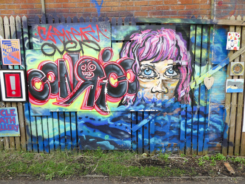
The gallery is a wall and fence, about twenty metres in length, which is festooned with pieces of art on paper, boards, canvass or in frames, all attached to the fence – a truly public gallery that anyone can contribute to. This particular section has been painted by Conrico, and would appear to have been quite a challenge to paint, given the different textures and materials. The scene is a very typically Conrico piece, with plenty of atmosphere and a style that looks more like paint brush strokes rather than spray can work. Some nice writing accompanies the portrait.
Slakarts isn’t painting quite as much as I would like to see, but in this piece on the roundabout he has turned out an absolute beauty. It is almost like he has applied the Picasso cubist treatment on his stylised face, and the result is something rather special.
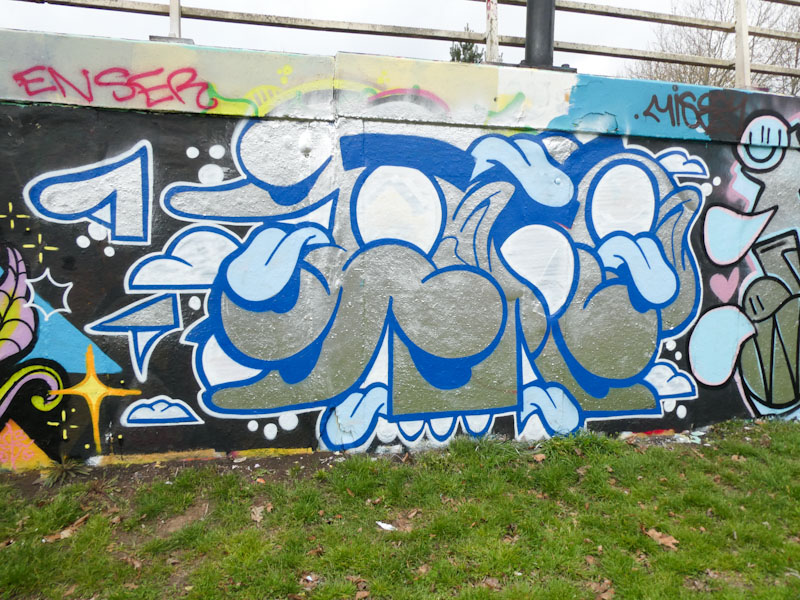
I am not the biggest fan of chrome, as I think it tends to dominate a piece – great for throw ups and bubble writing, but difficult to pull off with tidier pieces. Slakarts has more than pulled this off, he has smashed it with the interactions between chrome blues and white and the overall effect is stunning. Beautifully conceived and executed, this is a magnificent specimen from Slakarts.
‘Milk’ seems to be such an unusual word to choose for a writer, but I guess there is plenty of scope for playing with letters, and it is certainly memorable; I would be interested to know why Wxttsart chose it. Whatever the reason, he has made it his own and Bristol is becoming a bit of a Milk city.

Wxttsart creates these script letters that feel quite organic in both the wobbliness of the letters and the fills, in contrast to some writers where it is all about straight lines or solid fills or angles etc, this somehow feels much more free and expressive. Some lovely blue drips to finish the piece off. Nice work from this LRS crew member.


