6903. St Werburghs tunnel (493)

Werm, St Werburghs, Bristol, April 2025

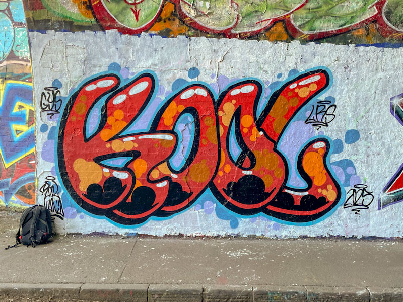
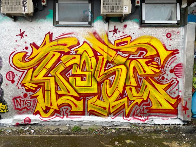
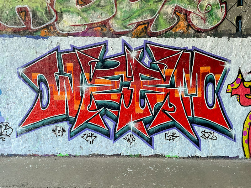
This is a delightfully clean and crisp piece by Werm, whose symmetrical pieces are a well known sight in the various graffiti spots around Bristol. I particularly like this one with its delightful colour scheme, and the boldness of it set on a white background.

Werm, St Werburghs, Bristol, April 2025

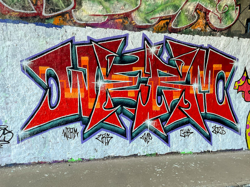
It is well worth getting up close and taking a proper look at the letter fills in this piece, the overall colour is a blend of reds from dark to light, and running through the midline is a wonderful continuous orange line… a golden thread through the piece. This is a very attractive piece by Werm, that unfortunately only lasted a short time.

6859. St Werburghs tunnel (489)

Kool Hand, St Werburghs, Bristol, April 2025

This piece by Kool Hand was part of a recent collaboration in the tunnel, but alas his third only lasted about 24 hours. On the upside I was fortunate enough to see it, literally moments before it was painted over by Mr Klue.

Kool Hand, St Werburghs, Bristol, April 2025

I have said it before, but Kool Hand is a bit of an unsung hero of Bristol street art. His unique blend of colour, characters and writing is a central part of the heartbeat of the Bristol scene, without which it would feel diminished. The letters KOOL and nicely presented in very Kool Hand orange, with some great solid fills and spots. The background in softer purples and blues provides a perfect counterbalance to the graffiti writing. Nice work from Kool Hand.

6847. Peel Street Green (38)

Cort, Peel Street Green, Bristol, April 2024

Cort doesn’t paint as often these days as he has done in the past, however, what he does paint tends to be pretty good. This stunning piece from the quiet artist is quick to grab the eye, with some simple shapes and colours, reaffirming the maxim that sometimes ‘less is more’.

Cort, Peel Street Green, Bristol, April 2024

The orange C is quite distinct from the chrome ORT, and given different treatment, creating a juxtaposition within the writing. The splash of light blue behind the letters is a clever design intervention to break up the monotony of the darker blue background. This is a nicely conceived and executed piece by Cort.

6664. River Avon (75)

Werm, River Avon, Bristol, January 2025

This is a neat and tidy piece of Winter writing from Werm painted in his symmetrical theme design. What is particularly attractive about this piece is that the proportions work really well, and it is really tight.

Werm, River Avon, Bristol, January 2025

Orange and green are common colour combinations in graffiti writing and are colours that work extremely well together. It looks like Werm too his time with this piece, as all the lines are nice and straight, the fills accurate and the highlights very nicely placed. First-class writing from Werm.

6558. M32 roundabout J3 (641)

Sub, M32 roundabout, Bristol, November 2024

Sub paints his large three letter pieces reasonably often, but I have been waiting for one that has the ‘wow’ factor, and with this enormous piece on the roundabout, I think he has pretty much got there. I first saw this piece on Instagram, before I photographed it, and was actually really keen to go and see it for myself.

Sub, M32 roundabout, Bristol, November 2024

I think that the buffed wall really helps in this instance, and the colour selection of orange and blue works really well. Sub has paid great attention to the dimensions of the drop shadow, which drifts off to the left. There is a fusion of his letters, through which the blue fill bleeds across the piece. The thing I like the most is the thin line patterning, which is just about right. Any more decoration and it would look fussy, any less and it would look bare. In my view, this is Sub’s best piece to date.

6472. Greenbank (137)

Nips, Greenbank, Bristol, October 2024

There are several graffiti writers in Bristol who simply write their letters in a broadly similar style and format from piece to piece. Nips is one of these artists, and her forte is in the colours and fill patterns she chooses.

Nips, Greenbank, Bristol, October 2024

Photographed late afternoon on a rather sunny day, the photographs have a bit of glare and probably don’t do the piece justice. Nips has used yellows, oranges and pinks, and blended them skilfully throughout the piece. Some contrasting squiggles and fabulous white feature lines finish what piece well. I am an admirer of her work, and have yet to meet the artist… it is simply a matter of time.

6465. St Werburghs tunnel (453)

Logoe, St Werburghs, Bristol, October 2024

Logoe payed us one of his visits a couple of weeks back, and this is a magnificent piece of writing he left behind, that has lasted longer than many of his pieces do. I think he painted at least six pieces on this particular visit, and I will be sharing those I found over the coming days and weeks.

Logoe, St Werburghs, Bristol, October 2024

The letters of this script writing are really bold and look quite chunky with a deep 3D drop shadow. Perhaps the most distinguishing feature of this one is the vertical stripes in oranges and greys in the background, which provide a strong foundation and springboard for the letters. Nice work from Logoe.

6433. Purdown (80)

Daz Cat, Purdown, Bristol, September 2024

This is my 80th post from Purdown, but if I am honest, it feel like an awful lot more. Daz Cat seems to like it up here and the square format of the concrete blocks seems to suit his designs. It is always far more difficult for writers to fill a square space than for character artists.

Daz Cat, Purdown, Bristol, September 2024

Daz Cat has painted a cat (naturally) curled up in the square. The blue cat is wearing a fabulous orange striped shirt and shorts combination, and looks really rather cute. The cat is smiling and there is a good feeling all round about this piece. I will never tire of Daz Cats’ cats.

5963. M32 Cycle path (259)

Inkie, M32 Cycle path, Bristol, March 2024

Inkie is arguably the second most well known street artist in Bristol, but unlike his contemporary (Banksy) still visits and paints in the city frequently. I was in the right place at the right time when he, Sepr and Haka were painting this wall together and although I have met Inkie on a few occasions, we actually had quite a long chat this time, whereas usually it is a ‘hi’ and ‘bye’ kind of thing.

Inkie, M32 Cycle path, Bristol, March 2024

This is a classic piece of Inkie writing, almost archetypal, which oozes confidence, capability and class. Green and orange work really well together, and we discussed the merits or otherwise of orange paint, which in this case was really thin, and he wasn’t overjoyed about it. There are some paints that just seem to be partially transparent and require more coats, and this was one of them. Unless you knew about the thin paint, you probably wouldn’t notice. Classy work.

5934. Dean Lane skate park (702)

Kosc, Dean Lane, Bristol, March 2024

Bursting onto the walls in Dean Lane was this stunning and vibrant piece of writing from Kosc. Kosc is an artist who appears to be equally at home with writing or character/scenic pieces, and only a few posts ago I shared an amazing Samurai mask that he painted as part of an NTS Crew collaboration. He is a master of his styles and designs.

Kosc, Dean Lane, Bristol, March 2024

This piece cries out to be seen, with its bright colours and busy letters spelling KOSC. As I look at it now, I wonder to myself whether he ran out of the orange colour for the ‘O’, or whether the letter is deliberately more yellow to create a focal point to look at. I guess I will only find out by asking him in due course. A great find, that didn’t last too long, if my memory serves me right.