
A gallery of anti-style graffiti writing from Bristol’s fabulous Whysayit (YSAE).
Crew: PLB
All photographs by Scooj


A gallery of anti-style graffiti writing from Bristol’s fabulous Whysayit (YSAE).
Crew: PLB
All photographs by Scooj

Biers (or WD40 as he writes these days) has been on fire this winter, producing a series of fine writing and character pieces. The formula is a winning one, and the balance between the writing and the character is usually spot on. There are also loads of additional elements that feature in his work and contribute to the overall look and feel.

I am not sure who the cartoon pig is, but will do a very quick Google search to see if I come up with anything… nope, I have drawn a blank. So we have a pig with a bandage – there is a story there I am sure. This is a nice piece to round off the year with for Biers, and I hope he keeps up his frequency and consistency into the New Year.
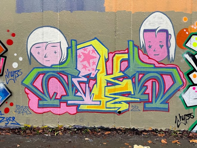
I was lucky enough to meet Zeks late last year while he was painting with Hypo and Dun Sum on a different part of the roundabout, and learned that they all live in Lawrence Weston (L Dub). Fortunately they make the trip into the centre from time to time and decorate our walls. Although I have photographed a handful of pieces by Zeks, this is the first I have published on Natural Adventures.
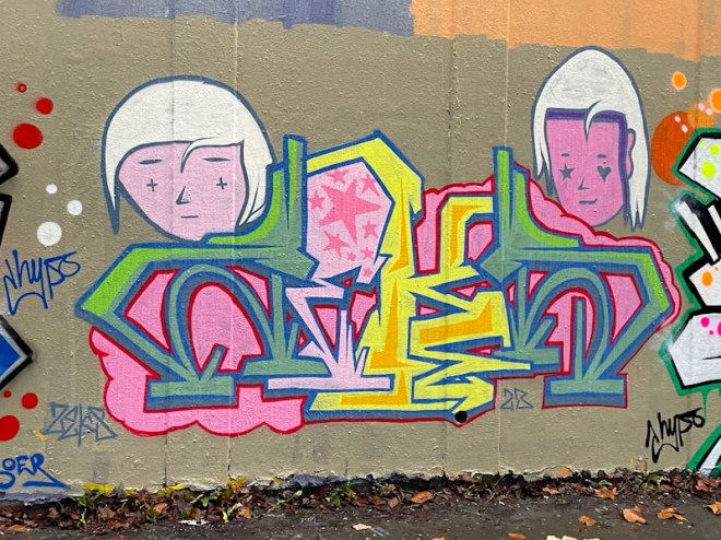
I have to say that this is one of my favourite pieces of 2023. It has an originality and lightness of touch that really makes it stand out. The letters spell ZEKS, although I might have struggled to work it out without knowing the artist (and seeing the signature, of course). The pastel colours on a grey background work incredibly well, but it is the two stylised faces, with their mysterious expressions, accompanying the writing that set it off perfectly. A very nice piece indeed from Zeks – I must dig out others of his, if I can find them in my archive.
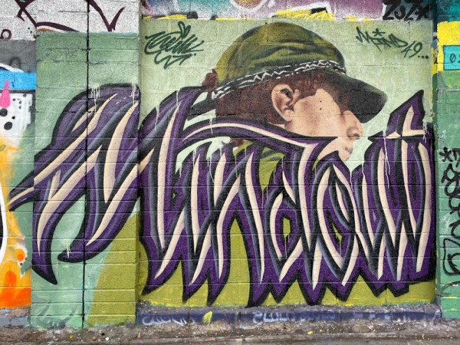
This collaboration is one panel of an end of year paint jam on the M32 Cycle path, parts of which have hosted some outstanding pieces in 2023. This piece brings together the styles of two incredibly different artists, Mind 49 and Wxttsart (recently rebranded as Whatsxmilk).
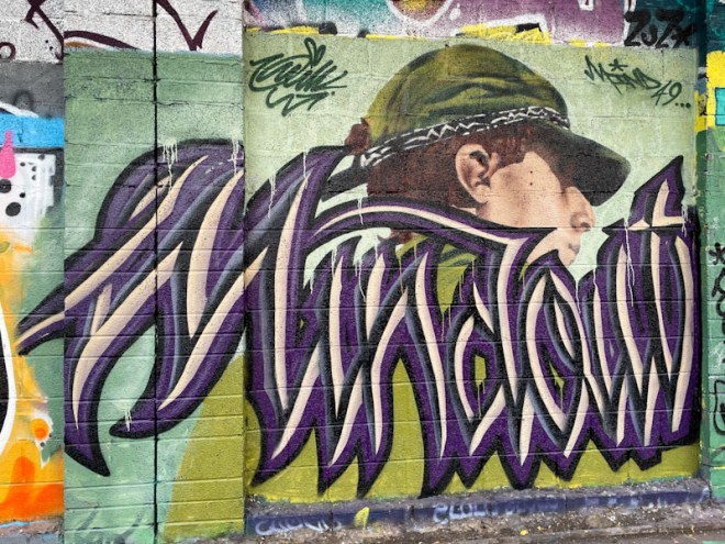
The unmistakable anti-style calligraffiti from Wxttsart spells ‘Mindout’, a clear reference to his painting partner. The letters are beautifully constructed and consistent in form, and this writing is a little more conventional than some of his work. The contrast with Mind 49s portrait couldn’t be more marked.
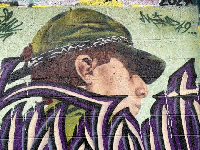
There is something slightly elusive about much of Mind 49s portraits, a vagueness that allows the imagination to fill the gaps. There is an absence of sharp focus, so often found in photorealism, that makes Mind 49s pieces so special. The subject’s features are partly obscured by the shadow of the cap, adding some mystery to the piece. The folds in the material of the cap are beautifully worked. This is a fine piece and fine collaboration. A great way to end 2023.

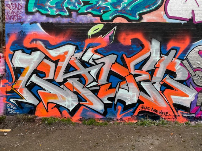
Raid has had a flurry of activity this winter, and I keep finding pieces new to me, wondering if they are recent or if I have simply missed them. I can be pretty sure this is a recent piece (it wishes us a Happy New Year) as turnover in the tunnel is much easier to monitor than in some of the other spots in Bristol.

One of the challenges Raid appears to have set himself, on occasion, is to create a piece that is rotationally symmetrical, and this piece I think falls into that category. The fills in this piece are beautifully done, and the green line with stars creates interest and continuity through the letters. It is interesting that he hasn’t painted a border between his fill and drop shadow, preferring to leave a clean line instead. Surely time for a gallery?

Any and every time I see a piece by Fiva, it makes my heart sing. The rarity value has something to do with it and this is one of only three pieces painted in Bristol in 2023, and before these we had to wait three years for his reappearance.
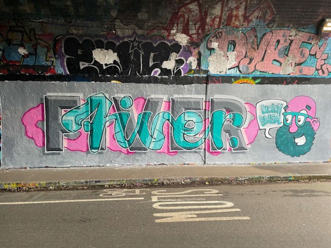
This is an outstanding piece, adopting his customary formula of writing his name and accompanying it with a fun cartoon character. As in previous pieces, Fiva has superimposed a script ‘fiver’ over his block capitals ‘FIVER’ to create an amazing and very clever effect. He is a master of this technique and seems to make the complicated look simple.
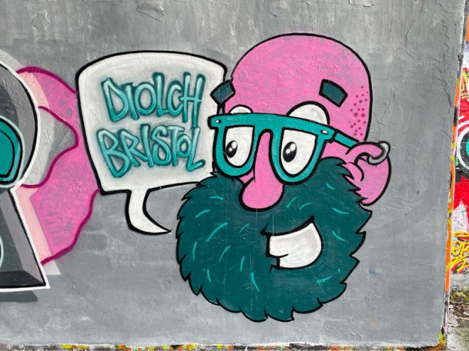
The wonderful character is saying ‘Diolch Bristol’ which is Welsh for ‘Thank you, Bristol’. I’m not too sure what that means, but it has an inference of finality about it. I do hope not, and will be keeping my fingers crossed for a return by the artist in 2024. Meanwhile, I will simply enjoy and admire this outstanding piece.
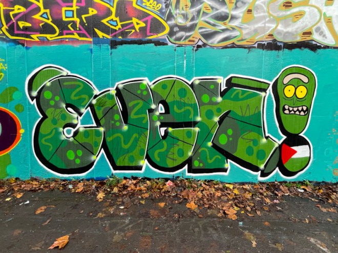
The Natural Adventures accolade for most improved and diligent artist in 2023 goes to Evey, whose work last year has been nothing short of inspirational. A regular member of RBF paint jams, Evey has gone from strength to strength and appears to be a much more confident artist than she was a couple of years ago. Practice really does make perfect.
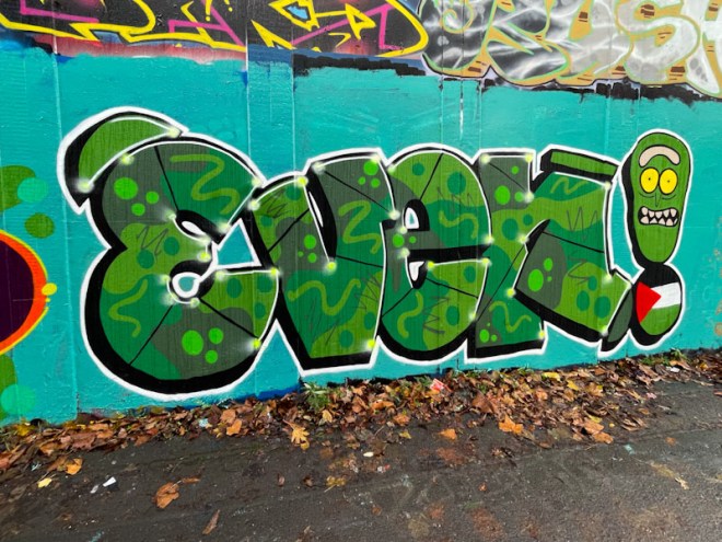
This superb piece was painted during a paint jam celebrating Pekoe’s birthday back in December. She has painted some solid letters with wonderful fills in three shades of green, and a host of decorations and squiggles. The exclamation mark at the end makes reference to the people of Palestine and their struggles in the face of daily Israeli bombing raids. A great piece to round off her excellent 2023.
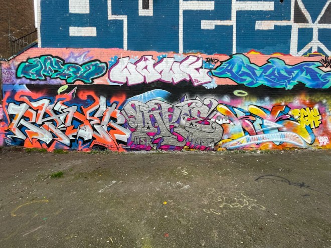
When Inkie is in town, he will often get together with friends and paint a collaborative wall, and often it is this one in Dean Lane. On this occasion he got together with Ryder and Mr Riks, which is not a trio of artists that would ordinarily spring to mind, but the street art scene is always full of surprises.
Ryder doesn’t paint at Dean Lane all that often, but he has smashed it with this rather condensed burner painted in orange and grey. The RYDER letters are nicely worked, with the orange bleeding out into the background at the top of some of them. The colour palette which includes a dark blue and black isn’t one that I would instinctively chose, but works incredibly well in this striking piece of graffiti writing.
Most of the time, you pretty much know what you are going to get from Inkie, and this chrome piece delivers in bucket-loads. Great design and precision are trademarks from the gentle giant, who is probably one of Bristol’s most famous street artists after Banksy, alongside Nick Walker and Cheo. Inkie has such a distinctive style, that I reckon he could write any combination of letters and it would be easy to identify.

To the right, another artist with a distinctive style, Mr Riks, has gone for this colourful piece, which is full of energy and joy. Although, not the focal point of the piece, the cartoon eyes are irresistible and draw attention. Great fills and a wonderful drop shadow, this is a fine piece of graffiti writing from Mr Riks.
This collaborative wall brings together three graffiti writers, each with very strong and distinctive styles, opting to paint in colours of their choice, making it a loose collaboration – more like three friends painting a wall together, without a theme or agenda. Great stuff.

It has been a while since I last posted a piece by Mena, and in fact, I think that she is rather underrepresented on Natural Adventures overall. I am sure that I have several photographs of her pieces in my archives that I never posted, which feels kind of wrong really and I am minded to do something about it when I find the time.
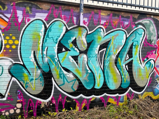
It would be quite easy to walk past this piece and dismiss it, but that would be quite wrong. This is classy writing of the highest level. Great letters, with a nicely worked drop shadow and a brilliant and intricate fill pattern that runs throughout. The icing on the cake is the brilliant white accents to the right of the letters helping the piece to pop from the wall. This is great stuff from Mena.
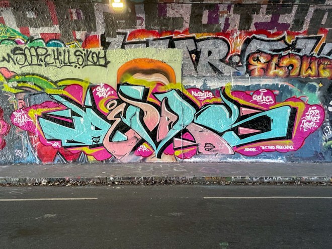
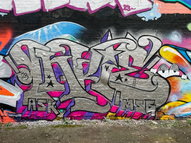
While I know of Mr Devas, the artist who painted this graffiti writing in the tunnel, I have a feeling that this is the first time I have ever posted a piece by him on Natural Adventures. This tells me that he is an occasional visitor to Bristol and not a regular.
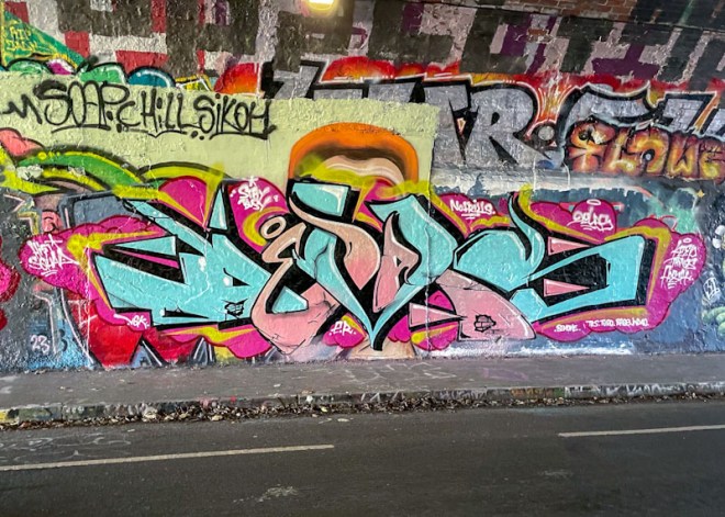
The writing spells out DEVAS and reminds me a little of Javiceus’ writing style and colours. The interlocking letters in blue and pink (the memorable colours of 2023) are nicely thought out and beautifully painted, supported by a classy 3D drop shadow in black. Nice work – I’ll have to see if I have other pieces by Mr Devas in my archive.


