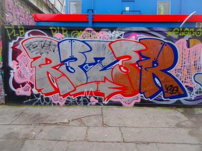
There are a great many artists in Bristol that I could label ‘old faithful’ and Biers is definitely one of them. His style is very recognisable with irregular letter sizes, but a ‘house-style’ font that is very much his own.
Biers, M32 Cycle path, Bristol, January 2021
I was pleased to see this piece appear and the others with it because this wall had remained stagnant for far too long. In my view it is one of the best walls in Bristol, but the turnover tends to be quite low, and so anything new is always welcome. This is Biers at his best, clean and crisp with decent fills and nice white accents to create a 3D feel. classic Biers.
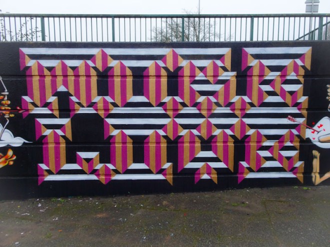
I can’t recall seeing these two collaborating before, but that doesn’t mean it hasn’t happened, simply that my memory doesn’t serve me as well as it used to. Sepr and Acer One is a partnership that I wouldn’t have predicted, as their styles are very contrasting, but this new wall is Cumberland Basin is absolutely spiffing.
Acer One, Cumberland Basin, Bristol, January 2021
The central section is by Acer One and is an amazingly technical piece of writing, based on a geometric design style for which he is known. Standing up close, it is near impossible to work out what these letters say, but by stepping back, the brain interprets it more easily and it says ‘More Love’ – I don’t think any of us can argue with that.
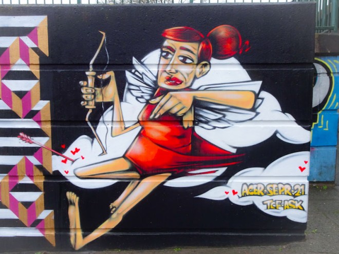
Sepr, Cumberland Basin, Bristol, January 2021
The central panel is bookended by two exquisite characters from Sepr. On the left is a devilish Cupid whose love arrows are finding mischief, in particular with a seagull who appears to be smitten.
Sepr, Cumberland Basin, Bristol, January 2021
To the right a female Cupid character is also firing love arrows across the piece. I don’t quite know what these two characters symbolise, but they are brilliantly painted and a lot of fun. Maybe they are a representation of the frustrations of lockdown and our distance from our loved ones.
All in all a superb collaboration and well worth a visit.
Sepr and Acer One, Cumberland Basin, Bristol, January 2021
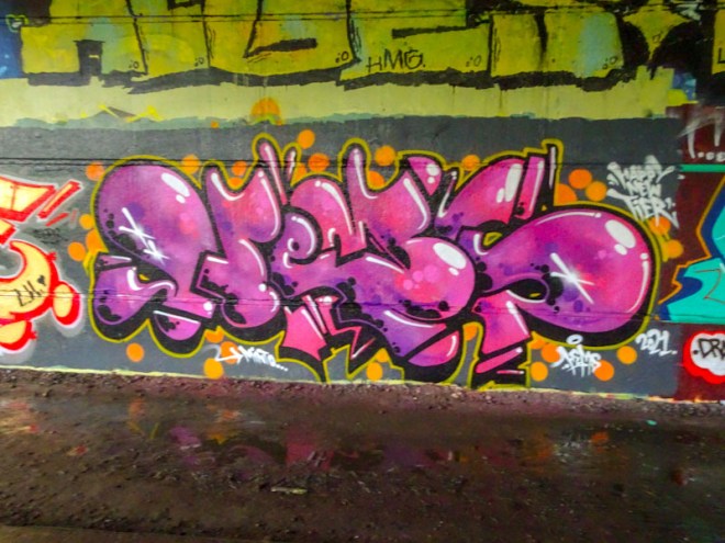
Of all the ‘masters’ of Bristol graffiti writing, I think that Hemper is probably the least represented on Natural Adventures. I am not entirely sure why that might be. Perhaps it is the modest approach he takes to his highly technical freestyle work, or to the fact that he normally paints with other artists, which might take the attention away. I don’t know. Anyhow, I really ought to address this imbalance – perhaps with a gallery.
Hemper, Brunel Way, Bristol, January 2021
In this piece under Brunel Way, Hemper spells out HEMS with some glorious curvy letters filled with a couple of shade of purple and embellished in a way that gives it a shiny 3D effect – how does he achieve that shiny thing? Some very clever white additions that give it a reflective quality. This is a real technical banger.
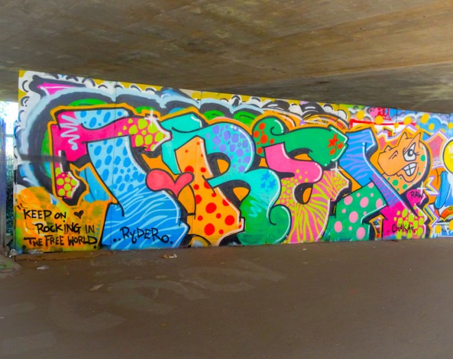
I have expressed before how much I like this wall. Protected from the rain, it is a wall that can change at almost any time without warning. Sometimes you need to be patient to photograph it because this is a DIY skate park and it can get quite busy, but there are often some really nice pieces here, including this one from T-Rex, so it is worth waiting.
T-Rex, M32 Spot, Bristol, January 2021
Spelling out T-REX, this is an extraordinarily colourful and happy piece, with each letter having at least two fill colours and patterns expertly and cleanly executed. I have a feeling it is dedicated to Ryder – perhaps a birthday or anniversary or something like that. This is great graffiti writing.
It has been sad to witness the downfall of graffiti spots in the Stokes Croft area under the relentless march of gentrification. I understand that redevelopment is part and parcel of the growing up of a city, it is just a shame that local communities and cultures are swept aside, without any allowance for them. For example the creation of ‘legal walls’ to keep that ‘feel’ of an area. Obviously that goes against the proliferation of clinical, sanitised, overpriced housing that we see emerging in towns and cities across the country.
It is the lack of imagination and creativity that is so upsetting, almost as if town planners and corporate architects have had their ‘fun chips’ removed. It is all about squeezing as much profit out of every square inch of land, no regard for local communities or indeed the natural environment. I don’t see much in the way of creation of proper green spaces accompanying the gentrification agenda. Let’s line our pockets with gold. Greedy fools.
There won’t be many more posts from Moon Street, is my guess, because of this relentless building programme, and many street/graffiti artists seem to have abandoned the area altogether. That is why it was especially gratifying to come across this quick collaboration from Rezwonk and Mena.
Rezwonk, Moon Street, Bristol, January 2021
Rezwonk has been fairly quite over the last six months, working on other projects not entirely unrelated to his art. This piece has an industrial/construction feel to it, with rivets locking pieces of his letters in place. Modest, but really nicely done. This could be walked past quite easily as a simple throw up, but it is rather more sophisticated than that.
Mena, Moon Street, Bristol, January 2021
Menaces adopted the same colour scheme, but her fills are rather more straightforward. Both artists have followed the ‘code’ of the colour scheme, and it is one of those collaborations that are joined but not fused. Nice to see.
When it comes to writing about graffiti writing by Ryder, there is little more to say than he is an exceptional talent and seeing his work is always accompanied by a bat-squeak of excitement.
Ryder, L Dub, Bristol, January 2021
A recent trip to L Dub was fruitful, and among that crop of superb pieces was this one from Ryder. Full of colour and a fine fluid movement of the letters which makes this piece of writing very easy on the eye. Sophisticated and smart.
I have a feeling that this playful piece in St Werburghs tunnel was the first time that I became aware of the work of Ugloe, way back in October. I have stumbled across one or two others and each of them is carefully thought out and beautifully executed.
Ugloe, St Werburghs, Bristol, October 2020
Ugloe’s style is a clever mash up of graffiti writing combined with illustration and is very effective. It merges the edgy with the safe. In this piece, the colourful letters spelling UGLO are being decorated and given some sparkle by three of her distinctive characters. A joyful piece.
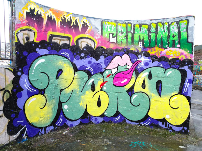
There may be a perception that it is unusual for women to be involved in street art and graffiti art, however, if it is a perception, it is one that I can blow apart right now certainly as far as the Bristol scene goes. This piece on the curved wall is by relative newcomer Pura Decadencia and is a welcome addition to this wall that has been a little stagnant over recent weeks.
Pura Decadencia, Dean Lane, Bristol, January 2021
I am so glad to have seen this and found out a little bit more about the artist from it, because I have a couple of pieces in my archive that I can now post and attribute to her. The piece itself is a nice bit of writing spelling out PURA on a blue bubble background and some vampire teeth getting stuck into the ‘R’. I think that Pura Decadencia is rather fond of vampire teeth if her Instagram stream is anything to go by. Welcome Pura to Natural Adventures.
At last a piece by Benjimagnetic that I can actually read. It quite clearly spells out BEN, much like many of his other pieces, but this one more legibly. It is interesting to note that Benjimagnetic is painting a few of these less cryptic pieces at the moment demonstrating that he is clearly not a one trick pony.
Benjimagnetic, Brunel Way, Bristol, January 2021
I hadn’t particularly been looking for this, and when I first saw it, wasn’t too clear who it was by until the penny dropped with the BEN and the little hollow highlights (that look like ‘V’s) that are such a trademark of the artist. Silver and Gold work well in this piece and which again are quite unusual colour selections that I wouldn’t normally associate with Benjimagnetic. A nice modest piece.
This wall at the Farm end of St Werburghs tunnel has been ripe for a refresh for some time and who better to bring about some colour and joy than Mr Draws? As night follows day, Mr Draws will be out there brightening up our walls with his unique style.
Mr Draws, St Werburghs, Bristol, January 2021
This one is a simple affair using blues, purples and red laid out as horizontal fills in a DRAW outline. There is a deep 3D black shadow and the whole thing is given added interest with some yellow bars. Bold and shouty – this piece has Mr Draws written all over it, literally.