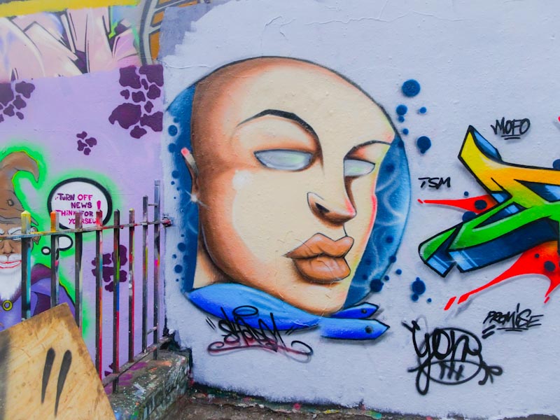
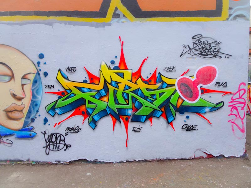
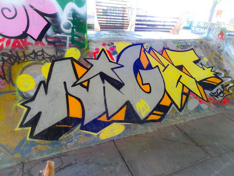
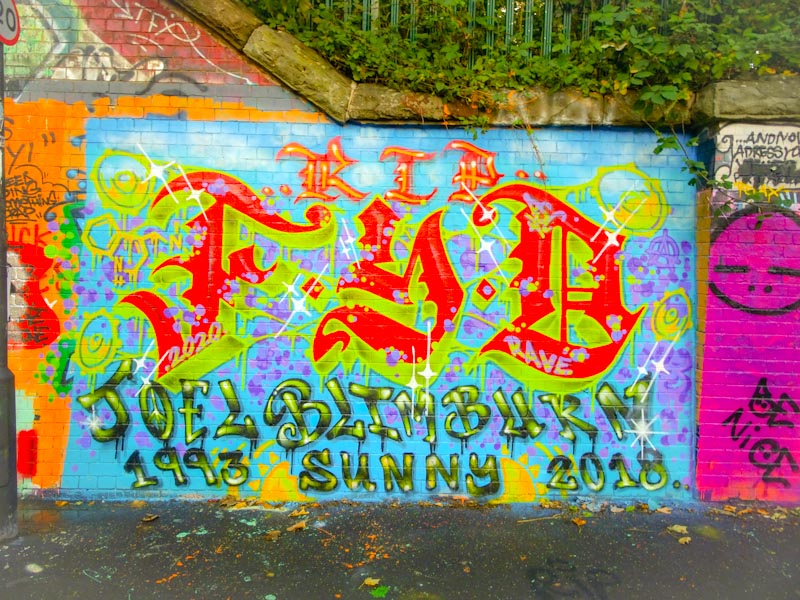
A gallery of outstanding murals from Bristol artist and designer Zase
All photographs by Scooj


A gallery of outstanding murals from Bristol artist and designer Zase
All photographs by Scooj


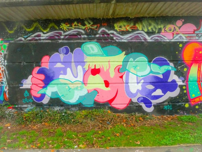
Daz Cat seems to be a very social artist. A great many of his pieces are painted with friends such as Kool Hand and more recently Varo. This piece was one of several in a loose collaboration, more of a paint jam really.

I am quite enjoying Daz Cat’s writing/character combinations and in this one the cat on the right is holding up the letters on the left spelling out D CAT. His writing style is unusual, quite organic and irregular but somehow similar to his cat style.

The cat is a good one, and like so many of his cats seems to be wearing a woolly jumper. All in all another nice contribution from Daz Cat.
I have a feeling that this might be the first piece that I have posted by Stivs. This is something of a poor show on my part, because I have plenty of pieces by him in my folders, but just never got round to posting any of them. I am putting this wrong right with this lovely piece of writing under Brunel Way by the riverside.

Stivs is probably best know for his beautiful gothic script works. These ornate letters spell out BDSC although I’m not too sure what this represents, but will come to know in time I’m sure. The letters are well proportioned and drafted and the colours work well The yellow and white lines help to lift the letters from the wall. Overall a wonderful piece. More to come soon.
This piece was painted a little while back by Decay, but I decided to dig it out because it marks further experimentation from an artist, who, when I first met him only painted in black, white, red and grey colours. His artistic journey has blossomed over the last three or so years and his pieces are becoming more and more interesting as a result.

Most unusually, Decay has gone for orange and purple colours with green highlights and arrows. More unusually he hasn’t used black outlines for his letters, although his little Chuck character does have an outline. Spelling out DECAY, I see this piece as pivotal in the artist really pushing himself to try new ideas. I love the orange splashes above the A. Looking forward to more developments.
I last met Jee See during a mini paint jam under Brunel Way back on a sunny summer’s day, and he had already completed his column piece and was just chilling and chewing the fat with friends. I haven’t seen any of his work since then until a week or two ago.

Jee See presents us with one of his ‘seismic’ pieces which has a political strand to it with the accompanying message of ‘Underclass rising’. It is nicely sprayed and planted over the top of an existing graffiti piece which makes the whole thing quite busy.
Unfortunately the piece has been dogged, probably by a kid with an almost empty discarded spraycan (it happens a lot). It is a pity, but it goes with the territory. My message – artists…take your empty cans home and dispose of them properly.
Well, what can I say about this really classy piece of graffiti writing from Hire? It is out of the top drawer that is for sure and it demonstrates clearly the benefit of prepping a wall properly to create a big impact.

The last piece I saw by the artist was a real departure from what we are used to and I have to say that I am comforted by this triumphant return. The midnight blues and blacks work well together and the sharp letters spell out the artist’s name. This is simple (although not really) and beautiful and I think might be my favourite piece by him ever. Bravo!
Painted alongside friends Inkie, Smak and Sled One, this is a first class piece of graffiti writing from Soker, who since lock down restrictions were eased has been very busy on the streets, which is a great thing for people like me.

The writing is superbly clean with a black shadow and white boundary that gives the whole thing a sharp crispness. There is a lovely blend of greens and blues in the letter fills and the red bubbles complement the piece beautifully. The work of a graffiti master.
3Dom is probably best known for his character pieces and scenes, which are utterly outstanding, but he is also a very accomplished writer and every now and again we are treated to a little bit of his graffiti writing like this piece at the M32 Spot.

This is a splash of colour with what looks like translucent letters over the top spelling out 3DOM. It is full of joy and hope and the colours of summer, something we need to hold on to as we accelerate towards winter. Always classy.
Phour, an artist that I only encountered for the first time this summer, has been hitting the walls quite hard this year and there aren’t many spots around the city that haven’t had his letters displayed in all their glory.

This piece, behind the swimming pool railing at Dean Lane, shows what Phour is capable of. Some really nice crisp letters with a three-colour horizontal fill, the central red stripe with loads of little red spots around it. There are further purple decorations reading across to the top and bottom stripes. The whole thing set on a green splat background. I’m not entirely certain about that green with the other colours, it just doesn’t quite feel right. A top quality piece from Phour.
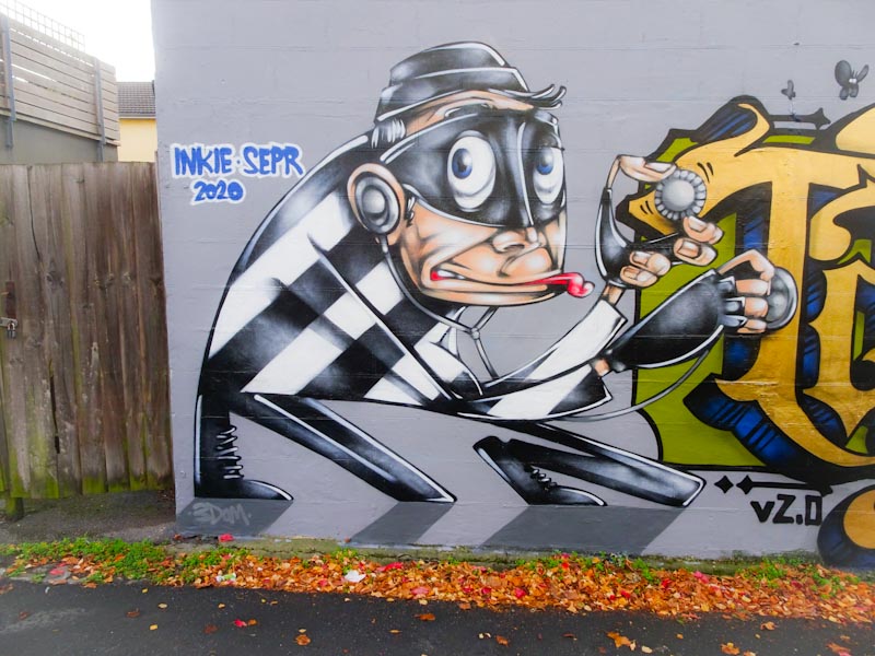
Yet another outstanding piece from Inkie in this purple patch we are lucky enough to be witnessing in Bristol at the moment. I am guessing that Inkie has a bit of time on his hands at the moment… maybe it is a pandemic thing and if it is then it is an upside as far as I am concerned.

Alongside some of his friends (posts to follow soon) this appeared about a week or so ago at the top end of Stapleton Road. It is an absolute classic and painted in colours that he has used before, from memory he painted a van in similar shades. Those of you who follow Thursday Doors, might well see this piece again sometime in the future (door hidden under the I and E). I will never tire of his work and am really enjoying this current spate.