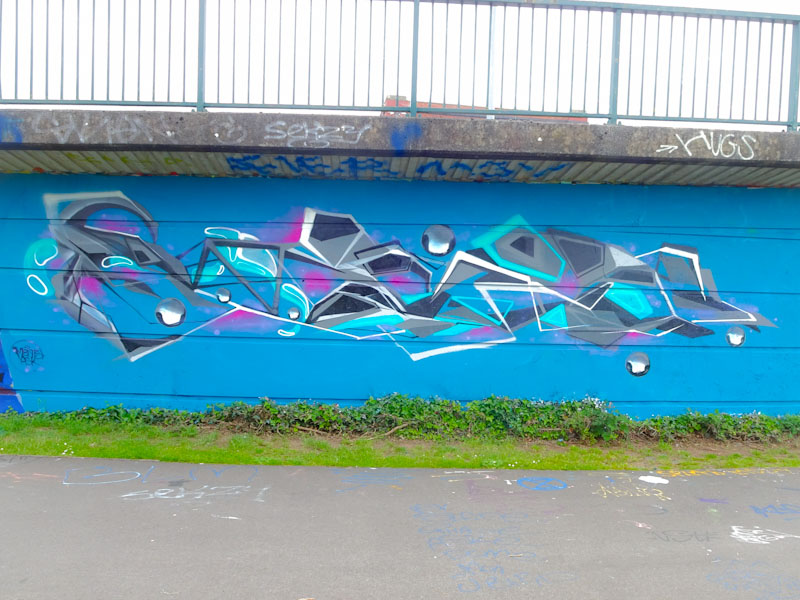
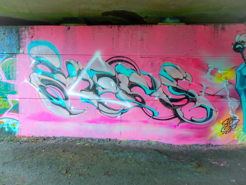
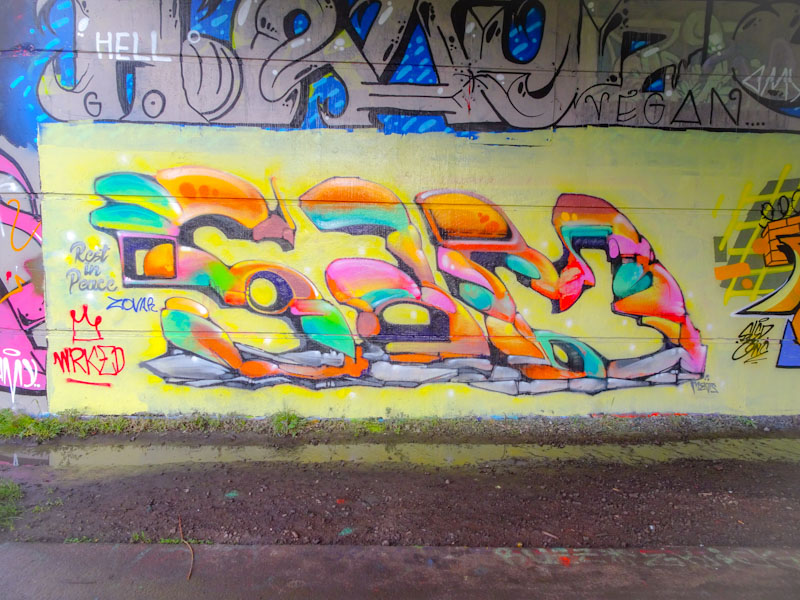
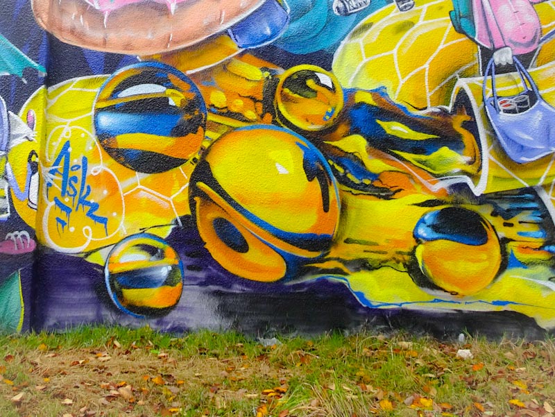
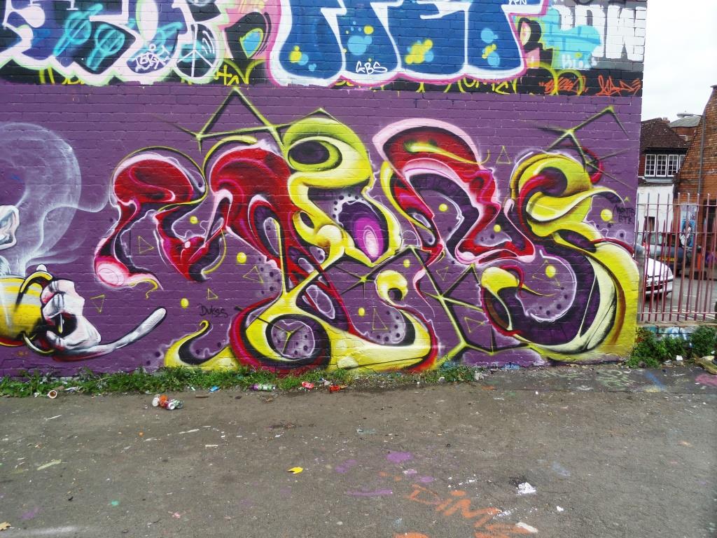
Soker never disappoints. His graffiti writing is always of the highest possible quality and he sets a very high bar for other writers in Bristol to aspire to. This is a super little piece alongside Inkie in Dean Lane from a week or two back.
Soker, Dean Lane, Bristol, August 2020
The letters are filled with three slightly different shades of blue with some nice bubbles running through the middle. There is some partial 3D shading in yellow with a vanishing point behind the piece and the whole thing is set off perfectly with some red decorations around the perimeter. Clean and crisp, a great example of great writing.
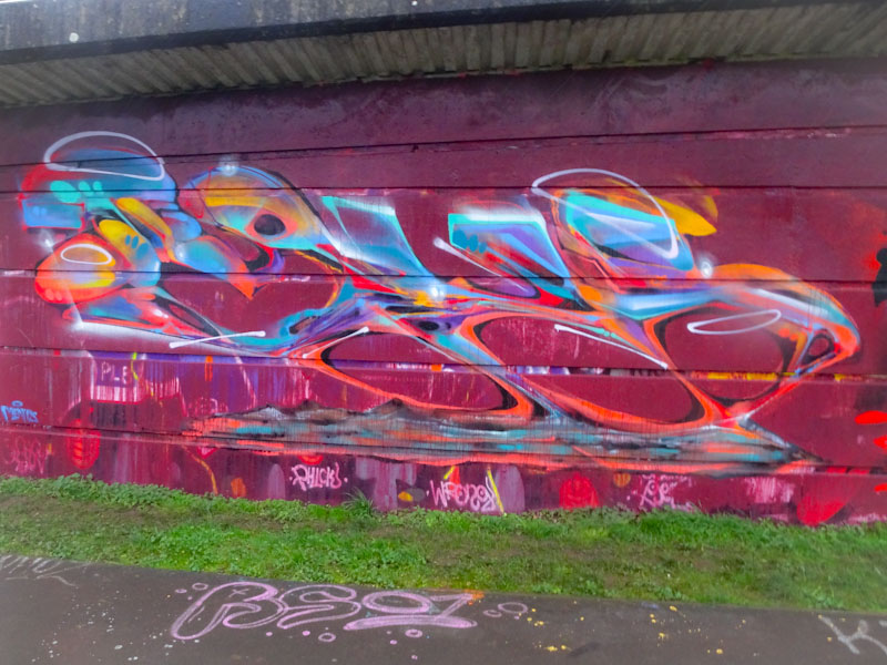
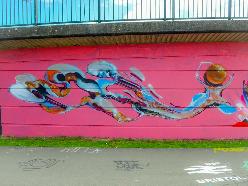
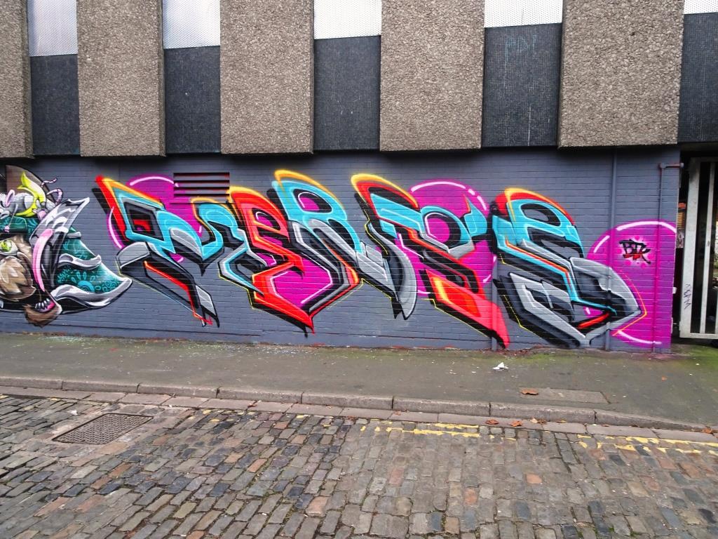
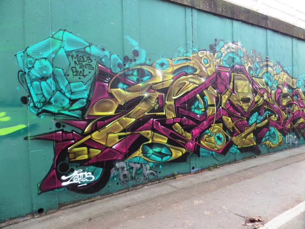
This is a real statement piece of graffiti writing from Smak down at Dean Lane and amply demonstrates why he is one of the very best writers in Bristol and probably the country. His pieces are elaborate with so many interlocking parts all seamlessly brought together with clean crisp lines.
Smak, Dean Lane, Bristol, August 2020
The colour palette is similar to one I have seen him use before and works well on the dark background. There are to many elements in this piece to be able to describe them all, but consistent with several pieces by the artist you get more for your money, with two SMAKs visible in places, most obviously with the A.
Smak, Dean Lane, Bristol, August 2020
On his Instagram feed, Smak mentioned that a little kid told him he could paint jellyfish, so Smak decided to add one for good measure – that is why it is there. Another monster piece from Smak.
One of the busiest artists over the summer has been Taboo with his rather unconventional style of writing. Why is it unconventional I hear you ask… tumbleweed… well I’ll give you my perspective. His letters look like they are made of rubber. They have no consistent form or size and don’t seem to follow any formula or rules. Letters may be stretched or condensed and some are replaced with motifs or characters. His pieces are quite anarchic in a graffiti writing world that is surprisingly conventional.
Taboo, Brunel Way, Bristol, August 2020
This one under Brunel Way by the riverside spells out TABOO with a wobbly skull between the T and A. An Ionic column makes a random appearance in the first O. Unusal and interesting ans as I said at the start unconventional.
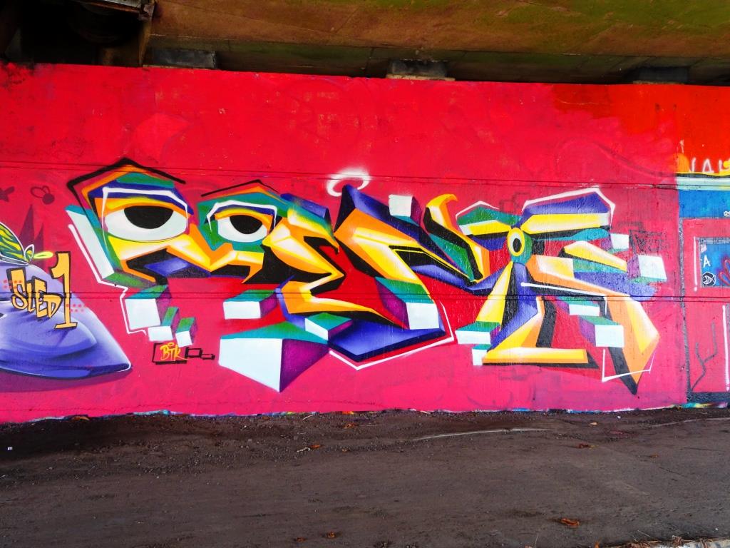
Ooh, I am really enjoying the work of Pl8o at the moment. The letters he uses lend themselves very well to graffiti writing and provide a lot of scope to do great things, like Boogie for example. There are some letters And numbers that just seem to work well together.
Pl8o, St Werburghs, Bristol, August 2020
This one was at the farm end of the tunnel and in daylight that makes it so much easier to photograph. All the elements of this piece come together. The gold letters and grey shadow, the stars and spots and white letter stars. This piece is so very easy on the eye.
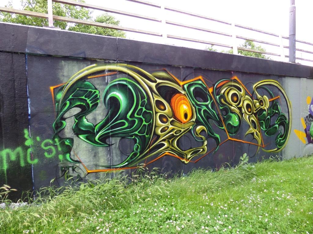
It is always a treat to find an Inkie piece, and to come across two new ones in the space of about month is a great excuse for celebration. This one appeared a week or two back on the long wall at Dean Lane alongside Soker and Zooki (an artist I am unfamilar with).
Inkie, Dean Lane, Bristol, August 2020
The shapes of the letters and the style of 3D fills are so recognisable in his work and it only takes a second to identify his pieces. The colour transitions in the fills are expert an the overall colour selections with the blue 3D shading and red clouds are brave, but work fantasticlly well. A fine piece from a top artist, and a nice tribute to Desire.
His is only the third piece I have posted by Benjimagnetic although I have quite a few of his older pieces in my archive. His style is quite unique and more about outlines than solid fills. The sketchy appearance makes it difficult to decipher the letters, but they are there somewhere. It definitely starts with a B.
Benjimagnetic, St Werburghs, Bristol, August 2020
The colours in this piece are nicely thought out and the splashes of light blue and orange add some interest. In a funny way, this style is a bit like an angular version of the abstract writing we see from Mr Klue – there is a wispish, ghostly quality to it. Watch this space for more from Benjimagnetic.
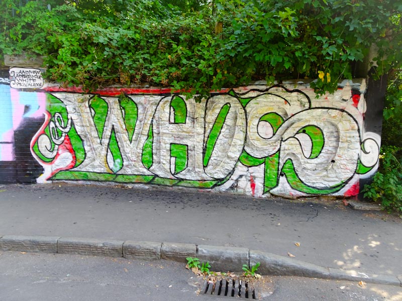
I have a feeling that this is the third piece I have posted by Whos and I am rather enjoying what I see. This unconventional writing style feels very ‘New Bristol School’ if there is such a thing, along with Taboo and Alos. I am full of admiration for this piece, because any kind of spraying on a heavily textured wall is not going to be easy.
Whos, St Werburghs, Bristol, August 2020
The piece is located at the entrance to St Werburghs tunnel, and I expect it to stay there for a while due to the nature of the wall. The letters are large and bold with a clever shaded ridge down the middle giving a nice 3D effect. The silver/white and green colours work well together. Altogether a nice piece of writing the likes of which I expect to see more of.
Moon Street still holds an important place in my heart. Although it rarely hosts ‘top end’ pieces it represents, for me anyway, the beating heart of the Bristol graffiti scene. The area around Moon Street is steadily being gentrified, and in time these images of street/graffiti art will be distant memories. I don’t recall seeing a Taboo piece in this street before, so I was thrilled to come across this one recently.
Taboo, Moon Street, Bristol, August 2020
This new piece is beautifully laid out on a blue background that gives it some prominence. In typical fashion, Taboo’s unconventional lettering style spells out TABOO with a long-nosed character on the left and a ghostly face constituting the second O. As is often the case, there is a little shout-out to his girlfriend Amy. I’m really enjoying Taboo’s work at the moment.
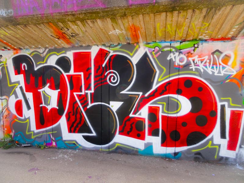
It feels like an eternity since I last saw a Biers piece that actually spelled out ‘BIERS’ rather than ‘OhYeah’, and I have to say it makes me very happy. I remember the first piece I ever posted by Biers – it had a piece of toast in it, and shortly after that I met him on several occasions while he was painting and we struck it off really well – it has been a while since I last saw him though.
Biers, M32 cycle path, Bristol, August 2020
This is a regulation piece of Biers writing and all the more splendid for it. His irregular sized letters are expertly filled with black and red patterning. This is a most satisfying piece.