I enjoy getting to where people paint, and by that I mean, in this example, that although Hypo paints a lot in central Bristol, this is his local spot and somewhere that I expect he feels very much at home painting. I visited this spot on a warm, sunny day, which was as much a nature ramble as a graffiti hunt.
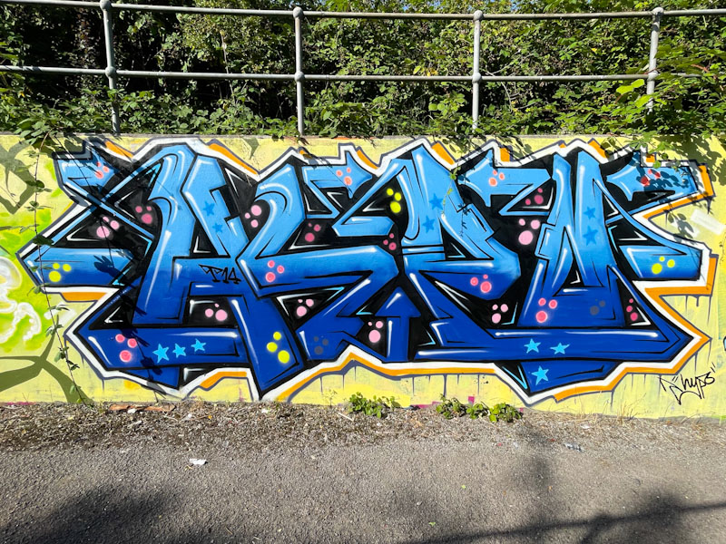
Hypo, L Dub, Bristol, August 2024
I am never quite sure about the colours blue and yellow together, which is curious, because they are the traditional colours of my beloved Arsenal’s away kit, but of course, I forgive my football team anything and everything. The HYPO letters are nice and regular, painted in two tones of blue and decorated nicely with spots and stars. A thin 3D Drop shadow and two border lines round the piece off nicely. Hypo in his natural habitat.
Well, this is surely one of the more unusual pieces from Hire, that indicates he is enjoying pushing boundaries. When I first encountered his work a few years ago, his USP was his spiky, sharp letters that could poke your eye out if you weren’t careful. Contrast that with this organic green piece spelling HIRE.
Hire, Dean Lane, Bristol, August 2024
Each letter resembles a bushy tree with green branches and canopy, in various orientations. The letters are set on a dark conifer woodland silhouette. This is a very nicely considered and executed piece from Hire – connecting with nature.
Some viewers/visitors may wonder what the numbering convention at the top of each street/graffiti art post on this blog is all about, and might legitimately question whether it is helpful or not. In my mind, it is quite simple. The first number is the sequential listing of the blog post, so, this is the six thousand three hundred and tenth post I have written about street/graffiti art on Natural Adventures. The following name is the spot or road where the piece can be found, and the number in brackets (unconventionally there isn’t one for Cumberland Bain (a quirk)) at the end relates to the number of posts from that spot or location. It might have been simpler to instead have the name of the artist included as well, but when I started doing this back in 2015, I didn’t know who most of the artists were and so a place-based approach seemed more sensible.
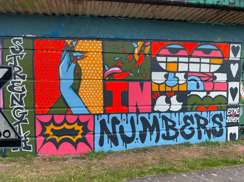
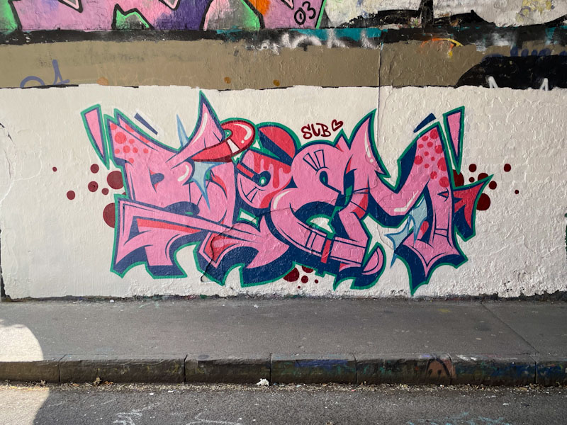
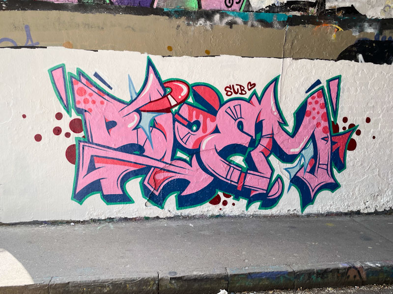
This is an absolutely gorgeous and rather unexpected collaboration from Esme Lower and Bloem.
Esme Lower and Bloem
The collaboration appears to be entitled ‘Strength in numbers’ which might be a reference to the ‘counterprotest marches’ against the far-right riots that were happening around Britain at the time this piece was painted.
It is what I would call a ‘true’ collaboration where the piece is a mash-up by both artists, and although some parts are identifiable as being by one artist or the other, the whole thing is an integrated mixture. The hands and chain are definitely by Bloem and the eyes and teeth by Esme Lower, the rest could be by either one of them. It is great to see these two artists stretching themselves, and it would be wonderful to see more co-creations like this one in the future.
Oof! This is an absolutely outstanding framed piece of writing by Smak, which stands out ‘poster-like’ from the long wall of the M32. Rather well concealed, the letters spell out SMAK, and there is an overwhelming sensation of a tropical island landscape conveyed by the palm trees and a possible reference to a bright sun.
Smak, M32 roundabout, Bristol, August 2024
The way the piece is pulled together has a collage appearance, as if a youngster had cut up pictures from a holiday brochure (remember those?) and stuck them onto a rectangular piece of paper. This is a truly memorable piece by Smak and something a little special.
This outstanding abstract piece of graffiti writing by Mr Klue has it all, and has taken a bit of a shift in colour composition from his usual palettes of blues, greens, purples or oranges. It is really quite unusual to come across a piece by the artist with a white background, and it leaves the viewer with quite a different impression.
Mr Klue, St Werburghs, Bristol, August 2024
The wispy letters spell out KLUE, and I am pleased to note the incorporation of his floating steps, which I think really adds something to the mystery and spirituality of his work. It is interesting to see that he, and others before him, have chosen not to paint the semicircle of chipped wall along the top of the piece. Wonderful work from local artist Mr Klue.
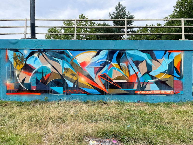
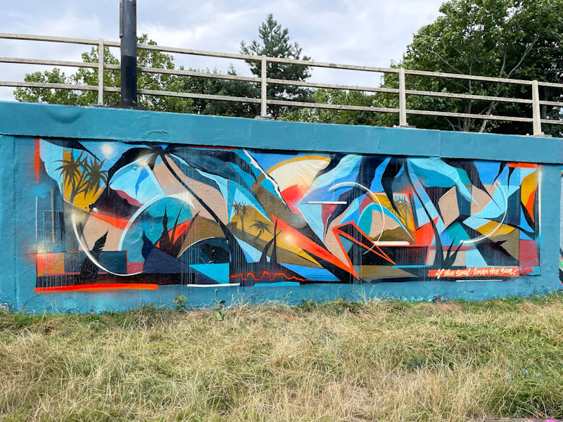
I’m not entirely sure how Acer One finds the time to paint so much, but I am glad that he does. One of the upsides of self-employment I guess. This is a really classy design piece in one of his favoured spots, which he pretty much ‘owns’ these days.
Acer One, Cumberland Basin, Bristol, August 2024
The word ‘love’ is written in the same format as the background, and emerges from it due to the curves in the lettering where they depart from the horizontal background pattern. If the letters were to straighten out, they would disappear into the wall altogether. The piece is nicely conceived, and as always with Acer One, beautifully executed.
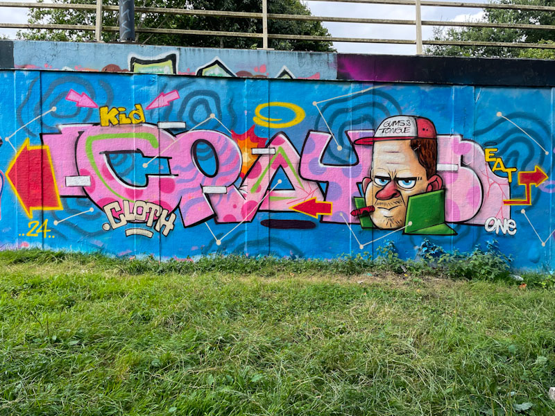
Kid Crayon and I Am Ian, M32 roundabout, Bristol, August 2024
You’ve got to grab the opportunities when you can, and that applies equally to artists as it does to me. Kid Crayon and I Am Ian have been out and about a few times this summer, and knowing that they are busy people, it is great to see them painting walls and enjoying themselves.
Kid Crayon, M32 roundabout, Bristol, August 2024
This recent collaboration on the M32 roundabout wall showcases their artistic skills beautifully. kid Crayon has produced one of his light-hearted writing/character combinations, which I have to say is really good. It is always nice to see the floating crayon, KC’s signature symbol, in front of the character’s mouth. There is a little shout-out to the Gums and Tongue crew on the character’s baseball cap.
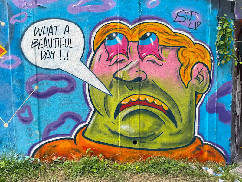
I Am Ian, M32 roundabout, Bristol, August 2024
I don’t think I have ever seen any writing from I Am Ian, I don’t think it is his thing, but his characters are always interesting and usually humorous. This rather forlorn character at least is able to comment ‘What a beautiful day!!! I Am Ian’s pieces are often accompanied with the words ‘sit up’, although I am not entirely sure of their significance. A wonderful collaboration from these two fabulous artists.
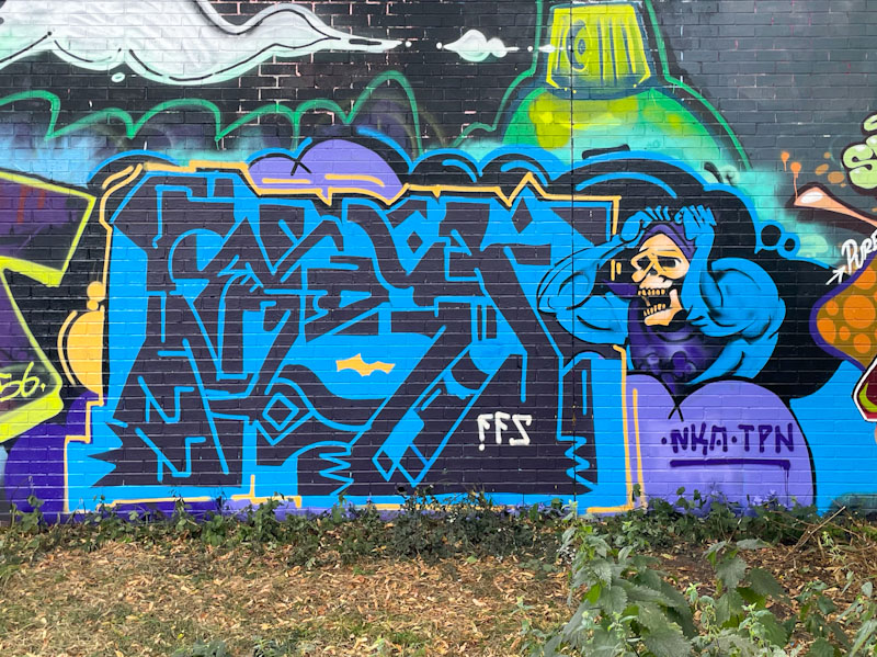
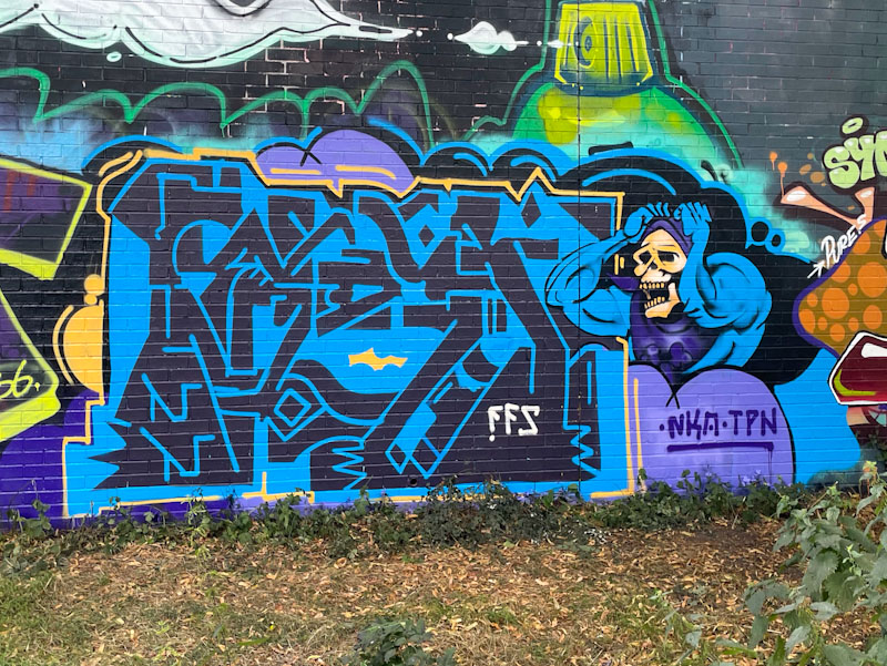
Kid Krishna, Sparke Evans Park, Bristol, August 2024
I haven’t featured Kid Krishna’s very much over the last few months. That doesn’t mean to say he hasn’t been painting, he has, it just shows how difficult it is for me to keep up with the volume of wonderful artwork being produced in Bristol on a daily basis. I might have to do a catch-up collection of Kid Krishna’s work, just to put things right.
Kid Krishna, Sparke Evans Park, Bristol, August 2024
This is a striking and quite unusual combination piece by Kid Krishna with his graffiti writing (which might spell out CRIE – it usually does) and a muscular skeleton, who I think it is Skeletor from He-Man and the Masters of the Universe franchise. The two parts of the piece are juxtaposed creating quite a special look. It feels good to get back on the Kid Krishna merry-go-round.
Ah, what a joy it is to witness the genesis of a graffiti writer. I believe that this is only the second piece of graffiti writing that Bloem has painted, and her artistic skills are such that you simply wouldn’t know that was the case.
Bloem, St Werburghs, Bristol, August 2024
This piece of writing is clean and tight, with fabulous colours and a nicely buffed background to help the whole thing stand out, and stand out it does. Her letters are very nicely arranged, beautifully filled and finished off with a decent 3D drop shadow and tidy border. I like the shout-out to Sub, who painted the wall opposite. Bravo!
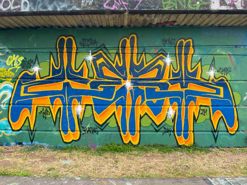
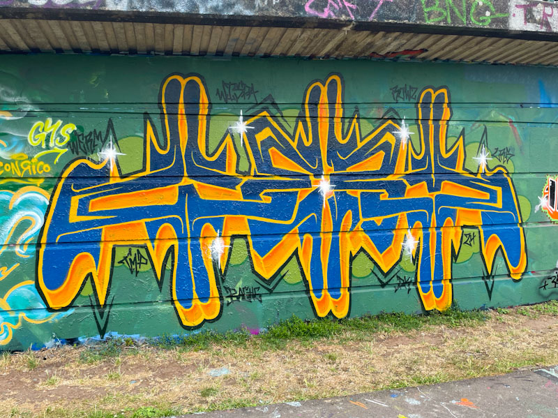
I like the way that Werm is constantly trying to find new ways to present his letters, and explores different looks, while retaining his essential style. This piece takes him into the realms of bilateral symmetry of his letters WERM, which works surprisingly well.
Werm, Cumberland Basin, Bristol, August 2024
The letter colours contrast strongly with the green background, helping the piece to stand out… it will not be ignored. There is something quite mesmerising about the symmetry, and I like the direction this idea is taking. The left-hand side is stretched a little bit, knocking the symmetry out a fraction, but this is all something that Werm can work on and improve. Great new innovation from Werm.