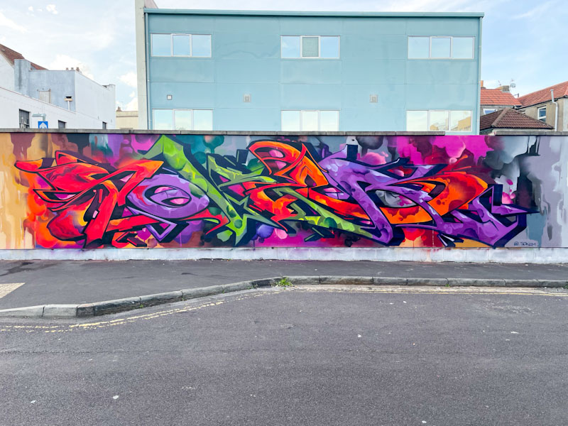
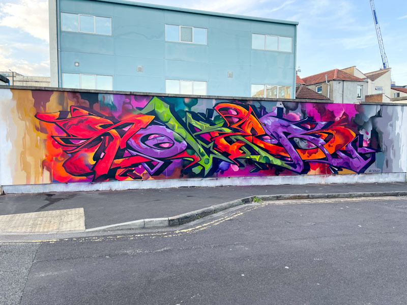
If ever you want to see wildstyle graffiti writing at its absolute best, then look no further than this outstanding piece by Soker painted on the wall of the Sofa Project in Old Market.
Soker, Waterloo Place, Bristol, October 2025
Starting with the background, this piece is set on a colourful abstract wash, that has the look of a watercolour, with blended tones and drips. The letters, spelling out SOKER, are presented in a sumptuous palette of red, purple and green with magnificent fill patterns throughout. This enormous piece is a testament to an artist who sits at the pinnacle of his craft.
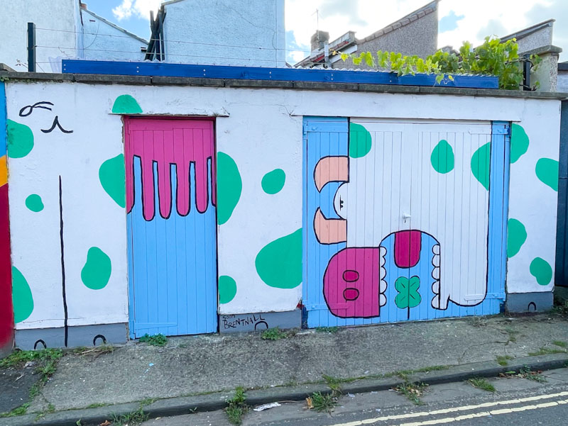
Sam Brentnall, Lucky Lane, Bristol, September 2025
Although he doesn’t paint all that often, Sam Brentnall pretty much always brings a smile to my face with his quirky illustrations of familiar animals and their amusing personalities. This beauty was painted in Lucky Lane as part of the most recent Bristol Mural Collective paint jam.
Sam Brentnall, Lucky Lane, Bristol, September 2025
The piece, painted on a back yard wall with door and garage, takes the form of a reconstructed cow. Of course no real cow looks like this, but the caricature illustration immediately appears as a cow, even though it is mixed up and has green spots instead of black. I love the udders on the door on the left, and the cow’s head cropping a four leaf clover – tapping into the lucky theme of the paint jam. This is a truly charming piece from Sam Brentnall.
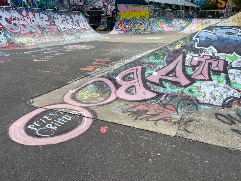
It would seem that Taboo doesn’t paint all that often these days, or at least, not in the places that I frequent. Dean Lane Hardcore (DLH) is an annual opportunity for street/graffiti artists to do their stuff in a one-day skate festival atmosphere, and I think that Taboo painted this and one other piece at this year’s DLH.
Taboo, Dean Lane, Bristol, October 2025
Wall space might have been a bit of a premium, who knows, but Taboo has instead painted the floor of the skate park – perhaps with a view to his work being more likely to appear in skate videos. Taboo’s letters are written back to front (nothing is straightforward with this artist) but rather more conventional than his typical anti-style pieces. Great to see his work after a while.
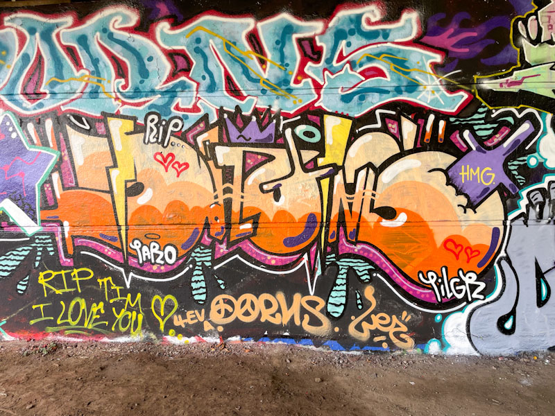
This tidy little piece of graffiti writing is Dirtygypo’s contribution to a tribute wall painted in honour of Dorns recently. I betray my lack of knowledge at times like this when I say that I am not entirely sure that I ever met Dorns nor featured any of their work in Natural Adventures. What is clear from this wall is that Dorns was well-loved and respected by many in the graffiti community in Bristol.
Dirtygypo, Brunel Way, Bristol, October 2025
What is deeply frustrating from my perspective is that I find it quite easy to read the letters DORNS in this piece, but I can’t decipher the letters used in Dirtygypo’s normal writing. There are some great colours in this piece, and a rather special 3D drop shadow in purple with pink dots. A thin white highlight enhances the feeling of depth. RIP Dorns.
Benjimagnetic, M32 Cycle path, Bristol, August 2025
I rather like this piece by Benjimagnetic on the cycle path, with its orange and green stripes for a background, it has something of a psychedelic look to it. The GRO letters are beautifully ‘sculpted’, with layers of geometrical shapes stacked one upon another.
Benjimagnetic, M32 Cycle path, Bristol, August 2025
The piece was painted alongside Hemper, and looking at this with hindsight I really ought to have posted them as a pair, as they shared a colour scheme. The piece is really neat and tidy, and the sharp lines are softened, ever so slightly, with the floating bubbles, a clever device. Great work from Benjimagnetic.
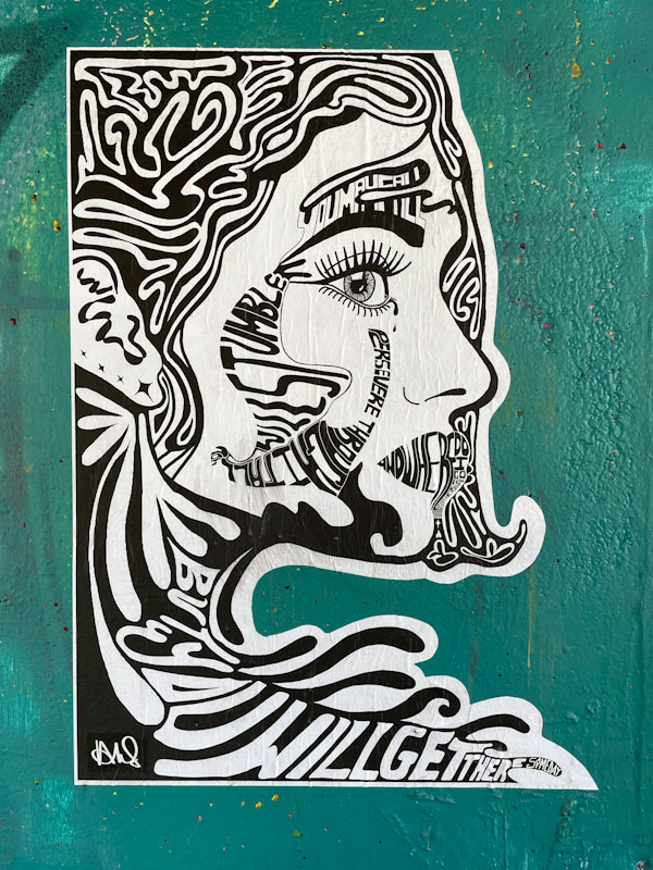
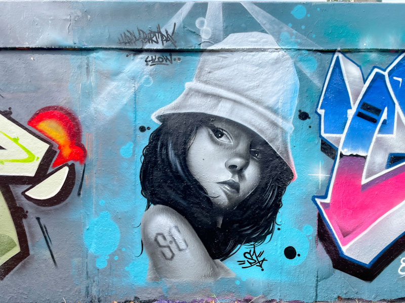
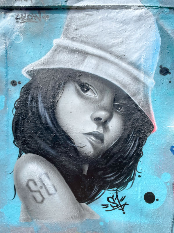
One of the very best character portrait artists in Bristol, who doesn’t paint as often as I’d like is Shade One. Fortunately the draw of joining a Ulow birthday celebration was enough to bring him out to create this absolute beauty.
Shade One, M32 roundabout, Bristol, August 2025
Shade One is a specialist at painting caricature portraits, where the subjects are completely on point, but don’t fall into the realm of photorealism. The girl, wearing a bucket hat, painted in greyscale, is absolutely beautiful. Her expression somewhat moody as she glances to her right. Shade One is surely an artist at the very top of his game.
The Lucky Lane Bristol Mural Collective paint jam last month, is a gift that keeps on giving. Although I missed the pieces being painted because I was out of the country, I have been able to enjoy them completely and utterly. This is a wonderful shutter piece by Yoliws.
Yoliws, Lucky Lane, Bristol, September 2025
I love Yoliws’ characters that have a sense of freedom and joy about them, and the colours she selects have an upbeat feel. Unfortunately, I think that the shutter is working against Yoliws in this instance, and perhaps some stronger colours might have brought out a bit more contrast. There is a lovely message here for all who care to look at it… ‘Feelin’ lucky to have met you’. Fabulous stuff.
Doors 328 – Doors of Marrakesh, Morocco, January 2025 (Part VIII)
I have been a little all over the place lately, and just returned from a few days fishing in Cornwall. I also have to go in to the office tomorrow, something of a rarity, so I am getting ahead of myself by writing this post last night.
These are the last few doors in Marrakesh from an early morning doorscursion on my own, during a short period of light drizzle. These street doors here resemble many of the doors I have already featured, but include some open gateways as I approached the Souk area. Next week things get a little bit different, but in the meantime I hope you enjoy this selection:
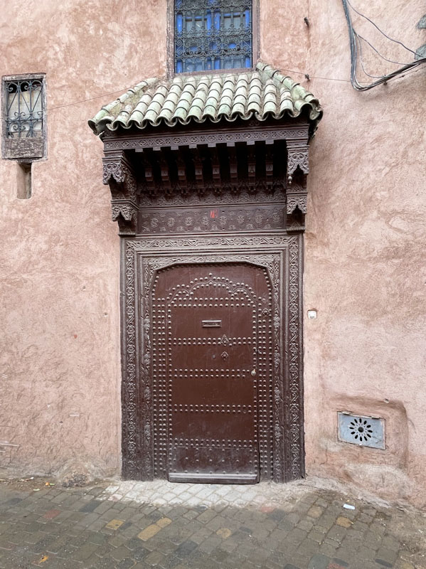
Studded door and ornate surround, Rue Douar Graoua, Marrakesh, Morocco, January 2025
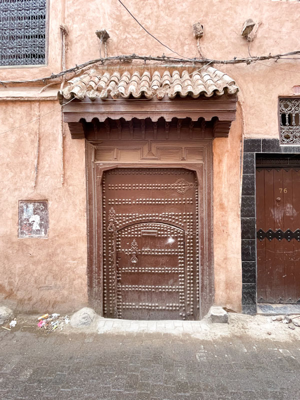
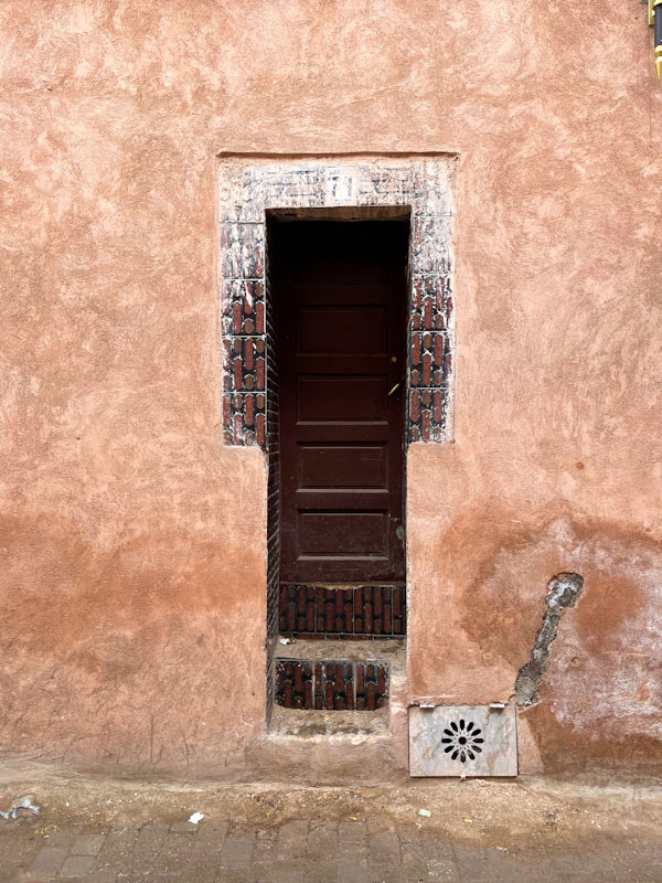
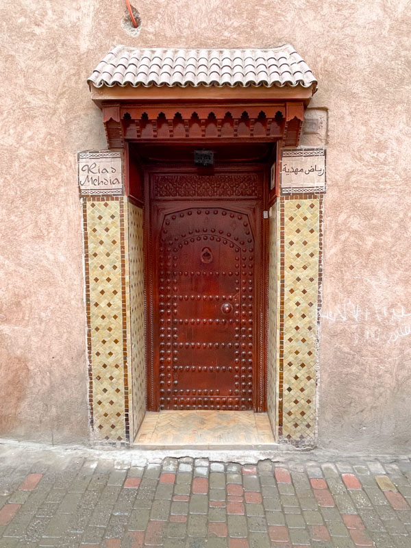
Studded door within a door, Rue Douar Graoua, Marrakesh, Morocco, January 2025Steps up to a slim door, Rue Douar Graoua, Marrakesh, Morocco, January 2025Door to Riad Mehdia, Rue Douar Graoua, Marrakesh, Morocco, January 2025Door within a large double door complete with chair and motorbike, Rue Riad Zitoun El Jedid, Marrakesh, Morocco, January 2025Doorway to the Bahia Craft Market, Trik Amlak Mkhaznia, Marrakesh, Morocco, January 2025Doorway to a carpet shop, Trik Amlak Mkhaznia, Marrakesh, Morocco, January 2025Tiled keyhole doorway to the jeweller’s souk, Trik Amlak Mkhaznia, Marrakesh, Morocco, January 2025Large city wall gateway, Rue de Berrima, Marrakesh, Morocco, January 2025
I guess this is about the halfway stage of doors from Marrakesh, and so far all of the doors have been residences or shops. The next few selections will be from sites and places of interest that we visited during our stay, although the odd street door will be making appearances from time to time. May I wish you a fabulous weekend.
If you have made it this far, you probably like doors, and you really ought to take a look at the No Facilities blog by Dan Anton who has taken over the hosting of Thursday Doors from Norm 2.0 blog. Links to more doorscursions can be found in the comments section of Dan Anton’s weekly Thursday Doors post.