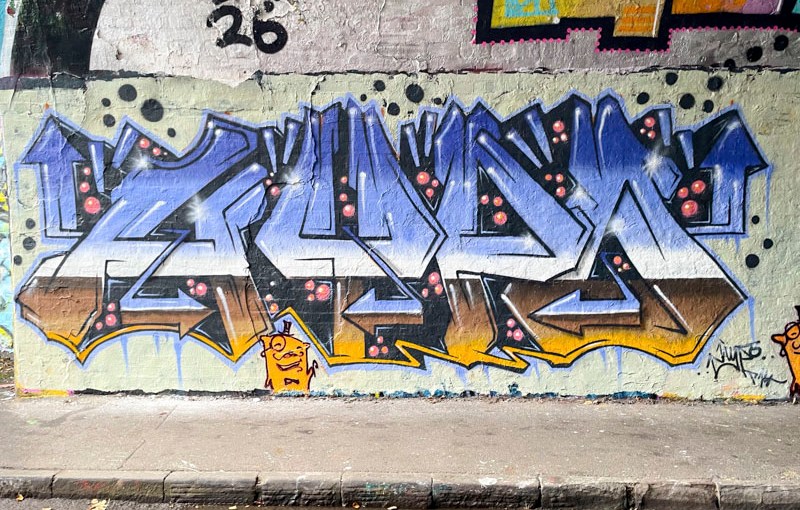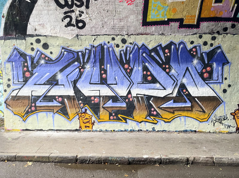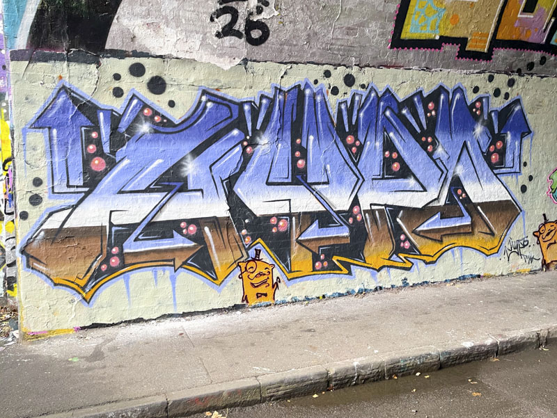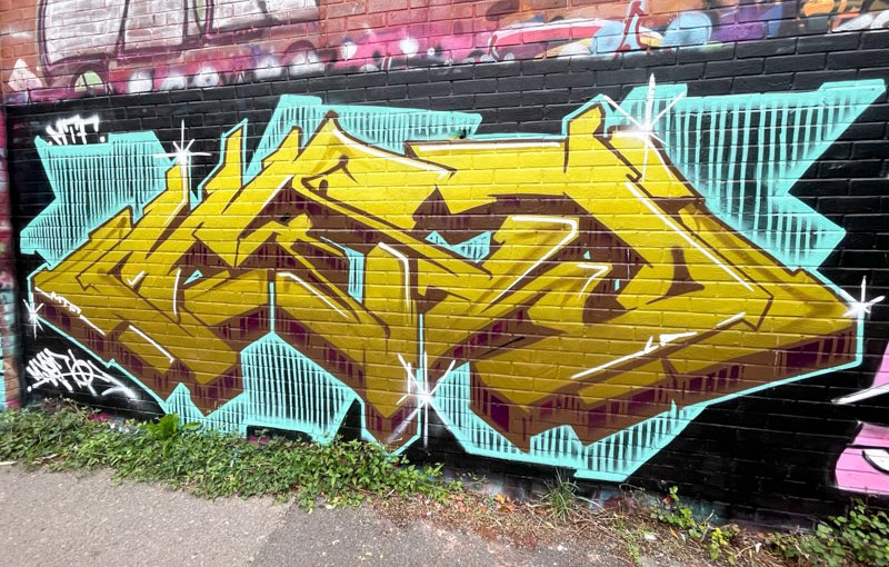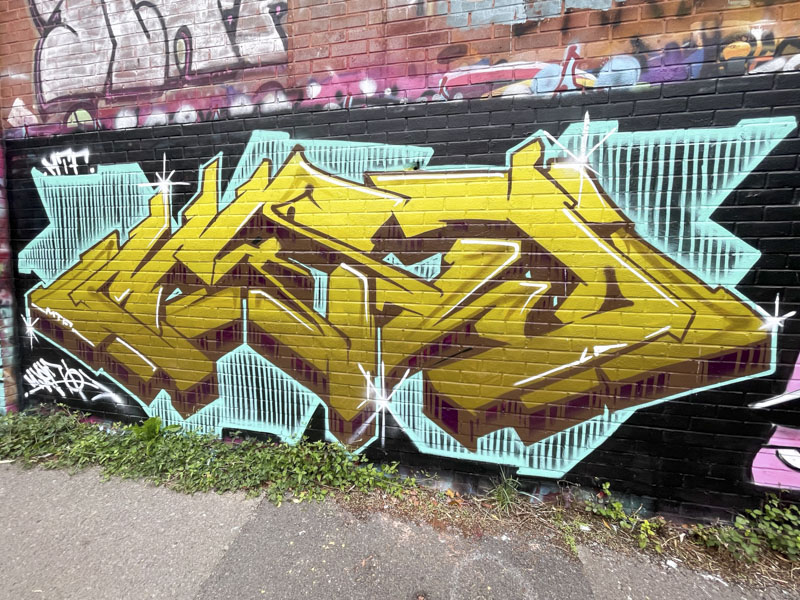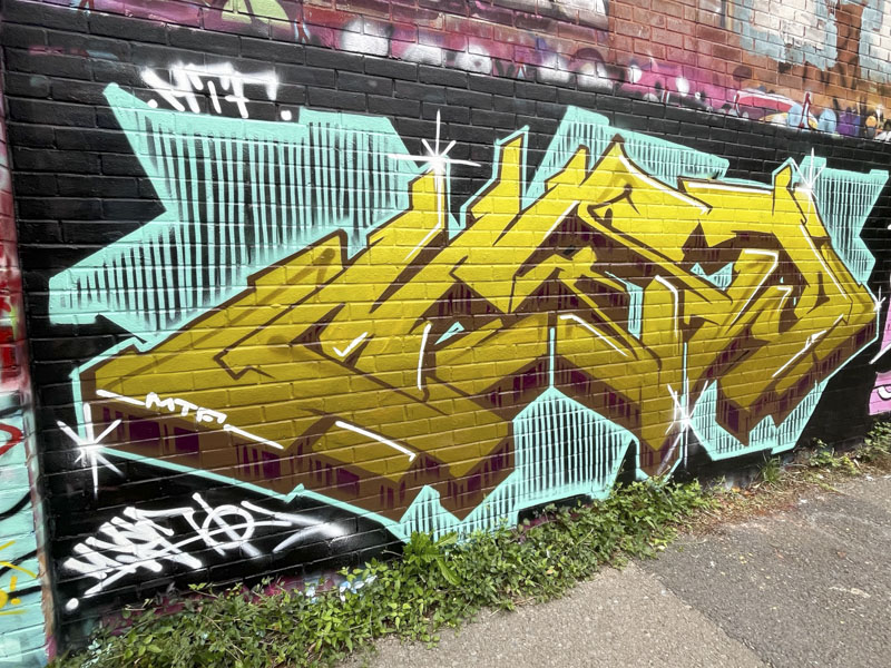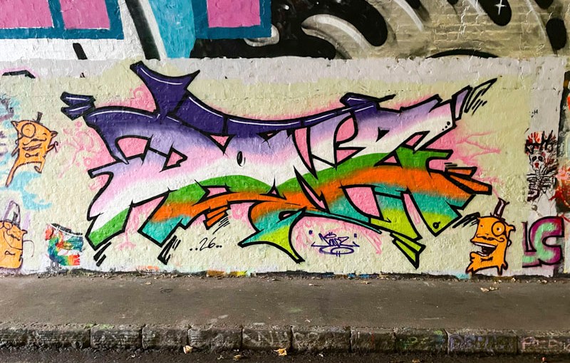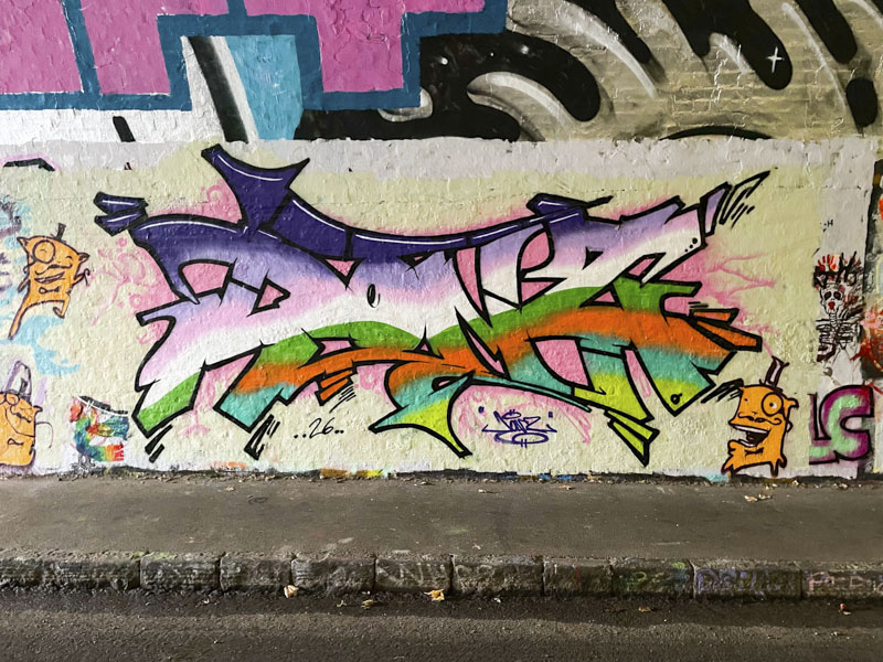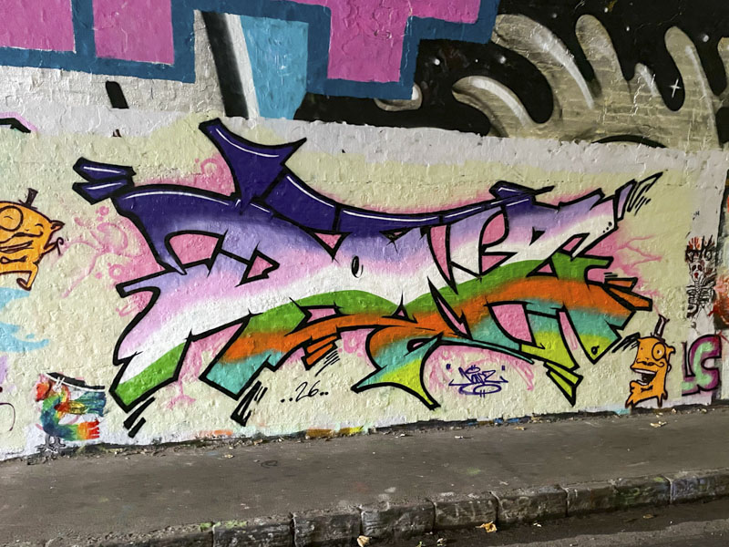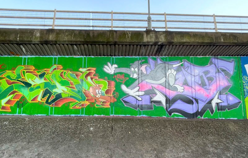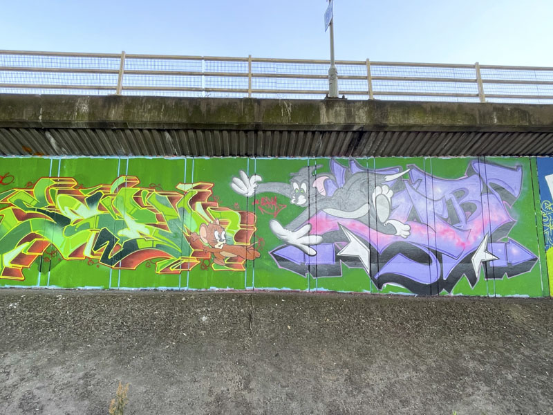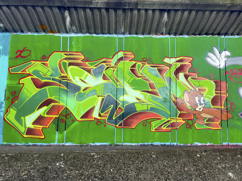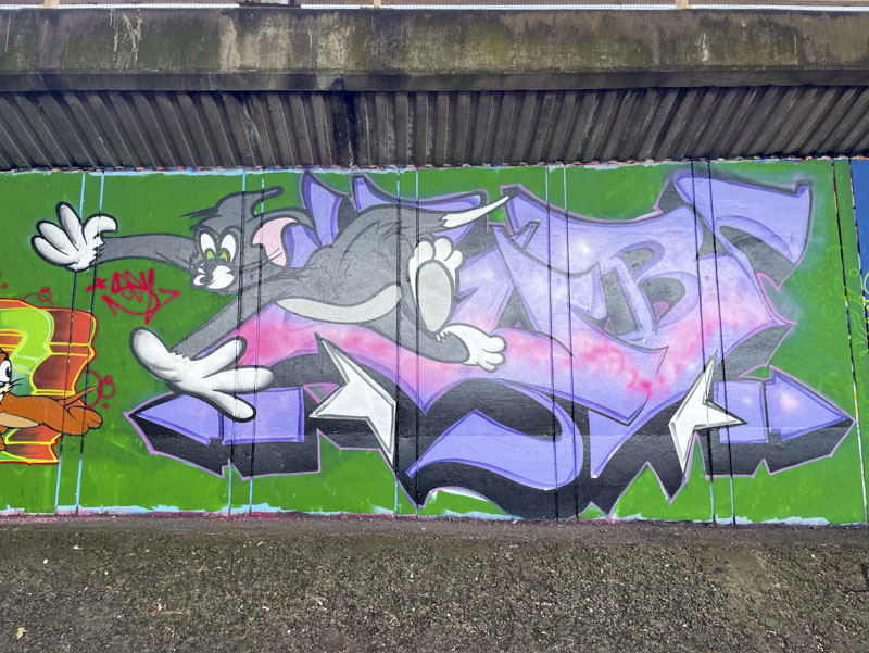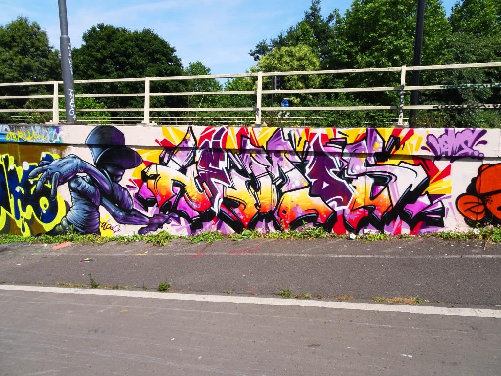
I have mentioned in the past that much (not all) of Donz’ work is quite flat in terms of perspective, as you can see from this updated gallery of his work. But every once in a while he includes a 3D drop shadow, and this is the finest example of this that I have seen.
Donz, St Werburghs, Bristol, June 2026
Painted as part of his own birthday paint jam in the tunnel, Donz has seriously stepped up to the plate and produced a classic. The clean colours, painted into nicely designed letters are lifted perfectly by the purple shaded shadow. The whole thing isn’t overworked, instead a clean and clear attractive piece. Happy Birthday.
This wonderful combination piece by Kid Crayon is his contribution to the Mexican-themed wall painted alongside the M32 a few weeks ago. KC has embraced the theme with gusto, using the colours of a parched desert for his lettering and decorating the piece with cacti. These might be stereotypes, but certainly chime with a British characterisation of Mexico as a hot, dry country.
Kid Crayon, M32 Cycle path, Bristol, June 2026
The character is a masked Mexican wrestler (luchador), and is accompanied by the word Lucha and a little enacted wrestling scene in the bottom left of the piece. Loads of fun in this beautifully finished celebration of Mexico.
My Dog Sighs, Quakers Art Lane, Bristol, June 2026
In the area where Broadmead meets Cabot Circus (two adjacent shopping centres in Bristol) is a little lane which Upfest curated for some spectacular pieces as a precursor to Upfest 2026. How brilliant to brighten up this area, reinforcing Bristol’s reputation as a global hub for street art. This outstanding piece is by Portsmouth’s superstar My Dog Sighs, and was the first of three he has painted in the city this year.
My Dog Sighs, Quakers Art Lane, Bristol, June 2026
This piece blends a trademark eye by My Dog Sighs with a musical theme with plenty of speaker cones dotted about the piece, and a music staff containing some notes and notation. The whole piece is decorated with attractive colourful splats, providing an interesting backdrop for his themes. There appear to be people celebrating in the reflection in the eye, and I am sure there is a backstory relating to them. A wonderful piece for shoppers and visitors alike to enjoy.
Just when you think you have seen all the improvements and variations Werm can make with his letters, he comes up with an original piece like this one. Spelling out the letters WERM, the piece is almost (but not quite) perfectly symmetrical.
Werm, Sparke Evans Park, Bristol, June 2026
The thick letters are filled with blues and oranges, with a pink and purple puffy background… not a combination of colours that should work in my mind, but somehow it works really well and draws the eye. I think that this piece really demonstrated that Werm keeps pushing boundaries and developing his style. Never a dull moment.
Turoe, Jody and Fade, Cumberland Basin, Bristol, June 2026
I’m not sure what the occasion was, but it doesn’t really matter when three such accomplished artists come together. The triptych combination collaboration is by Turoe on the left, Jody in the middle and Fade on the right.
Turoe, Cumberland Basin, Bristol, June 2026
Turoe has been a little more active of late which is great to see, and it might signal an improvement in his health which I understand has been a challenge for him in recent years. This is a gorgeous piece of graffiti writing, which with its white and grey fill, gives the impression of being reflective chrome or other metal. A decent red drop shadow lifts the letters above the dark velvety purple background.
Jody, Cumberland Basin, Bristol, June 2026
Any reference to Star Wars is always welcome on these pages and this outstanding portrait of Darth Maul by Jody is top drawer stuff. (note to self – prepare a Star Wars gallery). Jody has captured the character perfectly and manages to convey his attitude and menace. The background of the planet Mustafar works well with Darth Maul’s lightsabre
Fade, Cumberland Basin, Bristol, June 2026
Fade had a quiet winter, but now that the weather is fine (almost too fine) he has been out and about more frequently. This classy bit of wildstyle graffiti writing is vibrant and full of movement augmented by the squiggly border. Some nice transitions in the fills with reversed bubbles appears to have been applied with such ease. None of this is easy, and these three artists are at the top of their game.
Every once in a while I come across a piece of writing from a writer I don’t know, and just have to offer a nod of appreciation, saying to myself – ‘that is pretty good you know’. This piece by Sindo, is one of those.
Sindo, Dean Lane, Bristol, June 2026
Many visitors to Bristol don’t make it into the hollowed pages of Natural Adventures (I jest), but Sindo – who hails from Northern Italy – easily made the cut with this stunning chrome piece. Set on a purple cloud, the nicely presented letters with an interesting black/grey 3D drop shadow, is augmented with a scattering of blue marks which give additional life to the piece. Benvenuto a Bristol.
I know that I have quite a few pieces by Hugs in my archives, which I will have to dig out. Hugs’ work has some similarities with Dog Bless the Band, in that the anti-style writing is made up of large conjoined letters, filling the space, with fine details subtlely scattered around.
Hugs, M32 Cycle path, Bristol, June 2026
In this piece, which Hugs has annotated with the words ‘Vein melter’, the fill is like a blended wash of orange and light brown, with what look like inky doodles dotted about. I imagine that if Gerald Scarfe were to write graffiti, it might look a little bit like this. There is something about Hugs’ work that I find quite compelling – nice one.
One of the highlights of the year so far has been observing How Avem808 has been developing his work, and transitioning his character drawings and digital representations into his street work, creating elaborate combination and complex pieces.
Avem808, Stapleton Road, Bristol, June 2026
In this busy piece, his characters have pretty much superseded his letters, and in fact I’m not sure that I can find any. Mouths seem to feature pretty strongly in these characters who are introduced alongside some kind of mechanical and process-type piping. There is plenty going on here, but I can’t be too sure what it all means. Colourful and creative.
Creamylines has been working on an array of community art projects in recent months which has taken up a fair amount of his time, and, as a result he hasn’t been painting walls all that frequently. This piece under Brunel Way has bucked that recent trend.
Creamylines, Brunel Way, Bristol, June 2026
This time his column landscape has more of a nighttime feel to it, even though there is a large sun at the top of the piece. Perhaps it is sunset. Water, fields and an urban scene all contribute to this overall English landscape, and in such a small area of wall too. He certainly crams it all in. Another winning piece from Creamylines.
This is a brilliant piece of anti-style graffiti writing from Taboo, which demonstrates clearly how interconnected and varied the art world is. The piece is a touching tribute to David Hockney, whose own unconventional style won over the public’s imagination and whose legacy will forever influence artists worldwide.
Taboo, Cumberland Basin, Bristol, June 2026
Taboo’s unconventional green letters sit on a pink background, but it is the scene inside the second ‘O’ that steals the show. There is a little pastiche of a swimming pool and diving-board, a theme so familiar in many of Hockney’s paintings. Such a lovely idea and tribute to pay. Bravo!