
A gallery of spectacular stencils and murals from Bristol-based street artist Kin Dose (Nick Harvey)
All photographs by Scooj


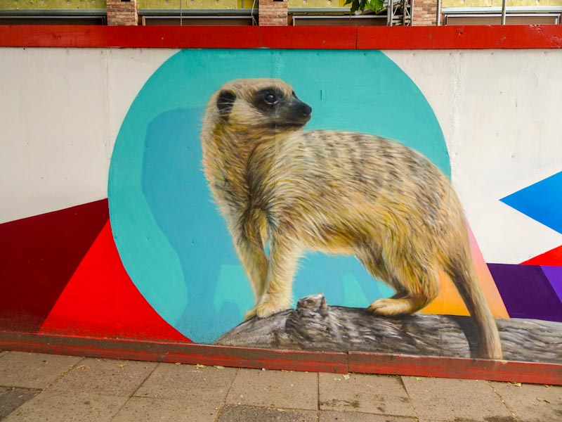


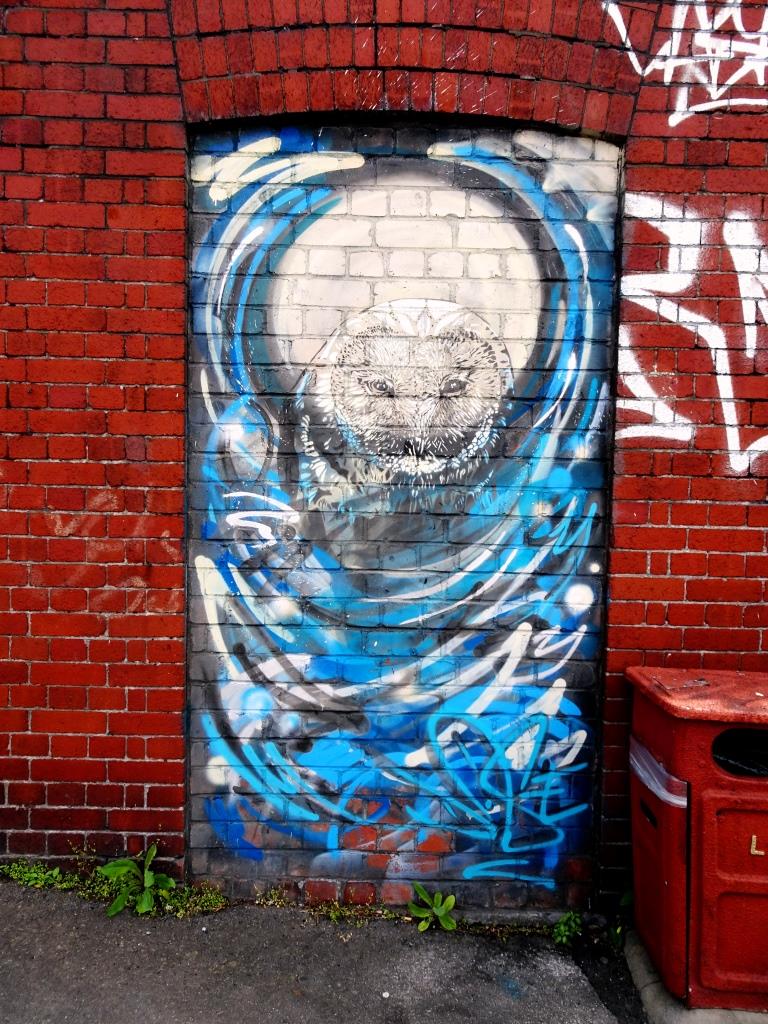


A gallery of spectacular stencils and murals from Bristol-based street artist Kin Dose (Nick Harvey)
All photographs by Scooj
And so on to the ninth archway in the John Street open-air gallery and this magnificent portrait piece by Hazard. My understanding is that this was her second attempt after she had had to buff over her first one for being controversial. This disappoints me a little because art is an expression and reflection of our lives and times and we shouldn’t hide away from difficult issues, otherwise where would we be? China? North Korea? On the upside however, Hazard has rewarded us with this outstanding portrait of Jeff Knight, a Big Issue vendor and big character in Stokes Croft.

I love Jeff. He is one of the brilliant things about living in Bristol. He greets everyone in the street with a big smile and kind words irrespective of who they are or what they look like. This piece is not the first piece of street art to feature Jeff, John D’oh sprayed a fabulous stencil of him a few years ago. Hazard’s portrait is an honest representation and skillfully painted. In this one archway we have two legends of Bristol street culture.

Immediately after lockdown, Laic217 was on fire. I am guessing that he was not working and so was able to paint the streets without restraint. In recent weeks he has slowed down considerably, so it was great to see this quick one on one of the ramps in the skate park.

This stop-start nature of activity from street artists is common and probably reflects the employment model they adopt. Self-employed artists seem to have a bit more flexibility around when they can paint where as those with 9-5 jobs probably find it all a little more challenging. Of course coronavirus and Furlough have played havoc with these regimes.
The piece itself is straightforward, a skull with a woolly hat bearing the letters PAD, a crew name. Even in these quick pieces, Laic217 still manages to achieve a high standard of artwork. I hope he gets some leave soon, I am suffering from withdrawal symptoms.
There is no stopping Nevergiveup, AKA Followmyrabbits, AKA Eldey (is that LD?), and that is a very, very good thing. I think that the tireless painting of rabbits all over the city over the last two to three years has added to Bristol’s character and amplified it’s rich street art culture, making it more accessible to more people. Some people (other than people like me) actually collect rabbits.

It is always fun to find another rabbit, although there are so many it can be difficult sometimes to remember if you have seen it before. I am pretty certain that I haven’t posted this one before, and I can tell it is a recent one, because he hasn’t been writing Eldey on his rabbits for all that long. As always perfectly executed, and potential for a Thursday doors post too..
As I see it, Slim Pickings (TES) creates his pieces in two forms; a high-end version of his letters with immaculate fills and clean lines and considered colour schemes and his throw-up versions that are a little bit more ‘street’ if you get my meaning. This one falls ever so slightly more into the second category.
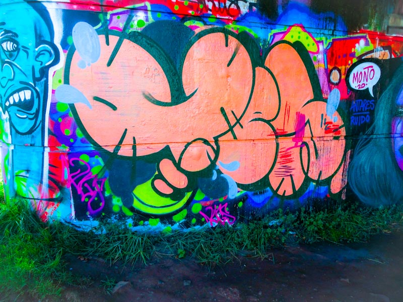
I have to say that I am not too keen on the salmon pink colour and I think the ‘stitch’ lines on the edge of the letters make the piece a little untidy in my opinion. I ought to add that I might be overthinking this and being slightly picky. I always welcome Slim Pickings’ letters in whatever shape or form they come in.
Well I’m not sure how I missed this one first time round, but I just had a little potter around in my archives and once I found it I couldn’t really ignore it. It is a tidy collaboration from Mr Klue and DNT, who quite often get together to paint, from those heady days before coronavirus was a thing in the UK… remember that?
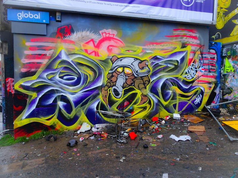
I can’t decide whether the shopping trolley is really annoying or actually adds a little bit of character to the photograph. No matter, it is there. The very ‘DNT’ monster embedded within the Mr Klue writing is a window into the artist’s mind and like so many of his characters is part organic, part mechanical. It looks likes the puffs of yellow smoke are puffing out of one of the legs of the character. A nice collaboration.
I can totally see that Morny’s murals might not be to everyone’s taste, they are just not as polished as some of the stuff you see in Bristol, but I absolutely love them. While the characters may have a soft edge, the messages don’t, and Morny is not one for holding back.
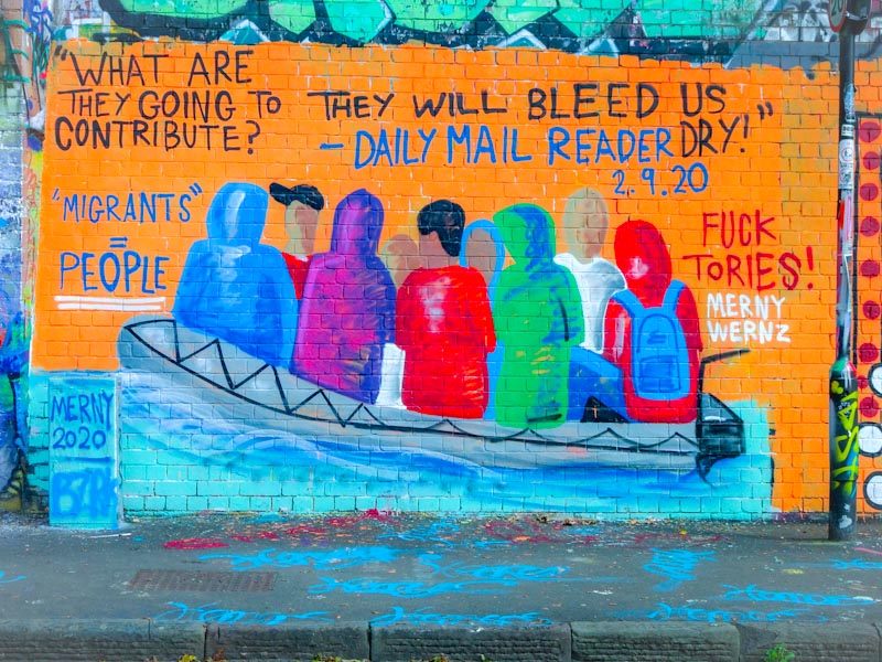
We have a great many global crises to contend with at the moment, but the dominance of the coronavirus pandemic may have masked other environmental and political issues such as climate change and migration. The Tories are not known for their compassionate approach to migration, preferring an Australian style hard line. This piece from Morny is calling them out.
I think that this might be the best piece I have seen from Morny, it has a lot of emotion and is a very powerful image. You don’t have to have sharp lines and solid fills with patterns to create a great piece. I love this.
Robin Hood, Robin Hood riding through the glen… Well there you have today’s ear worm, sorry. This is a rather nice little piece from Veks, that is modestly tucked away near a tree on the M32 roundabout wall.

It is quite an unusual piece With large chrome letters and bang in the middle an old school character looking very much like Robin Hood to me, but I am probably wide of the mark on that one. Still, as with all art, there is what the artist paints and there is what the viewer sees and these may not be the same thing at all. I rather like this understated offering.
There are two graffiti writers that I am really enjoying seeing at the moment and they are Phour and Pl8o, both emerging as great writing talents to add to the long list in the city. This is a recent piece by Pl80 on the long wall facing the river.
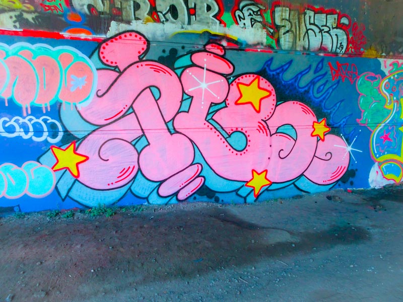
Pink is a colour that seems to be coming back into fashion and as with other pink pieces about the place it works very nicely indeed with blue. The 3D shadow is nicely done and the red details and yellow stars work very nicely in this piece. Probably Pl8o’s greatest asset though is the shape of the letter/number combination he uses it is very pleasing to the eye and full of lovely curves.
This is the second piece I have posted by Mudra, but it was the first that I photographed, and as with any first discovery I am rather fond of this modest piece. Bold and yet subtle colours have been used to create this funny looking portrait of a moustached man.

There is something aboout the simplicity of the piece that makes it all rather interesting. In particular, I can’t keep my eyes off the dark pink nose. Like the last piece I posted, this one also has a little @ with a hat, which I am assuming is Mudra’s tag. Lovely stuff from the Bristol newcomer.


