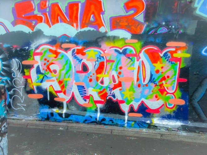
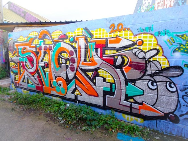
Mr Draws has been turning out some really nice pieces recently and this one is a particularly colourful one. His work has a tendency not to last too long, probably an artefact of the walls he paints rather than any commentary on the quality of his work.
Mr Draws, Dean Lane, Bristol, October 2020
In this piece, as usual, he spells out DRAW! and his fills are a colourful array of lines, spots, stars and squiggles. This is classic ‘make it up as you go along’ artwork and looks like it was fun to do. The streets of Bristol would be duller without Mr Draws.
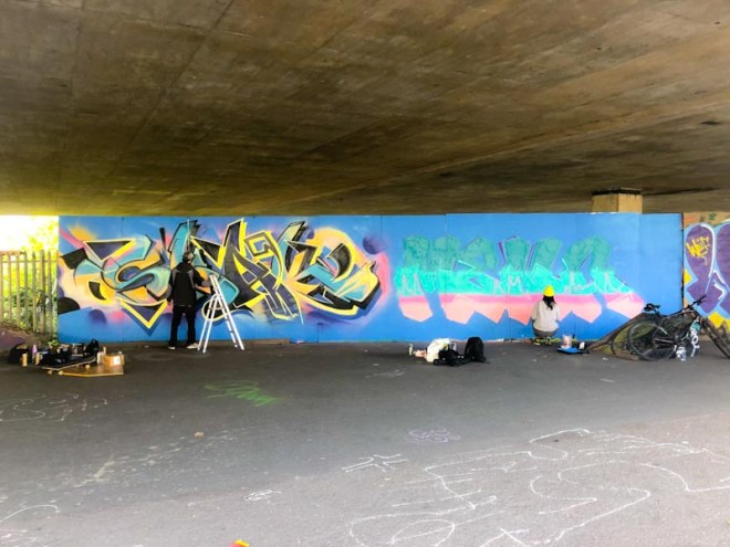
A couple of weeks ago I bumped into Paul H in St Werburghs tunnel and he tipped me off that Smak was likely to be painting at the M32 Spot, so naturally my next port of call was to my favourite board under the motorway. There I found not only Smak, but Mena too, both busily spraying.
Smak and Mena, M32 Spot, Bristol, October 2020
I have many photographs of Mena’s work, but I think this is the first time I have posted anything, so I guess a bit of a rummage through my archive will be happening in the not too distant future.
Smak, M32 Spot, Bristol, October 2020
On the left of the board is a beautifully worked piece of graffiti writing from Smak. What is noticeable about this is that the light conditions on the two days I visited this piece have presented two different tones, one much yellower than the other – I guess that cameras get pretty goofed up with poor light under the motorway and bright light bleedinng in at the sides. Auto settings simply can’t cope.
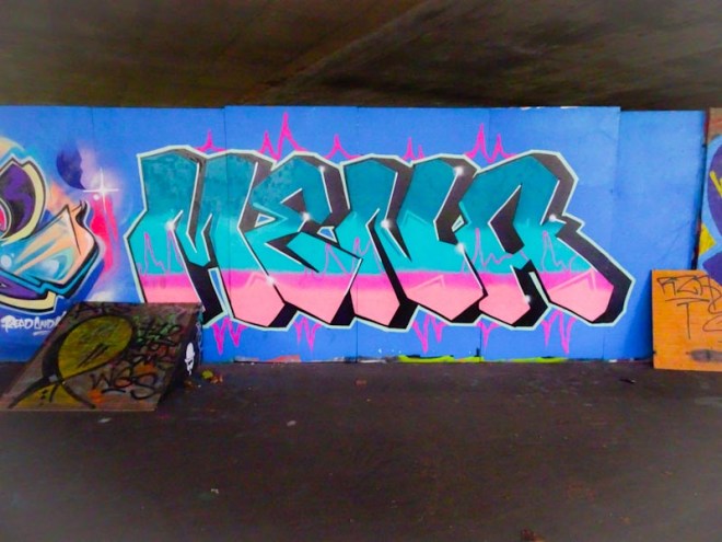
Mena, M32 Spot, Bristol, October 2020
On the right is a ‘stock’ piece of writing from Mena. The letters are uniform in size with interesting shapes and Mena really goes to town with some beautiful horizontal fills in wonderful complementary colours. The outcome is very pleasing, and the black 3D shading really helps to lift the whole thing out from the wall. I am really looking forward to sharing more from Mena.
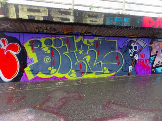
There is a thing at this time of year in the street/graffiti art world and that is to do a Halloween piece. I haven’t seen too many this year, although I have just been out to walk the dog and photographed a whole bunch more. This one is by Biers, who I am pleased to report is writing Biers again having spent the last year or two writing OhYeah.
Biers, M32 cycle path, Bristol, October 2020
This piece is a classic writing/character combination with a rather friendly looking grim reaper popping up to the right hand side of the writing. Biers has been reasonably dormant this year, so it is great to see him getting out and about.
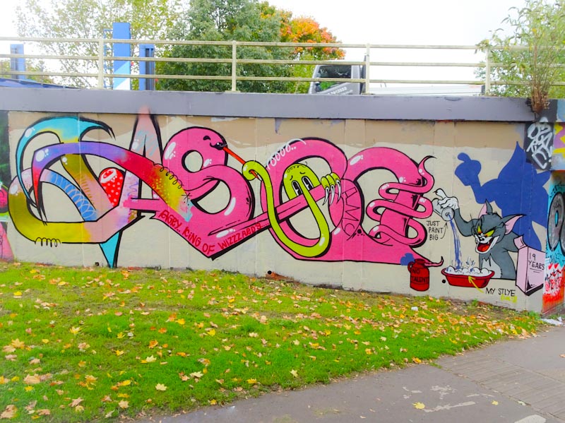
Classy. It is something of an overused word on Natural Adventures, but in this case it is simply the best word I can think of to describe this amazing piece of graffiti writing by Claro_que_sssnoh. To make things a little easier I am going to call the artist Claro, that should save me about five minutes in typing time.
Claro_que_sssnoh, M32 cycle path, Bristol, October 2020
The letters spell out SNOH, but it is the superb way Claro has layered colours onto the chrome structure, with really interesting letter shapes that stands out in this piece. It is clean, creative, complex and he has even thrown in a little character for good measure. It is great to see a quality piece like a this on this wall.
Discovering new artists about the place is definitely part of the fun of seeking out street art, and meeting Mudra and subsequently finding several of his pieces in quick succession has been very rewarding. Although he has not been in Bristol long, he is certainly making his mark.
Mudra, Cumberland Basin, Bristol, October 2020
This piece is on the long Cumberland Basin wall and incorporates his soft pastel colours into the letters MUDRA. The writing is really clever with the letters being concealed through the piece – can you find them? In the centre is one of Mudra’s pink faced characters wearing a cap. This is a fine piece of work which stitches in all sorts of ideas and techniques. Lots more to come…
I didn’t find as many Halloween pieces this year as I usually find, but that might be as a result of the terrible wet weather we have had over the last week or so. I did however manage to capture this piece under Brunel Way by Pl8o and although not overtly Halloween, I think this collaborative wall was to celebrate the festival.
Pl8o, Brunel Way, Bristol, October 2020
This piece is painted out entirely in greyscale which is rather nicely done. The owl in a darker grey stands out and adds interest to the piece overall. The bags in front of the piece actually belong to Varo who was painting the word ‘Conspiracy’ just to the right of this piece. Pl8o continues to go from strength to strength.
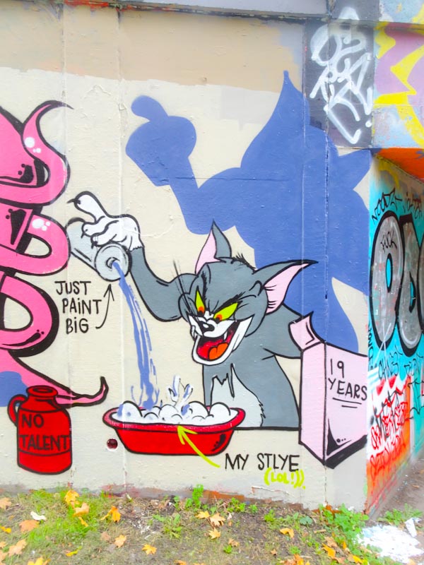
This is the second recent piece from Taboo, the other one was in Dean Lane skate park. A feature of both of these superb pieces is the use of lots of colour, which is noteworthy simply because many of his pieces can be based around two or three colours. Perhaps he has been on a recent spending spree.
Taboo, M32 roundabout, Bristol, October 2020
Taboo has stuck to his usual tradition of writing his name followed with a character piece, which will be familiar to most of you as Tom cat from Tom and Jerry. In addition there is an appearance from his Kilroy (was here) character in yellow peering out from one of the ‘O’s.
Taboo, M32 roundabout, Bristol, October 2020
The Tom is superbly painted and the story being told here would indicate that Taboo considers his work to have been 19 years in the making and combines a mixed up style underpinned by no talent and painting big. I fear this is a modest story, and I consider this piece to demonstrate his obvious talents for all to see. Unusual yes, but nonetheless skilled and creative.
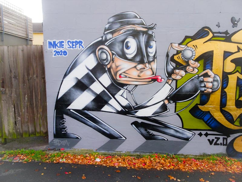
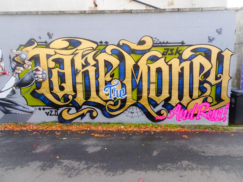
This wall is an epic wall. There had been an incredible 3Dom piece here for a long time which was replaced by an exceptional Sepr and 3Dom collaboration and now in its most recent makeover we are blessed with this outstanding Sepr and Inkie collaboration.
Sepr, Princes Place, Bristol, October 2020
On the left we have a classic masked thief in a stripy black and white top breaking a safe, stethoscope in hand. Everything about this cartoon character is brilliant – I just don’t know how Sepr can do this with spray paint, it is quite remarkable and I am awe.
Inkie, Princes Place, Bristol, October 2020
On the right is a stunning piece of writing from Inkie with the words ‘Take the money and run’ with the words ‘the’ and ‘and run’ highlighted in different fontd and colours from the main body of writing. The ‘the’ is just so Inkie!
Sepr and Inkie, Princes Place, Bristol, October 2020
While I am not too sure what the whole piece refers to, I don’t think matters too much because the class of the artistry simply screams out – one of the best collaborations I have seen for quite a while. What is it about this wall?
Sepr and 3Dom, Princes’ Place, Bristol, February 2018
It seems that everywhere I look in Bristol I am coming across new pieces by Bristol newcomer Mudra, and a most pleasurable experience it is too. Incoming artists and new artists keep the whole scene nice and fresh and add to the extraordinary diversity of art in the city.
Mudra, Dean Lane, Bristol, October 2020
When I first spotted this one in Dean Lane, I wasn’t too sure who it was by, and guessed it must be from a visiting artist, but then I saw the @ with a hat signature and the penny dropped that this was so obviously a Mudra piece. I guess the letters spelling Mudra and the signature ‘Mudra’ ought to have indicated who the artist was, but it is all about familiarity and context. The piece has some lovely colour combinations and unusual letter shapes. I reckon this would have made a superb 1970s album cover, it has that kind of feel about it. Great work and so much more to share with you.
I am increasingly being drawn to the conclusion that Whos is the same artist as Alos, and if that is not the case, then they hang out together a lot and share a style. So here is a dilemma for me. Do I aggregate all their pieces under one name or do I wait for some kind of certainty and continue to treat them as separate artists until I know better.
Well, I had a little bit of luck half way through writing this… I had an unplanned meeting with Paul in the St Werburghs tunnel and he confirmed for me that they are indeed two separate artists, and that’s that.
Whos, M32 cycle path, Bristol, October 2020
I rather like this one from Whos, and consistent with most of his work it painted with only a few colours which gives it a simplicity and honesty. I particularly like the way he sprays the ridged running through the centre of each letter. Unusual but great to see.