

.
Boy (and girl) racers
without a care in the world
plunder and destroy
.
by Scooj
.
Boy (and girl) racers
without a care in the world
plunder and destroy
.
by Scooj
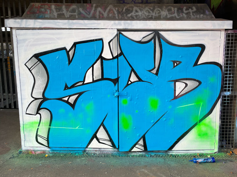
Although I have seen several pieces by Sub dotted about the place, this is the first time I have posted one on Natural Adventures. I met him for the first time when he was painting this piece alongside Bloem, who I also met for the first time – it appears that they often paint together, which I kind of already knew, but the penny only fully dropped properly when I saw them together.
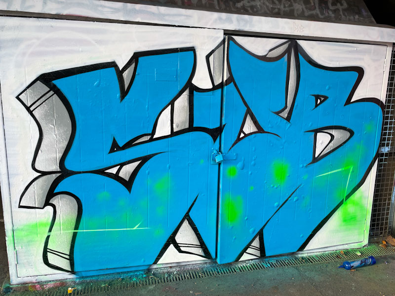
This is a very nicely worked piece with large bold letters and a solid blue fill flooding across the whole thing. The letters are nicely formed, and apart from the green smudges, the piece is simple, with only some feature lines on the drop shadow, providing a sense of perspective. I have a feeling that there is a lot more to come from Sub, and I will watch his development with interest.

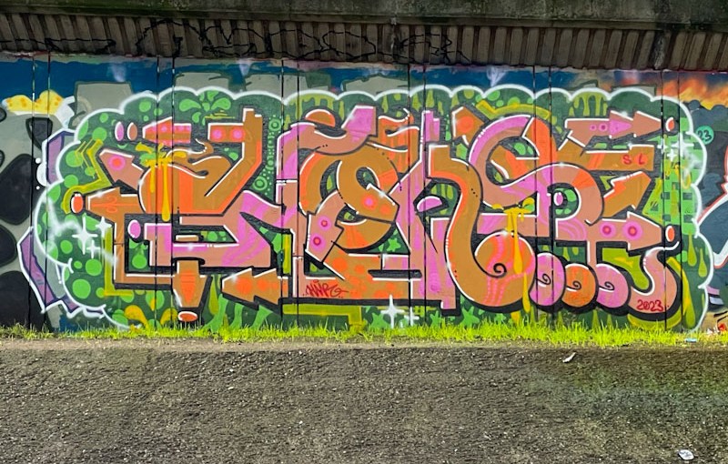
I only venture down under the M32 alongside the canalised River Frome when I don’t have the dog with me, so it doesn’t happen very often, more is the pity, because there are often some cracking works to be found, such as this lovely large piece of graffiti writing from Claro_que_sssnoh.
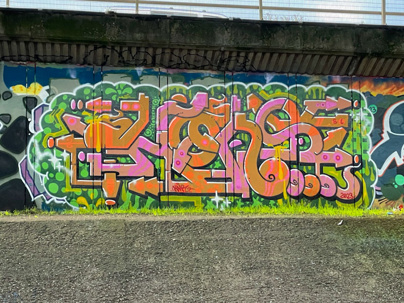
This wall is large, and there is a steep ledge just in front of it, so the best way to take pictures is from the opposite bank. The writing is instantly recognisable as Claro_que_ssnoh’s work, and spells out HONS in his unusual angular/curvy script. Great colours and a decent background help to make this one stand out a bit. Another one for the gallery.

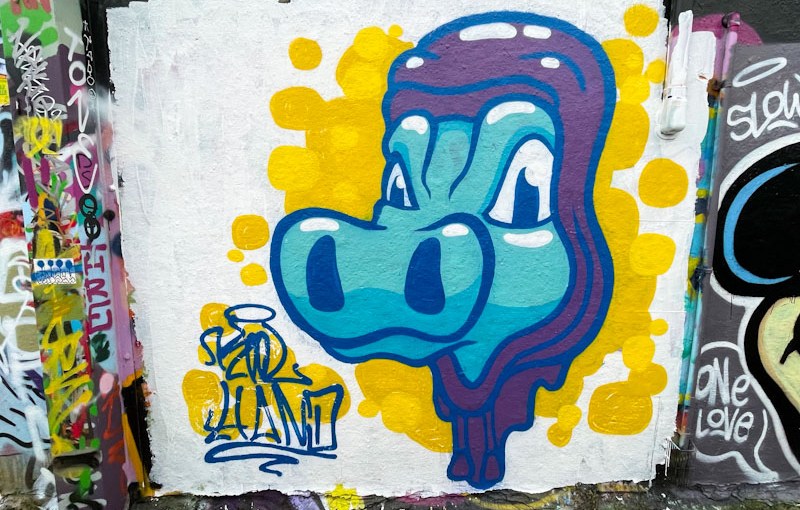
Kool Hand has come on a long way from his early days, when he concentrated on one character, his orangutan, that gave him scope to practice his technique. Fast forward to now, and he is coming up with all sorts of characters, and adding layers of sophistication to his painting.
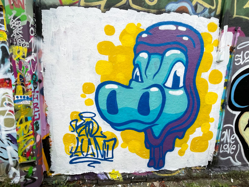
This looks like a crocodile character, really stands out with the white background and the colours he has chosen, there is definitely no hiding here. The fills are good and solid, the lines thick, but crisp, and his cutting-in is good too. All round, this is a good character piece from the Bristol regular.
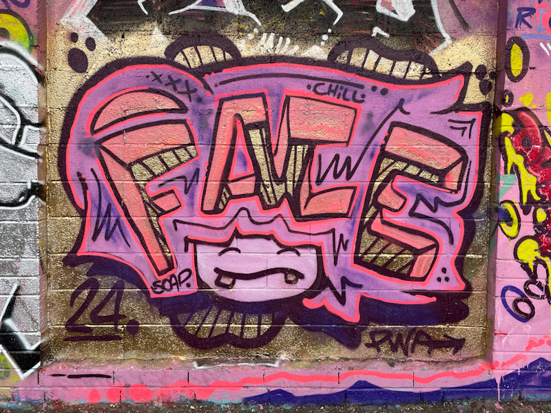
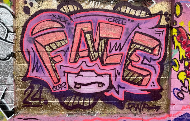
Just a reminder that Face 1st remains one of my favourite Bristol artists. He and his PWA friends provide the rhythm and bass upon which the Bristol street and graffiti art scene thrive. This piece, I think a solo effort, takes us back to a simpler version of Face 1st’s work.
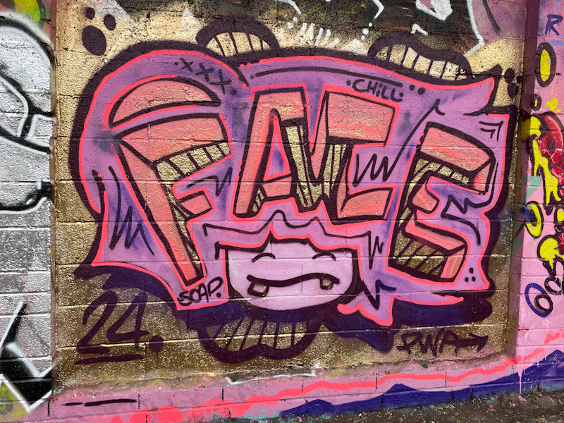
This laughing girl piece with the letters FACE making up her hair is a theme that Face 1st has used to great effect for many years, and here, he is reminding us that he is happy to keep revisiting the idea, in his unstoppable way. What is a little different to similar pieces from the past is that the letters are made to look chunky and deep some good 3D work. Keep ’em coming.
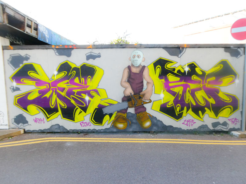
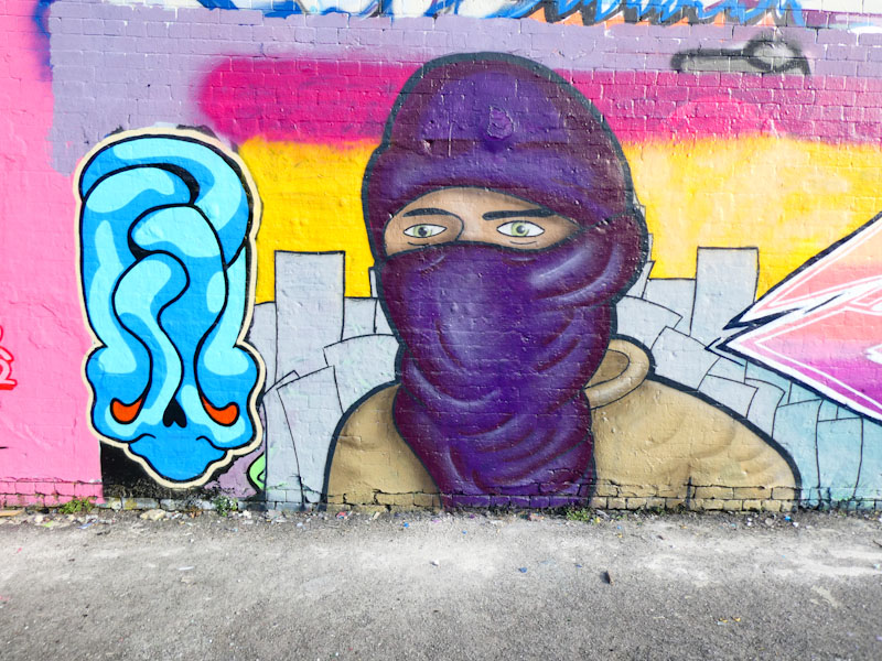
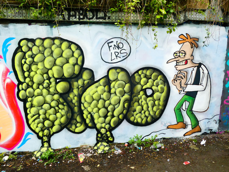
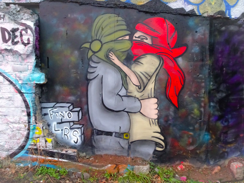
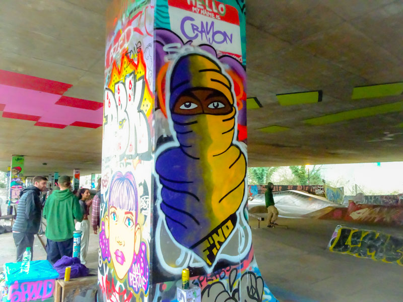
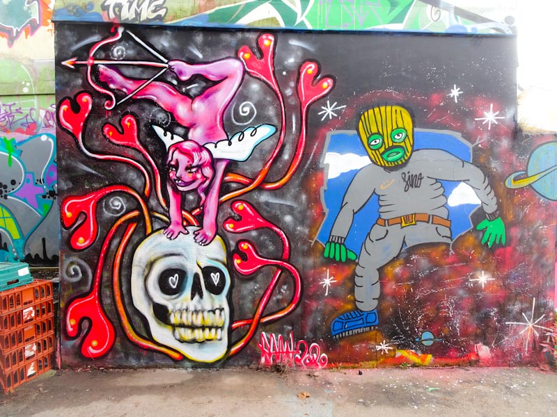
A gallery of character pieces and graffiti writing from 3F Fino or simply Fino
Crew: LRS
all photographs by Scooj
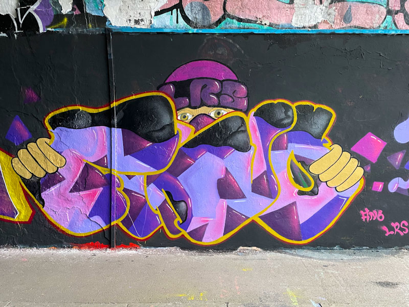








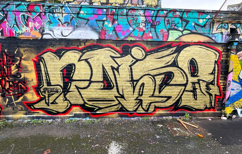
Ooh! this is a very nice piece of graffiti writing from Noise, which was painted in collaboration with Werm for the ‘World Wall Stylers’ December 2023 challenge (@worldwallstylers), which I think incorporated the colours gold and red. Noise followed the brief well.
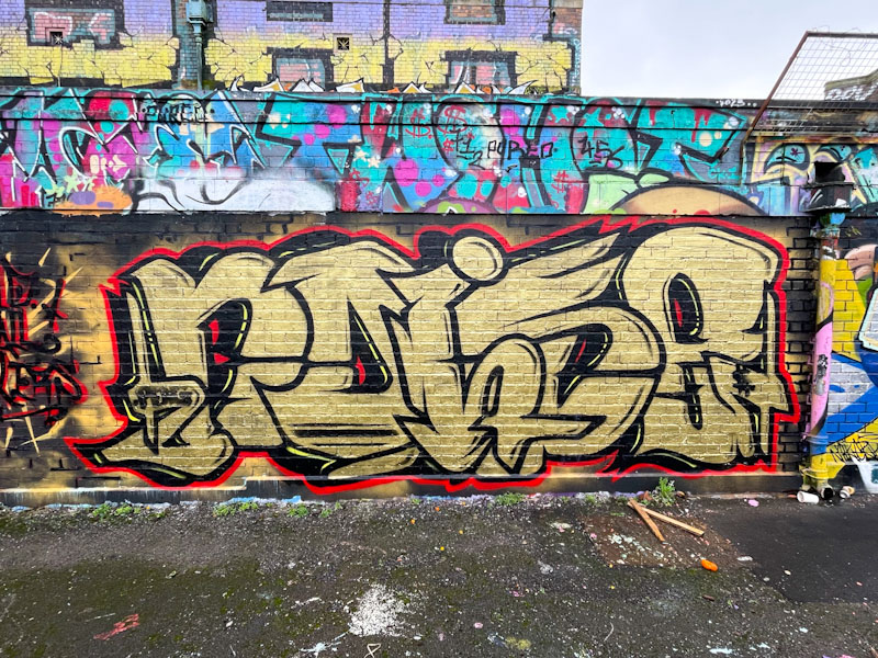
I like Noise’s large letters, that really impose themselves, and the fact that the ‘I’ sits over the ‘O and S’ which in turn sit over the ‘N and E’. The gold fill is nice and solid with only a few decorative elements, leaving the letters looking uncluttered. This is yet another decent piece from Noise.
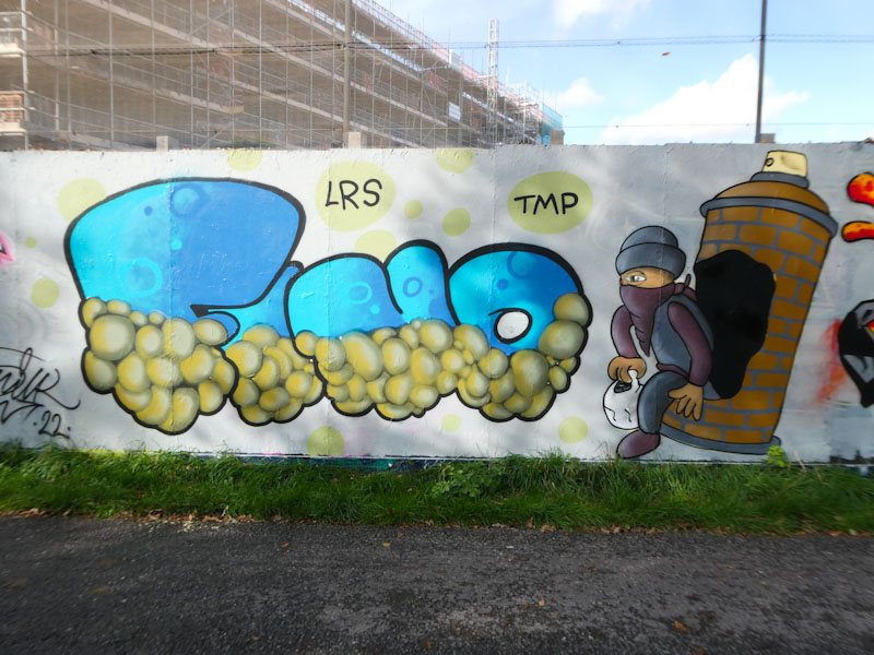
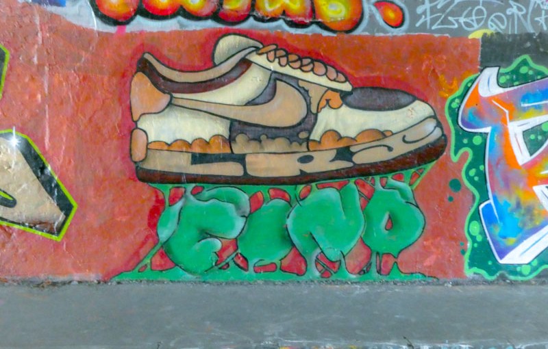
One of the nice things about pausing and going back through archives is that it gives me a chance to post those pieces I had always intended to, but never quite got round to doing. This fun spray can character piece by 3F Fino is one of those.

This piece in Mina road spent much of its time being obscured by all sorts of shop paraphernalia and rarely saw the light of day, however, I got lucky and managed to capture it when it was partially exposed. The character, with a nozzle for a head, is standing in a pile of what look like banana caps. I felt, that this was a piece that demonstrated 3F Fino’s development really well, and he did a great job on the fabric shadows and textures, and the same with the shapes and orientations of the caps. A really good piece from the artist, who appears to have stopped painting in Bristol (although I saw a piece by him last week). Time for a gallery? I think so.
.
Tuneful gusts and squalls
in the midst of Storm Isha
whistling chimney
.
by Scooj

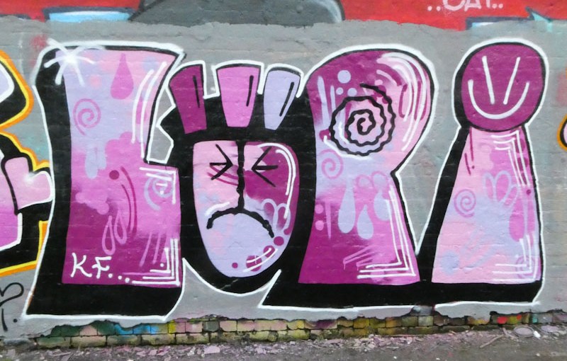
My rummage through my graffiti archives continues with this beauty from Lupa, painted last February. I have said before that I am attracted to her slightly crude style, which is definitely not to detract from it, but to distinguish it from some of the other writers who paint with knife-edge precision. There is room for all styles on the walls of Bristol.

Lupa’s letters are large and chunky, giving plenty of scope for creating interesting fills. In this case, she has used some lovely shades of purple and lilac which are carefully blended in several different ways, overlayed with some symbol decorations. Her trademark face in the ‘U’ is looking a little sad, and is joined with a simple smiley on top of the ‘A’. An attractive piece from a graffiti writer whose work definitely appeals to me.

 Natural adventures