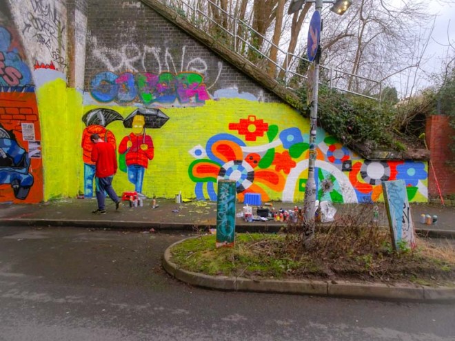
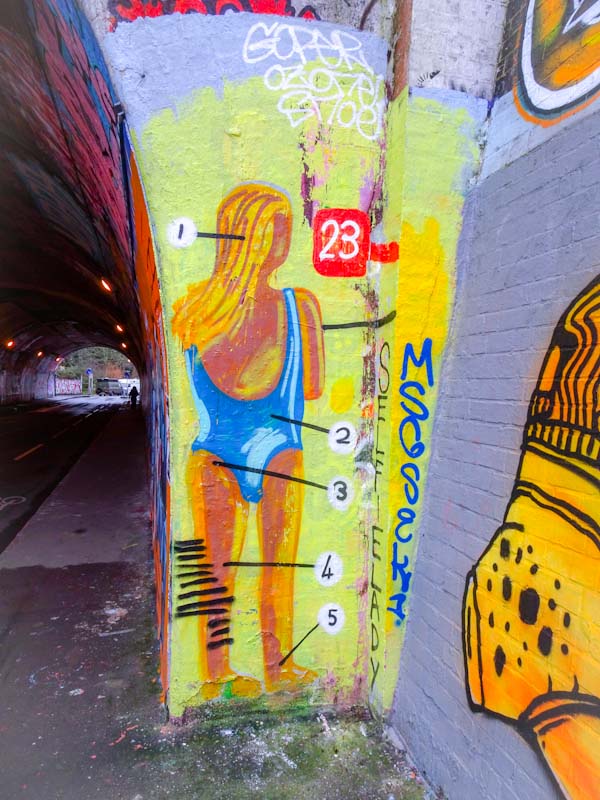
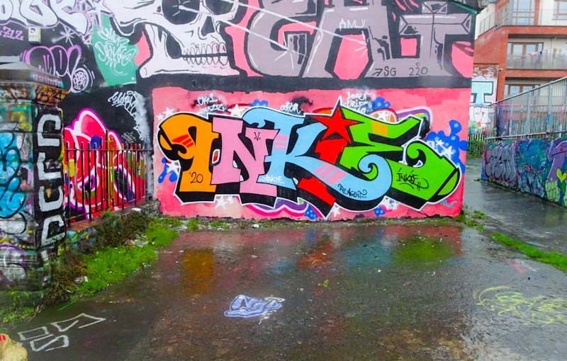
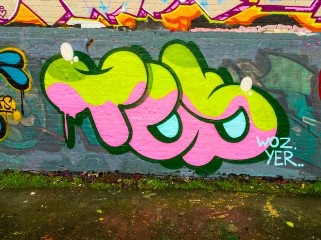
It seems like my eyes have been opened. Either Turoe One has been painting a lot more in recent months than over the last five years or so, or I have got my eye in and am spotting his work where before it passed me by. Either way, it is great to find lots of his work and in so many styles too.
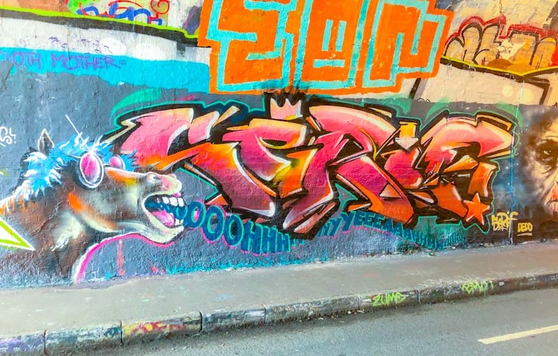
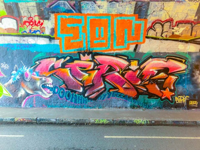
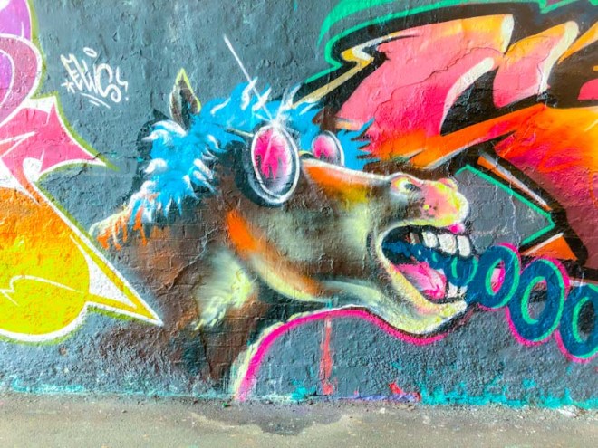
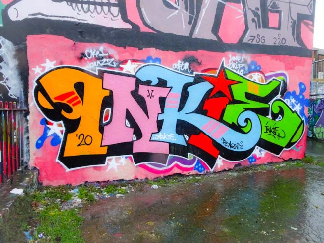
Turoe One, Dean Lane, Bristol, January 2020
Turoe One is very versatile and changes his style a lot, unlike some other artists who have a very distinct style that they repeat with variations. This piece resembles a kind of blend between Soker and Dibz (or maybe that’s just me). Anyhow it is a very neat and tidy work with clean lines and for interest there is a fine pink decoration running through the piece. More Turoe One stuff in the pipeline.
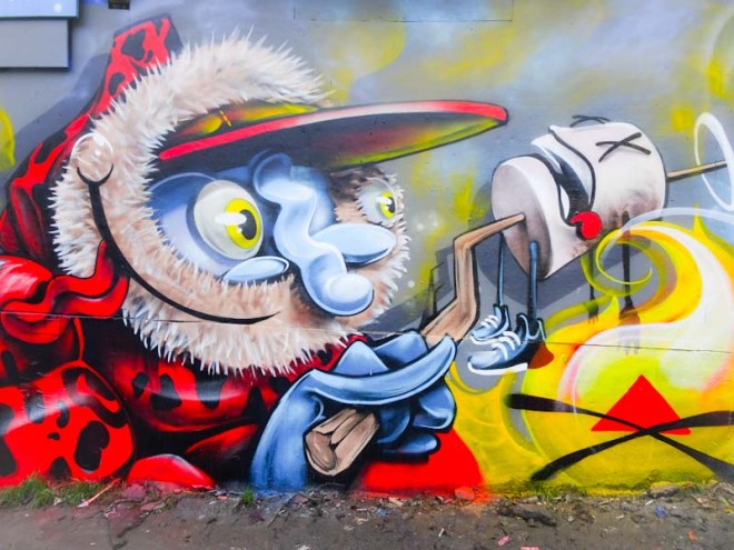
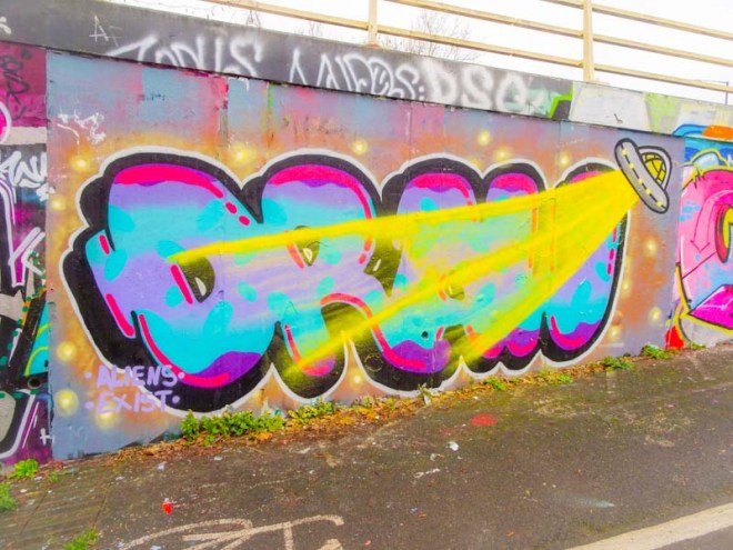
This is a really interesting piece to write about because it has given me an opportunity to introduce you to an artist I have never posted before here on Natural Adventures. I have a whole ton of his work in my files, but didn’t quite know how to break the ice. The artist is Taboo, or at least that is what I will call him (her?) until I know more about them, which currently is zilch. You can see the word TABOO in reverse in this piece (I thought it said EAT when I first saw it) with the OO being made out of the eyes of the skull.
Taboo, Dean Lane, Bristol, January 2020
There is a definite style here that is consistent across all of his work, with quite bold lettering that is in a font all of its own. The artwork is quite crude, in so much as it is not clean and crisp like so many graffiti writers in Bristol, but it has something in the raw approach that makes it rather effective. The skull appears to be firing beams out at the letters, which I am guessing might have been a bit of an afterthought.
All in all I rather like this different kind of piece from Taboo and over time look forward to posting more of his work and understanding more about the artist. A good start.
Well, I never did get a clean shot of this great two-tone piece by RichT and now of course it has gone forever, so this is the best I have. RichT has quite an unusual style in which he tends to fill the ‘canvass’ from top to bottom with decoration and detail, there are no ‘white spaces’ in his work – busy and interesting.
RichT, Park Street Avenue, Bristol, December 2018
This piece was painted on a hoarding half way up Park Street on a building that seems to have been going through a renovation for a very long time. The work has been there for most of it, but wheely bins and scaffolding have been at the scourge of decent street photography. I still felt the piece was worth posting though as I do rather like RichT’s work.
This is an extraordinary paste up that I really ought to have posted some time ago, but it slipped through the net until I had a little look back through old files. It is by the Bristol-based artist Gvnly and presents his surreal style with real confidence.
Gvnly, North Street, Bristol, December 2018
At first I mistook this for a regular poster and with peripheral vision it looked like a kind of generic ‘circus coming to town’ poster. But as always with these things taking a moment to stop and look has its rewards. There is a lot going on in this colourful piece and there is quite a dreamy type of theme going on. I’m not sure what media were used in the painting, nor do I quite understand how it was turned into a poster (I’m not very good at understanding that kind of stuff). The wheatpaste stayed up for quite a long time before finally seccumbing to the elements. Something a little different from the norm in Bristol, and all the better for it.
It is a great time of year for street art because although there is not a huge amount of action (something of a relief for me I can tell you) on the streets it is a time when artists are doing their ‘first piece of the new year/decade’ and it somehow feels a bit like a fresh start.
Pekoe, M32 cycle path, Bristol, January 2020
This new one from Pekoe on the M32 cycle path is a fresh and clean start to the year. Of course the portrait piece wouldn’t be a Pekoe work without the big hair, and what magnificent hair with a crown, hearts and face concealed in it. A wonderful way to kick off January.
This is just sublime. Although the form of Slim Pickings’ (TES) work is relatively simple and repeated, the way he sets about the colours, fills and attention to detail is masterful. In this piece I absolutely love the complementary colours of the fill and the bubbly shapes. As always the outline and shadow are clean and crisp.
Slim Pickings, Dean Lane, Bristol, January 2020
The letters TES are set on a floaty cloud of green and red and the letters are adorned with some little light blue drippy bits and whight highlights. The whole thing is set off perfectly with a grey buffed wall, completely worth the effort if you ask me. Really nice piece.
Another New Year collaboration, they are coming thick and fast, this time from Decay and Lens. Decay is of course well known to me and to readers of Natural Adventures, but this is a debut piece for Lens, which is perhaps not at all surprising given that he comes from Melbourne, Australia and is just visiting.
Decay, M32 cycle path, Bristol, January 2020
I do like it when artists from different places hook up and paint together, it makes for a terrific sense of community. This Decay half of this combo is everything we would come to expect from the artist and ticks so many boxes… the shapes of the letters, the extravagant fills and the little ‘motion’ highlights in black on the outside of the lettering to give a sense of movement and energy to the whole piece. Perfect.
Lens, M32 cycle path, Bristol, January 2020
Using a similar colour palette to Decay’s, Lens has an altogether different letter shape, much more angular with sharp edges and corners. Lens’ fills and decorations are absolutely magnificent, and this is an accomplished piece of graffiti writing. It is so good to see some work from an Australian artist, and it is great to see that Lens has included a little shout out to Rezwonk, who often teams up with Decay, a nice touch.
I think that this is the second collaboration between Logoe and Haka in as many months, and both have apeared on this board under the M32 in the DIY skate spot. It is not often that I like my photographs, always something wrong with them, but I actually like this one, somehow the colours of the piece stand out well against the dark top and bottom, but have not been bleached out by the light to either side.
Logoe and Haka, M32 Spot, Bristol, January 2020
Logoe has written his name in his script style set on a rather nice red tone abstract background. He has added to the work the sentence ‘What a year it’s been’ and he is not wrong there. On the right Haka has included a character into his chrome writing which I believe to be Hanna Barbera’s creation Quick Draw McGraw – a cartoon I don’t think I ever saw, but rather wish I had… I might have to consult with YouTube. All in all a most satisfying collaboration from these two established Bristol artists.
Here’s a rather nice three-way collaboration from just before Christmas by The Cat Came Back, the ever so familiar Mr Klue and DNT who has rather ‘owned’ this wall over the last few years.
The Cat Came Back, Moon Street, Bristol, January 2020
I know absolutely nothing about The Cat Came Back, but there are two things I really like. The first is the name of the artist, it’s just kind of bonkers and memorable too, the second is the simple but well constructed piece from an artist who is obviously well practiced in producing this cat character. I don’t know if the artist is Bristol-based but if they are, then I look forward to seeing more alley cats.
Mr Klue, Moon Street, Bristol, January 2020
The central portion of the collaboration is by Mr Klue, who seems to be on a bit of a painting spree at the moment. I have commented before on the pulses of activity from Mr Klue. You can go a month or two and see nothing new and then out of the blue several pieces appear in quick succession. I can’t read the letters in this abstract piece, but I don’t think it says KLUE. (Update, The artist tells me it does).
DNT, Moon Street, Bristol, January 2020
On the right is another feline-type creature compete with a third eye, and a design style that is so very DNT. His character pieces tend to be mad up of shapes with solid fills and outlined with black, almost like a stained glass effect. Great to see another DNT piece here. (Note to self – a good wall for ‘One wall many faces’).
This is Daz Cat’s first piece of 2020 and what a humdinger it is too. On his Instagram feed he talks about the new letter style, which I think works pretty well although I’m not sure it matches the style of the ‘lynx’ – it is almost as if this were a collaboration of two artists.
The lynx is rather special both in design and in colour selection and naturally carries the signature polygon on its forehead – a tell tale sign that this is a Daz Cat piece. All in all a great start to the decade from an artist I’ve yet to meet… it is only a matter of time.