4107. Dean Lane skate park (443)

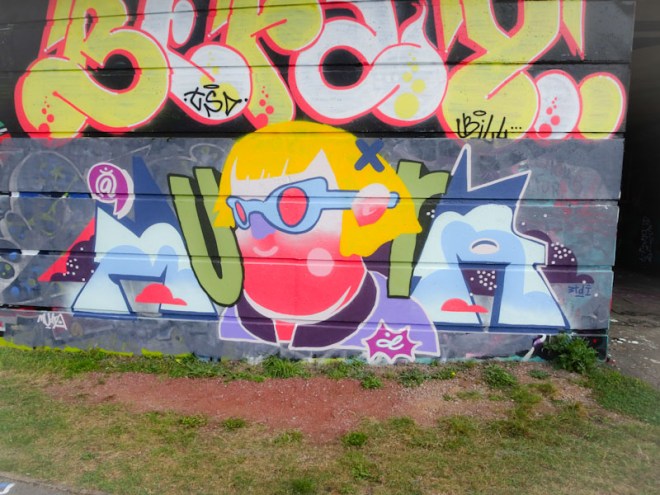
On the fabulous curved wall at Dean Lane skate park is this nice LRS collaboration featuring Veee and Werm (formerly known as Eman). The centrepiece is the main attraction here, or at least it is the most eye catching and is by Veee.

Veee, Dean Lane, Bristol, November 2021

Veee, from Weston-super-Mare is painting ever more frequently in Bristol, and his trademark characters, of which there are a couple, are appearing across the city. This ‘lion’ character, with symbols for eyes, is rather fun and compelling and impossible not to like.

Werm (Eman), Dean Lane, Bristol, November 2021

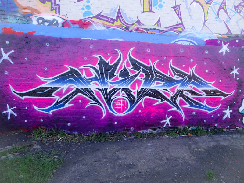
Werm’s contribution to the collaboration is this quick LRS crew throw up, adopting the block letters that he has been enjoying of late. Two things I don’t understand about Werm… how on Earth does he afford all the paint and how does he have so much time to paint. I don’t expect answers and I don’t really care too much, the key is that he keeps going and keeps improving.

4105. Greenbank (20)

A few weeks ago Pl8o told me that he had a whole bunch of new designs ready to go, and since then I have figured that each new piece I have seen would have been part of this roll-out, including this beauty on the long wall at Greenbank.

Pl8o, Greenbank, Bristol, November 2021

If I am honest, I think that brown and orange are my least favourite street art colours, although if used to highlight or fill pieces they are not so bad. I suspect that this relates to a rather horrible pair of nylon pyjamas I had in the 1970s that were brown with an orange trim. Yuk.

I absolutely love the stylised letters that Pl8o has drawn up and the character is a very welcome addition, which I assume is by him too. All in all a very nice addition to his portfolio, just a pity about the colours (in my opinion).

4104. New Stadium Road (36)

I met Logoe for the first time a couple of weeks ago at this spot while he was painting a collaboration with Silent Hobo, one of his old mates. Their collaboration, I don’t think even lasted a day, and I only have one WIP photograph of it, such is the ephemeral nature of street art in popular spots. Logoe comes across as a lovely bloke and was more than happy to talk about his work and his trips to Bristol.

Logoe, New Stadium Road, Bristl, October 2021

Unlike his collaboration piece, this one has lasted well and I believe is still there, or at least it was last time I visited this spot. The delicate colours work really well on this script LOGOE entering. With many of his pieces Logoe likes to add a little quote or phrase and here he gives us:

“They say (she) dodged a bullet… but it put her in the ground”

This sounds like a lyric, but I am not too sure what from. Anyhow, it works well with this lovely piece. Logoe also told me that he had missed out a word. I am guessing it was the word ‘she’ that I inserted in brackets.

4103. City Road (12)

This magnificent beast was created by Ryder as part of a magnificent paint jam marking the opening of Stoked Food in Stokes Croft. The whole delivery and car parking Bay Area was decorated by several local artists, but this shutter skull was the centrepiece.

Ryder, City Road, Bristol, October 2021

Ryder is better known for his outstanding writing, but this is a great character piece, and extra clever as the mouth opens up when the garage door is raised. Very nicely painted and full of cartoon ‘over-the-top’ character, this piece demands to be looked at and enjoyed by passers by on City Road.

4102. Cumberland Basin

Different artists have different creative patterns or routines. Some paint the same thing over and over again, tweaking and perfecting it (for example Slim Pickings – TES), others create something extraordinary and different every time (Sled One, Tom Miller, 3Dom). Some only write, some only create characters and some combine the two. Mudra too has a modus operandi, which is either to create a character portrait or to write MUDRA cryptically incorporating characters and symbols. This piece falls into the latter category.

Mudra, Cumberland Basin, September 2021

This lovely piece from a little while back on the long wall at Cumberland Basin spells out the artist’s name, where the ‘d’ in a little breakout star at the bottom is replaced with a wonderful stylised portrait of a pink-faced, purple-nosed lady with shocking yellow hair. A wonderful and creative piece beautifully worked nice clean lines and fills.

4101. Dean Lane skate park (442)

Dibz is an immensely talented graffiti writer and whose status is in the highest echelons of writers in Bristol and, I dare say, the UK. He manages to turn out beautifully designed piece after piece, never letting his standards drop, and the creativity of his designs and outstanding colour palettes is of the highest order.

Dibz, Dean Lane, Bristol, September 2021

This piece in Dean Lane is extra special because it is a birthday celebration for his mother, which is really touching. For this piece, he has really gone to town, with all the elements coming together perfectly. Great design, superb colours, tight lines, beautifully crafted fills and 3D shadows. In short this is an outstanding piece, and about as good as it gets.

4098. M32 Cycle path (149)

Regulars will know that I really like Bnie’s work. She fits into a school of writers whose letters are not cryptic… what you see is what you get, and the magic is created in the colour schemes and in the fills and patterns. Some, for example Mena in yesterday’s post, try something a little different from time to time, but it is in perfecting what you enjoy that shines through the most.

Bnie, M32 Cycl path, Bristol, November 2021

This newish piece on the cycle path, part of an RBF paint jam, does incorporate some slightly new letter shapes and the horizontal fade from purple through to green in four shades is beautifully worked, but it is her distinctive patterned (in red and black this time) 3D depth that is truly masterful. Great piece.

4097. Sparke Evans Park (21)

There is something very enjoyable when an artist adds to their repertoire with something quite different. Mena is a writer who up until recently worked with uniform soft blocky letters, but recently she has gone on a spate of beautiful script writing, which has taken her work to a new level in my opinion.

Mena, Sparke Evans Park, Bristol, November 2021

This piece in Sparke Evans Park is an absolute belter. The script is beautifully designed and the horizontal blend of colours in the fill are masterfully done. A really lovely piece and a great new direction for the artist.

4093. Greenbank (19)

Just because I haven’t posted anything by Turoe for a while, doesn’t mean he hasn’t been decorating Bristol’s walls, it is more a reflection of the sheer number of new pieces appearing every week in the city, and I don’t have the capacity to feature them all in Natural Adventures.

Turoe, Greenbank, Bristol, November 2021

On the long hoarding at Greenbank, this is a rather luscious (or lush as we say in Bristol) chrome burner with a gorgeous red 3D shadow giving the letters real depth and lifting them away from the hoarding surface. This is a lovely piece of graffiti writing from a very accomplished artist.

4092. Dean Lane skate park (441)

I met Hire in Dean Lane the day before he painted this beauty, and he was basically sizing up the wall looking where would be best to paint his new work. I hadn’t seen him for quite some time, but he remembered me and even remembered my name, which felt good, and we chewed the fat for a little while, before I had to dash.

Hire, Dean Lane, Bristol, November 2021

I like, and have always liked, Hire’s work. His graffiti writing has a distinctive jagged appearance of edges and shapes that remind me of medieval weapons and blades. The letters are sophisticated, spelling HIRE, and the colour transitions beautifully worked, with a bright band running horizontally through the piece. So good to see both the artist and his new piece.